The information of cryptography in people, places, and things

Place: Spyscape Museum

This summer, I visited the Spyscape Museum in Manhattan. It’s at once a museum and an activity: while it has exhibits about counterintelligence operations, cryptography, and other “spy”-related topics from across history, it also comes with a significant interactive component, leading visitors through quizzes and games.
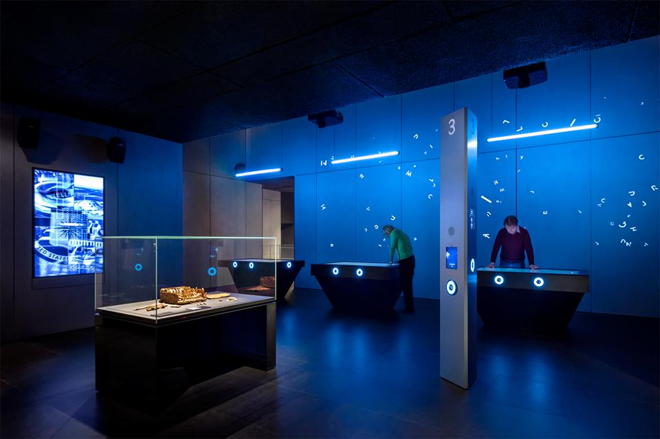
Photo: Spyscape

The whole museum is centered around a challenge of sorts, geared towards discovering what sorts of skills you have that could be relevant to various professions related to spying, including field operators, handlers, researchers, and codebreakers, among other roles.

Beyond being a fun way to spend a few hours away from the summer heat, the Spyscape Museum actually made me curious about many of the things I learned there, such as the Anonymous movement, cryptography’s legacy in the digital age, and the role of covert operators across history.

As a museum, Spyscape is an institute of information, cataloguing and preserving different histories of covert operations. Spyscape, like many museums, teaches by a method called interpretation.

“Interpretation relies heavily on sensory perception—sight, hearing, smell, taste, touch, and the kinetic muscle sense—to enable the museum-goer emotionally to experience objects.”

(Alexander, 2008)

With visual and audio components to its exhibits, plus touch screens that allow visitors to play games and answer questions, Spyscape certainly makes use of the full sensory experience.

The subjects of the museum, cryptography and covert operations, also deal heavily in information: protecting it, freeing it, and controlling who has access to it.

“Nations go to great lengths to gain [information] by using the time-honored tools of espionage and codebreaking to gather information secretly. … Codebreaking evolved from the ancient art of pencil-and-paper puzzle solving to the science of cryptanalysis.”

(Gannon, 2001)

This evolution in cryptography mirrors the journey of the information field, from the simplest of roots to the complex webs of information we have today in the digital age. It’s this evolution that the Spyscape Museum catalogues, interprets, and shares for its visitors.

Person: Alan Turing

One of the most important people in the history of cryptography, whose story was given great focus in one of Spyscape’s exhibits, was Alan Turing. He’s famous for leading the World War II-era British counterintelligence team that beat the German Enigma machine, which encrypted messages according to regularly-changing ciphers that were difficult to crack. But he had a hand in many other information-related operations during and after World War II, and his life itself is a study in how information can have an impact on a personal level.

Turing’s claim to fame was his work for British counterintelligence on the Enigma problem.

“The science of numbers and symbols was in Turing’s genes … [He] ignored the intimidating numbers and put his trust in what he knew—mathematical logic.”

(Gannon, 2001)

Having an eccentric manner but an undeniably genius brain, he gained respect from his colleagues and managed to find a solution that reliably broke the codes created by Enigma machines.

Even after the war, Turing continued to work in information-related fields, going on to lay “the foundations for computer technology and artificial intelligence” (Spencer, 2009). His work, in large part, has been the starting point from which much of the digital age has sprung: computers, machine learning, and data analysis, in their modern iterations, have all been influenced by Turing’s work.

Of course, the sensitivity of Turing’s projects during World War II meant that he wasn’t publicly recognized for his contributions to ending the war; he had to keep his work a secret from even his family.

“Turing’s oldest niece, Inagh Payne … recalls sitting on his knee asking him repeatedly what he did at the office. Turing remained quiet about his work for the war effort.”

(Spencer, 2009)

And this wasn’t the only part of his life he had to keep a secret: his homosexuality, for which he was eventually criminally prosecuted, was another large piece of information about him that could not see the light of day.

It is this juxtaposition between his work and his life that strikes me most about Alan Turing. His life’s work, the achievement for which he is most recognized, is that of freeing information, revealing secrets, and saving lives by being able to break codes and open lines of communication. But in his personal life, neither recognition for his incredible deeds in the service of his country, nor the simple liberty of being able to love freely, were granted to him. Exposing and withholding information are two sides of the same coin; perhaps no one knew that coin as well as Alan Turing.

Thing: Cryptex

While I was at the Spyscape Museum, I couldn’t help but reflect back on one of the first books that ignited my interest in cryptography: The Da Vinci Code. Though I haven’t read it in a long time, a few of the concepts from the book have really stuck with me. One of the things that has always intrigued me is an object called a cryptex.

“A portable container that could safeguard letters, maps, diagrams, anything at all. Once information was sealed inside the cryptex, only the individual with the proper password could access it.”

(Brown, 2003)

This device struck me as a genius invention when I first encountered it — appropriately, it was credited to Leonardo Da Vinci in the story. For a while, I believed that was its origin, but actually, it was invented by Dan Brown, The Da Vinci Code’s author.

The cryptex itself is obviously linked with information: namely, it’s designed to protect information from everyone but its intended recipient. But the real-life story of this fictional object also has a lot to do with the way we interact with information, especially when it can be used for profit.

A year after the publication of The Da Vinci Code in 2003, a fan of the book named Justin Nevins created the first physical replica of the cryptex. Shortly thereafter, he trademarked it — which led to a dispute between Nevins and Columbia Pictures when The Da Vinci Code was adapted into a movie. Nevins wrote out his side of the story many years later on a forum website (Nevins, 2017).

As Nevins tells it, Dan Brown didn’t have a problem with him holding the trademark for the cryptex at first. But when The Da Vinci Code‘s movie was in production, Columbia Pictures wanted to make their own replicas for the movie, and wanted Nevins to drop the trademark. Nevins and Columbia Pictures eventually settled out of court: the movie was allowed to use the word “cryptex,” but Nevins was allowed to keep his trademark. He still sells cryptices online.

This part of the story is, understandably, not as well known as the cryptex itself; but it brings this device from a fictional object to a technology of the real world. Copyrights and trademarks are a big part of regulating how information can be used and received in the world, which echoes the original purpose of the cryptex itself: keeping information from certain parties, and revealing it to others.

The cryptex’s journey from fiction to reality illustrates the importance of information: the creativity that can happen when it’s shared with the world, and the monopolization that might ensue when it’s kept safeguarded in just a few, powerful hands.

References

Alexander, E. P., & Alexander, M. (2008). Museums in Motion: An Introduction to the History and Functions of Museums. Lanham, MD: Rowman et Littlefield Publishers, Inc.

Brown, D. (2003). The Da Vinci Code. New York: Doubleday.

Gannon, J. (2001). Stealing Secrets, Telling Lies: How Spies and Codebreakers Helped Shape the Twentieth Century. Washington, D.C.: Brasseys.

Nevins, J. (2017). The history of the Cryptex. Retrieved from https://forum.thecodex.ca/t/the-history-of-the-cryptex-r/70.

Spencer, C. (2009). Profile: Alan Turing. Retrieved from http://news.bbc.co.uk/2/hi/uk_news/8250592.stm.

Spyscape Museum. Retrieved from https://spyscape.com/.

It’s Prof. Cooley, in the Art Library, with the Useless Box

Person: Heidi Cooley

My person is Heidi Cooley, author of Finding Augusta: Habits of Mobility and Governance in the Digital Era. I was at the 4th floor library at PMC looking at the new books display, and this book caught my attention. The title and the cover image conveyed the perfect combination of artsy, academic, and applying theory to practice. A brief skim of the chapters revealed that this book encapsulates perfectly the four degrees taught at the School of Information.

So what is Augusta? Scott Nixon, a traveling insurance agent from Augusta, Georgia, used a 16mm camera to document places in the U.S. called Augusta, filming from about 1930 to 1950. These are towns and streets and villages and storefronts and some other surprising Augustas. The result is an 18-minute movie, available on YouTube and archived, along with Nixon’s home movies, at the University of South Carolina (USC).

Cooley was a professor of technology and media arts at USC, and during a visit to the archive, the archivist showed her The Augustas and these 18 minutes triggered this book. The book is interesting, clever, and well written, but the main appeal to me is how Cooley extrapolated meanings and applications of information in ways that are both deep and broad and directly connect to our school. The Augustas relate to technology, mobility, mobile devices, bodies in motion, managing the movement of “stuff,” the application of surveillance, tracking, indexing information, metadata creation, digital and physical preservation, archiving, display, and the implication on governance.

Cooley’s departure point is the traveling salesman problem, which asks, “Given a list of cities and the distances between each pair of cities, what is the shortest possible route that visits each city and returns to the origin city?” It’s a question that is relevant to information storage, retrieval, design, display, usability, findability, and more. Books and articles that reflect the intellectual landscape in an interdisciplinary way are few and far between, and Cooley’s study is an “example of digital humanities scholarship and critical readings of the political stakes of new media technologies” (Archibald, 2016). It can provide new appreciation for a broad and deep understanding of information.

Place: Brooklyn Art Library – The Sketchbook Project

I’m not sure what possessed me to make my way across town on one of the coldest days of last winter to visit The Brooklyn Art Library. I must have read about it someplace, but I can’t recall where.

Nestled in some abandoned (or maybe it was the cold) side street in Williamsburg, the library is one large rectangular room lined with bookshelves, and on them are uniform sketchbooks. People buy a sketchbook from the library, then draw, paint, write, collage to their hearts’ delight, and bring or mail it back to the library. The library digitizes the books, adds metadata, and places them on the shelves where they are arranged chronologically. To look at a book, you register on your phone or using one of their iPads, and request up to three sketchbooks. You can search by artists, by title, by region, by topic, and more. You receive the book within a few minutes and as a special bonus receive the book immediately preceding the one you requested. This aspect of the arrangement particularly appealed to my knowledge organization sensibility. It somehow reminded my of Aby Warburg’s library in London and its cross-disciplinary references between adjacent sections.

Photo: The Sketchbook Project

The books themselves are, as one might expect, very wide ranging. Every imaginable kind and color of ink and pencil and paint and every style of drawing. There are journals and landscapes and manga and books in all languages and from many countries. Some are magnificent, some are puzzling, but the effect is quite strong, and even the duller ones are lifted up by being part of a beautiful and surprising collection.

Toward the back of the library there is a community-style conference table where visitors can look at the books. There were few people during my visit (temperatures were in their 20s, after all) but there were some, two adults and a child, some other adults of all ages. The people who work there are conversational without being pushy and will take their cues from the visitor.

The library embodies some of the ideas expressed in Finding Augusta, particularly those about arrangement of information as mobile objects; as Cooley notes, “mobility, its organization and potentiality, is the defining problem of this present” (Cooley, 2014). To that end, the Brooklyn Art Library provides its Bookmobile, which brings the collection to locations around the country in a mobile library.

Thing: The Useless Box

For my Thing, I chose a useless box. How do I know it’s a useless box? Well, it says so in bold black lettering on top of a flimsy looking plywood box: Useless Box.

Photo: Debbie Rabina, Ph.D. 

Right under the lettering there is a slit in the cover, and below it, a simple mechanical switch. Push the switch and half cover lift open from the hinge to the center, only to immediately close again. Open close, open close—that’s all it does. Useless.

Measuring about six inches, I can hold it my hand, turn it around and examine it. Peeking inside I can see a small mechanical device operated by battery. Pushing the outside switch makes the top open and immediately close. The only use that comes to mind, or at least to my mind, it that this is some executive stress toy.

So what makes The Useless Box a worthy choice for my information-Thing? Well, it’s the legacy of the Useless Box that ties in to our information universe. Developed in the 1950s in Bell Labs, it is the brainchild of Claude Shannon, a pioneering information theorist:

“The first working model was constructed by his mentor, Claude Shannon, who later became known as the father of information theory. This context, the fact that the creators of this aggressively pointless gadget are emblematic figures in the ascendancy of machines over our contemporary world, lends a frisson of historical oddity to what is essentially an executive toy.”

(O’Connell, 2016)

Contemplating the box as an expression of meaning is an act of mediation that can take you in many directions, from the meaning of labor and mechanical objects to questioning usefulness itself. And finally I admit, one appealing thing about this Thing is that is reminds me of Thing. Picking up on some lines of thought from Cooley, this can take us to the latest in creating life out of dead brain tissue to Ted Chiang’s “Story of Your Life,” in which a woman learns how to see the future:

“From the beginning I knew my destination, and I chose my route accordingly. But am I working toward an extreme of joy, or of pain? Will I achieve a minimum, or a maximum?”

(Chiang, 2002)

In other words, even when everything is known (like a device that you know will close itself immediately after you open it), isn’t it still possible for wonder to exist?

by Debbie Rabina, Ph.D. 

References

Archibald, R. (2016). Review of Cooley, Heidi Rae, Finding Augusta: Habits of mobility and governance in the digital era. H-War, H-Net Reviews. Retrieved from http://www.h-net.org/reviews/showrev.php?id=43095

Chiang, T. (2002). Stories of your life and others. New York: Vintage.

Cooley, H. R. (2014). Finding Augusta: Habits of mobility and governance in the digital era. Hanover: Dartmouth College Press.

O’Connell, M. (2016) Letter of recommendation: The useless machine. The New York Times Magazine. Retrieved from https://www.nytimes.com/2016/09/04/magazine/letter-of-recommendation-the-useless-machine.html

Shaer, M. (2019). Scientists are giving dead brains new life. What could go wrong? The New York Times Magazine. Retrieved from https://www.nytimes.com/2019/07/02/magazine/dead-pig-brains-reanimation.htm

Event Review: Braiding Strands of Wellbeing: Reclaiming, Healing, and Sending Knowledge into the Future

In her talk, Braiding Strands of Wellbeing: Reclaiming, Healing, and Sending Knowledge into the Future, Dr. Sonya Atalay discussed anthropologists and archaeologists can and incorporate the local and indigenous populations’ cultural practices of sharing and preserving knowledge into their studies of these cultures. An anthropologist and Ojibwe (the Native American tribe also known as the Chippewa) keeper of knowledge, Dr. Atalay has conducted anthropology and archaeology research within indigenous populations in North America as well as the Middle East. Her work, including her books Community-Based Archaeology: Research With, By, and for Indigenous and Local Communities and Transforming Archaeology: Activist Practices and Prospects, has been focused on the development and implementation of participatory research, seeking to decolonize the language and practices used by non-indigenous researchers as well as justice for communities through the collection of indigenous artifacts. Dr. Atalay is currently working on her book, Braiding Knowledge, an ethnographic review of these projects and other engaged scholarship of indigenous communities to how collaborative knowledge production are transforming research practices and outcomes. Many of her concepts are similar to practices found in the Ethics of Fieldwork by the Program for Ethnographic Research & Community Studies, expanded and adapted to the fields of Anthropology and Archaeology.

The main example used in her talk was the ezhibiigaadek asin, which translates to “the place where knowledge is written on stone”, a Saginaw Chippewa heritage site archaeologists refer to as the Sanilac Petroglyphs.The carvings on the rock face represent history of the tribe as well as instruction on how to send its knowledge into the future. A sacred site, with important physical and cultural links to the surrounding area, cultural practices involve water art ceremonies where tribal elders bring river water to wet the carvings and share the histories and practices represented. The researchers working on the site, to protect the site for their own purposes, had covered the rock face with a pavilion and installed a fence to prevent erosion and vandalism of the carvings. Gated and only available to the public upon request of a scheduled visit the indigenous community could not access the site or conduct the water art ceremonies.

A place of knowledge for both tribe members and anthropologists, the difference in approach to accessibility and use of the physical site indicates the divide in perspective each group holds about the information the site contains and how to it should be studied. Not only did researchers not take into account the indigenous people’s desires for how the site is utilized but also the outcome and application of the research. A source of contention was the misinterpretation of one petroglyph archaeologists dubbed the hunter. The carving actually depicts shkabewis, a spiritual teacher sending information and knowledge into the future. Not only had the researchers misinterpreted its meaning, fitting the colonial narrative of Native Americans as hunters rather than purveyors of knowledge and information, the University of Michigan had copyrighted the image of the carving and used it in branding. they  as well as the the physical site, the information and knowledge it contains

An image of the shkabewis carving taken from Dr. Atay’s Braiding Strands of Wellbeing: Reclaiming, Healing, and Sending Knowledge into the Future.

When the researchers began consulting the Ojibwe leaders, it resulted in a shift in practices, results and use of their work. By addressing some of the concerns PERC in the such as establishing a rapport with the participating group, learning indigenous knowledge needs and desires of application of the research and the representing the participants in a recognizable and respectful way. The Saginaw Chippewa gained more consistent access to the ezhibiigaadek asin as well as influence over the conduction and results of the fieldwork. The archaeologists gained a more accurate representation of the petroglyphs and people that created them.   

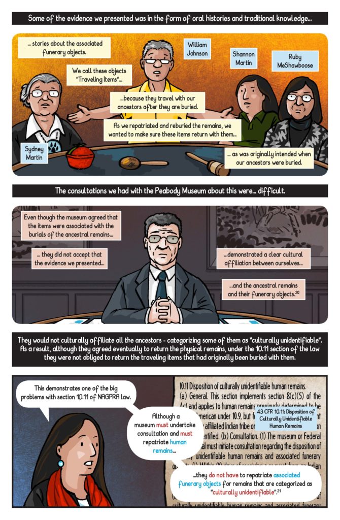
Dr. Atalay presented the ethnographic comic “Journeys to Complete the Work: Stories about Repatriations and Changing the Way We Bring Native American Ancestors Home (NAGPRA Comics: A Graphic Narrative)” she co-authored with John G. Swogger, and Jen Shannon, in collaboration with Shannon Martin and William Johnson of the Ziibiwing Center of Anishinabe Culture & Lifeways, and Tribal elders Sydney Martin & George Martin. The comic details the effort of anthropologists and tribal leaders to have the remains of Native American peoples, held by several museums, returned to their ancestors for proper burial on the basis of the Native American Graves Protection and Reparations Act. This comic, along with others Dr. Atalay has produced on similar topics, is a novel way for Ethnographers to share their research practices and results with the populations they study and the general public.

Dr. Atalay’s talk was an enlightening look at how ethical fieldwork in ethnographic studies, including the concerns outlined in the PERC document, can be practically applied to a variety of fields of study.

References:

PERCS: The Program for Ethnographic Research & Community Studies, The Ethics of Fieldwork

Atalay, S., Shannon, J., Swogger, J., (2017) Journeys to Complete the Work: Stories about Repatriations and Changing the Way We Bring Native American Ancestors Home (NAGPRA Comics: A Graphic Narrative) 

Event: Why No One is Looking at Your data


Department heads painstakingly compile reports and analyses filled with data which are sent to executives every week. The pages are barely skimmed, if read at all. Network and security operation centers line the walls with giant screens, displaying dashboards powered by expensive big data analytics. No one ever takes more than a passing glance on the way to lunch. If data is so essential, why is it so easily ignored? Many data initiatives fail to make a real impact.”

On April 10, 2019 I attended “Why No One is Looking at Your Data”, an event hosted by Meetup featuring Clare Gollnick, the Director of Data Science at NS1. Clare Gollnick started her career as a Neuroscientist and holds a PhD from Georgia Tech and a BS from UC Berkeley. As an expert on statistical inference and machine learning, she writes and speaks often on the intersection of data, philosophy, and entrepreneurship. She was previously Chief Technology Officer of Terbium Labs, where she led a diverse team of engineers and researchers. The team released novel data intelligence solutions which prevents credit card fraud while still protecting consumer privacy. Clare has published a number of academic papers on information processing within neural networks, validation of new statistical methods and the philosophy of science.

The presentation was focused on the difference between data and information, designing data dashboards and data products and “Why No One is Looking at your Data”.

Clare starts off her presentation with the scene from Douglas Adams’ novel series, The Hitchhiker’s Guide to the Galaxy to demonstrate how difficult it is to understand data without any context. In short, a race of hyper-intelligent, pan-dimensional beings had built an enormous supercomputer named Deep Thought, which calculated over a period of 7.5 million years to answer the meaning of: life, the universe, and everything. After 7.5 million years of calculation, the pan-dimensional people gathered eagerly to watch Deep Thought finally announce the answer they have been waiting for.

Scene from Douglas Adams’ novel series, The Hitchhiker’s Guide to the Galaxy.

The answer was “42”. But what does “42” mean? Data can mean absolutely nothing if you do not provide it with context.  

Practical suggestions were provided from the presentation such as choosing initiatives for investments, and providing valuable data to deliver useful and interpretable information. To understand the personal mental logic process while looking at data, Clare provided a demonstration and suggestions on how to make inferences.

The first and most obvious suggestion was to add units to the data. Using “42” as a random piece of data, adding kilogram (kg) to 42 would make 42 into 42kg. A kilogram is a SI unit of mass, an international standard, which scientists have based their definition of the fundamental unit of mass on a a shining platinum iridium cylinder stored in a locked vault in France. However, most people have not seen this cylinder, and they would be considered non- experts. Yet they are able to develop a concept of what a kilogram means by having shared experiences with other items labeled kilogram throughout their life. For example, people at the gym might have a concept of a kilogram based on the weights they would use for a specific workout done in the past. This method can be applied with any form of information, and can be built upon as well. “Cat” was then added to 42kg, further explaining the mental logic in understanding the context of 42 kg while visualizing a 42 kg cat. Claire further explains that a person with knowledge about cats (an expert) might visualize a larger cat, such as a leopard.

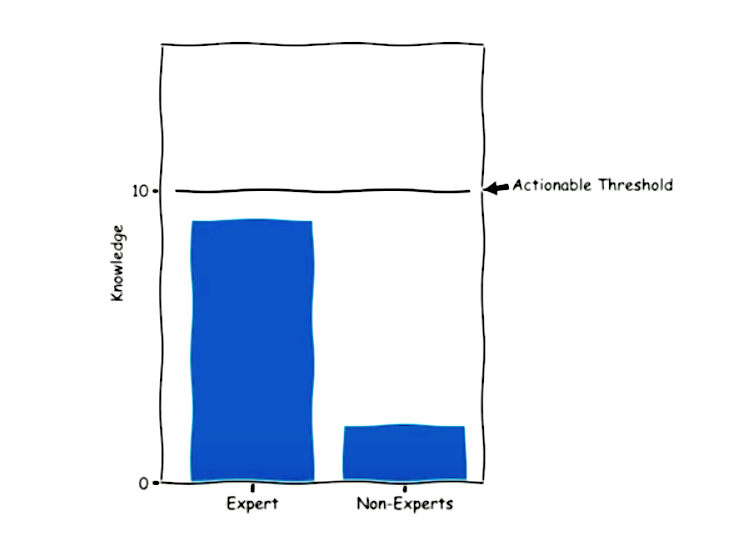
Segmenting the market or the audience into experts and non-experts may be the result of a single piece of data. An expert would be someone who has a solid understanding of the given information, whereas an non-expert would have considerably less knowledge.

Summary Statistics Inform Only Experts

Data results from the mental model might be different given the knowledge gap between the expert and non-expert. Experts use data more effectively, and therefore reach a “threshold” in which something is actionable. Given a single piece of data, the expert crosses that threshold and catapults into another stratosphere of other questions and other types of issues they might want to know about the data. Meanwhile, non-experts are unable to obtain the minimum knowledge required to alter their action. An expert with more familiarity of the subject might ask for the raw data because they know what to do with it, whereas the non-expert would be clueless. Clare emphasized that this dynamic creates challenges for those trying to design a product. The goal of a product should deliver repeatable and scalable value with consistent outcomes across the entire target market. When you end up in this middle ground, you are stuck with a wall of data which is not viewed or seen. Experts find data at the source while others attempt to interpret information on the dashboard.

Data Does Not Speak For Itself

The presentation take away was the difficulty in making sense of data when it does not speak for itself. This belief is addressed in Boyd and Crawford’s article, Critical Questions for Big Data: Provocations for a Cultural, Technological, and Scholarly Phenomenon”. Where Big Data provides ‘destabilizing amounts of knowledge and information that lack the regulating force of philosophy’ (Berry 2011). To understand data, there needs to be context. As mentioned in the the article Critical Data Studies: An Introduction by Andrew Iliadis and Federica Russo, data is apprehended through various levels of informational abstraction (Floridi, 2011). Big data is framed within levels of informational abstraction, where the product of positionalities constrain and afford a gateway into multiple data roles including abstraction which may be adopted, manipulated, or repurposed for any number of aims. This is a crucial part of giving sense to data. Choosing a level of abstraction from which to view Big Data alters the types of conversations that can be had about data, its aims, and functions (Iliadis, Russo 2016).

Conclusion

When you fail to recognize that data is difficult to understand, you can wind up with mismatched expectations between what is promised and delivered within a data project. Overall, the main suggestion was the need for inferences, or making a comparison to existing knowledge. Data can only inform once you already know something. You need knowledge to gain knowledge.

References:

Berry, D. (2011) ‘The computational turn: thinking about the digital humanities’, Culture Machine, vol. 12, [Online] Available at: http://www.culturemachine.net/index.php/cm/article/view/440/470 (11 July 2011).

Danah Boyd & Kate Crawford (2012): Critical Questions For Big Data, Information, Communication & Society, 15:5, 662-679 http://dx.doi.org/10.1080/1369118X.2012.678878

Floridi, L (2011) The Philosophy of Information, Oxford: Oxford University Press. https://doi.org/10.1111/1467-9973.00221

Gollnick, C. (2019, April 10). Why No One is Looking at Your Data. Lecture presented at Meetup: UX+Data, New York.

Iliadis, A., & Russo, F. (2016). Critical data studies: An introduction. Big Data & Society. https://doi.org/10.1177/2053951716674238 

Observation: The Bronx Museum of the Art’s Useless Machines Exhibition

Recently, I went to the Bronx Museum’s “Useless: Machines for Dreaming, Thinking, and Seeing” exhibition. The exhibition was created to highlight the opposite purpose of machines. Rather than creating machines to produce labor or fulfill a practical duty, the exhibition featured artists all over the world who constructed or depicted useless machines “to praise inutility.” The exhibition was a direct “reaction to the materialistic values promoted by capitalist society.” The artists created a collection of machines to stir dreams, feelings, critical thinking, and ironies. I thought this exhibition was interesting because of its purpose to create something useless and meaningless out of machinery. In class, we talked a lot about machine learning, artificial intelligence and how we currently live in a machine culture. And according to Sengers, machines are embedded into every aspect of our lives:

“We are no longer…simply supplied by machines; we live in and through them. From our workplaces to our errands about town to our leisure time at home, human experience is to an unprecedented extent the experience of being interfaced with the machine, of imbibing its logic, of being surrounded by it and seeking it out…” (Sengers, 2000, p.5).

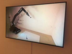
Fernando Sanchez Castillo, Method on the Discourse, 2011, video screen shot

I thought that the exhibits at the museum highlighted what Sengers explained as the “shortcomings in technology.” The collection was a mixture of video, digital photographs, interactive sculptures and robotic machines behaving in curious ways. One exhibit by an artist named Fernando Sanchez Castillo displayed a video (pictured above) of a military robot that was originally designed to disarm explosives creating a painting in a slow, sarcastic manner. It was interesting how the artist inverted the function of the military robot by turning it into an artistic device. Technology is what we create it to be and as we rely on technology and machines to carry out dangerous or important tasks for us, the magnitude of its presence is felt even more when machines fail to (or are reprogrammed) complete the tasks we program it to do or they become useless. Transforming a machine so crucial as a bomb deactivating robot into a mere painting device changed the value of it as it was stripped of its former programmed task. This showed how machines can be used and recreated for other things than what it is originally meant for.

Unlike the artists, computer scientists are trained to identify these shortcomings and make solutions to those problems (Sengers, 2000, p.5). However, they are also blinded-sided by their myopic focus on improving machinery and not on the cultural context the machine is being made in (Sengers 2000). Thus, there can be unintended consequences of designing or creating a machine without discussing the need for it, the context it is being made in, and how it can be used in other ways if placed in a different environment.

I went to this particular exhibition with the intention to observe how visitors interact with the pieces within the space/ environment of the museum. But when I got to the museum, I found that visitors were not allowed to touch any of the art displays even though some of it incorporated interactive features for people to try out. I wanted to see if people were more inclined to go to the interactive exhibits which included displays of machines, video and robotic devices rather than the “non-hardware”/non-machinic ones such as photographs or drawings. Unsurprisingly, I found that people were more drawn towards the machine and robot displays. This brought to mind Norman’s Being Analog chapter, in which he explained why humans are inherently analog beings while technology and machines are created to be digital (2008).

According to Norman, “the world is not neat and tidy.” The world is naturally analog but with the advancement of technology and machines, people are forced to fit the world into digital models. Computers are logical and strict. Humans are unreliable and dramatic beings who are susceptible to making errors even if they are forced to behave in a machine-like way. Norman has described a world where technology destroys the mercurial essence of humans, but does not take into an account a world where both technology and humans are seamlessly integrated. Technology is no longer a separate entity of our world. AI and robots are becoming more human-like while humans are using advanced technology to enhance physical bodies and improve their health. In addition, AR devices are being created to integrate the real and the digital.

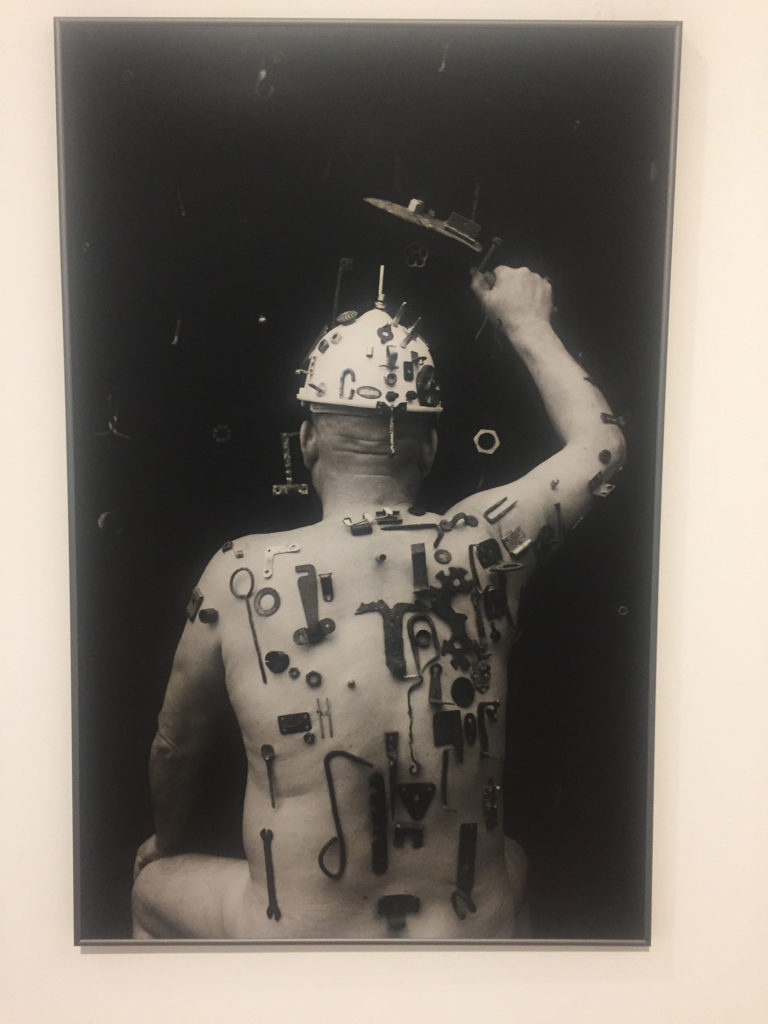
Algis Griškevičius, Toned photograph

We are constantly interacting with machines and technology that someday maybe we will become as one–a concept that artist Algis Griškevičius depicted in his photographs at the museum. The photograph showed a nude man with numerous tools stuck and screwed into his body as if he was a living magnet or a hybrid. Within the scope of the exhibition’s theme of depicting useless machines, I found this photograph very telling of the future we may live in. The tools on the man’s body seemed useless, placed in a illogical or unhelpful way. It’s there because it can be; they are tools without purpose. Soon, perhaps we will live in a future world where technology is not only all around us, but just another extension of our bodies.

The exhibition’s concept of “praising inutility” reminded me of how technology cannot be studied separate from its cultural context in which it is made in. Even though the exhibition wanted to depict the uselessness of technology and machines, I realized by doing just that they created meaning out of the displays by making it art. Thus, the machines and collection of pieces were useful in an artistic setting of a museum but they, of course, will not be useful in a non-artistic setting.

References:

Sengers, Phoebe. “Practices for a machine culture: A case study of integrating cultural theory and artificial intelligence”. Surfaces, vol. 1,  2000, p. 2-58. www.pum.umontreal.ca/revues/surfaces

Norman, Don. “Being Analog”. The Invisible Computer, 2008. https://jnd.org/being_analog/

The Optimistic Road Ahead

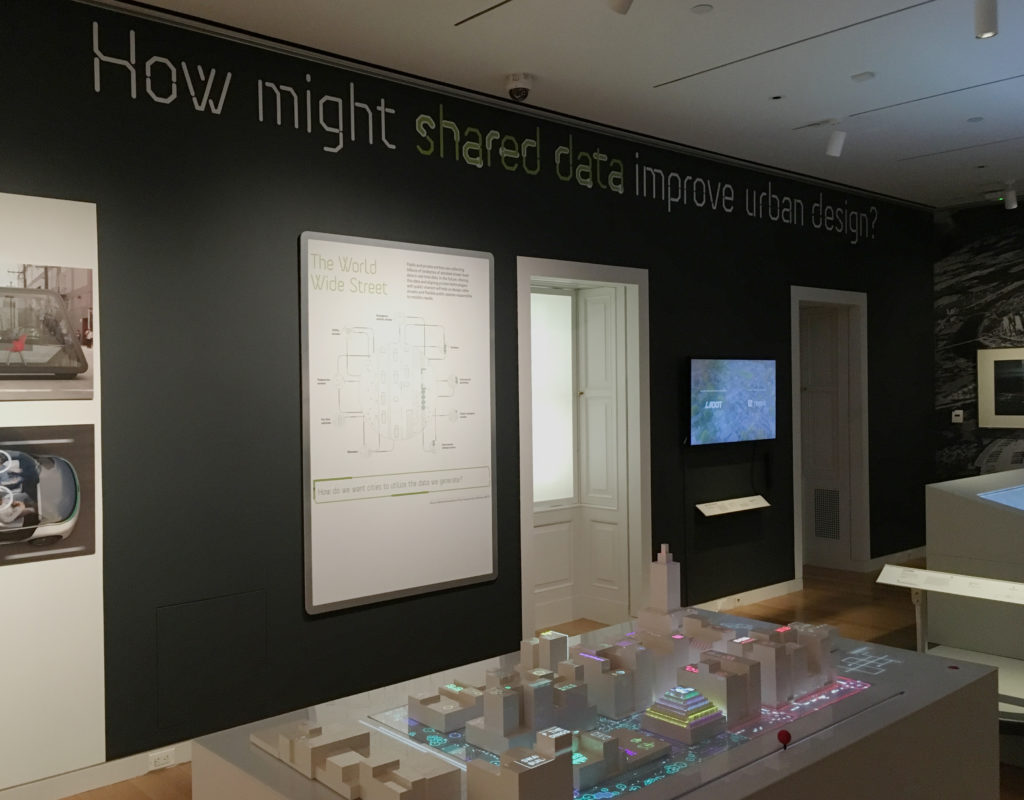
One section of The Road Ahead, with Cityscope (2018) in foreground

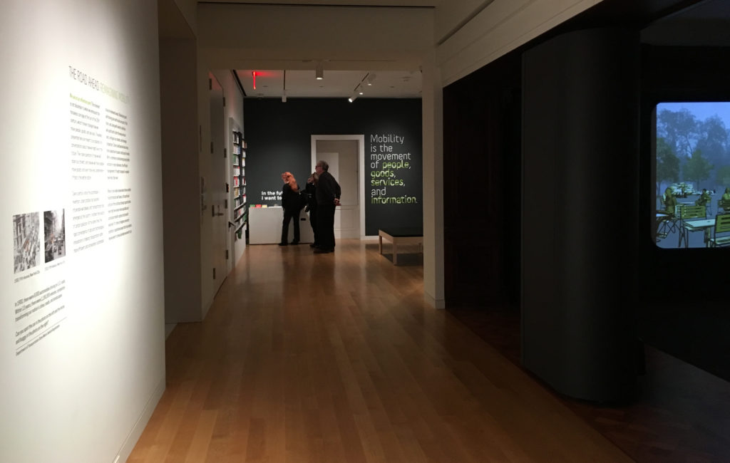
From December 14, 2018 to March 31, 2019, The Road Ahead: Reimagining Mobility at the Cooper Hewitt, Smithsonian Design Museum presented forty design projects, ranging from interactive platforms to urban design. Noting that “We are at an Inflection point”, the introductory text on the wall proposed that “the works presented here are meant to be catalysts for conversations about how we might live in the future” The attempt to start these conversations was framed by six questions that ran across the top of the exhibits including, most intriguingly for me, “How might shared data improve urban design?”

Having briefly visited the exhibit previously, I went in with a couple of questions at the ready myself (some of which I will combine to frame the comments below). The general goals were to observe both the exhibit itself and specific projects as environment and methods for gathering and presenting data.

In an attempt to observe a larger and broader population, I went on a pay-what-you-wish evening (and the second-to-last day of the exhibit), arriving early to review all exhibits and then stepping back to observe more of how they were experienced.

How did the exhibition itself collect and display data? How did an exhibit about mobility move visitors?

The visitor’s introduction to the data collection aspect of the exhibit actually started on the ground floor, with a display that asked “How was your commute to the museum?” The question was to be answered — and those answers collectively visualized — through the use of foam balls (Green = “Good”; Red = “Not too good”). This was the only interactive exhibit-specific wall graphic, but it did engage and prepare the visitor for the interactive world of touch screens and post-its in the projects two floors above.

However, this clever prelude was then undercut in the exhibit itself by framed infographics that seemed out of context or less effective than the projects exhibited. Some were predictive (Three Futures of Urban Transportation); some diagrammatic (Contested Curbs). Some were explanatory (How We Move); some illustrative (Letting go of the wheel). Collectively, they could have helped navigate a visitor through the exhibit, but instead they felt like projects of their own, ones that did not always rise to the level of the work with which they shared the space. Instead of directing traffic, they added to it, a congestion made all the more troublesome by the exhibit’s confusing start.

Upon arrival, and after reading the introductory text, viewers were presumably expected to move toward the opening section of the exhibit, which invites one to listen to experts and offer one’s own thoughts before diving into the projects on display. Instead, I watched visitor after visitor turn right to investigate a sound installation designed specifically for Cooper Hewitt called Sounds of the Future City (2018), which enticed them with bells, whistles and video projections, before depositing many of them out the other side — into the middle of the exhibit. This was a particularly unfortunate detour for an exhibit that states, just twenty feet from this misdirection: “Mobility is the movement of people, goods, services, and information.”

How did individual projects utilize data to tell a story? In an exhibit that aims to start conversations — that explores ‘convergence of data and technological innovations’  — to what degree do these presentations speak to and engage the visitor?

Here we come to the heart of the observation. These questions naturally overlapped in various projects and so will be addressed collectively here. Within such a dense and at times overwhelming show, the comments below will focus only on some of the projects that were most data-focused, sorting those into three areas I noted, with overlaps existing across them.

Data as Tool

As an awareness of the role of data becomes more prevalent in society, its visualization becomes an object of wonder, with the intermediary steps of the process presenting their own sense of “Look what they can do!”

The short video City Data Analytics: Modes of Travel and Commuter Walking Times (Zaha Hadid Architects, Habidatum, 2017) from the Walkable London Exhibit showed a clear visualization of data relevant to pedestrian and other metropolitan traffic. It proved a point, established patterns, but did not offer a specific ‘solution.’

The same might be said of City Scanner (MIT Senseable City Lab, 2018), a congregation of six sensors that sits atop the cab of a municipal garbage truck, gathering six kinds of data that are then visualized to show patterns and occurrences. The “think of what we could do with this” mentality was evident in the last line of its description: “City Scanner could be used to help inform decisions about public health, security, and overall better services for citizens.” Could be.

What differentiated the Los Angeles Mobility Data Specification (LADOT/ITA, 2018), however, was that this video actually spoke to how this ‘neat tool’ of data, in the form of a common vocabulary and standard, shared in real time as a software platform, could be used to efficiently manage issues of changing street capacity and public safety. This was a tool in use.

Data as Assurance

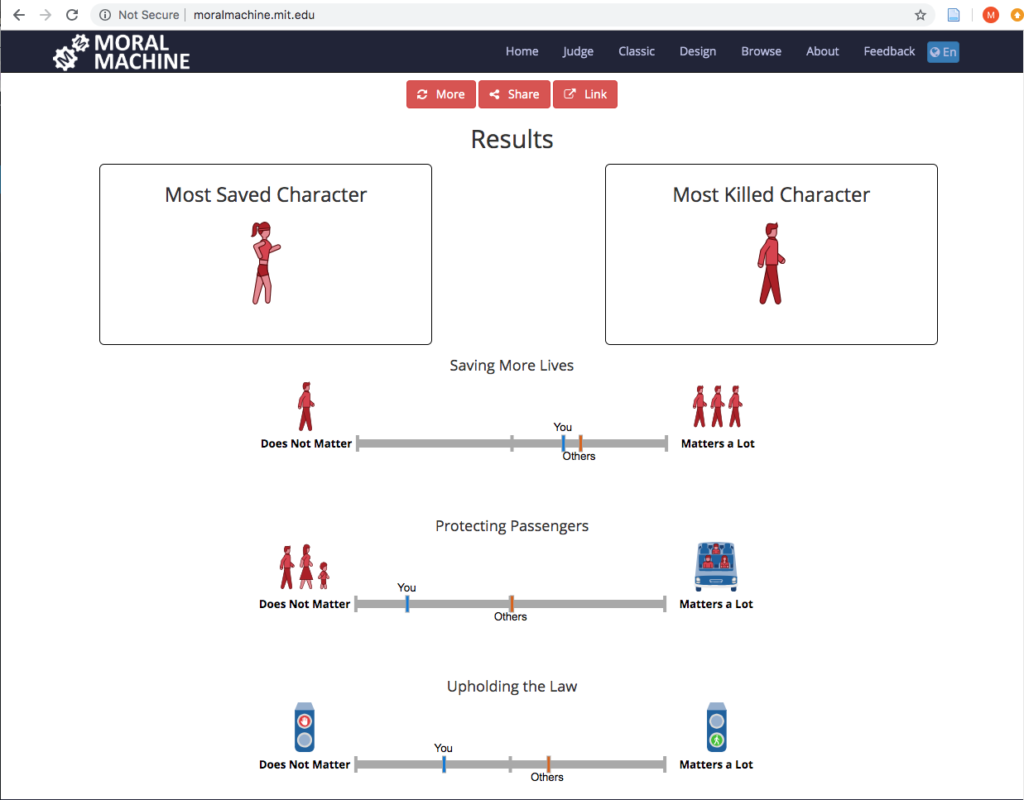
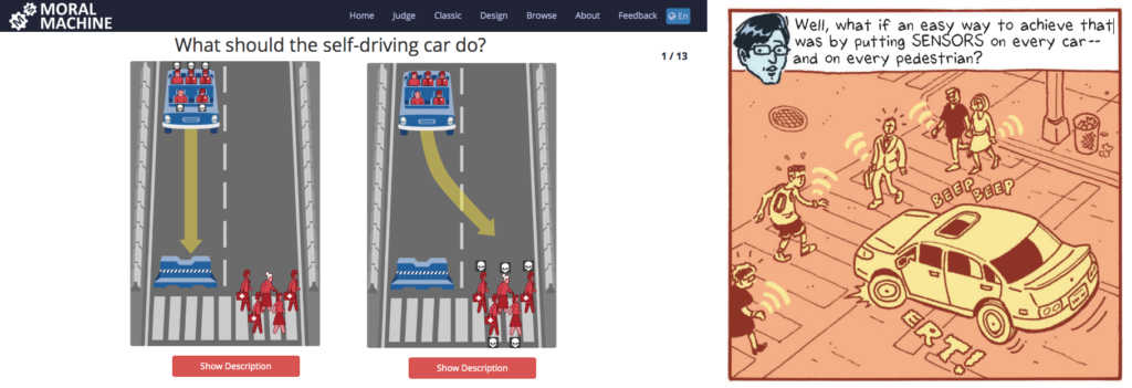
If the exhibit had a project that seemed the most fascinating to the audience the evening I visited, it was The Moral Machine (2016), an online tool created by the Scalable Cooperation Group at the MIT Media Lab to gather data related to human decisions as to which lives should be saved by a driverless car in various scenarios; a decision that was often made by one of a pair of visitors that commentated on each others’ judgments and processes:
“This is so funny… They die….”
“That was you. That was everyone else.”
“I don’t want to kill a cat…”
“This one you shouldn’t have to think about. Just kill the dog!”
And the almost unsettling: “I love judging…”

‘Assurance’ may not seem quite the right word for an interface that presents one with moral decisions, but at the heart of the project is the assurance that we are speaking with, and gathering data from, people ‘just like you’ as we make decisions about these autonomous vehicles.

Some issues arise at the end, when the machine evaluates your decisions and states whether or not a characteristic such as gender “matters a lot” in your decisions, when it cannot truly know, based on the limited data set. (It is worth noting that the original online version does offer more disclaimers, as well as a follow-up questionnaire asking one to explain their reasoning.)

The complement to all this judging was the Sensor Visualization video (Waymo, Google Creative Labs, Framestore, 2018), a very effective presentation that explains and visualizes how Waymo’s self-driving cars ‘see’ objects, pedestrians, lights and other factors to make one’s riding experience stress- and accident-free. Safe, clean projections of paths and labels for speed and distance from the car assure the viewer that Waymo has the data and as such has everything under control. It offers an assurance that there is measurement going on behind the scenes.

Data as Play

While the Moral Machine can feel like a particularly challenging game of Would You Rather?, Cityscope (City Science Group, MIT Media Lab, 2018) was Lite-Brite with building blocks, inviting viewers to redistribute structures on a street grid to visualize two possibilities of traffic density (shared vs owned driverless cars) on city streets. It was fun to move the structures around and note the changes, but it must be noted that despite its promise, and obvious ability to draw interest, Cityscope appeared to fail in communicating its intended message. This was one of those cases where the label for the project was behind the viewer. So everyone wants to play with it, but few understand it. This was exacerbated by the unfortunate choice of red (owned) and green (shared), which already tilts one toward preferring the latter, with the red definitely feeling like an indicator of intensity. All of this could be summed up in an exchange I witnessed at the table:
“Do you think red means…?”
“It’s congestion. Or something….”

Part of the ‘vehicle inspiration wall’

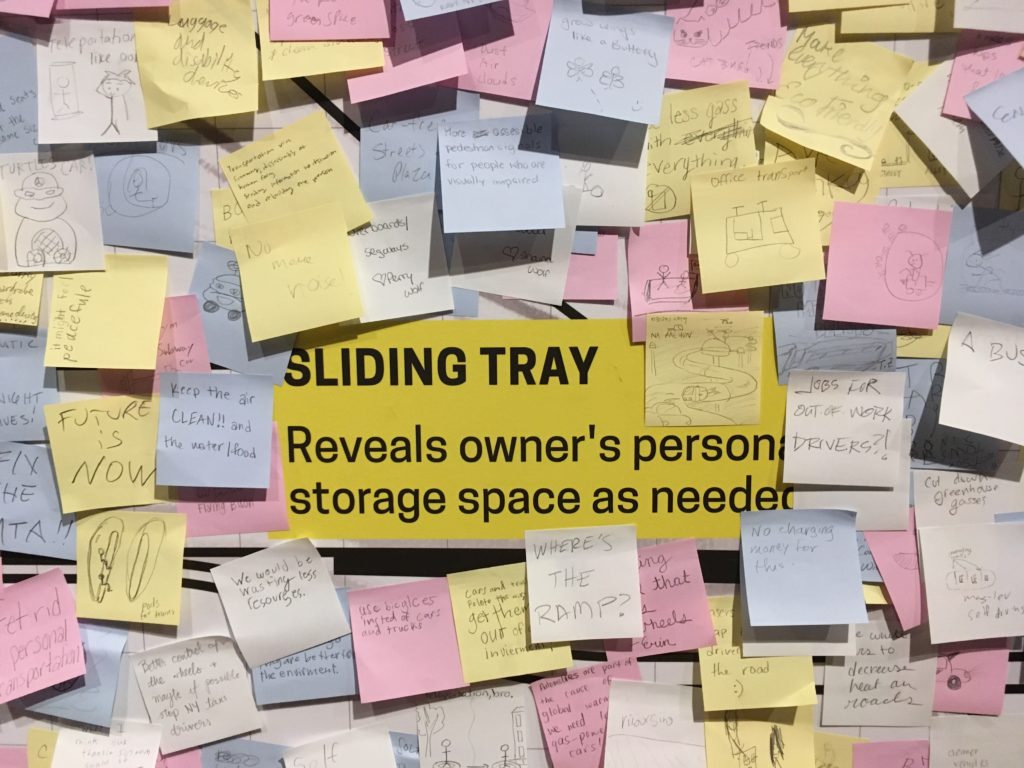
In contrast, The Future of Automobility (2014, 2017) from IDEO brought Design Thinking into the exhibit as a means of presumed research. This project invited visitors to contribute their ideas via Post-Its to a ‘vehicle inspiration wall.’ A kind of ‘free work,’ it excited the spirit of play and brainstorming in many visitors, who drew pictures and layered Post-It upon Post-It (ignoring the walls precisely drawn grid) with ideas fanciful and serious (e.g. ziplines; BAN ALL CARS).

So while acting as a tool and providing assurance, our interaction with data (whether in collection or review) can also be fun, which is a great way to engage visitors who might not otherwise consider these issues.

A Contrast

Of course, whether functioning as a tool, an assurance or a game, all of these projects were Good.

That is to say: collectively, The Road Ahead was largely about the solutions — or rather the possible solutions. It presented the problems of the world as mountains to be climbed through data and design and asked “How might we…?” In the terminology of Dan Geer shared in Terms of Service, the show’s “Tomorrow Questions” (Keller & Neufeld 8) are what-ifs of potential; “What will I gain?” Not “What will I lose?”

But, what if one combined the Moral Machine and Waymo, identifying certain members of society — those who ‘matter less’ — as it makes decisions?

The introductory text to the exhibit states “no one really knows where these mobility transformations will take us…” This is true. Before making a thing, Jentry Sayers asks us to envision “two dramatically different scenarios: one where the results are ostensibly positive, and one where the results are ostensibly negative.” (Sayers) This exhibit is only the first half of that equation. And if Cathy O’Neil, in defining ‘Weapons of Math Destruction’ speaks to the “authority of the inscrutable” which attempts to obfuscate and force acceptance (O’Neil), an environment such as The Road Ahead works through design and interactivity to make it more visible, providing, perhaps, an authority of the genuine.

It’s difficult not to look at an exhibit such as this and see in all these streets and cars the drawings from Terms of Service of car trackers and insurance premiums, pedestrian sensors and the internet of things — the connecting of dots from or by even the most (seemingly) innocuous, or even beneficial of sources to troubling ends. (Keller & Neufeld 13, 15, 23)

Yet in a world where suspicions of those connections are easier and easier to raise, The Road Ahead suggested a smoother ride than much of what we have been reading recently; an optimism and a welcome contrast to the data harms and big data that we know are the underbelly or other side of much of this technology. It offered assurances, tools, and a little bit of the play that makes any future seem a little more creative, and a little more promising.

– Michael Kelly, Info 601, Professor Chris Alen Sula

References:
–  Keller, Michael & Josh Neufeld. (2015). “Terms of service: understanding our role in the world of big data.” Al Jazeera America. http://projects.aljazeera.com/2014/terms-of-service/#1.
– O’Neil, Cathy (2015). “Weapons of math destruction,” Personal Democracy Forum 2015. https://www.youtube.com/watch?v=gdCJYsKlX_Y.
– Sayers, Jentry (2018). “Before You Make a Thing: Some Tips for Approaching Technology and Society.” https://jentery.github.io/ts200v2/notes.html  

Field Report – Exploring the Morris Museum

For my observation, I decided to go to the Morris Museum in Morristown, New Jersey to observe their current exhibit titled “Pen to Paper: Investigating Famous, Historical Letters.” When I saw this current exhibit online, I figured this would be the perfect exhibit to talk about the preservation of these letters and what this exhibit tried to tell the world about the famous people who wrote them. With that goal in mind, I went to the Morris Museum to view the exhibit. However once I arrived I realized that the museum also had a “traveling exhibit” about music boxes from the Guinness collection, which I found far more interesting.

One of my favorite pieces from this collection was the Plerodiénique Sublime Harmonie Cylinder Music Box and Writing Desk (pictured below).

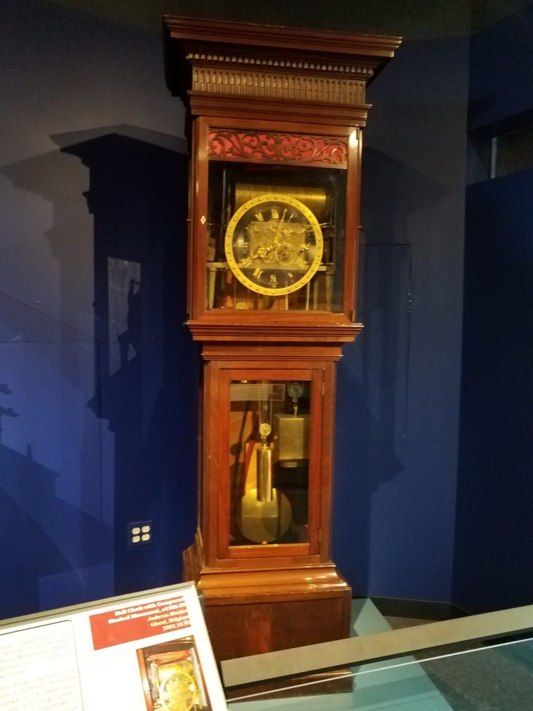
Another one of my favorite pieces was the Hall Clock with Compound Music Movement.

What interested me about this part of the exhibit is that they showed a lot of artifacts that had dual purposes, such as the music box that is also a desk and the clock that is also a music box. It was interesting to see that these items were created to have more than one function.

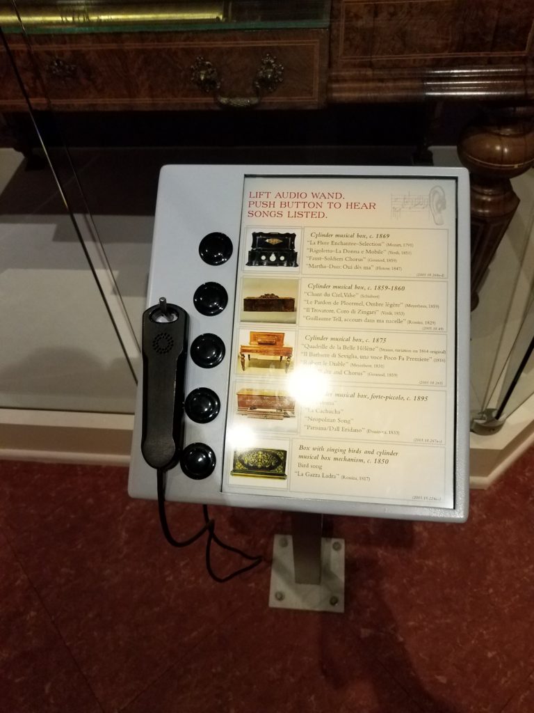
Another aspect that I enjoyed about this exhibit was that it encouraged the viewer to interact with the collection. There were display stands that had a hearing device and buttons that the viewer could press to hear what music from the presented time would sound like.

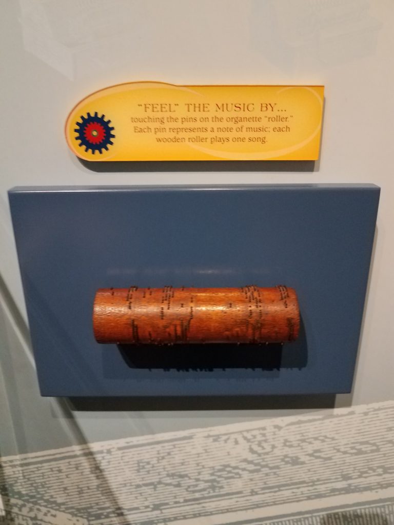
There was a wooden roller set out with pins. This was how songs used to be played during the time that these music boxes were created. It is was explained that each pin represented a note and each roller represented a song.

There was even a game that could be played at the end of the exhibit. For this game, you would put your hand on a speaker and try to feel the different vibrations that the different sounds made.

One of the reasons why I enjoyed this part of the museum so much was that it showed a time where technology was much different than it is now. These music boxes are major technological advancements when they were first created in the 1700’s-1800’s, even though in current society music boxes may not be considered a technology to a general viewer.

While touring the museum, I was surprised how small all the other exhibits were compared to the Guinness collection. I think this showed the emphasis that the museum wanted to place on this collection. I believe this is also the reason why I was much more fascinated with the Guinness collection over the other exhibits.  But even though the other collections were smaller, it seemed that the museum still made a conscious effort to show the comparison of older technology to newer technology.

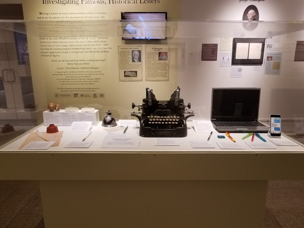
In the picture below, you see that the museum showed how writing has changed throughout time in their Paper to Pen collection. When I was reading Jentery Sayers article on technology throughout time, I couldn’t help but think about the collections that I saw at the Morris Museum. Originally I thought about the music boxes and how they could be considered “technology instrumentalism”m which means that they were a neutral technology. But then I realized that the Pen to Paper collection could be an example of “technology determinism” which is technology used for social progress. As Sayer mentioned most of these pieces from these two collections would be considered “symbols of progress, modernity, efficiency, and mastery over nature” (Sayers).

In this picture it shows elements that could have been used to make different colors of ink that would be used to write or draw, it shows a few ink wells, different types of quills and calligraphy pens, a typewriter, laptop, and cellphone.  As the picture implies, these all became means of communicating. Just in this one picture, we can see the progress and change of technology throughout time.

What I found most interesting about this exhibit was its incorporation of current technology into the collection itself. It almost felt like the current technology used for this collection overshadowed the idea of the collection which was looking at old letters from famous people in history. I say this because in the room, just below one of the displays, there were two pairs of headphones and IPads that were showing a short film. Then on the wall, there was a television that told about the making of quill pens and how society portrays old quill pens wrong in movies since most of the time the hair of the feather is cut off to make it easier to hold. It just seemed like the focus was mostly on the current technology since the letters left a lot of white space on the wall, while the television area took up a lot more space and the museum had changed the color of the wall to draw attention to it (which you can see in the picture with the display of past/current technologies that is above). Also, the short film and the television were both a form of white noise in the room, which grabbed my attention and probably the attention of a general viewer, which took my attention away from the famous letters.

In the end, it was nice to see the different exhibits that the Morris Museum had on display. It was interesting to see their way of incorporating technology into their exhibits as a way to attract the audience to engage with their collections. Because of my experience with museums and my interest in continuing to work in a museum, it was interesting and educational to see how other museums use technology. 

References:
Sayers, Jentry. (2016). “Technology” in Keywords for American Cultural Studies,” ed. Bruce Burgett & Glenn Hendler. NYU Press. http://keywords.nyupress.org/american-cultural-studies/essay/technology.

Morris Museum. Morris Museum. morrismuseum.org/.

Observing Human Information-Seeking Behavior at Roosevelt Island.

On April 13th, Saturday, ‘The Cherry-Blossom Festival’ was held at the Four Freedom Park at Roosevelt Island. The festival was organised to celebrate Roosevelt Island’s blooming cherry blossom trees and was also featuring traditional and modern Japanese performances and Cultural Fair.
The festival was free, and registration for the event was voluntary and was only there for organizers to estimate the number of people attending .

It was encouraged to take public transportation for the event as there is limited parking space available at Roosevelt Island. The modes of transport in and out of the island available were – subway, tram, ferry, bus and car.

The first sign of trouble which was visible while arriving to the island was that the waiting time to take the tram was no less than 2 hours. But at least the Subway and the Bus traffic was moving smoothly. Even after arriving the Island via the Subway, people were greeted with an extremely crowded subway station. But at this point all everybody desired was to escape the subway station and rush towards the necklace of cherry blossom trees present at the island.

While at the island, people enjoyed the beautiful displays and performances. The problems began when people started heading back home. The island had drawn such a crowd that all the modes of transport were jammed. The line to the subway station grew so long that the end of it was not visible. The bridge, tram, Subway, NYC Ferry, and bus service all experienced crowding and delays. The crowding got even severe after 1:45, when the NYPD briefly asked MTA to bypass the Roosevelt Island stop so that paralyzed F trains could move again.

This was the point where there was a sudden switch in the behavioral pattern of the attendees. It went from ‘relaxed, enjoying the beauty of spring’ to ‘Need to find means to get off the island at once’.
The surge of urgency and frustration seemed contagious. The people started gathering information to select the best possible mode to get off the Island.

The characteristics that were witnessed in their behavior were closely related to the characteristics stated by Ellis in ‘ Wilson, “Human information behavior”’
which are:

Starting: the means employed by the user to begin seeking information, for example, asking some knowledgeable colleague.
Chaining: following footnotes and citations in known material or “forward” chaining from known items through citation indexes.
Browsing: “semi-directed or semi-structured searching;”
Differentiating: using known differences in information sources as a way of filtering the amount of information obtained.
Monitoring: keeping up-to-date or current awareness searching.
Extracting: selectively identifying relevant material in an information source.
Verifying: checking the accuracy of information.
Ending: which may be defined as “tying up loose ends” through a final search.

It started with people asking MTA staff or visible event organizers the best means (of transport) which might take the least possible time. When no substantial answer was given to them they started chaining which in this case might just be following directions given to them by fellow attendees of the festival, who might’ve been trying to leave since an hour earlier, thus, having more experience in that current scenario.

Then they started browsing the different options available for getting off the island. Differentiating them by an estimate of time it might take if they opt for each of the available options, or in what direction of the city it would take them. They kept monitoring the progress of the lines, whether they were moving, or the amount of people present in the lines for the Subway or the Bus.

People then extracted the data which seemed relevant to them, making decision, for example selecting to travel by bus, because the line seems the shortest and they would definitely get a seat when the bus arrives. But still kept verifying the time when the bus would arrive by messaging the number present with the details of the bus, which informed them of the estimate time of arrival and current distance of the bus from the stop.
But in the end they still kept a track of whether the subway line was moving faster, so they could switch the mode they selected according to their observations.

The search for any sort of information begins with the need to solve the problems being experienced by the users. During the festival, the attendees faced a problem and looked for methods in which they could solve the problem. Even though everyone unknowingly followed the simple basic method of narrowing down to their preferred mode of transport, the ultimate decisions taken and the reasoning behind those decisions were all distinct. The process incorporated a series of encounters with information within the space rather than a single incident from which a decision was made.

References:

  1. Wilson, “Human information behavior”. – Ellis, D. (1987). The derivation of a behavioural model for information retrieval system design. Information Studies. Sheffield, University of Sheffield.
    http://inform.nu/Articles/Vol3/v3n2p49-56.pdf
  2. Kuhlthau, Carol C.”Inside the search process: Information seeking from the user’s perspective” “Journal of the American Society for Information Science’ 
    https://ils.unc.edu/courses/2014_fall/inls151_003/Readings/Kuhlthau_Inside_Search_Process_1991.pdf
  3. https://www.fdrfourfreedomspark.org/public-programs-events/2019/4/13/roosevelt-island-cherry-blossom-festival

Bluestockings: Organizing information to facilitate empowerment and challenge oppression

Question

What is the main mission of a “traditional” retail bookstore? Simple – to sell books. And how does a bookstore meet that mission? Display configurations and shelving tactics are used to get people to buy books, or any product for that matter. But what about a bookstore that’s mission isn’t just to sell books? What about a store that wants to offer more – to offer resources both to empower and create a safer space for its patrons?
How does an independent and radical bookstore like Bluestockings, present and organize its resources in order to meet their mission of inclusivity and challenge oppression?

Bluestockings

Bluestockings is a volunteer-powered and cooperative radical bookstore, cafe, and activist center in the Lower East Side of Manhattan, NY. Their mission is three-pointed :
1) distribute literature and resources about oppression, intersectionality, community organizing, and activism;
2) maintain a space for dialogue, education and reflection where all people are respected; and
3) build community connections, knowledge, and skills.

With this mission, Bluestockings strives to empower people to challenge oppression by embodying, “the principles of intersectional, trans-affirming, gender nonconforming, and sex-worker affirming feminisms and support liberatory social movements.” In this effort to create an , “equitable, cooperative, and free” society, Bluestockings offers over 6,000 books and zines on a wide range of topics.

Note: I will be mostly referring to Bluestockings  as a “center”, as I think it is an encompassing term that best reflects their mission.

History

Bluestockings was founded in 1999 by Kathryn Welsh as a bookstore and community space for women. It was named after The Blue Stockings Society, a women’s educational movement and literary discussion group from the 18th century in England. Like today, the bookstore was collectively operated and volunteer-run. However, due to financial distress, the collective disbanded in 2002. In 2003, Brooke Lehman purchased Bluestockings, the collective was reestablished, and the store reopened with an expanded focus on radical politics and activism.

The Plan

I planned a visit to Bluestockings to learn more about the way the center organizes information to facilitate empowerment and challenge oppression. For my structured observation I intended to review the following:

  • The resources available
    • This includes an exploration of titles and common topics
  • The setup, layout, and distribution of resources
    • This includes a survey of the headings used for describing/dividing sections and organizing the information available in the center
  • How patrons used and interacted with the space and its resources

Expectations

In relation to the three main components of my observation, I expected to see the following:

  • A variety of resources available covering a wide range of topics
  • Use of alternative headings and categories related to minority or marginalized groups and feminisms
    • moving beyond the expected Fiction, Mystery, Romance, etc.
  • Patrons using the space as a center for community and engagement
    • to meet, discuss, and plan ideas

What I Observed and Learned

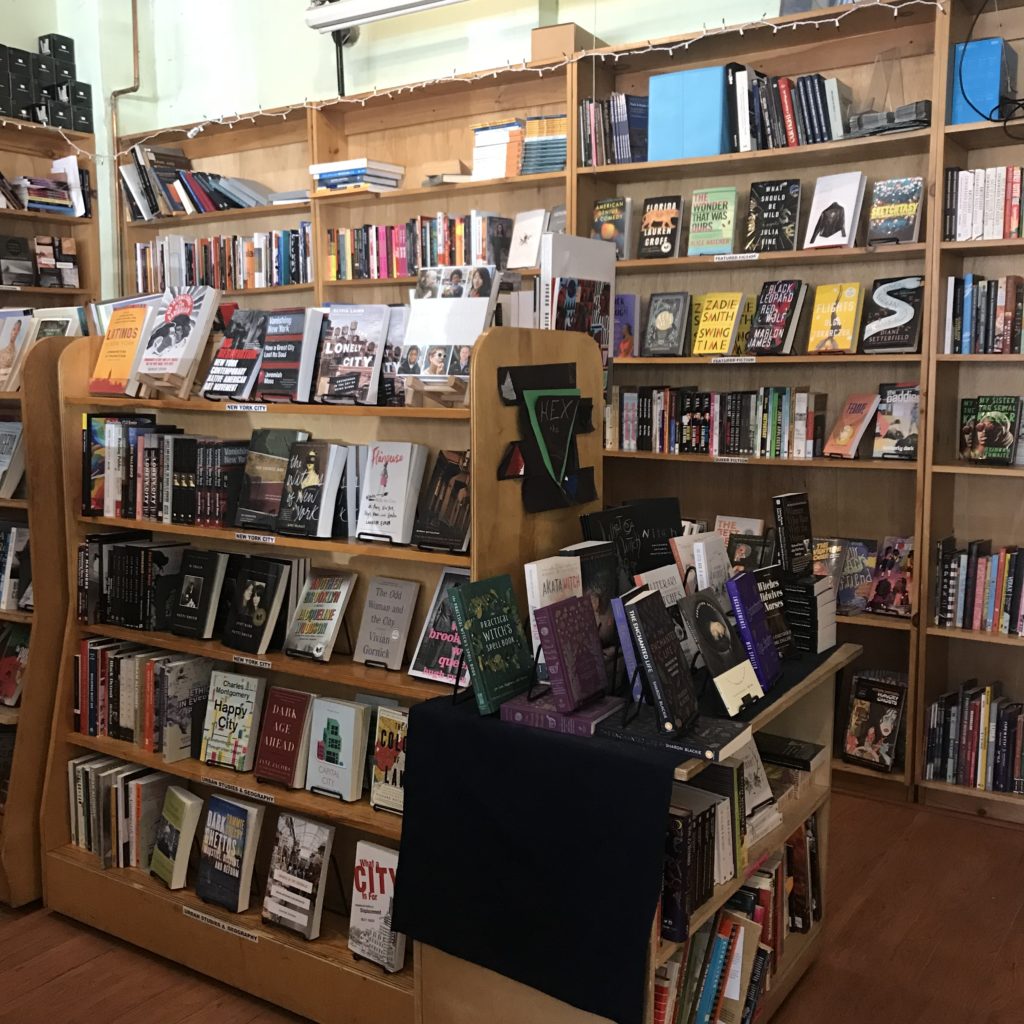
I went to Bluestockings on April 6, 2019. Upon entering, I was welcomed by a warm greeting and noticed people working, reading, and collaborating in the sitting area. Immediately to the left was a selection of zines, journals, and coloring books.  To the right, the checkout counter and cafe. A majority of the space was occupied by books on bookshelves and tables. The back wall displayed Bluestockings totes and t-shirts, alternative menstrual products, and “other oddly hard-to-find good things.”

Two tables of books stood near the middle of the store. The tables were stacked with a mix of books on a range of topics – feminism, incarceration, the environment, queer and gender studies, racial studies, radical education – with no heading to label them. In this way, these tables seemed to offer a non-hierarchical, uncategorized approach to organizing resources. This setup would seem to facilitate serendipitous discovery.

The rest of the titles offered were arranged by category with headings for different sections. 54 categories were surveyed:

Feminisms       Sexuality & Relationships           Radical History
Science & Technology Sex Work Radical Education
Violence & Trauma       Intersex           Hex the Patriarchy
Police & Prisons       Transgender            Activist Strategies
Race & Racism       Gender Studies           Feminist Fiction
  #Blacklivesmatter       Feminist Masculinity           Music
Black Studies       Queer           Art & Media
Indigenous Peoples Studies Queer Fiction           DIY Cookbooks
Libros para Niños       Asexuality             Spirituality
Latin American Studies       Critical Theory            Health Healing & Accessibility
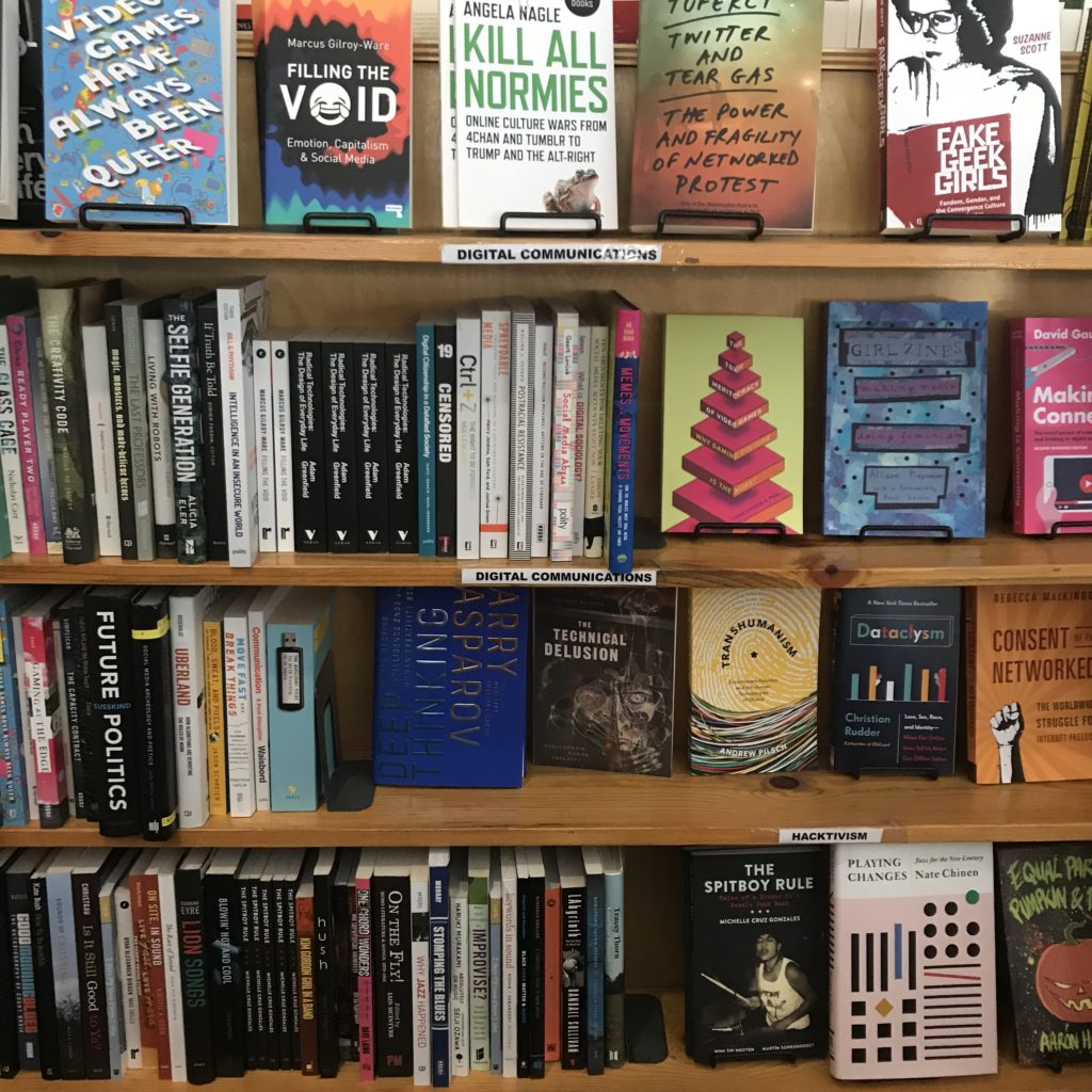
(Im)migration & Diaspora      Digital Communications   Parenting & Pregnancy
Global Justice       Environment & Food Systems   Animal Rights
Post Colonial Fiction     Asia                 Comics & Graphic Novels
Class & Labor      Africa           Sci-Fi
Anarchism                       Middle East           General Fiction
Marxism & Autonomism        New York City         Featured Fiction
Political Theory       Urban Studies & Geography    Poetry
  Economics       Literary Nonfiction           Young Adult

A table labeled “Events” displayed 8 books with date tags on them. I talked with someone who worked at the center to learn more about the programs and events they offered. As it turns out, the center hosts an event nearly every day, if not multiple in one day. The date tags on the books signify the date of an upcoming event centered around that book. Some of these events highlight an author, editor, or contributor of the book. Other events aim to offer a safe space to discuss ideas, foster community, or simply read. In fact, on the day I visited there was a silent book club taking place. A calendar on the Bluestockings website shares all of the upcoming events.

Takeaways

In order to meet their mission, I expected that Bluestockings would organize their resources in a way that would facilitate inclusivity and challenge oppression. One way I imagined they could achieve this would be to employ a varied array of headings to organize their resources. With 54 different headings, Bluestockings did just that.

As mentioned earlier, the two ‘No Category’ tables appear to facilitate serendipitous discovery. With no categories to influence you, they also provide a relatively unbiased opportunity to discover titles. Of course in a store dedicated to selling radical content, you can expect to find books that fit that description, but the fact that there is a label-less table is worth noting.

Hosting events is a non-organizational method the center employs to reach their mission. Events like the silent book club create a welcoming environment to read at one’s one pace and be inspired by what others are reading. It rids the pressure associated with the commitment involved in a traditional book club, but still provides the sense of community. The dozens of posters, fliers, and notices for events taking place outside the center further exemplify Bluestockings’ effort to build a supportive environment and sense of community.

Representation matters. Words matter. The granularity in the more than 50 sections used to organize Bluestockings’ collection challenges the idea of neutrality in classification by recognizing the importance and power of language. In Emily Drabinski’s, “Queering the Catalog: Queer Theory and the Politics of Correction,” she talks about this power. She says, “in terms of organization and access, libraries are sites constructed by the disciplinary power of language.” Drabinski talks about libraries, but this would seem to hold true for bookstores, as they also use headings to organize information. Drabinski asserts, “subject headings, often cast by catalogers as a kind of pure, objective language, are not; where and when and by whom subject headings are used makes all the difference in terms of meaning.” While working to expand subject headings and more accurately organize material about social groups and identities is productive, Drabinski makes clear that emphasis on “correctness” is not. For, “even when subject headings are updated to reflect current usage…they do not account for all the other words users might use to describe themselves.”

With design layout being a major component to organization, I am reminded of Costanza-Chock’s recent work, “Design Justice: towards an intersectional feminist framework for design theory and practice.Costanza-Chock discusses the history and principles of design justice. According to Costanza-Chock, “design justice rethinks design processes, centers people who are normally marginalized by design, and uses collaborative, creative practices to address the deepest challenges our communities face.” She may have been talking about larger scale and more deeply rooted design decisions, but I would argue design justice would apply on a smaller scale. In this way, the layout and organization of books and information could be designed with the principles of design justice in mind.

Design and organization are evidently powerful tools and should be treated as such. From my observation, it seems Bluestockings has employed design justice principles to meet their mission. They have created a space and organized it in an effort to, “sustain, heel and empower,” to provide “liberation from exploitative and oppressive systems,” and to work towards, “sustainable, community-led” outcomes. Bluestockings is evidently a notable community institution that fosters community and provides a space for learning and empowerment.

They also just have a lot of good books. I bought two.

By Tina Chesterman
Info 601, Professor Chris Sula

References:
Costanza-Chock, S. (2018). Design Justice: towards an intersectional feminist framework for design theory and practice. Design Research Society 2018.

Drabinski, E. (2013). Queering the Catalog: Queer Theory and the Politics of Correction. The Library Quarterly: Information, Community, Policy, Vol. 83, No. 2