In this blog post, I will present my observation of the interaction between seven airplane passengers and the in-flight entertainment system of a Eurowings A340-300 aircraft. The observation was performed during a daytime flight from Dusseldorf to New York, on Sunday the 17th of March, 2019. In addition to the observation, I evaluated my own experience of interacting with the system.
Considering that online functions of phones and other devices are unavailable on most flights, the entertainment system becomes a passenger’s main source for information and entertainment. Like most modern in-flight entertainment systems, the Eurowings interface is touch screen based. The physical design shows no buttons or indications on how to turn the system on. Despite the lack of visual signifiers on how to wake the screen up, all passengers in my observation managed to start the system without any issues. Because of cultural conventions (Norman, 2013), people nowadays assume that screens without physical buttons will respond to touching, hence making this minimalist design work.
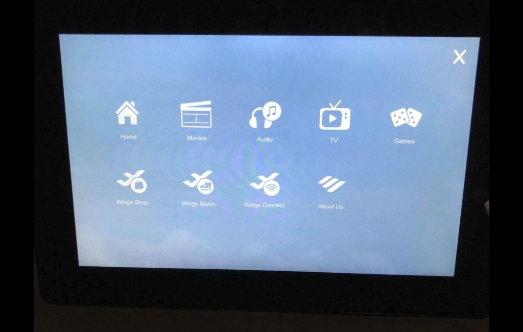
Most in-flight entertainment systems that I have come across as a passenger provide a rather user-friendly interface. Considering that most of these systems have similar standard content and functions, such as movies, food and beverage menu, and flight information, returning flyers will generally have a good idea of how to use the systems. The Eurowings entertainment system consists of a main menu with the following content; home, movies, audio, TV, games, shop, bistro, wi-fi, and “about us” (see picture below).

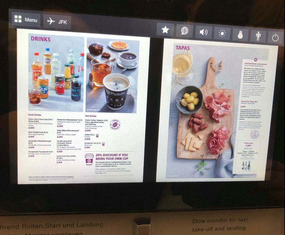
The positioning of the screen and the interface design appears to be inviting to users, as all passengers in my observation, including myself, started using it immediately following getting seated. Upon entering the system, four out of the seven passengers began to browse for movies, a function which was discovered without any apparent difficulties. Though once at cruising altitude, I observed how a passenger appeared to be struggling with ordering food. The menu was presented in a PDF format, instead of a built-in menu (see picture below).
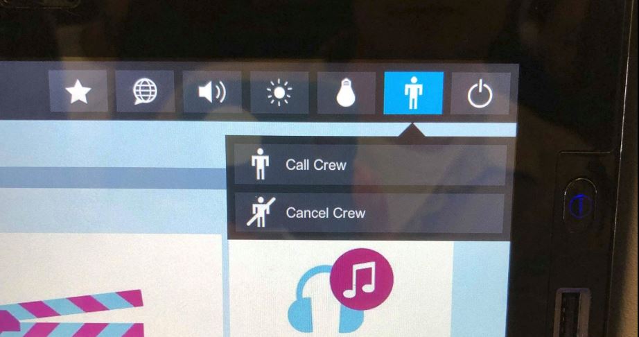
The small proportions of the screen made it difficult to read the menu, which led to the passenger picking up a physical copy of the Eurowings magazine, which luckily also contained the menu. I would suggest implementing a function to browse the food and beverage menu directly in the entertainment system to enhance the user experience. Once the passenger had decided what to order, she tapped the call-crew symbol on the screen (see picture below).

A slight moment later, a flight attendant and arrived to take the order. The call-crew button was also used on another occasion, where I observed how a passenger had a question for one of the flight attendants. These two events show how the entertainment system act as a link between a digital source of information and a human information source, i.e. an intersection of digital and physical. The fact that you can retrieve human information in addition to the recorded information within the interface implies encountering Goonatilake’s neural cultural and exosmotic flow lines (Bates, 2006).
Features on the screen further allow controlling the surrounding environment of passengers. By tapping the light bulb button on the screen, a passenger can switch the personal reading light on or off. Once again, showing how the digital interacts with the physical through the system. However, I noticed how some of the passengers got up from their seat and stretched to adjust the airflow from the ventilation above them. I would suggest making airflow adjustment a digital function placed within the interface, in order to further improve user and passenger experience.
Following the observation, I reflected on the importance of in-flight entertainment systems. In today’s society, people are used to having access to information at practically all times. I performed a minor, informal, in-flight experiment involving myself and a fellow passenger, where I decided we could not use the entertainment system for one hour. Being a daytime flight, none of us felt the need to sleep, neither did we have any books available. The prohibited use of the entertainment system resulted in reading all available papers provided in the back of the seat in front of us, and following that, a slight feeling of distress. This, somewhat disturbing observation, show how dissatisfaction can be generated when not having access to information. Conclusively, the in-flight system does not only function as a source for keeping passengers entertained and informed, but it also pleases our demand for constant information accessibility.
Another finding upon my observation was that all three information principals in Buckland’s article (1999) were encountered as passengers interacted with the entertainment system. Information as process was encountered as the flight attendant was called through the system, consequently providing information to the passenger. Information as knowledge was encountered e.g. when a passenger received insight from the flight information provided by the system. Information as thing was encountered as the screen presented informative visuals and audio through headphones to the passenger.
References:
Bates, M. J. (2006). Fundamental forms of information. Journal of the American Society for Information and Technology. 57(8), 1033-1045. Available at https://pages.gseis.ucla.edu/faculty/bates/articles/NatRep_info_11m_050514.html
Buckland, M. (1999). Information as Thing. Journal of the American Society for Information Science. June 1991, Vol. 42 Issue 5, p. 351-360.
Norman, D. (2013). The Design of Everyday Things. New York, New York: Basic Books.
