Introduction
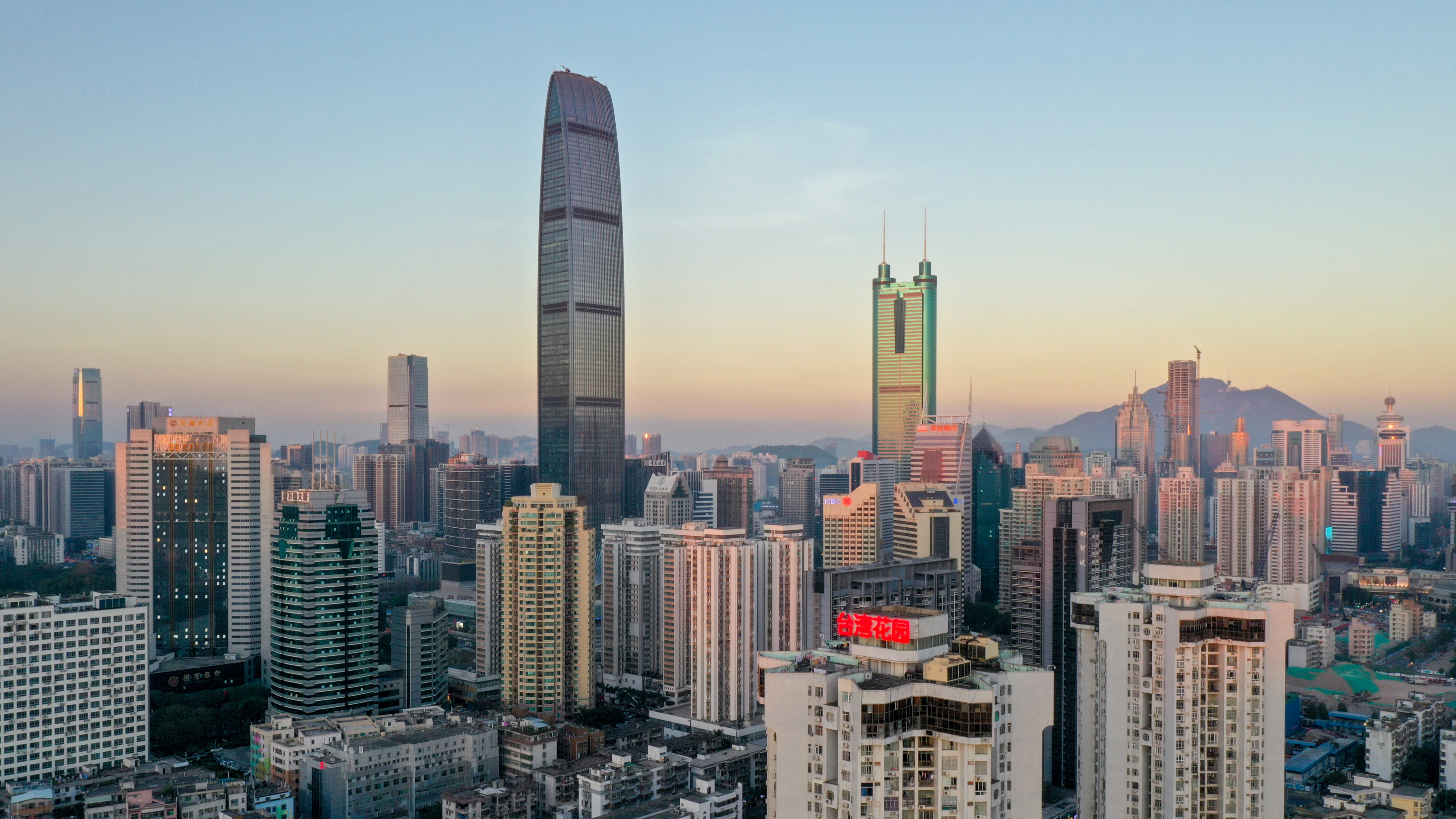
Getting stuck in traffic is something that most people hate, especially if you are driving within a city like New York City. Public transportations are main way of commuting within a city, and many people use it daily to get to school or work. We get so used to just lining up at the bus stop or subway station, or slowly driving and stopping on the road that we often think: Is there a better time to leave my house so that I don’t get stuck in traffic? In this study, we will take a look at using some of these urban data build some visualization and see what kind of information we can get to help us make a better decision on our commute. Our target city here located in Shenzhen, China, a major sub-provincial city and one of the special economic zones of China.
Inspiration
This project is inspired by a research done in Rutgers University lead by professor Desheng Zhang. The research is about bridging Cyber Physical Systems (CPS) and Data Science in extreme-scale urban infrastructure from a sociotechnical perspective. By using urban data such as traffic, subway, bus transactions and SIM card activity, we can create different analyzation to improve the flow of the city. In this project, we will not be looking too deep into using Data Mining or Machine Learning process to compute outcomes for users, but we can create some data visualizations for users to have a general insight about the city of Shenzhen.
Tools & Software
Tools and software that were used in this projects are:
- Tableau Desktop – for creating visualization
- Python, PyCharm – for data cleaning
- Overpass Turbo/ OpenStreetMap API – generating base road network
- QGIS – for creating shapefiles of road network
- Angular 11 – to create a website for compiling all the visualizations
Design Process
Target Users
The target users is mainly for people that live or have lived in Shenzhen before, as they have the most knowledge about the areas of Shenzhen. The target users could also be people that lives in a city like New York City, as traffic conditions logic and human interactions are similar in every city.
Data Sources – Getting the Right Data
In the last lab report, the Shenzhen road network data that was used was very inaccurate. Even moving the whole map to the correct location using QGIS, many of the lines do not line up with the actual roads, therefore when joining with the GPS datasets there are very little intersections and the calculations are very inaccurate.
OpenStreetMap offers API tools that allow anyone to export all map information based on the locations and parameters user passes. Overpass Turbo is a tool that based off of this OpenStreetMap API. With this tool, a very accurate set of road network of Shenzhen, China was generated.


The rest of the dataset (Traffic data of Electric Taxi, Buses, Smartcard Transactions, SIM Card data) are obtained from the here.
Data Cleaning & Challenges
The datasets used in this project is enormous. Each vehicle class data (taxi, bus, subway, etc.) has more than 30,000,000 rows. In order to see how much traffic occurs on a specific road, we need to do a join with the shapefile geometry data. However, not all of the GPS points of the vehicle data are accurate and actually line up on the road. We would need to add a BUFFER() function to make the GPS points actually touches the road lines.

As a result, in addition to the huge amount of data, all the GPS points also need to add an extra calculation of BUFFER, which makes Tableau Desktop impossible to compute. Just the Electric Taxi data took almost 10 minutes to finish, and every time a small change is made, it takes another 10 minutes to load.
Resolution
In order to make Tableau run a little faster, some data cleaning is necessary. To do so, a Python script was run to filter out all the inaccurate data: data that is incorrectly reported and become outside the boundaries of Shenzhen.

The data is also separated into 24 files, which corresponds to the hour of the day.

After all the cleaning, each of the files are imported into Tableau one by one. After each one’s visualization is complete, the dataset is remove and the next hour’s dataset is imported.
Designing Visualizations
Since the data is mostly about density of traffic, we would want to see some sort of heatmap with darker colors being the most dense area and lighter color being the opposite. Usually for this kind of heatmap we would use a yellow to red scale.

For the electric taxi dataset, since the color scale is yellow to red, a dark black color background map was chosen to give a nice contrast between the yellow lines.
Compare to the electric taxi data, the bus data is so much more bigger, and it was impossible to load all the data at once. So the lines of each hour are mostly yellow, and only a couple ones are red. In this case, if we use the black base map, the contrast is too high and the red lines are not as visible. Therefore, for the other datasets, a “normal” map was used as the base map to make the red lines more visible.

We also would like to see which subway station and bus line has the most people at each hour of the day, so a simple bar chart order by the count of Smartcard ID swipe-in transaction was made for both subways and buses. Again, the dataset is way too big for all the data to load at once, and there are too many stations/bus lines in Shenzhen, so the images were exported as PDF. In addition, the subway station names are only available in Chinese, as putting another set of data to map the stations into English would required even more calculation that causes Tableau to crash.

UX Research
A simple UX research was conducted before the visualizations were created. The UX research consist of a quick 15 minute zoom call with 2 individuals that lives or have lived in a city, and one of the participant was actually a resident of Shenzhen for 4 years.
During the UX research, the participants were first asked a couple simple questions such as their age group, occupation, and how long they have lived in a city. Then, the participants were asked how often they use public transportation and how they usually travel around the city. Lastly, the participants were asked what information they are most interested in or they will find helpful to improve their commute.
The following points summarizes the participants responses:
- It would be beneficial to see what the traffic conditions during rush hours 7-9AM, and 5-7PM.
- Amount of people are taking the subways or buses during different times of the day
- Which station/bus line to avoid during busy times.
- The participants don’t care much about regular vehicles and trucks traffic because they don’t drive or it’s not relevant to them.
- Time consumption difference between subway and bus. (Unfortunately, that is beyond the scope of this project because dataset is too big and Tableau cannot handle such complex calculations)
Results & Findings
The result of all the visualizations can be found here:
The results are pretty surprising, but also makes a lot of sense. For the Taxi visualization, we can see that the most heavy traffic area is around the downtown area, while the the right side of the city is mostly yellow because it’s the furthest away from the main part of the city.


There are several lines that are red on the far side of the city, which are the main highways that lead to downtown Shenzhen.
For the bus traffic map, there are not a lot of changes we can see between different hours of the day. However, we can see that the red lines are also mostly the highways that leads into the downtown, especially during 7AM-10AM. According to one of the UX participant, people usually live further away in slight rural area, and they would commute to the main city area for work or school.

Similarly, most of the people taking subway are during rush hours, and the most populated subway stations are located in places like 坪洲 (Ping Zhou), which is somewhere to the left of the downtown area.

At 10AM-12 Noon, 罗湖(Luo Hu) and 深圳北(Shenzhen Bei) Station have very high subway entries. These are the main stations that connects with Hong Kong.

Finally, the SIM activities during the day did not show a significant result. Most of the map have 0 coverage. There is a possibility that a lot of the data were inaccurate and were filtered out due to being outside the range of the Shenzhen boundaries.

Reflection
In conclusion, this project was very interesting and there was definitely a lot of trial and error during the process. One thing that was learned during this project is that Tableau is definitely not the best tool to compute all these calculations. With this huge amount of dataset, Tableau crashes very frequently or refuses to load the data because it ran out of memories. Even during cleaning the data, python took about several minutes to complete going through the whole dataset. A suggestion for doing such calculation and analyzation for next time would be obtain all the road segments as a more coding friendly format, and utilize python to calculate the intersections between the GPS data and the road segments. Overall, it was very exciting to see that the most of the resulting maps make a lot of sense.
Citations
Urban Data Release V2
Desheng Zhang, Juanjuan Zhao, Fan Zhang, and Tian He.
UrbanCPS:a Cyber-Physical System based on Multi-source Big Infrastructure Data for Heterogeneous Model Integration.
In the 6th ACM/IEEE International Conference on Cyber-Physical Systems (ICCPS’15), 2015.
Electric Vehicle Data Release V0
Wang, Guang, Xiuyuan Chen, Fan Zhang, Yang Wang, and Desheng Zhang.
Experience: Understanding long-term evolving patterns of shared electric vehicle networks.
In The 25th Annual International Conference on Mobile Computing and Networking (MobiCom) 2019.
ETC Data Release V0
Yang, Yu, Fan Zhang, and Desheng Zhang.
VeMo: Enabling Transparent Vehicular Mobility Modeling at Individual Levels with Full Penetration.
In The 25th Annual International Conference on Mobile Computing and Networking (MobiCom) 2019.
Yang, Yu, Fan Zhang, and Desheng Zhang.
SharedEdge: GPS-free fine-grained travel time estimation in state-level highway systems.
Proceedings of the ACM on Interactive, Mobile, Wearable and Ubiquitous Technologies 2, no. 1 (2018): 48.