Background
Inspiration
My family recently got a dog! She’s a 2-month-old Shiba Inu which is the most popular dog breed in Japan. Without any resistance to the cuteness of dogs, I’d like to explore data about dogs in my final project.

This semester, we have learned multiple tools and created many conventional visualizations using bar graphs, pie charts, etc. For my final project, I want to try something different by challenging myself and illustrating data in a more graphic and fun format. Therefore, I decided to design the figures using a combination of Adobe Illustrator and other data visualization tools.
User Research
For this project, I want to target audiences who have a general interest in dogs and do not have any expert knowledge about dogs. The purpose of the project is to help the audiences gain some general understanding of dog breeds and allow them to engage with the visualizations in a fun way. Therefore, before I get started visualizing data, I firstly conducted primary user research to understand what topics my target audiences want to know about.
After interviewing 3 potential target audiences, I noted down that users are interested in the following topics:
- Popularity of dog breeds
- Characteristcs of different dog breeds
- Fun fact about dogs
- What breeds are more friendly/dangerous
- They don’t want to know about a hundred breeds but just the top ones
Research Questions
The result from user research helped me refine my research questions for this project:
- What are the most popular dog breeds in the U.S.?
- What is the relationship between dog popularity and their intelligence level?
- What are the most popular dog breeds in NYC?
- What are the most commonly used dog names?
- What are the most dangerous dog breeds in terms of dog bites in NYC?
- What is the relationship between dog bites and dog distribution in NYC?
Process & Methods
Step 1. Finding datasets
I was able to find four data resources about dogs:
- NYC Dog Licensing Dataset: The data is sourced from the DOHMH Dog Licensing System, where owners can apply for and renew dog licenses. The dataset covers the dogs that are owned and have a license in NYC from 2014 to 2021. Each record stands as a unique license period for the dog over the course of the yearlong time frame.
- Dog size/intelligence: The two datasets records the size and intelligence information for 130+ dog breeds.
- AKC Popular Breeds 2013-2016 & AKC Popular Breeds for more recent years: The datasets list the ranking of dog popularity for about 200 breeds.
- Dog Bites in NY: This dataset includes information on over 10,000 dog bites which occurred from 2015 to 2017 in New York and includes information on whether the animal was quarantined after the bite occurred and whether that animal was rabid.
Step 2. Tidy up data
I used Excel to clean up rows that have empty cells. I then used R to combine the datasets together using dog breeds and zip codes.
Step 3. Initial data visualization using Tableau
Using the cleaned-up data, I firstly used Tableau to visualize the rankings, relationships, and distributions. These would serve as a guideline for the next step.
Step 4. Beautify visualizations using Adobe Illustrator
Then, I used Adobe Illustrator to visualize the data in a more engaging and fun way.
Step 5. Feedback from Rachel and Hao
After completing the draft of my visualizations, I asked for Rachel and Hao’s feedback on my visualizations and made improvements accordingly. The main purpose of the peer review is to understand if the message of each graphic is clear and if the visuals are consistent.
Overall, they think the visual is consistent. Rachel thinks the dogs in the ‘Top 5 Popular Breeds in NYC’ chart are a bit distracting, and it’s hard to tell where the data points are. Hao thinks the axis titles for dog intelligence can be improved as the obey level sounds irrelevant to intelligence. Therefore, I added dog balls to each dog’s mouth to indicate the data points in the ‘Top 5 Popular Breeds in NYC’ chart. And I replaced the axis title of “obey level” with “intelligence” and added an explanation about how the intelligence level is evaluated at the bottom of the chart.
Step 6. UX Research
At last, after refining the visualizations based on peer reviews, I showed my graphics to 2 potential audiences who like dogs but don’t have much background knowledge. I conducted moderated usability testing to gain feedback about my illustrations. As participants go through the graphics, all of them were asked to employ the “think-aloud technique” during the test. Some of the questions I asked during the test included:
- Explore the graphic one by one and tell me what’s your understanding of them
- Is the information of each graphic clear for you?
- How engaging is each graphic?
- Is there anything confusing?
- Comparing with bar graph/chart, which one do you prefer?
User Feedback
Overall, both participants think that the information is clear and the illustration method is very engaging. They both prefer the illustrated images over the Tableau-generated graphs. They think that the titles and texts for explanation really clarify the message for each image.
For improvements, they think 1). the big titles of “AKC popular breeds” sound confusing because they don’t know what AKC is before reading the small texts; 2). Dog tags can be cuter; 3). They want to know a bit more about what other factors may cause dog bites from secondary research as well.
I then further refined the visualizations and present them in the following section – “Result”.
Results — Visualizations & Interpretations

As a result, I have created three sets of visualizations with 6 graphics in total. The first set combines the dataset of AKC Popular Breeds and dog intelligence datasets together using breeds as the connection to illustrate dog facts in the U.S. The second set uses NYC Dog Licensing Dataset to illustrate dog facts in NYC. The third set integrates NYC Dog Licensing Dataset and Dog Bites in NY using ZIP code to show dog bites in NYC.
In this section, I will demonstrate the before-and-after visualizations created with Tableau and Illustrator, then I will analyze and discuss the final visualizations.
1. Labrador has been the favorite dog in the U.S. for 30 years, while French Bulldog surpassed German Shepherd Dog who has won the 2nd place for 7+ years
- Process

I first sorted the AKC breeds popularity from high to low. Since the target audiences said that they mainly want to look at the top breeds rather than the whole ranking of 100+ breeds, I decided to illustrate the top 5 breeds in terms of popularity in the U.S.
- Result

To clearly illustrate the top 5 popular breeds in the U.S., I used podiums to highlight the ranking. I also added additional information about the breeds on the bottom of the podium to provide more details.
As users thought that the original titles of “AKC popular breeds” sound confusing, I removed AKC and included it in the small text.
2. The smartest and the “dumbest” dogs are the most popular
- Process
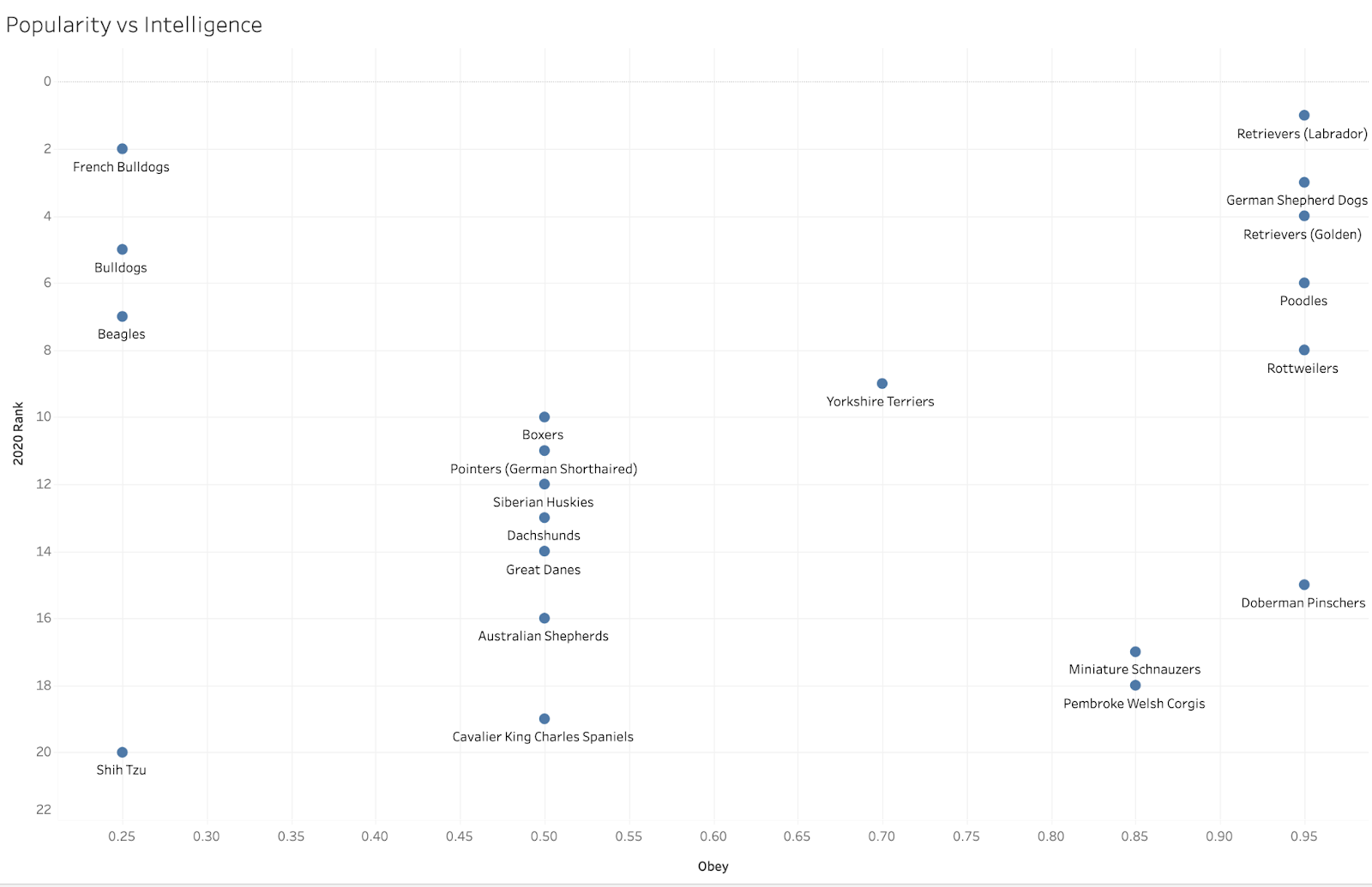
- Result

As a result, it is very interesting to see that, among the top 10 popular dogs, they are either the smartest or the “dumbest”. Among the top 11th to top 20th popular dogs, they generally have a medium level of intelligence.
Here, the user feedback is that, though it was a bit hard for them to see which dog relates to which point, they can understand the dog positions on the chart much more clearly at the first sight.
3. Smaller size dogs are more popular in NYC
- Process
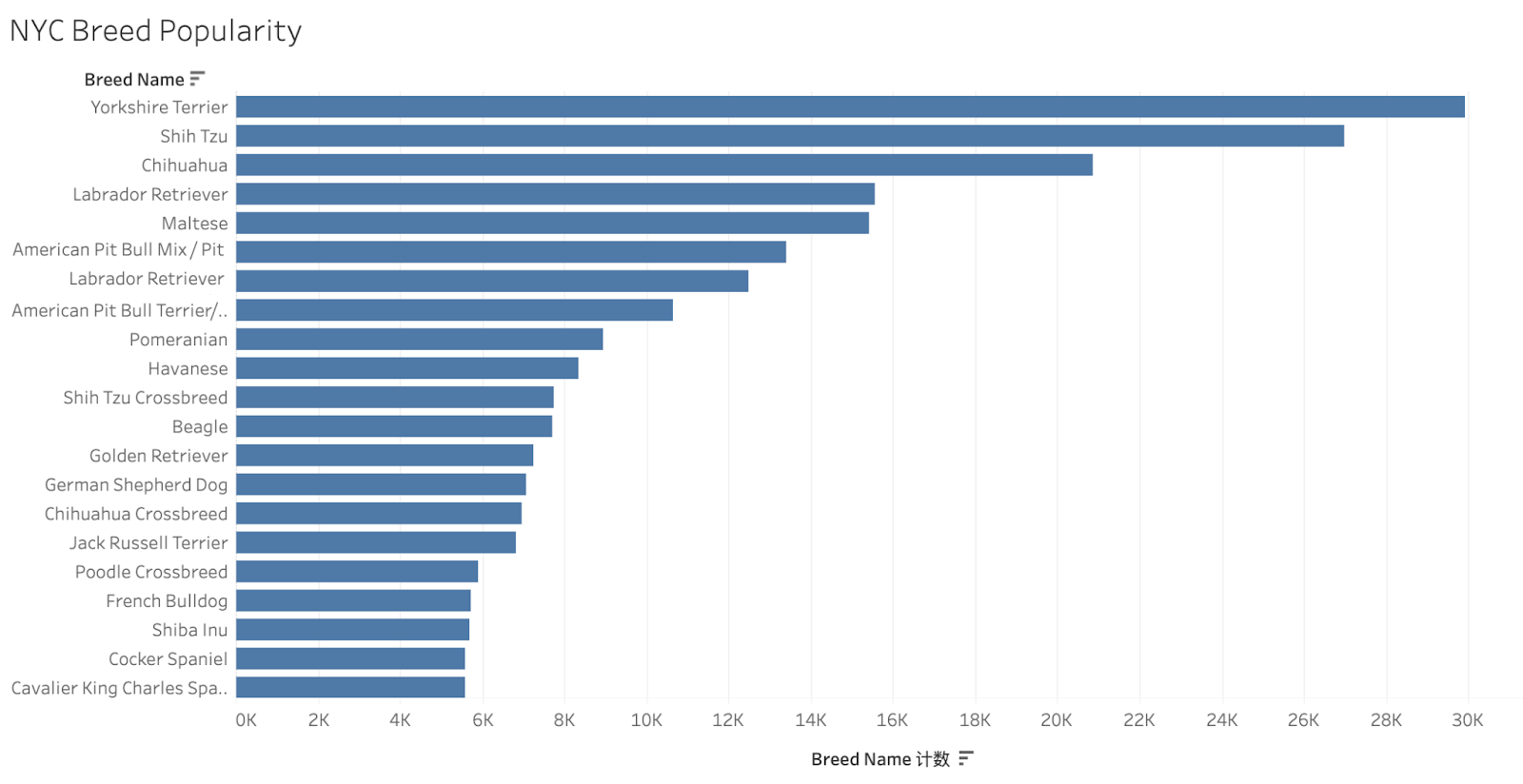
- Result

For the refined graphic, I used dog-run competition as a way to illustrate the dog popularity with the x-axis showing the number of dogs in the breed in NYC. Not surprisingly, unlike the popularity of big and medium-size dogs in the nation, 4/5 popular breeds in NYC are small size dogs since NYC is so packed and the area of the house is usually smaller.
As Rachel mentioned that the indication of data points is not very clear, I added a red dog ball to each dog’s mouth to indicate the data points on the chart.
4. “Bella” is the most popular dog name in NYC
- Process
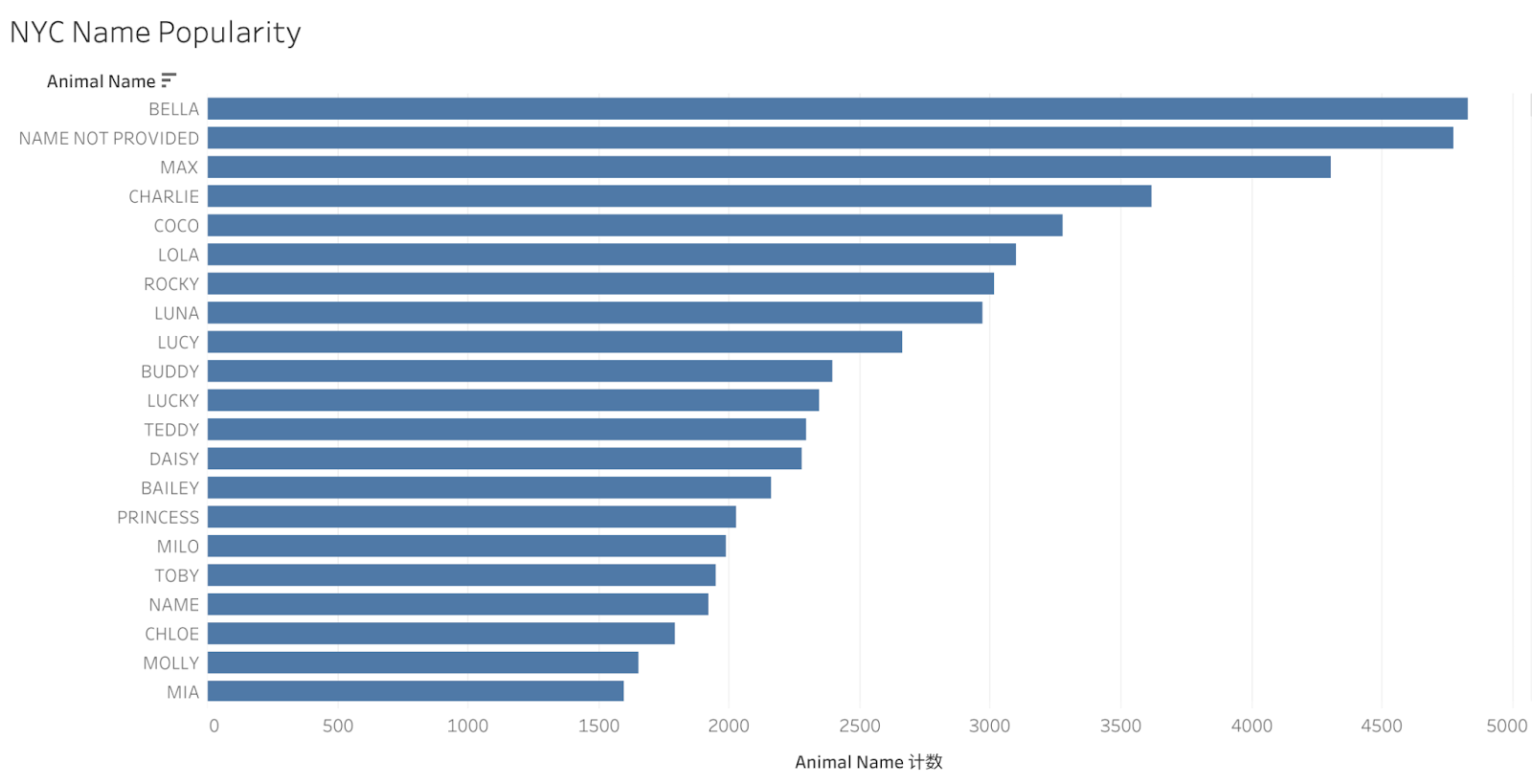
- Result

It turns out that “Bella”, “Max, and “Charlie” are the most popular dog names in NYC. As one user said that the dog tags are not cute enough in the UX research, I added a small paw to each dog tag to make the graphic more interesting.
5. Pit Bull is the most ferocious dog in terms of dog bites in NYC
- Process
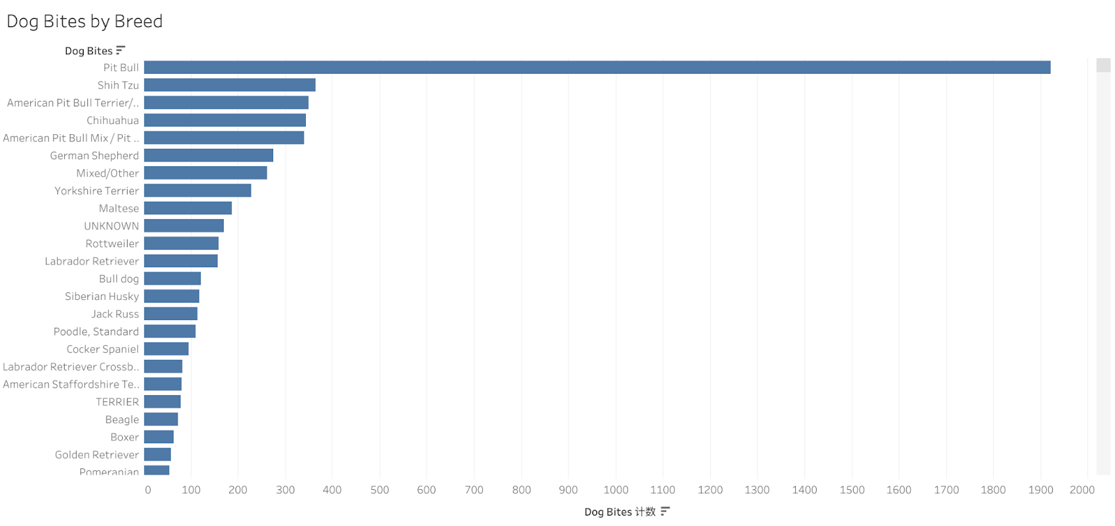
- Result

Not surprisingly, Pit Bull – who’s on the “dangerous dog list” – causes a significantly high number of dog bite incidents in NYC. The breed is banned in various countries and neighborhoods.
But surprisingly, the small size dogs Shih Tzu and Chihuahua are ranked as the second and the third “ferocious” dogs in NYC, though the number of dog bites incidents is significantly lower than Pit Bulls’. According to research, Shih Tzu and Chihuahuas are not predisposed to be aggressive toward people. One factor contributing to the number of bites might be the popularity of Shih Tzu and Chihuahua in NYC since there is a higher number of them in the city.
While the number may suggest certain facts about the breed, there can be biases. According to the news report, pit bull attacks are disproportionally reported because of the severity of the injuries they can cause. When the smaller dogs are attacking, they’re not getting reported very often because they are less likely to cause injuries and therefore are not represented in the Department of Health statistics. An advocator for pit bulls said that the perception of pit bulls is skewed because of the frequency of the reports against them, along with the representation of the dogs in popular media.
6. No strong correlation between dog bites and dog distribution in NYC

For this map, I used the Tableau dual-axis to illustrate the dog distribution in NYC using different shades of green and show the dog bites density using a blue heatmap.
As a result, areas that have more dogs (darker green) are more likely to have dog bite incidents (darker blue) but the correlation is not very strong as many light green areas also have dark blue dots.
I, therefore, conducted more secondary research to understand what factors are more closely associated with dog bites. According to research, dog bites injuries are more prevalent among school-age children, inhabitants of less-densely populated areas, and residents of poorer neighborhoods. In New York City, poorer neighborhoods are also associated with fewer dogs being spayed or neutered.

I then sorted dog bites by boroughs and searched for each borough’s median income as shown above. Boroughs that have the most number of dog bite incidents are Queens(2,520 cases), Manhattan(2,354 cases), and Brooklyn(2,281 cases) but their median income does not necessarily go from the lowest to the highest. But then, I realized that it might be a lot more accurate to sort median income by zip code areas rather than by boroughs.

Due to limited time, I compared the distribution of dog bites in NYC with an image of median household income in NYC I found online, and the pattern looks a lot more consistent. Areas that have more dog bites (darker on the left image) mostly correspond to areas that have lower median household income (orange/yellow areas on the right). The consistency proves that dog bite incidents are more likely to associate with the income level in the neighborhoods.
Reflection
I had a lot of fun playing around with how to visualize data in diverse and engaging ways. With the support of Tableau graphs, I was able to illustrate data using Adobe Illustrator in a relatively accurate way. In the future, I hope to learn more about how to create innovative illustrations with interactive features by using Javascript or other tools.
If I have more time for this project, I would find data about the income level in each ZIP code area and illustrate it in a map to compare it with the dog bites map, so the two maps would be more consistent to compare with. Moreover, I will spend more time ensuring the visuals are more consistent like incorporating more dog icons rather than using real dog images.
For future direction, I would be interested in exploring more about what other factors may contribute to dog bites, like genders, spay/neuter, and human factors. I would also like to create more graphics that can help audiences who want to buy/adopt dogs to understand the expenses, characteristics for each dog breed, and more.
References
Department of Mental Health and Hygeine. “NYC Dog Licensing Dataset: NYC Open Data.” NYC Dog Licensing Dataset | NYC Open Data, 29 July 2021, https://data.cityofnewyork.us/Health/NYC-Dog-Licensing-Dataset/nu7n-tubp.
“Dog Size/Intelligence Linked?” Data.world, 6 June 2019, https://data.world/len/dog-size-intelligence-linked.
“Dohmh Dog Bite Data.” DOHMH Dog Bite Data – CKAN, Publisher Data.cityofnewyork.us, 29 Nov. 2021, https://catalog.data.gov/dataset/dohmh-dog-bite-data.
Group, Gwynn. “AKC Top 100 Dog Breeds in the United States.” Medium, Medium, 20 Feb. 2019, https://medium.com/@gwynngroupinc/akc-top-100-dog-breeds-in-the-united-states-110e0b6d47c7.
jostapiuk@siadvance.com, Joseph Ostapiuk |. “Guess Which Borough Has the Highest Rate of Dog Attacks?” Silive, 19 Apr. 2019, https://www.silive.com/news/2019/04/guess-which-borough-has-the-highest-rate-of-dog-attacks-and-it-isnt-really-close.html.
Loder, Randall T. “The Demographics of Dog Bites in the United States.” Heliyon, Elsevier, 20 Mar. 2019, https://www.sciencedirect.com/science/article/pii/S240584401838527X.
McCandless, David. “Best in Show – What’s the Best Dog Breed, According to Data?” Information Is Beautiful, Information Is Beautiful, 1 Feb. 2021, https://www.informationisbeautiful.net/visualizations/best-in-show-whats-the-top-data-dog/.
“NYCDATA: Income and Taxes.” NYCdata | Income and Taxes, https://www.baruch.cuny.edu/nycdata/income-taxes/med_hhold_income.htm.
Reese, Laura A, and Joshua J Vertalka. “Preventing Dog Bites: It Is Not Only about the Dog.” Animals : an Open Access Journal from MDPI, MDPI, 11 Apr. 2020, https://www.ncbi.nlm.nih.gov/pmc/articles/PMC7222712/.
Tuckel, Peter S., and William Milczarski. “The Changing Epidemiology of Dog Bite Injuries in the United States, 2005–2018 – Injury Epidemiology.” BioMed Central, BioMed Central, 1 Nov. 2020, https://injepijournal.biomedcentral.com/articles/10.1186/s40621-020-00281-y.
Xiao, Di. “Dog Breeds Data Visualization.” Medium, Medium, 25 Feb. 2018, https://medium.com/@dixiao_62927/dog-breed-case-study-c048f9a7207e.