Before reading this report I would like for you to know the topic of sexual health can be triggering. If you are not comfortable with this topic please refrain from reading.
During NYC lockdown due to the Corona pandemic, it was important to gather data based on areas/boros in NYC that distributed condoms. Due to this closure it was pivotal that your health along with sexual health was taking care of. I thought it would be important to bring to light and promote safe sex.
Inspiration
I found my data on NYC OPEN DATA when clicking the data I expected to see a visual. Unfortunately I didn’t, I clicked on the data link and was brought to a chart. Visually I didn’t know what I wanted to hook my viewer. I knew I was dealing with locations throughout the 5 boros. I you live in places like Manhattan, Brooklyn, and Queens you can expect a high number of condom distributors, I mean it’s NYC right? Haha.
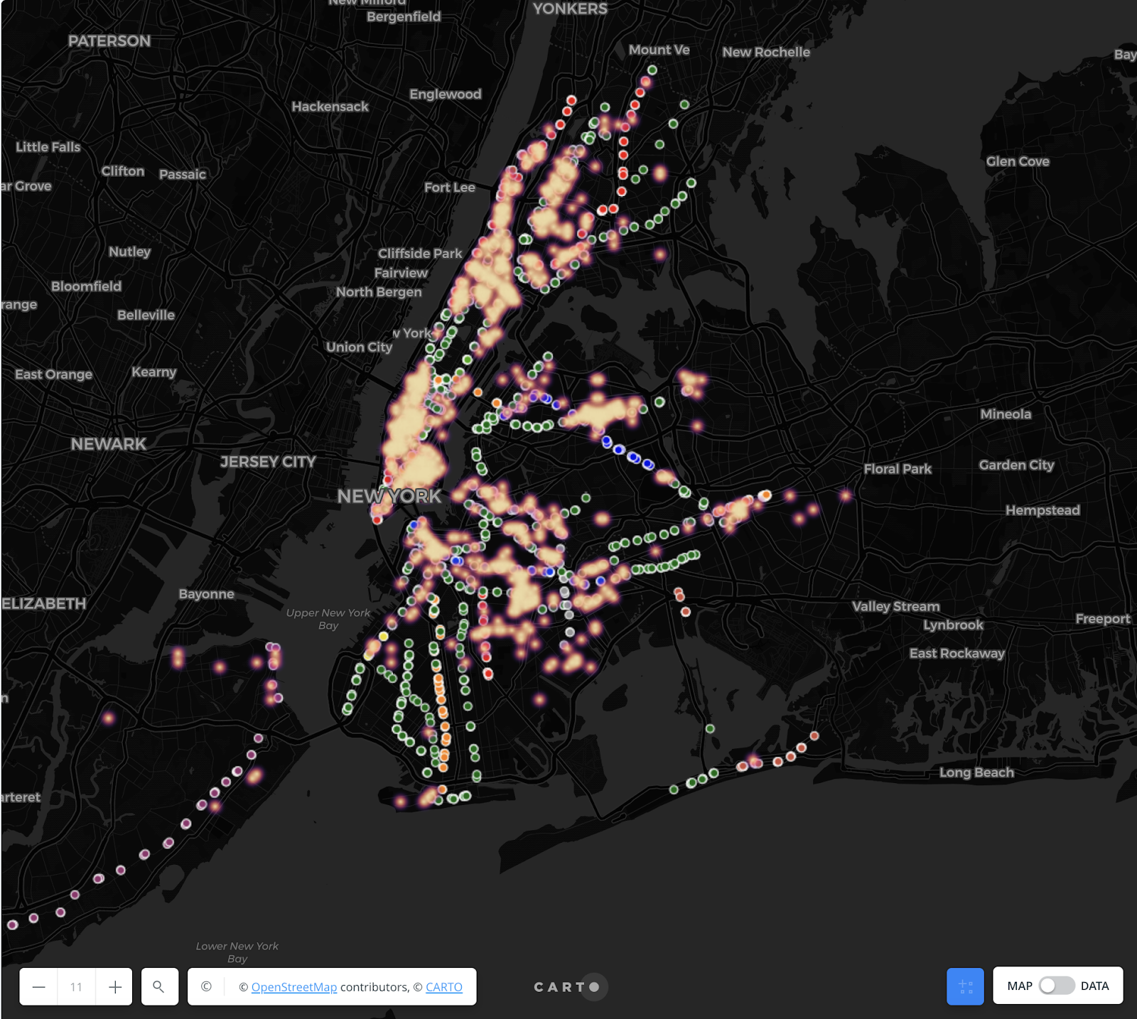
For high density areas I thought a great way to visualize this will be some form of heat detection/infrared colors. This will show the areas throughout NYC with the most condom distribution.
I also thought of merging along with this data NYC MTA train stops. This was important to me because the average New Yorker doesn’t usually drive. Who needs to? Its NYC! We have 24 hour public transportation. Along with the Condom distribution, I thought it’ll be ideal to add NYC train station entrances. That way people viewing this data will know what trains will take them to the distribution centers. When I added the trains I wanted city folks to resonate with my data so I coordinated the train stops to correspond to the color based on the trains letter/number tag.
Materials
Carto – To make this spatial analysis I used this software which was easy and user friendly after importing your data I was able to import my data in various ways, making it user friendly. Also I was given the control to alter my plotted nodes.
Process
The first thing that needed to be done was to add the data into Carto. I exported my data as a CSV file and dragged it. When the data was done uploading a very unappealing visual is generated. Carto now gives me the ability to alter this bland spatial analysis and make it easier for the viewer to understand. I was using a lot of color and the map that was provided already had color. I decided to change it because it would’ve been too much going on for my viewers. I wanted this to be simple and straightforward.
Next I played with the visualization of the Condom distribution nodes. I decided to change the appearance of my nodes to heatmap. Heatmap allowed my nodes to turn into a more liquified node and the color legend I decided to go with represented a good visual of density. When I was done dealing with the representation of condoms I focused on the NYC train station nodes. I knew I wanted to train stops to represent the color tag based on the train route. Now it was easier for my viewer to see and understand what was happening on my map.
Visualization
Results
When I first looked at the mapo completely I had a lot of thoughts that ran through my mind. First I was shocked with the amount of locations where condom distribution was located. Looking at Manhattan it looks like nearly every store had condoms to give away for free. But I also noticed places with less density of people such as the outskirts of the city there weren’t that many coordinates. I began to think that sexual health wasn’t spoken about in these areas? Usually what I’ve noticed through my own personal traveling is rural places have more of a conservative narrative around sex therefore sex isn’t a topic of decision. In queens I’ve noticed a patch along Roosevelt avenue. I used to work at a sex clinic and I know that Roosevelt avenue is a popular strip for prostetution. I thought i t was cool that I was able to draw conclusions as to why that is.

Reflection
Overall this has been an amazing experience using Carto. I would recommend it to anyone looking to visualize map data. It is a fun and easy software application. With a software like this I want I’m curious as to making this data a lot more interactive for viewers. Almost like a google maps display. I would like to know also why isn’t this information already a given in doctors offices/schools/ and other large institutions to eradicate STIs.