Introduction
New York City is home to over 1,400 public schools which educate over 1.1 million students per year. This makes the school system, which encompasses the five boroughs, the largest in the United States. Student achievement is the top priority for the organization, something that requires constant progress and growth. According to the New York Schools website, “there is constantly construction and updating done to the various buildings—some historic or memorial sites.” To learn more about which districts and areas of the city are targeted most often for improvements, I created a visualization of current construction projects in New York City schools.
Process
To answer my question of which area schools undergo the most construction projects, I consulted a dataset found on NYC OpenData entitled “Active Projects Under Construction.” This information, first created in 2011 and updated as recently as April of this year, gives insights into where new school buildings (Capacity) are being constructed and where Capital Improvement Projects (CIPs) are currently taking place. The data also contains geographic information as well as the monetary value awarded to each project. In this set there are 4,437 rows that correspond to school construction and improvement projects.
In pursuit of creating a visualization, I uploaded my data to Carto, a website that provides GIS, web mapping, and spatial data science tools. This is done in two steps: first, by loading the dataset containing the construction information, and second, by adding in a shapefile which creates polygons on the map of administrative districts. Carto affords users the ability to share datasets with one another, so I was able to take advantage of a pre-uploaded shapefile of the New York City school districts. I chose to organize by school district instead of borough or ZIP code in order to show how construction projects, and presumably funding, vary throughout the organizations.

Once both layers were added to the map, it was time to use the “Analysis” feature. By “intersecting and aggregating” the two layers, Carto counted up all the projects within each district boundary. This allowed me to style the polygons by value, or number of projects within each district, using a gradient color scale. I chose blue as it’s a pleasing and simple color, and did not feel the need to use the color itself as a signifier (e.g. red-green meaning better and worse). I went back and forth between including dots on the map where specific projects occurred, and ultimately felt that including these gave a fuller picture of activity in each area and allowed for more context to be shown. Grayscale bubbles were chosen so as not to add more colors to the map and maintain neutrality. White shows where there are capital improvement projects and gray shows new additions.
Link to the finished map: https://annasize.carto.com/builder/21e6109f-a228-4866-ba79-07f7d37436c2/embed

Because New York City school districts are numbered instead of named, I refrained from placing the labels directly on the map as I felt that could confuse the user between the district number and number of ongoing projects within that district. Instead, I used two different pop-up boxes to relate information to the viewer. The first type of window shows when a user clicks inside the school district boundary, but not on a specific point. Included in the box are the district number and number of active school projects under construction within. I made this box dark to correspond with the colored-in polygons. The second type of window occurs when a user clicks on a point on the map. I chose to include the name of the school, construction type (capacity or CIP), project description, and the value of the construction project in order to give more details and context to the viewer. This type of box has a white background to correspond to the white points on the map.
Results
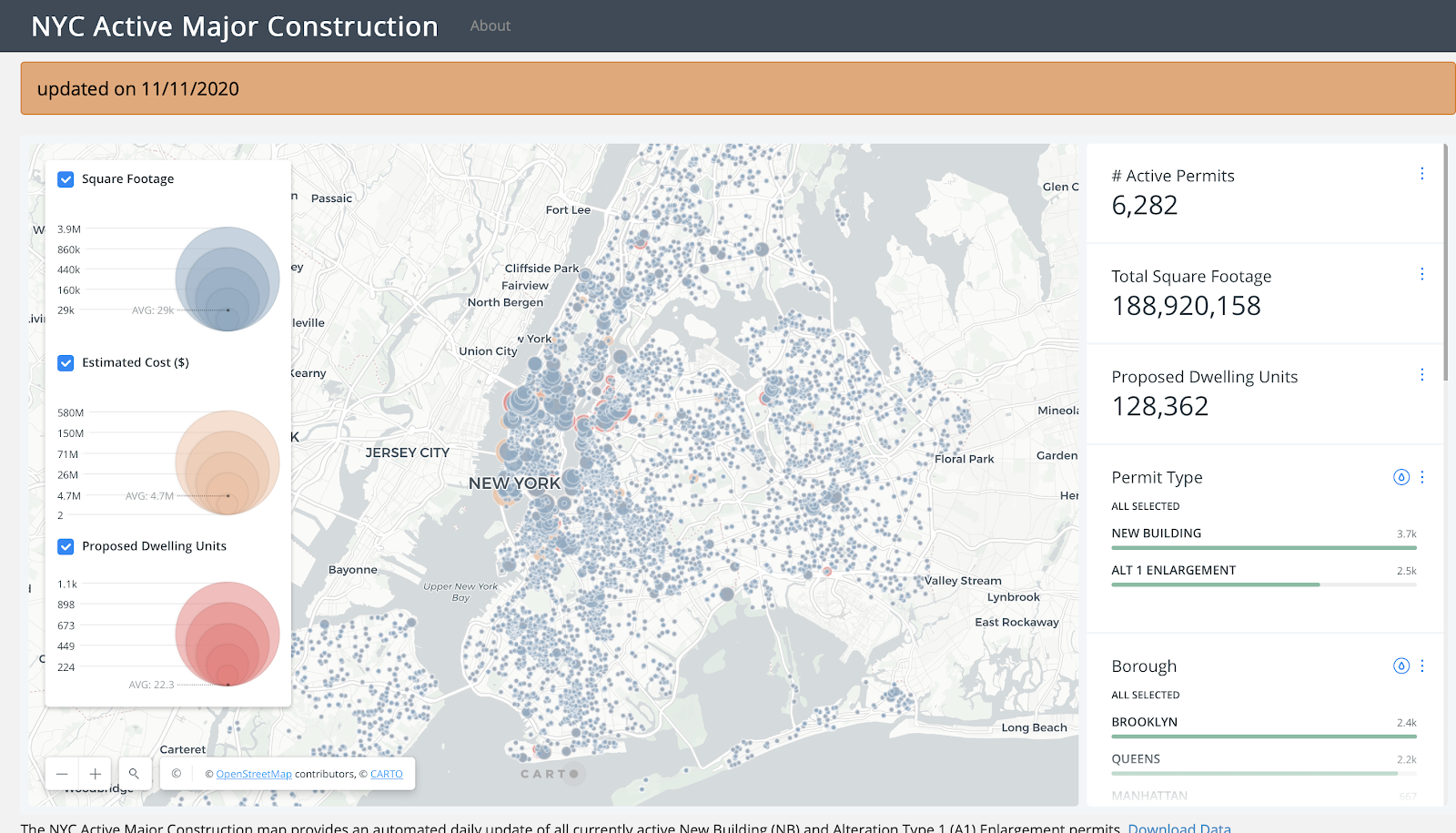
One map that I took inspiration from is this Dashboard (most likely created with Tableau or a similar program) from the NYC government website. It shows all currently active New Building (NB) and Alteration Type 1 (A1) Enlargement permits. An aspect of this map that I did not end up incorporating into mine was using the size of the point to show the cost of the project. This is something that I would have liked to see, but could not quite finagle Carto into doing. Another thing I considered taking from this map is the ability to filter by type of construction. Because there were only two options in my dataset, I chose to simply denote this through the use of color and indication in the legend.
Reflection
I think that this map would be improved by serving as part of a dashboard. I would like to incorporate the ability to overlay average income and other demographic information in each area to see the distribution of wealth among school districts in the city. I also think that having more information about the age and condition of schools would be helpful to provide a fuller picture. This would allow users to see if older schools are getting much-needed updates, or if money is being funneled into wealthier areas. Perhaps information on student achievement such as school ranks or student success barometers in each district could tell a story about how money is allocated.
I think that dividing this map up into school districts helps users visualize where improvements and capacity updates are more prioritized. For example, most of the additions take place in Queens while many of the Manhattan CIPs are concentrated in the East Village/Lower East Side and Upper Manhattan.
I really liked the Carto experience. I think that it is much more user-friendly than other platforms used in previous labs and would be easy for novices to figure out on their own, after the dataset uploading process at least. Carto had many features that let me explore my data in exactly the ways that I had hoped to, and helped me answer my question on where school improvements take place in New York City.
Sources
https://data.cityofnewyork.us/Housing-Development/Active-Projects-Under-Construction/8586-3zfm
https://www1.nyc.gov/assets/buildings/html/nyc-active-major-construction.html
http://www.newyorkschools.com/nyc-schools/