Background and Research Questions
This series of visualizations explores the physical geography of trash in Brooklyn. Through a study of trash-related 311 complaints, I have visualized how such complaints show up in different Brooklyn neighborhoods. With these charts, I explore the frequency of 311 trash-related complaints as well as the content of those of these complaints.
These visualizations are the first step of a larger project that explores the relationship between the geography of trash and various socioeconomic factors in New York City. This project has been prompted by my experience living in different neighborhoods in New York City, most recently Kensington and Flatbush, and noticing the different ways that trash and city litter baskets are present throughout the community. In some areas where I’ve lived, like East New York and Flatbush, there is a noticeable amount of trash on the streets. On the other hand, while living in areas like Kensington/Ditmas Park, I haven’t noticed a significant amount of trash.
In order to better understand and visualize the geography of trash in New York and the factors impacting it, I chose to begin with visualizing trash-related 311 complaints across Brooklyn to get an idea of how litter is showing up in various communities.
Data and Software
These visualizations used the 311 Service Requests from 2010 to Present, filtered to show only complaints made in Brooklyn regarding the New York Department of Sanitation (DSNY). From there, I filtered complaints occurring since 01/2017 in order to work with a smaller dataset. I used Google Sheets for data cleaning and processing, particularly to allow cross-referencing between the location type used in the 311 data (high-level community boards) and more understandable neighborhood names.
Methods and Visualizations
Exploring the dataset revealed the 311 complaints were categorized by “complaint type”. The “descriptor” field was a level below “complaint type” and if included, contained more specific information about the complaint. Because I wanted to explore the frequency of complaints as well as their content, I first visualized the complaints by “complaint type.” After uploading the dataset in Tableau, I filtered the data for my best guesses of trash-related complaints and excluded those related to graffiti, derelict vehicles, dead animals, and numerous other non-trash related observations. I did not include complaints related to litter basket requests, overflow complaints, or general complaints because I wanted to focus on space instead of sanitation infrastructure.
My first visualization is a stacked bar chart of complaint types per Brooklyn community board. I chose to visualize my numerical data – the count of complaints – by board and type so that I explore the differences between different Brooklyn geographic regions. The visualization of complaint types via color allows the user to quickly observe that “missed collection” is the most common complaint type across Brooklyn, followed by “dirty condition.”
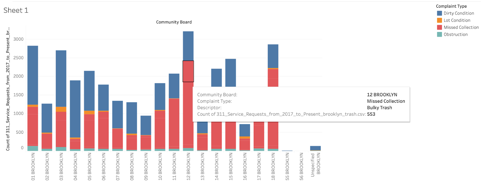
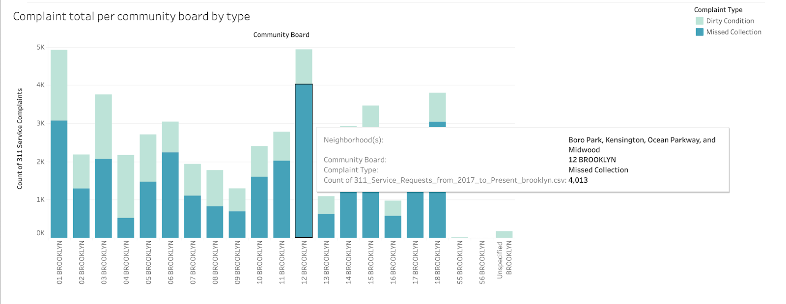
To make the visualization more user-friendly, I created a calculated field that served assigned neighborhood names to each Community Board, which may be composed of multiple neighborhood areas. I also filtered the visualization to show only “missed collection” and “dirty condition” as factor levels of “complaint type” since these were the most frequent.
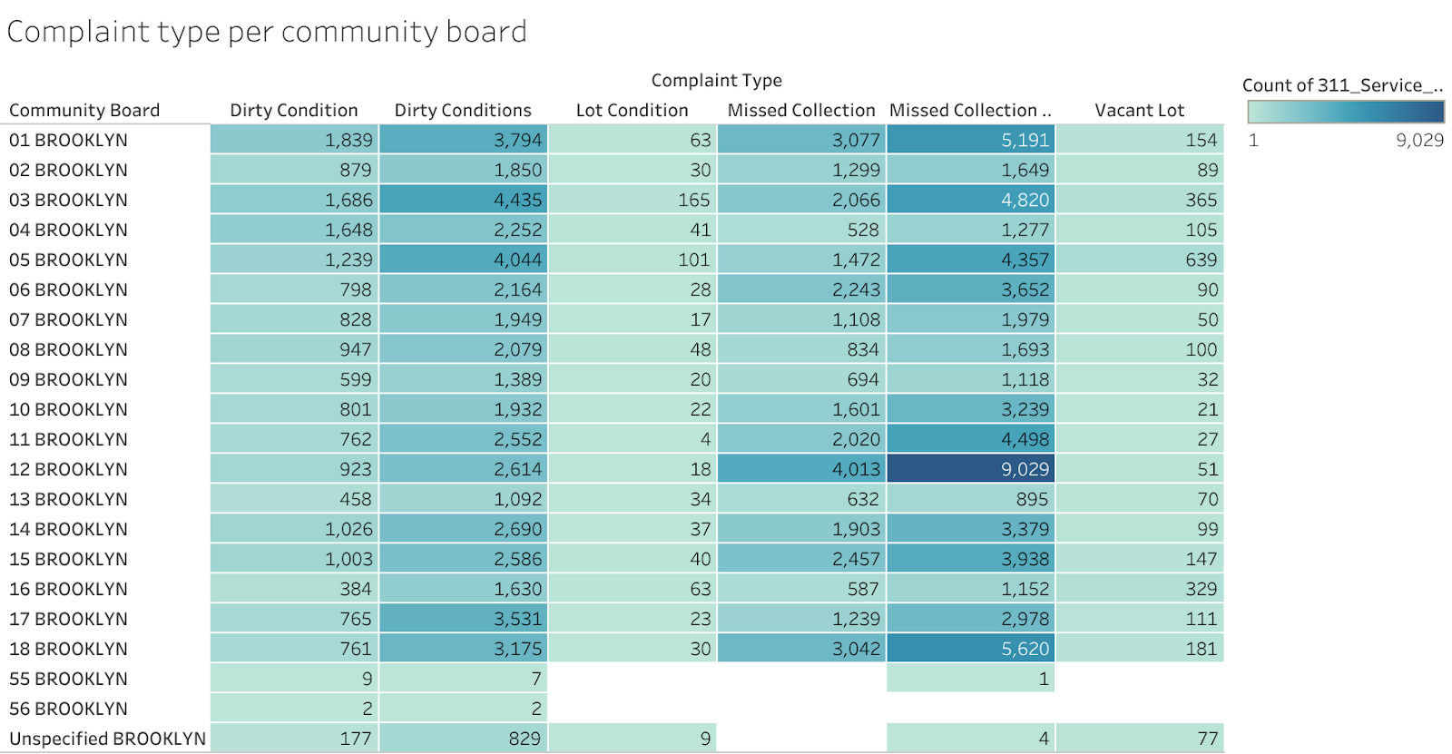
I then created a highlight table to further visualize the frequency of complaints. Here, I also added complaint types that seem to be near duplicates of the other, like “Dirty Condition” and “Dirty Conditions.” The sequential color palette of the highlight table immediately shows which community boards have the most complaints.
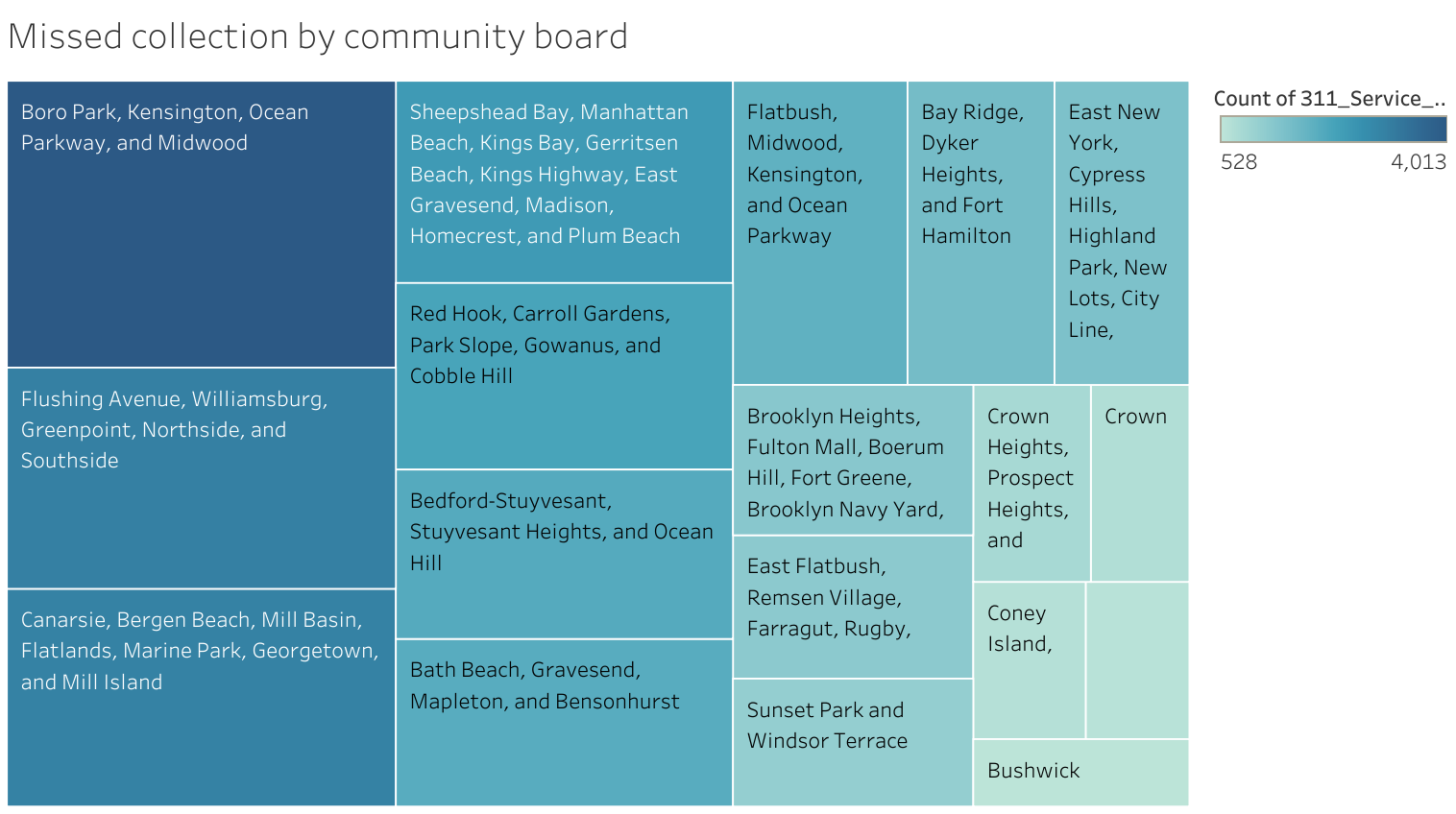
Lastly, I created a tree map that dove a bit further into “missed collection” as a complaint type, examining which neighborhoods (grouped by community board) submitted this complaint the most. The same sequential color palette again offers a quick understanding of how different Brooklyn neighborhood groups relate to each other in terms of these complaints. The sizes of the tiles also allow a deeper understanding of the data when the color differences can lead one to believe that differences are more pronounced than they are.
Conclusion
Using Tableau for data exploration provided an insightful peak into a large, messy dataset. With these visualizations, I was able to understand which types of trash-related complaints are most frequent and where in Brooklyn they are occurring. Missed collections appear to occur most frequently in the Borough Park, Kensington, Ocean Parkway, and Midwood neighborhood group. Future direction for this project can attempt to explore the factors impacting the frequency and types of complaints. Such factors could include population density, race, median household income, and mean property value of a neighborhood. I would also like to explore a way to analyze the 311 data through more granular geographic lenses. A challenge of this study became finding data that related community boards to census tracts or neighborhood tabulation area. The 311 dataset only contained location data by latitude and longitude, community board, and addresses, which became difficult to explore solely through tables.