As a kid during the 90s the Food Guide Pyramid, as pictured above, was a very familiar image. Included in public school curriculum starting at a young age, the Food Guide Pyramid was an accepted resource for reliable dietary guidelines. It is an educational tool that helps shape how we approach our diets, what foods to purchase and what is considered healthy. Thinking about this effect that a simple image of colorful foods can have, I was curious about the history and motivation behind the creation of the food pyramid visualization and how it has evolved over time.
To create my timeline I utilized Timeline JS by Knight Lab. Timeline JS is an open source software tool that allows for the creation of dynamic and interactive timelines. Requiring only a single Google spreadsheet, Timeline JS is fairly intuitive and great for users like me who do not possess a technical background. Its ability to easily integrate rich media content makes it a good tool for creating slideshow projects that are engaging and visually appealing. While overall I found Timeline to be relatively easy to use, I did have some confusion identifying the initial row highlighted in blue as corresponding to the title slide. Additionally, I found it was a little cumbersome to have to continually un-publish and then re-publish the document so that any edits that I made would update in the preview screen.

I relied on Wikipedia for many of the images that I used in the project. Like Timeline JS, Wikipedia uses images that are open source so I was able to freely use them within my timeline. I also used images from other sources and made sure to credit them within my timeline as instructed in their copyright terms. Most of the images I chose to include were of the actual pyramid dietary models in order to showcase their evolution over time. I played around with some different background colors but ultimately chose a black background for the title slide to set it apart, and then white for the rest of the slides. I felt that white was the best option because it was simple and would emphasize the content versus distracting from it.

After some preliminary research, I broke my timeline down into specific dates in order to create a narrative about the development of the food pyramid from past to present. In the initial slides, I discussed the history of dietary models that traces back to Sweden in the 1970s. Initially designed as circles dissected into “slices” representing the major food groups, these diagrams were handy resources for what foods people should be eating, as well as how much of them. Food educator, Anna-Britt Agnsäter found the circular model to be confusing, with the equal slice sizes misleading people about the difference in serving sizes within the major food categories. Through conversations with her peers she put forth the pyramid model in 1974 where the sections decrease in size as you move from the base to the top, more accurately reflecting the variation in serving sizes within the different food groups.

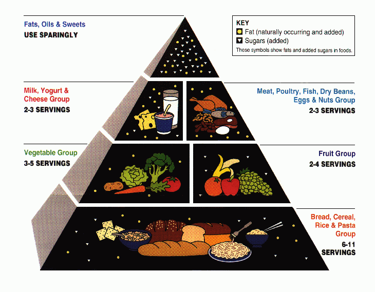
The USDA released its own food pyramid in 1992, called the Food Guide Pyramid. It incorporated the pyramid design, divided into horizontal sections for each of six major food groups. A new stylistic element was the inclusion of small circle and triangle icons to represent fats and sugars. The inclusion of these icons inside of the food group sections helped to emphasize their varying nutritional content among consumers. I also included a slide showcasing a food pyramid model released by the World Health Organization in 2002 to demonstrate alternative ways the pyramid has been used to visualize nutritional information.

The next slides showcased updates to the USDA’s food pyramid models to the current one in use today. The first update occurred in 2005 when the model was renamed, MyPyramid. The redesign included vertical sections versus horizontal that had previously been used, and included a figure scaling steps on the side of the pyramid that was meant to emphasize the need for exercise along with healthy eating and moderation.

In 2011 the pyramid model was abandoned, and the USDA released a new dietary model in the shape of a place setting called, MyPlate, that is still in use today. These slides helped to show how each new iteration of the dietary model attempts to present accurate information in a way that is more direct and easier to comprehend by consumers than its predecessor.

It was not surprising to me these models started as government sponsored tools meant to educate the public about healthy consumption. I was also not shocked to discover these designs were also motivated by economic reasons (soaring food prices) and not just for the good of the public. While the USDA’s models are generally understood to be reliable sources of information, it is worth mentioning that there have been challenges to the accuracy of their advice. There has also been some concern regarding the influence that the food industry has on what is included and promoted. I addressed these issues in my last slide and included an alternate food pyramid model put forth by Harvard’s School of Public Health that seeks to address the perceived flaws in the USDA’s model.

Overall I found Timeline JS to be a relatively easy tool for creating a timeline visualization considering my limited programming experience, and was very happy with my final product. Using it, I was able to create a basic but thorough overview of the history of the food pyramid, including appropriate images to support the text. I felt this was a fitting topic since it was relatively specific and showcased the design evolution of a common visualization model. A more intense exploration of the topic could include further discussion about the criticisms facing the USDA’s choices and alternative dietary models or perhaps more about the history of nutrition guidelines in general. However, for the purposes of this project, only requiring 5-10 dates, I tried to limit my focus to the larger design/stylistic elements and how they changed over time. As science and nutritional research continue to uncover new information about our health and what makes up a healthy lifestyle, it will be interesting to see how dietary models continue to evolve in the years to come.
References
en.wikipedia.org/wiki/Food_pyramid_(nutrition)
https://en.wikipedia.org/wiki/MyPyramid
https://en.wikipedia.org/wiki/MyPlate
www.hsph.harvard.edu/nutritionsource/healthy-eating-pyramid/
https://pbs.twimg.com/media/Dwz5XojWkAEE7Me?format=jpg&name=medium