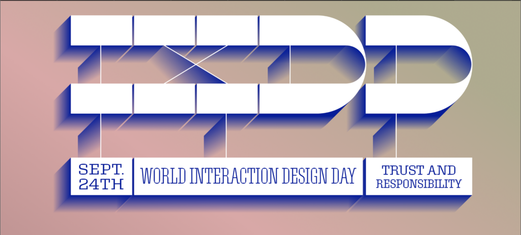
Interaction Design Association (IxDA) celebrated World Interaction day on September 24, 2019. World Interaction Day is an annual event hosted at various locations around the globe where designers come together to show how interaction design improves the human condition. Presented in partnership with Adobe, the theme for this year was Trust and Responsibility. I attended this annual event hosted by IxDA in New York.
The event kicked off with an introduction by Scott Belsky, the Chief Product Officer at Adobe. He spoke about how good interactions build trust. As designers, we get to influence a crucial part of the user’s experience therefore when we design we need to take responsibility for the interface we create. Users trust the design. Whenever you click a button on a website you expect a result but when you don’t obtain what you expect, you feel deceived. People are more likely to determine the trustworthiness of a website based on its design than reading the website’s privacy policy. How likely are you to close a website because of the number of click baits on the home screen? Have you ever felt cheated when an ad doesn’t look like an ad? Belsky says that as designers our core obligation is to be the voice of the users. Designers should understand their users well especially their needs and concerns and create interfaces that fulfill these needs and concerns.
Mark Webster the Director of Product at Adobe spoke about Trust and Responsibility in Voice Design. The adoption of voice technology in virtual assistants is rapidly growing, especially with the emergence of Alexa and Google Home. Most users of voice enhanced technology claim that voice improves their quality of life( 94%). Although more than half of them (around 49%) find using voice technology unintuitive. This reminded me of the last time I used Alexa and asked her to find the English equivalent of ‘dhania’ and she responded with “I don’t understand”. Did I not articulate enough or was she unable to find what I asked? Webster talked about how designers can play an important role in eliminating problems like these. Voice technology can improve the human lifestyle in many ways. It is an opportunity to allow illiterate people access information, it can help the aged and most of all help people with motor disabilities with their day-to-day activities. The only issue is because voice interaction is so unintuitive it results in uncertainty about all of these things. How is voice going to help people with motor disabilities if the user doesn’t know what the virtual assistant has understood? Voice processing works in three parts – The technology senses speech, the speech is processed according to the various algorithms(natural processing) and then and output is delivered. Current technology has been able to implement the first and last part pretty efficiently but ‘natural processing’ still has a lot of limitations. This is where the role of a designer would be crucial as the designer can understand these limitations, combined with the knowledge of the user’s intent, decide on how to make the experience more intuitive thus enable users to build trust with these technologies.
What do we really mean when we say ethics? Dr. Molly Wright Steenson, Senior Associate Dean for Research in the College of Fine Arts at Carnegie Mellon University elaborates on how designers can incorporate ethics in their design process. Since designers are good at investigating the context of the problem and use human-centric methods to understand the needs of the users and stakeholders, they should be directly involved with data. Framing the design problem is not the only task of the designer but how and what data to collect and use is also a design question. Dr. Steenson emphasizes how the ethics framework should stop looking like a checklist and be a vital part of the product life cycle. This reminded me of the PERCS chart we read earlier which talked about the ethics of fieldwork which according to me can be applied to the design process. Even Costanza-Chock and Sasha’s reading Design Justice talks about how designers should warrant a more equitable distribution of the design’s benefits and burdens and be aware of the cultural and traditional implications of designs.
This talk was followed by Milena Pribic the Advisory Designer of Artificial Intelligence Design at IBM who addressed the issues of ethics in AI. She talked about what it means to build a healthy relationship between two people when one of them is AI. She defined a framework for AI ethics used at IBM that can be incorporated by designers while designing interactions for AI. Trust and transparency are important when it comes to designing for AI. She provides a guideline on how to handle client data and insights to ensure they are protected. They include:
- The purpose of AI is to augment human intelligence
- Data and insights belong to their creator
- New technology, including AI systems, must be transparent and explainable
The event concluded with questions from the audience regarding the topics discussed. This was an eye-opening event for me because I realized as a designer there are numerous factors I should consider when I create my design. Design is not just about solving a problem but also considering its impact. Am I protecting my client/user information? Am I being inclusive of the different communities affected by my design? Am I able to build trust with the users of my design? As a designer have I successfully addressed the needs as well as the concerns of my users? This event made me realize what my responsibility is as a designer and what measures I should take to ensure my designs are trustworthy.
REFERENCES
- Massachusetts Institute of Technology, & Costanza-Chock, S. (2018, June 28). Design Justice: Towards an intersectional feminist framework for design theory and practice. Presented at the Design Research Society Conference 2018. https://doi.org/10.21606/drs.2018.679
- Pribić, M. (2018, September 6). Everyday Ethics for Artificial Intelligence. Retrieved October 15, 2019, from Medium website: https://medium.com/design-ibm/everyday-ethics-for-artificial-intelligence-75e173a9d8e8
- What We Really Mean When We Say “Ethics”—Molly Wright Steenson | Open Transcripts. (n.d.). Retrieved October 11, 2019, from http://opentranscripts.org/transcript/what-we-really-mean-when-we-say-ethics/
- How Good Interaction Design Builds Trust. (2019, September 18). Retrieved October 11, 2019, from Adobe Blog website: https://theblog.adobe.com/how-good-interaction-design-builds-trust/
- IBM’S Principles for Data Trust and Transparency. (2018, May 30). Retrieved October 15, 2019, from THINKPolicy website: https://www.ibm.com/blogs/policy/trust-principles/
- Voice Assistant Statistics & Trends, 2019—UX Survey. (2019, July 22). Retrieved October 11, 2019, from Adobe Blog website: https://theblog.adobe.com/voice-assistant-statistics-trends-2019