New York City’s Subway is one of the oldest and most efficient public transit systems that the world has seen. It started operating in the year 1904 and runs 24 hours on every day of the year. The Subway transit is also the most used metro system of the world, by a countless and diverse population.
The Subway lines run through Manhattan and branch out into the boroughs of Brooklyn, Queens, and Bronx. It is a network of extensive structures and many junctions, of which I have made observation of one – Times Square 42nd Street/Port Authority Bus Terminal(PABT).
This Subway station complex is located under PABT and Times Square at the intersection of 42nd Street, 7th and 8th avenues, and Broadway. Every train has a distinct color and number or alphabet associated with it. The 42nd Street Times Square station offers access to multiple lines.
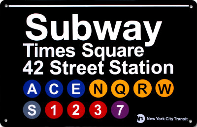
All the lines are bi-directional, running towards uptown and downtown. There are local lines which stop at every station, and there are express lines that make stops at fewer stations. Most lines, except a few, run 24 hours with higher frequency on weekdays.
NAVIGATION AND TECHNOLOGY
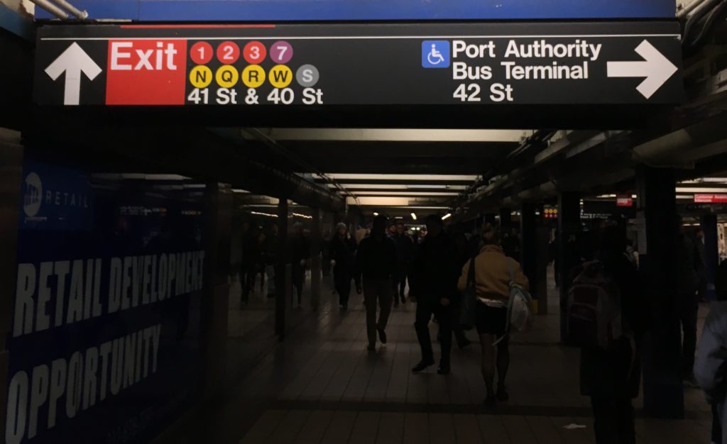
The Subway system has a very well designed way-finding system which poses hardly any challenge to its users. It uses consistent visual language, universally accepted icons, and smart placement to make navigation through the enormous space easy. All signages are on non-reflective black surfaces with white legible sans serif text. The signages mark uptown and downtown trains with their specific icon. Use of icons and text together reinforces information, the “S” with “Shuttle” for instance. While the train icons are invariably placed on the right of the text, icons for ramps and wheelchairs go consistently on the left.
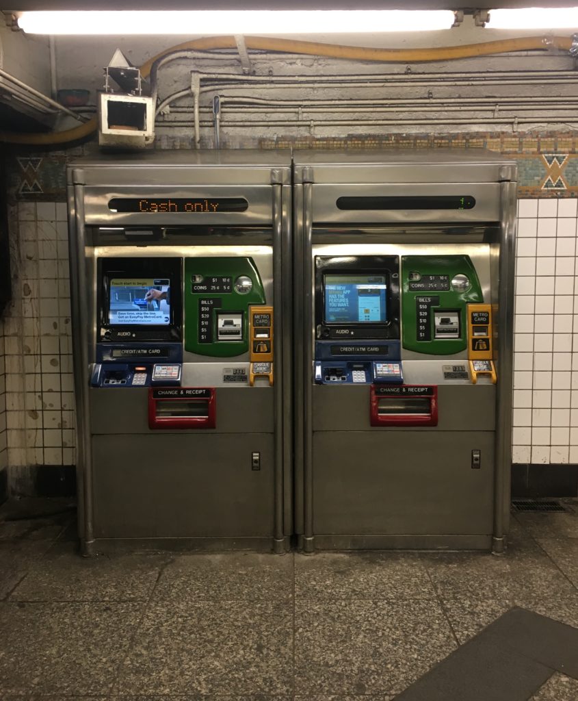
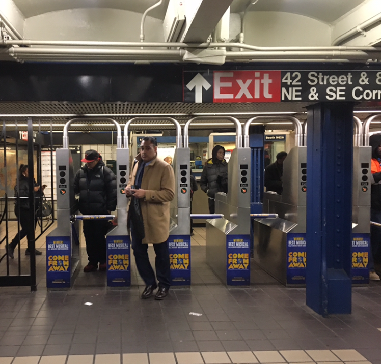
A user’s initial point of contact with the Subway system’s technology is at the entrance where he finds a Metrocard vending machine. The machine accepts cash, debit or credit cards and is effortless with touch screen and comprehensible instructions. The system is quick and economical with $1 for the Metrocard itself, and preset values that the user can choose from to put charge on the card. Moving further the commuter enters the station through turnstiles which use a card reading technology.
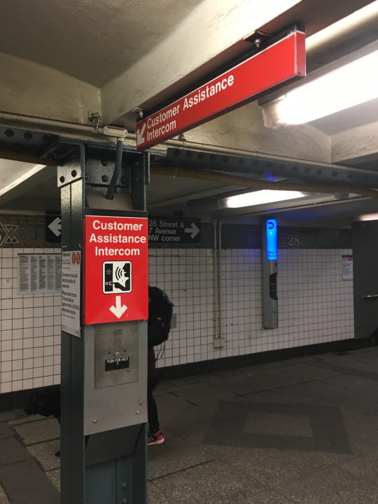
Throughout the Subway premises Customer Assistance Intercoms and Emergency Intercoms are easily accessible. The smart positioning of speakers allow system announcements to be audible all over, without any hindrance from the commotion. The station has Subway maps at frequent spots and Neighbourhood maps and entrances/exits.
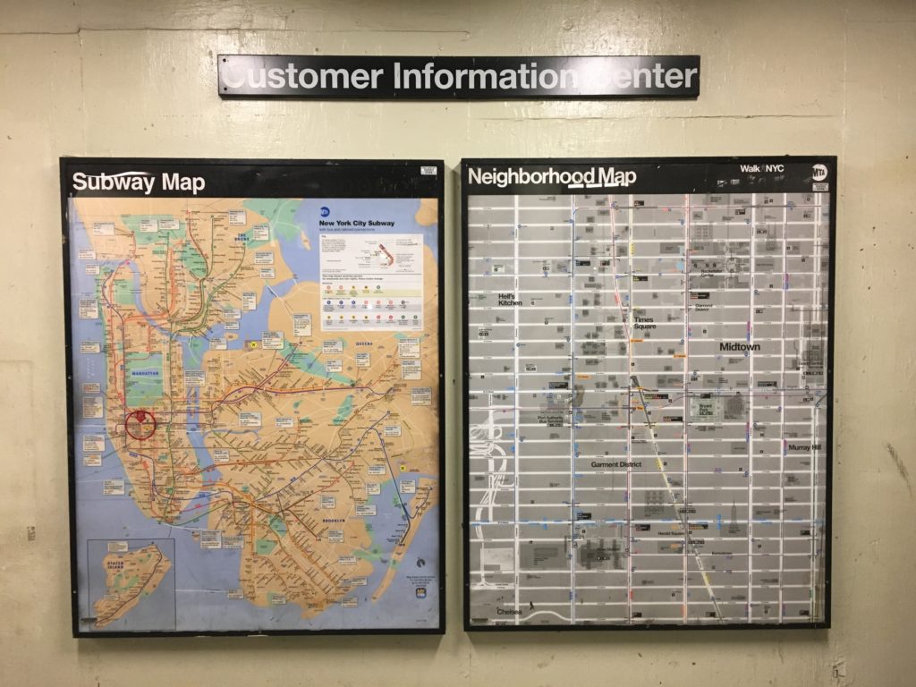
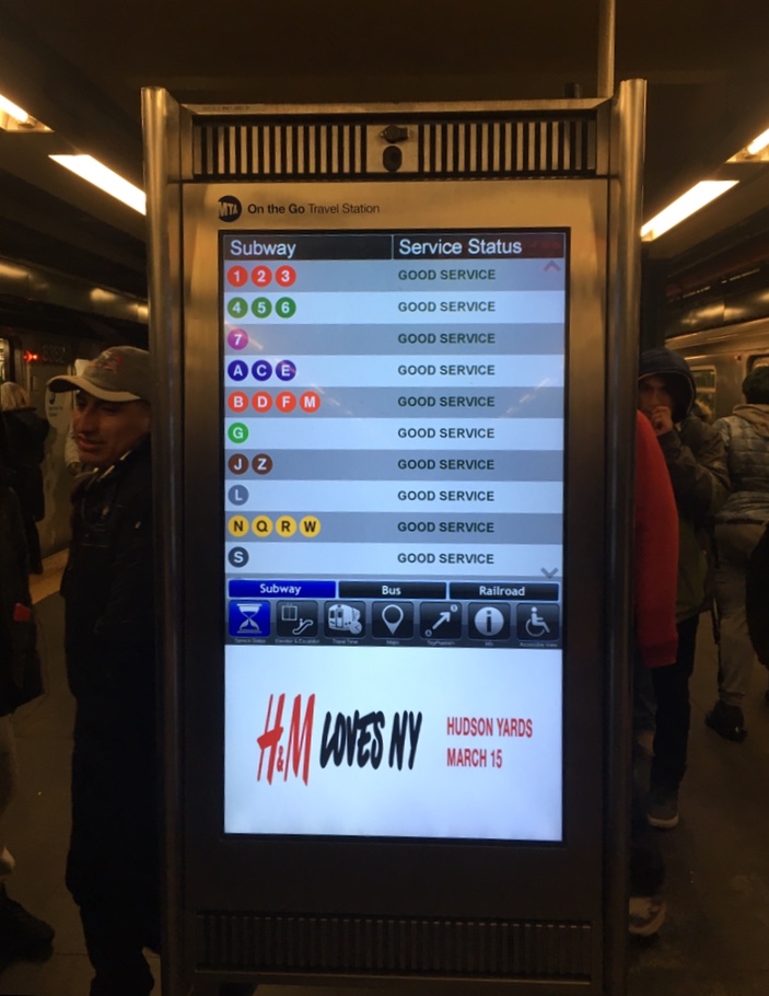
Moreover, a recent addition of interactive touchscreens has augmented navigation. These all-in-one customer information devices allow one to select a destination station, in response to which the screens display possible routes with time estimates. Aside from information on train schedules these screens also offer recommendations for points of interest at select locations, information about escalators and elevators, outages and train delays, or if planned work is coming up. However, commuters don’t seem to use this technology as often.
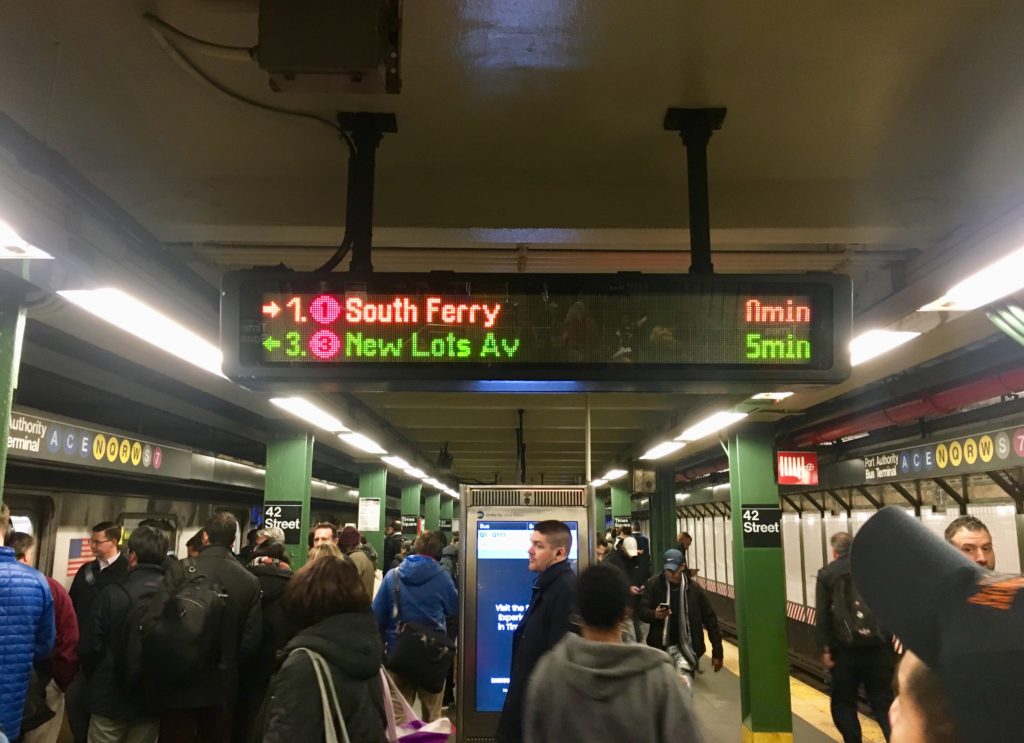
All platforms have digital screens displaying ETA for their respective trains.
There are multiple apps designed specifically to aid Subway navigation, for example MTA Subway Time.
The 42nd Street Station, as all Subway stations, has several entry/exit points spanning across surrounding blocks with supplemental northwest, southwest, northeast and southeast corners, marked “NW”, “SW”, “NE” and “SE” respectively. There are two underground passageways to PABT allowing easy transfer to interstate buses.
CONVENIENCE AND EXPERIENCE
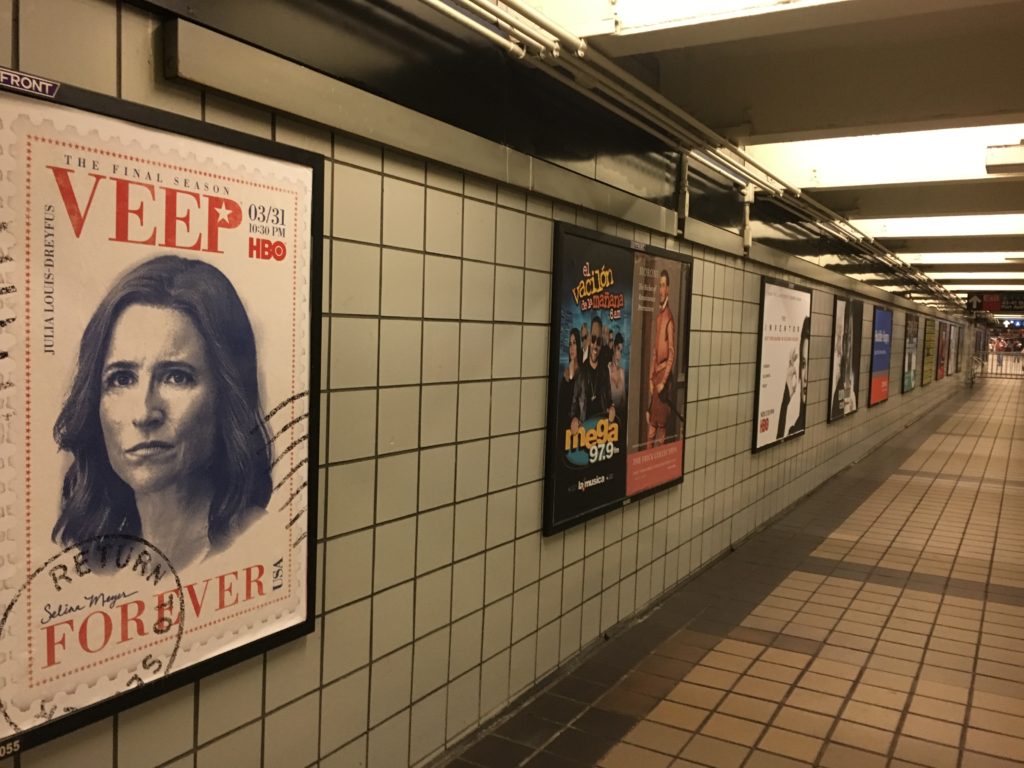
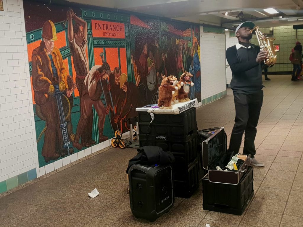
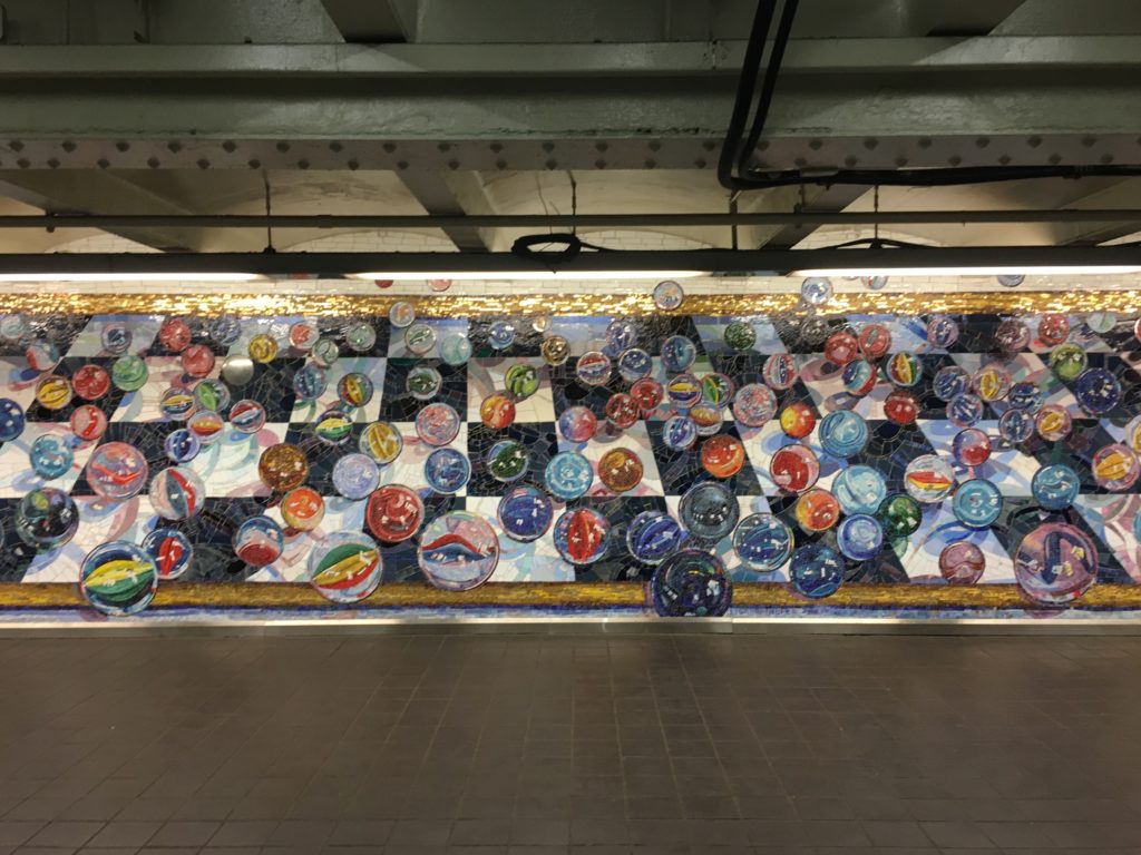
ATMs, convenience stores and trashcans are easy to locate. The subway is safe, and well monitored by surveillance cameras and police. Several posters advertising tv shows, web series and brands among other things, offer a sense of familiarity and make the experience less daunting. Also serving the same purpose are the artworks on the walls. Musical performances are a regular affair at the station, which also becomes a platform for artists to showcase and sell art. This makes the Subways less monotonous and more entertaining. Yellow strips at the edge of the platforms mark a safe distance from the rail tracks. These strips are embossed to prevent slipping. A set of benches are placed at the platforms for senior citizens and physically challenged.
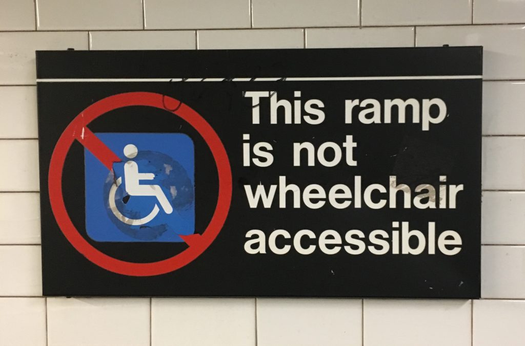
An attempt to incorporate inclusive design has been made through the use of braille, ramps and elevators, but it fails to be efficient.
ON THE TRAIN
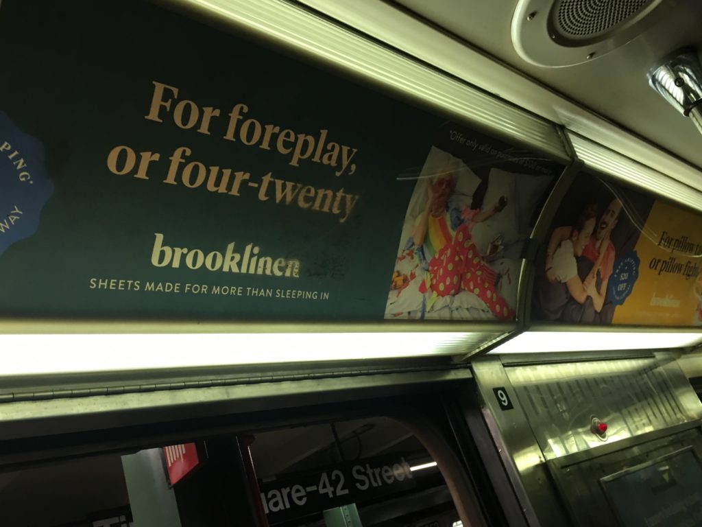
Every train’s icon, number/alphabet and route is visible on it. Red bulbs light up on both sides of the automatic doors when they are open. Many advertising posters on the insides of the trains offer comfort and interaction. There are poles and railings for standing commuters to hold onto. Newer trains have digital display of the trains route with current and next station highlighted, but the old trains only have a poster of the trains’ routes. To complement this, system announcements alert the passengers of the upcoming and current stations. There is priority seating for disabled and senior passengers. Clear instructions for events of emergency are displayed with assistance intercoms and emergency brakes.
OBSTACLES AND SUGGESTIONS
The Subway system is extremely well planned and functional, and given its technological structure manned stations are barely needed. Although, a considerable number of users are not tech-savvy. There is a lost and found unit, but without relevant assistance chances of items being turned in are slim. There could be a dedicated station for a personnel within the premises for further help. Nonetheless, NYC Subway system is an exemplary public space design with minimum room for errors.
References: