Activity Theory in Young Users of Digital Technology: an observation of the iGeneration

Introduction

A field study observing the digital interaction of young users was conducted on a second-generation, three-year-old boy of Afro-Indo Caribbean descent. The observation was conducted in the observer’s home.

The purpose of the study was to better understand the intuitive use of young children. How do they know to navigate and interact with features as they do? How do they learn these behaviors in unsupervised environments? How are their behaviors reinforced and applied across devices?

Many of these questions were a result of the above curiosities and a desire to better understand the cognitive processes at play as noted by Kuhlthau:

“A model representing the user’s sense-making process of information seeking ought to incorporate three realms of activity: physical, actual actions taken; affective, feelings experienced; and cognitive, thoughts concerning both process and content. A person moves from the initial state of information need to the goal state of resolution by a series of choices made through a complex interplay within these three realms (MacMullin & Taylor, 1984). The criteria for making these choices are influenced as much by environmental constraints, such as prior experience, knowledge, and interest, information available, requirements of the problem, and time allotted for resolution, as by the relevancy of the content of the information retrieved” (p. 362).

The structure of this field report was a combination of interview and observation. The purpose structure was due primarily to the subject’s age.

Disclosure

The subject of the observation is the observer’s nephew. Alluded to below, one of the many reasons why this observation was informally conducted was due to general curiosity. This initial curiosity began when noticing the subject’s use of mobile devices but, most recently, when he began sending nonsensical messages. The messages were initially thought to have been a prank by the subject’s mother but upon further inquiry, and frequent occurrences, the messages were a combination of drawn shapes or autocompleted phrases that were illogically constructed.
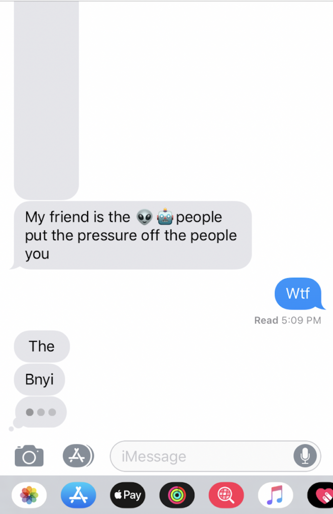
Screenshot of chat messages sent between the subject and the study's author.

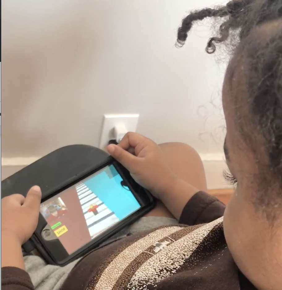
Observations within the scope of this study included 1) how interaction changed or remained the same across an iPhone and iPad 2) interaction with specific features and implicit restrictions imposed on the user (e.g., inability to read or write).

“Motivation for doing the work”

According to “The Ethics of Fieldwork” by PERCS: The Program for Ethnographic Research and Community Studies – Elon University, listing motivations for conducting such studies better align the researcher with the outcome of the intended study and the benefits to the research field as a whole.

For many reasons, this study was not formally conducted. However, there are two reasons worth noting within the scope of this report. The first reason is due to the little experience the observer possessed in field studies containing child subjects. Leveraging practices from the readings within the study resulted in applying generalized techniques and procedures intended for adult subjects to a child subject.

Outlined later in greater detail, this posed many issues as one would expect the application of techniques and procedures reapplied in very different circumstances. However, motivation for pursuing this study prompted an attempt and a review of not only this study but also the review of unique requirements for child subjects. Hence, the second reason why the observation was not formally conducted: to better understand at what scale technology impacts early childhood development.

Possible Harms: skewed results due to the misuse of techniques and procedures.

Possible Benefits: generated interest to pursue, rectify, and advance this study.

Techniques

General tasks were assigned:

  1. Interact with a mobile feature
  2. Find and watch your favorite YouTube video
  3. Play an educational game
  4. Play a non-educational game
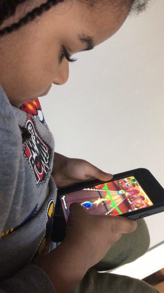
Subject playing the mobile app game "Grom Skate" on an iPhone.

As the subject worked through each task, some intervention and rewarding were required. Having known the subject, the tasks created were short in length–sufficient enough for possible naps or breaks–and the entire observation spanned across several hours. Snacks were rewarded for good behavior and for completing a task without interruption.

After completing the above tasks, the subject was closely observed to document any behavior which didn’t occur while completing those tasks.

Questions and notes from the observation

  • Activity Theory: in-practice
    • How would his actions change if the technology changed as Nardi claims, “Activity theory holds that the constituents of activity are not fixed but can dynamically change as conditions change” (p.38)?
  • Attention span: what does his actions say about the effect of technology on youth users’ ability to focus?
    • Never completes viewing of videos and tends to navigate to either the search bar or another video within 30 seconds to 2 minutes of viewing.
    • Viewing videos of greater interest last longer than 2 minutes but are never fully completed.
    • When a task was issued, the subject wanted to continue on longer for all tasks but the educational game. For the educational game, the user became frustrated unless there was sufficient guided intervention.
    • Voyeurism and the gaming culture: the subject’s attention was only kept when watching YouTube videos of others playing videos games or playing with toys.
  • Distributed Cognition (Nardi, p. 38): pattern recognition?
    • Participant cannot read nor sufficiently write. However, he is able to search YouTube videos he’s previously watched but is unable to search newly watched videos. To return to new videos, he taps the arrow icon to return to the video.
    • How he searches is by typing in the first few letters he remembers from the videos he’s views frequently. For retained previous search results, he reviews the list and selects which is most recognizable. He watches and then returns to the search bar if the video isn’t what he wanted. If the video is what he was looking for, he scrolls to the recommended videos to find new content and selects those items or searches content from the same channel of the video he’s currently viewing.
  • Signifiers and affordances
    • Participant understood the significance of the hamburger menu, toggles, touchscreen interface features such as swiping, device volume control and locking mechanisms, and other navigational signifiers such as the back/forward and up/down arrows.
  • Interaction
    • iPhone and iPad
      • YouTube and either a mobile app/feature.
    • No major differences in interaction other than the subject’s level of comfort and which device he preferred to use when.
      • The iPhone was generally used when sitting up.
      • The iPad was generally used when laid back.
  • Intervention
    • The study would be better conducted in a more controlled environment/location, without the mother nearby and by an individual with a balanced relationship.
    • Observer’s relationship with the subject was unbalanced. This required swapping between the mother as an instructor to guide him through exercises.
      • With the mother, the subject was at ease and felt less intimidated by the instructions and how they needed to be carried out.
      • The subject preferred guided instructions as opposed to unguided instructions. While guided instructions were more successful with the observer, they weren’t as successful as with the mother.
      • The subject enjoyed general instructions with sufficient freedom to navigate and course-correct by intuition than delegated navigational instructions.

Conclusion

The above study would do well with well-controlled environment, an unrelated observer with sufficient trust, and a well-vetted plan of tasks.

Additionally, prior to an observation containing child subjects, it would be helpful to know positive and negative triggers, learn what they like and what they dislike, review popular content for that age group and test the level of interest on the subjects, provide ideal rewards for completed tasks, and create a balance reward system.

Overall, this observation did provide an opportunity to analyze the subject’s behavior more closely and to develop a thoughtful hypothesis. Nardi explains that “activity theory recognizes that changing conditions can realign the constituents of an activity” (p. 38).

My original assumption that technology results in specific behaviors in young users has shifted to a hypothesis which accounts for the bidirectional relationship between any user and technology: technology reinforces or redistributes behaviors in young users which may predict their usage of other technologies and platforms, and related social behaviors.

References:

Kuhlthau, Carol C. “Inside the Search Process: Information Seeking from the User’s Perspective”, “Journal of the American Society for Information Science 42(5): 361–371. https://ils.unc.edu/courses/2014_fall/inls151_003/Readings/Kuhlthau_Inside_Search_Process_1991.pdf

McGrath Joseph E. “Methodology matters: doing research in the behavioral and social sciences”. https://lms.pratt.edu/pluginfile.php/876402/mod_resource/content/0/mcgrath-methodology%20matters.pdf

Nardi, Bonnie A. “Studying Context: A Comparison of Activity Theory, Situated Action Models, and Distributed Cognition”. https://lms.pratt.edu/pluginfile.php/876415/mod_resource/content/1/nardi-ch4.pdf

PERCS: The Program for Ethnographic Research & Community Studies, “The ethics of fieldwork”. Elon University. http://www.elon.edu/docs/e-web/org/ percs/EthicsModuleforWeb.pdf

Wilson, T. D. (2000). “Human information behavior.” Informing Science 3(2): 49–56. https://www.ischool.utexas.edu/~i385e/readings/Wilson.pdf

I spent an hour observing the Glossier flagship store as an information space.

I’ll be honest, for a long time I thought the millennial-favorite cosmetic brand Glossier’s flagship in NYC was invite-only. I’d seen the NYC showroom’s pale pink, the enticingly instagramable interior on the feeds of Instagram influencers. It was so lavish in comparison to a Sephora or Ulta; I didn’t think they’d let the public pour in. This changed once I saw the now ubiquitous plastic pink bag and bubble-wrapped pouches in the hands of the masses on the 4 train. My manufactured mystique around the showroom’s accessibility made Glossier a perfect information environment subject to observe.

Putting an ecommerce gloss on retail

Glossier’s part of a new class of neoliberal disruptors in the retail space for women. They use a social-conscious capitalist model: A body-positive, female empowerment brand that turns buying cosmetics into an act of resisting the patriarchy. Glossier’s picture-perfect showroom is an information environment similar to other retail brands that started as direct-to-consumer companies with NYC flagships, like Casper or Away. Their idea is to bring their recreate their beloved e-commerce experience in person.

An empty flagship via WWD.com

Once the doorman swings open the door on Lafayette street, you’re confronted with a pink-velvet cavernous staircase (I had to inquire about wheelchair accessibility, as an alternative to the stairs was not easily discoverable) that leads to a large, open-concept space with mirror-lined walls and more shades of pink decor. The crowd was large and surprisingly young. Mobs of girls no older than 14 painting their faces in such a plush setting; like a child trying on lipstick in mom’s bathroom.

Mascara as information

At Glossier, the information, or products, are extremely inviting. Unlike Sephora where the products are in high display cases at an angle, Glossier’s information lays flat on low-lying tables. The many tables have ridges that signify they can be picked up, and where to place them after. Also on the table are testing materials that make the products try-able for the masses. Cups filled with bite-size mascara wands, eyeshadow brushes, and eyeliner sticks are key signifiers that green-light trying the information. The products on the tables themselves are missing their application tools so the users must use a sample-size wand or brush to access the product. In other makeup stores like Sephora, or even the counter at Saks, I’ve never seen a testing product manipulated it such a way. Wouldn’t the users want to see the product in its entirety before using? Isn’t setting out the disposable application tools clear enough? Apparently, it’s not clear and can be a real hygienic concern. Glossier’s limited product testing design method is more user-centric than I thought.

Get in the groove: Try the products at Glossier

In the “wet room”, users can test the products with one of the many sinks that line the walls. When I took a peek, no one was full-on washing their face. A couple of giggling girls were taking a picture of the moisturizer. I asked an employee, Glossier’s information intermediaries, and she said people are a little tentative to lather up in-store. However, once someone takes the plunge, others follow. I’m familiar with this herding mentality from the behavioral economics book Nudge. This was a clear indication that within information environments, social norms can often serve as a barrier to access.

Cosmetic tech

Glossier information intermediary with iPad

Once you find a product you like, purchasing requires face-to-face contact with one of the intermediaries. Glossier is set-up like Apple’s genius bar, except the geniuses holding iPads specialize in makeup and skincare and adorn baby pink jumpsuits. The pink intermediaries are extremely friendly, but don’t overstep; I observed most of them smiling along the outer rim of the floor. Users went to them only when needed, dissimilar to the constant “can I help you find anything” at other retail spaces.

Glossier’s checkout system reminds me of a gas station in New Jersey; You can really do it yourself, but they won’t let you. A Glossier employee will scan your products with the iPad and then have you enter in all your information. On the interface, it has a place to enter a promo code, but I heard an employee tell the users they had to purchase the items online if they wanted to use the promo code. They could still pick up their products today, but downstairs where the other online pick-up orders are sent. I’m sure there’s a technological back-end reason for this promo process, but why include the promo line in the in-person checkout, to begin with?

Conveyor belt via Yelp

An info show

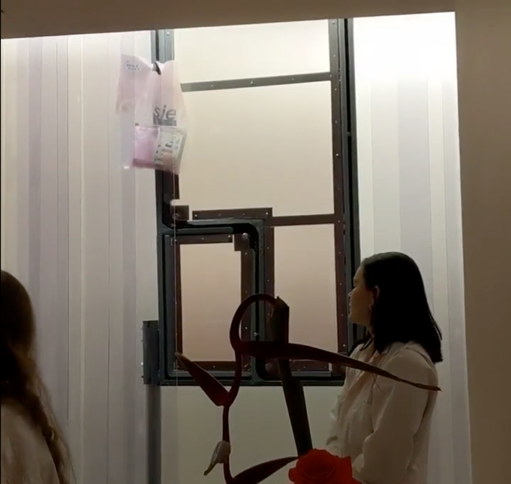
Once you’ve purchased your products with Apple technology in the hands of an intermediary, the pick-up process becomes kind of clunky. You’re told to wait in the waiting room, where there are more jumpsuit-fitted employees behind a counter with a vertical conveyor belt on the wall. A horde of people is anxiously awaiting one of the pink jumpsuits to grab their pink bag from the conveyor belt and call out their name. After witnessing the iPad and conveyor belt, it seemed so odd their process of delivery was to scream a name out, instead of implementing an arrival screen, like at an Airport. The employee had to continual repeat names, and to be completely honest, did not seem thrilled about it. The conveyor belt was a slow process and visually interesting. However, I wasn’t able to capture my own video as one of the intermediaries shouted “no photos.” I had to wonder if employee agency conflicts with the designed space; I just don’t see another reason for the expensive conveyor belt display but for social media fodder.

While there are some design hiccups, I think Glossier did a fair job of turning their seamless ecommence interface into a IRL retail space. I didn’t originally view the information environment as accessible, so upon entry, I was pleasantly surprised by the user-centric design.

References:

Buckland, M. (1991). Information as Thing. Journal of the American Society for Information Science. Jun1991, Vol. 42 Issue 5, p351-360. 10p.

Norman, D. A. (1990). The design of everyday things. New York: Doubleday. 

Thaler, Richard H.,Sunstein, Cass R. (2008) Nudge :improving decisions about health, wealth, and happiness New Haven : Yale University Press,

Preserving our Digital Afterlives

This morning, as I was scrolling through Instagram, I came across an interesting post by Oroma Elewa, a Nigerian-born visual and performance artist, writer and director. Under the Instagram post, Elewa captioned “Please make this go viral. Don’t love and follow me secretly. Show me you care. Do not let me be erased. This is very painful.” Elewa was addressing a viral quote she had originated in 2014 on her personal Tumblr that has been repeatedly falsely misattributed to Frida Kahlo since 2015: “I am my own muse. The subject I know best. The subject I want to better.” If you Google that quote, you’ll find hundreds of images, articles, products, and social media posts attributing it to Frida Kahlo. In the comment section, people who followed Elewa through her journey as an artist on social media, supported her while others were skeptical. Frida Kahlo, an iconic artist and figure in popular culture and an inspiration to all women of many different backgrounds, didn’t say those words–but, who would believe that Elewa originated the quote?

As a young rising artist, Elewa was inspired by Frida Kahlo’s actual words: “I paint self-portraits because I am so often alone, because I am the person I know best.” Although this is an issue of the spread of misinformation and the blurred lines of ownership and authenticity in the online world, Elewa’s fear of erasure brought to mind Michele Valerie Cloonan’s concept of the paradox of preservation and the transient or ever-changing manner of one’s digital remains. Cloonan wrote that “it is impossible to keep things the same forever. To conserve, preserve, or restore is to alter” (235). Frida Kahlo is not alive to disprove that she ever said Elewa’s quote. With endless digital copies of her image being attached to the quote, how can we manage to support Elewa’s claim? How can Elewa make sure her work lives on without the fear of being erased, silenced or altered in the digital world? And most importantly, how can we protect and preserve our digital afterlives?

The Digital Afterlives Symposium was held at Bard Graduate Center in honor of Professor David Jaffee who was the head of New Media Research. Prof. Jaffee was instrumental in introducing and creating a new direction for the Digital Media Lab at BGC. After his death, not only was his legacy as a leading historian missed, but he also left behind a plethora of files and media pertaining to his personal and professional projects throughout his life. The topic of the symposium came about while his late daughter and a few of his colleagues started a project to archive and preserve Jaffee’s work. This endeavor has led to the exploration of finding innovative ways to protect, prolong and preserve our digital afterlives and the impact technology has on the sustainability of our digital projects as well as the privacy and accessibility of our personal information.

Technology has become an extension of our physical world. As we increasingly develop and interact with technologies, we end up with a constant re-experiencing of the past. At the symposium, Abby Smith Rumsey, an independent scholar, spoke about her research paper on how memory creates identity and how humans create artificial memory through the use of digital technology. Our transformation from an analog to a digital environment has made us reliant on digital technologies to preserve memory and be reminded of the past. And there is a moral weight of dealing with a person’s memory, especially if the person can be immortalized in the digital world. In her presentation called, “Death, Disrupted,” Tamara Kneese spoke on the proliferation of “dead users” in the online world, particularly in social media. Social media is so embedded into our lives that it has become a space for ritualized mourning, memorialization and perhaps immortalization as personal profiles transform into actual shrines after users’ deaths.

But, not everything lasts forever in the digital world. Rosenzweig pointed out that the “life expectancy of digital media [can] be as little as 10 years, [and even so] very few hardware platforms and software programs last that long” (742). Platforms will eventually disappear over time. MySpace, Orkut, Friendster and OpenDiary are all remnants of the old digital environment. Inevitably, we have to address the issue of digital decay. In her presentation at the symposium, Robin Davis, an Emerging Technologies and Online Learning Librarian at John Jay College of Criminal Justice, proved the fragility of the digital world through her case study on the lifespans of digital humanities scholarship projects that were created in 2005. She found that only half of the 60 DH projects she studied were accessible online 10 years later. In some cases, she found that other projects had a shelf life of 5 years due to issues with hosting and the lack of funding while a couple of web projects were even taken over by fraudulent companies. Davis reiterated that digital scholars need to build a preservation plan into their projects and consider the longevity of their choice to create content for the web.

So, ultimately, our digital remains will disappear, but can individuals maintain and manage their own digital data in the hopes of living on as information after death? Is it possible to save everything? Rosenzweig wrote about “the fragility and promiscuity of digital data,” which requires yet more rethinking–about whether we should be trying to save everything…” (739). The debate over whether it is worthy or not to preserve everything was also discussed at the symposium. Overall, all of the speakers agreed that we do not have the proper tools or policies in place to be able to. And also that it is important to preserve more ephemeral data now in order to understand its significance in the future.  

According to Cloonan, “preservation must be a way of seeing and thinking about the world, and it must be a set of actions…[it] also has broader social dimensions, and any discussion of preservation must be include consideration of its cultural aspects” (232). Like Cloonan, Rumsey said that the primary issues of digital technology preservation are not just technical but are in light of larger political, economic, and education issues of our world. Companies like Amazon, Google, and Facebook and libraries as well as government agencies need to put more effort into creating preservation programs. They also do not have the right capacity or policies of dealing with the ramifications of digital remains. If Verizon Media, the owner of Tumblr, were to step up and protect Elewa’s words from being misquoted as Kahlo’s, would it have stopped the proliferation of companies and individuals attributing the quote to Kahlo?

At the end of the discussion, Rumsey left us with a parting message–it is important for us to remember that there are people behind these machines or technologies. People program and create software and applications so that machines behave in a particular way, so it is only up to us to change how we use and think of digital technology. Technologies have no built in moral bias other than what we program them to be, but it is has become an expansion of who we are. The material and digital world are a connected space now. Therefore, we must take responsibility over our digitized selves.

References

Cloonan, Michele Valerie. “W(H)ITHER Preservation?” The Library Quarterly, vol. 71, no. 2, 2001, pp. 231-242. The University of Chicago Press, www.jstor.org/stable/4309597

Elewa, Oroma. “Elewa’s quote.” Instagram, 18 Mar. 2019,

https://www.instagram.com/p/BvG_v1YDnGT/.

Rosenzweig, Roy. “Scarcity or Abundance? Preserving the Past in a Digital Era.” The American Historical Review, vol. 108, no. 3, 2003, pp. 735-762. Oxford University Press, www.jstor.org/stable/10.1086/52956