Blog Post 1: Person, Place, Thing

by Jay Rosen

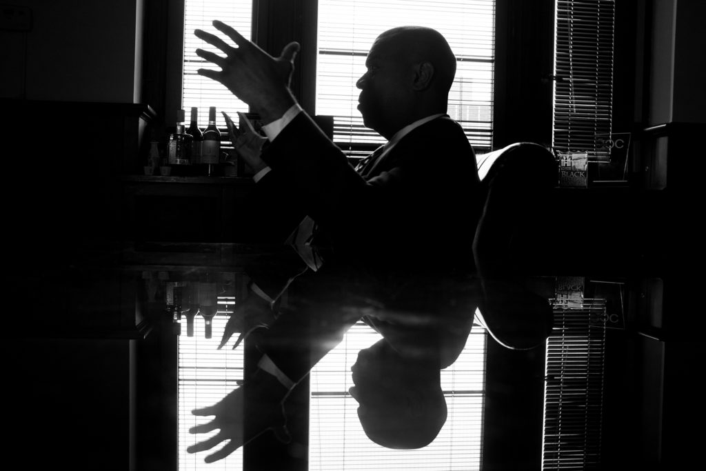
I recently spoke with Jennifer Gellmann, Assistant Division Manager of the Society, Sciences, and Technology (SST) division at Brooklyn Public Library’s (BPL) Central Library. Given my interest in adult services and reference librarianship, I was eager to learn about Jennifer’s work and the day-to-day challenges and rewards of her job.

Jennifer began by giving me a brief overview of SST’s scope and collections, and explaining its relationship to the greater Adult Services department at Central Library. SST is staffed by 8-full time “Adult Librarians,” and has a large and diverse physical collection with books on philosophy, psychology, social sciences, science, technology, and industry. SST also has digital collections, special collections containing government publications and legal documents, and a small reference collection.

SST is but one of four divisions making up the Adult Services department at Central Library. Other divisions include “Languages & Literature,” “History, Biography, & Religion,” and “Art & Music.” Related adult-centered divisions include BPL’s Business and Career Center, which offers services for jobseekers and small businesses, the Information Commons, which delivers technology-related programs and services in lieu of a physical collection, and the Brooklyn Collection, a local history archive. BPL’s Central Library is also home to an Adult Learning Center, which provides ESOL classes, test prep, and related educational services to adults. In Jennifer’s view, the various divisions and distinctions among adult service oriented departments are “unnecessarily complicated” and a vestige of prior administrations. For the most part, these departments stand alone, with little inter-departmental communication and collaboration (more on this later).

Jennifer described her role as involving a combination of supervisory, administrative, and public facing duties, with the ratio among these tasks varying depending on particular staffing and library needs. However, she did emphasize that public service is the most significant aspect of her job and the work of her department more generally, with all other responsibilities following from this priority.

Public service duties in SST include working at its reference desk and contributing to virtual chat and email reference services. When I asked about the typical information needs of her patrons, Jennifer told me the “vast majority” of patrons visiting SST are looking for a book on a particular topic. She pushed back on the notion of print being less important in today’s digitally connected age, despite circulation statistics dropping slightly each year.

For the most part, SST is able to successfully meet patron requests, but Jennifer did mention a couple of common issues her department runs into. For one, certain popular books are always in demand to an extent that BPL can’t accommodate. This means patrons often have to place holds and wait several weeks to get materials they need. SST also receives occasional requests for textbooks, but does not purchase them for their collection; as a result, they have to refer patrons to local universities and academic libraries. Despite having one of Central Library’s most expansive physical collections, “you can’t make everybody happy.”

Contrary to many branch libraries that serve fairly defined and specific local communities, Jennifer explained that Central Library serves people from all over Brooklyn. As a result, SST does not serve any one particular demographic. Jennifer emphasized that her work experience varies from branch library service in a couple important ways. For one, there is a great deal of segmentation between different departments at Central Library, with many patrons never stepping foot in the SST division. Because of this, Jennifer’s staff is less familiar with their information needs, which is usually more apparent in smaller branch libraries. In addition, Jennifer explained that branch library staff tend to “wear a lot of hats”, whereas staff at Central Library by and large have a narrower set of responsibilities.

Jennifer was refreshingly honest when describing the challenges of her work. In her view, SST’s primary public service challenge is dealing with the anger and confusion of patrons with undiagnosed and untreated mental illness. “It’s a problem no one has really solved yet,” she told me. Though her staff takes a patient and tolerant approach in these moments, and does their best to regard every request as legitimate, “there’s only so much we can do.” And while SST staff occasionally refers homeless patrons to local service agencies, they choose not to refer mentally ill patrons due to their lack of expertise with mental health issues. Interestingly, BPL hired a full-time social worker a few years ago to help respond to this need, but are currently without one. Until a new social worker is hired, Jennifer and her staff will continue to be seen by some patrons as “de facto social workers,” without the necessary training, expertise, or support. From what I have heard, this appears to be a major unsolved problem for many public-facing library staff around the country.

In further describing the challenges of her job, Jennifer highlighted a general lack of communication between higher administration and the rest of BPL’s staff. I witnessed the same dynamic firsthand during my time at Cleveland Heights Public Library system, and in Jennifer’s opinion this problem plagues most other larger library systems. Though I’m sure it’s easier said than done, I find it both strange and deeply ironic that institutions built to efficiently organize and distribute information suffer from such poor inter-departmental communication.  

Jennifer also acknowledged the difficulties of finding and retaining good staff on a limited budget. As she put it, “it’s hard to make a life and have a family in New York City on a particular salary level.” This unfortunate fact this has led to a sharp distinction between “lifers” (Jennifer’s term)— those Jennifer’s age and older who have worked in libraries for decades and live with relative financial stability — and younger staff who are unable or unwilling to commit to the field indefinitely for financial reasons.

Though very frank about the challenges of her position, Jennifer expressed a very clear enthusiasm for her work. She described the main benefits of her job as providing good public service and helping people locate materials that are meaningful to them. Jennifer also expressed contentment with working in “middle management,” citing the mix of public service, committee participation, and administrative roles inherent to her work, as well as the increased “headaches” that seem to come as one moves higher up in library administration.

Significantly, Jennifer told me that the information needs of her patrons have remained relatively stable over time, with the main change being a gradual decline in “reference ready” questions. Erik Bobilin, an Adult Librarian at SST I briefly spoke with, spoke to a more general decline in reference transactions in his experience, likely due to the ease of independently using information technologies. However, both Jennifer and Erik claimed that their division still regularly receives open-ended and more involved research-related reference questions.

When I asked Jennifer what qualities she thinks are needed to succeed in adult services, she emphasized soft skills, including communication skills, the ability to work with a wide range of people, a willingness to answer a variety of different questions, and, above all, patience. This last quality is so important “because the patron doesn’t always know what they want,” and so public-facing staff may need to spend significant time interviewing a patron before unearthing their ultimate question. 
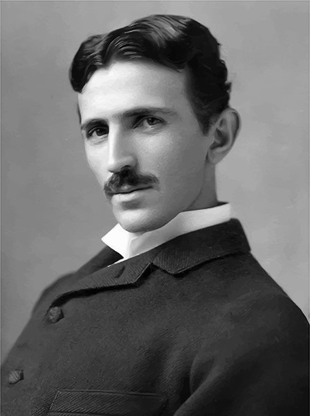
Nikola Tesla, Wardenclyffe & The Wireless World System

In his lifetime, Nikola Tesla was overshadowed, and even undermined, by his peers in the field we now refer to as STEM. His creations and theories, however, have endured beyond the twentieth century to significantly influence our modern methods of telecommunication, while his legacy of sensational experiments has come to epitomize what it means to be an innovator in the minds of many around the world. Through his ingenuity, and mastery of the alternating current, Tesla was crucial to ushering in the age of electricity. His advances in power transmission revolutionized the public’s accessibility to energy, light and heat, and paved the way for a host of life-altering conveniences we now take for granted.

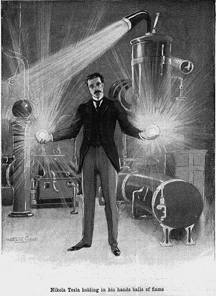
Though he recognized the significance of his work, and the great technological strides he was making, Tesla never became complacent in his achievements. His AC motors fed into the development of the powerful Tesla coils, which in turn were the catalyst for his breakthroughs in artificial illumination and X-rays. Those experiments would then spurn him on to his loftiest of aspirations: the wireless transmission of information and power.

While this grand goal ultimately eluded Tesla, his total body of work and overall vision of technological progress is remarkable nonetheless. In the same vein as Jules Verne in the generation before him, and George Orwell in the generation after, Nikola Tesla possessed such a prescient mind that he seemed to know the future. To theorize, and nearly implement, a global wireless network over 100 years ago is an astounding feat, and leaves little wonder as to why so many people have been captivated by his accomplishments.

The Future is Now

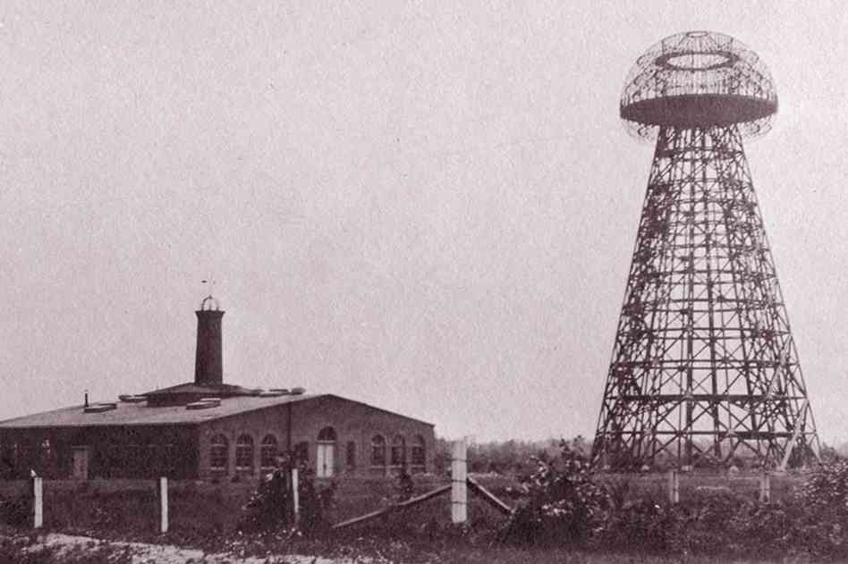
It should come as no surprise that scientific endeavors tend to take place in a laboratory, but what is not as well-known is the fact that Tesla’s sole surviving facility is here in New York. Erected near the Atlantic Ocean because of the proximity to England for transmission tests, Wardenclyffe was designed by prominent architect Stanford White (who is also responsible for the Washington Square Arch) and financed by banker J.P. Morgan. Situated 50 miles East of Manhattan, the brick structure was completed in the early years of the twentieth century.

Wardenclyffe Laboratory located on Long Island, in Shoreham, New York

The Tower at Wardenclyffe was a literal apex of Tesla’s imagination and engineering prowess. Though he had achieved success and numerous patents addressing radio wave transmissions, he was not satisfied with mere wireless communication, and became increasingly focused on developing a means of relaying usable electrical power through the atmosphere. This obsession of sorts unfortunately led to Tesla’s professional downfall. Instead of continuing his progress on telecommunications, his affinity for wireless power caused funding to dry up and in only a few short years the laboratory and tower were vacated.

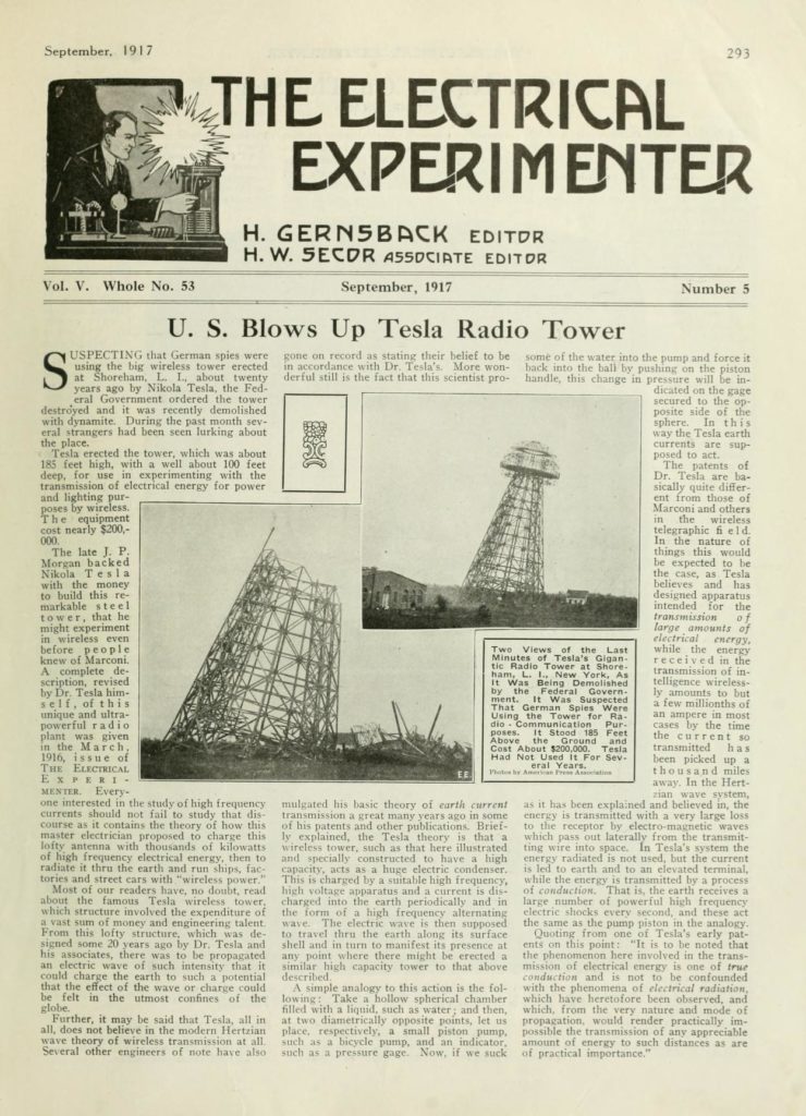
The Tower was destroyed in 1917 under suspicion of involvement in espionage

Though Wardenclyffe was abandoned and neglected for much of the previous century, it has been given a second life as the Tesla Science Center in recent years, and the site earned entry into the National Register of Historic Places in 2018. As a not-for-profit organization, the Center’s mission is to serve as both a museum and practical teaching environment. By preserving the laboratory and legacy of Nikola Tesla, while also hosting local scholastic physics competitions, guest lecturers and community events, the Center honors the historical contributions of its namesake as it strives to enrich the education and development of future generations.

The Tesla Science Center at Wardenclyffe hosts its Inaugural Gala in 2019

Wireless World System

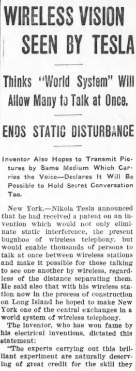
“As soon as completed, it will be possible for a business man in New York to dictate instructions, and have them instantly appear in type at his office in London or elsewhere. He will be able to call up, from his desk, and talk to any telephone subscriber on the globe, without any change whatever in the existing equipment. An inexpensive instrument, not bigger than a watch, will enable its bearer to hear anywhere, on sea or land, music or song, the speech of a political leader, the address of an eminent man of science, or the sermon of an eloquent clergyman, delivered in some other place, however distant. In the same manner any picture, character, drawing or print can be transferred from one to another place. Millions of such instruments can be operated from but one plant of this kind.”

– Nikola Tesla c. 1901

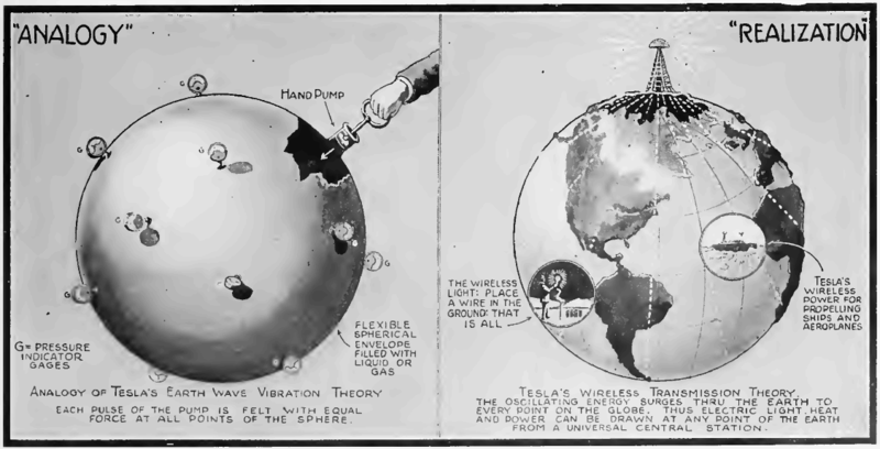
Believing he could tap into the resonant frequencies and conductivity of the Earth itself, Tesla envisioned a system which could relay energy in a myriad of forms around the globe using highly elevated transmission and reception towers. This “cloud” of wireless signals could serve as the conduit for text, images, audio, video and even electrical power for motors or light bulbs, according to his theories. While the funding and feasibility of putting such a network into practice did not materialize before his death in 1943, unfettered access to data and reliable energy is a brass ring we still have not completely reached. Poor wifi reception, drained batteries, dropped calls, broken chargers and network dead-zones are all modern symptoms of the same problem Tesla was attempting to resolve those many decades ago. What thoughts might cross his mind if he were to interact with our latest smart phones? Would he marvel at the quantity of content available? The speed with which he could access it all? Would he be impressed by our “wireless” charging pads or the ability to exchange battery power by simply holding two compatible phones adjacent to each other?

Though the potential of his experimentation was never fully realized, Tesla’s concept of a ‘Wireless World System’ serves both as a rudimentary precursor to our current global networking capabilities, and also as an advancement in technology still worth striving for.

Tesla’s global transmission theories have manifested to a degree in terrestrial cell towers and geosynchronous satellite networks

References:

https://www.nytimes.com/1915/10/03/archives/nikola-tesla-sees-a-wireless-vision-thinks-his-world-system-will.html

https://www.smithsonianmag.com/history/the-rise-and-fall-of-nikola-tesla-and-his-tower-11074324/?no-ist

https://archive.org/details/n5electricalexperi05gern/page/293

https://teslasciencecenter.org/

Newest Americans: Activating Archives Through Oral History

Through the historical gates of Barnard College, under the shadow of Riverside Church, and down the stairs of the Milstein Center Library, Columbia University’s Oral History Master of Arts program held the second event in a series of oral history and story-telling workshops. Tim Raphael, co-founder and director of the Newest Americans oral history and story-telling project, presented about the origins and scope of the project. Despite being a talk geared towards historians and story-tellers, there stood out a few interesting connections to preservation and representation in archives and story-telling. 

Raphael, a newly appointed Arts, Cultures, and Media Professor at Rutgers University, displayed his theater background with the ease in which he handled a few technical difficulties. Through video clips not cooperating, his laptop having died hours ago, and being emailed the wrong and out-of-order slide presentation, Raphael handled himself well and showed only a slight nervousness at speaking to Ivy League students and professors. Personally, I felt at ease upon overhearing several students discuss their confusion over an assignment, and one students’ phone going off mid-presentation. Ivy League-ers, they’re people too. 

A few sharply worded digs at archivists early on brought to mind Michelle Caswell’s impassioned discussion of the “intellectual rift between archival studies scholarship and humanities scholarship” in her article for Reconstructionism (Caswell, 2016, p. 15). Speaking casually with Columbia’s director of OHMA, Amy Starecheski, Raphael uttered the phrases, I’m paraphrasing, “the archives as chambers of death,”  and “archives are where no on who’s not an academic dare to tread.” As I wondered if this is what it feels like to be an information professional, to feel peeved when someone speaks down on archives, Raphael began his presentation. 

Before introducing the main event, Dr. Starecheski started by acknowledging the land. She acknowledged that Columbia and Barnard sit on the stolen land of the unseated Lenape People, and that indigenous stories are rarely seen in archives. Inspired by the hyper-diverse community of the area, Newest Americans is a multimedia oral history and story-telling project at Rutgers University focused on telling the stories of immigrants and first generation Americans in and around Newark, New Jersey. It works through collaboration between film makers, photographers, artists, historians, journalists, faculty, and students. 

It all started when a cardboard box of tapes from the 90s was found in the corner of a library, “and the librarian didn’t even know it was there” mused Raphael. These tapes were found to contain over 120 interviews with people who moved to Newark during the Great Migration between 1916 and 1970. Interviews with people of African heritage and descendents of slaves, the stories inspired Raphael to tell, what he calls, “local narratives with national and global implications.” The stories told are all examples of the preservation of cultural heritage, and the attempt to collect the stories of often ignored Americans. The goal of the format is to, as Raphael explained, “activate the archive” by creating engaging, entertaining, and informational short videos that new dimension to the american story. 

Raphael showed one of the first projects produced by Newest Americans: an 8 and a half-minute documentary about current Newark mayor, Ras Baraka, his father, and his grandfather. The two voices heard in We Came and Stayed: Coyt Jones/Ras Baraka, are that of Baraka and his grandfather: Coyt Jones, who was the grandson of a slave and whose interview was one of the over 120 found in a box. Jones was asked over 14 pages of questions for an oral history project organized by the Krueger-Scott Cultural Center in the 90s. 

The Mayor of Newark Ras Baraka answers questions in an interview with Marcia Brown at City Hall, in Newark, New Jersey, on March 13, 2015. (Photo by Ashley Gilbertson / VII Photo)

This is a long quote but it perfectly summarizes the documentary: “In his interview, Coyt Jones reflects on his arrival in Newark [in 1927] and the city in which he raised his family. […] Ras Baraka sat down with Marcia Brown to share his own memories of growing up in Newark, and to answer some of the same questions posed to his grandfather twenty years ago. Together these interviews describe how the Great Migration transformed a family and a city (Newest Americans, 2015).” This is an entertaining way to preserve cultural heritage and I can envision a museum exhibit dedicated to the projects inspired by these tapes. In a way, this story is an example of Macdonald’s ‘difficult heritage.’ It is a way for people who lived through the civil rights era and were victims of injustice to further take ownership of their history and identity. 

After We Came and Stayed, Newest Americans expanded into stories of people of many different backgrounds and U.S. cities, and recently began projects in Guatemala, Malta, and Lebanon. There was a tense moment towards the end of the question and answer part of the event when Raphael was asked about his role as a storyteller who is a white male and the inherent power imbalance. He appeared a bit shaken and shifted to the importance of story-telling and how much he loves the stories and that with the “access to all these amazing people” how could he not want to tell their stories. He finished his non-answer by stating, “if we only told our own stories, what a f—-ing boring world it would be.” Miriam Posner addressed this issue at the end of her keynote speech . She said, “it’s incumbent upon all of us […] to push for the inclusion of underrepresented communities […] (Posner, 2015). But, as Joan Shwartz noted towards the end of an introduction to two issues of Archival Science, and referencing Verne Harris, “It is important […] not to romanticize the marginalized, or feel elated for saving them from historical oblivion” (Schwartz, 2002, p. 17). There is a trend among archivists to collect previously unheard or underrepresented voices and stories, but inherent bias exists even if unintentional. For example, Indigenous Cataloging is the process for organizing information of indigenous people, but to have a separate phrase possibly further marginalizes the community. However, these stories need to be preserved and told as well, even if they are told by an outsider. It’s a difficult issue with a lot of ongoing discussion. 

Representation and preservation in archives and oral history will continue to focus more on the underrepresented voice and I think the best thing to do is, like Dr. Starecheski, acknowledge that we are on stolen land and acknowledge the power imbalance of a white male producing a documentary about the those underrepresented voices. Newest Americans is an admirable example of activating archives to bring stories alive. 

Heidi Klise

Sources:

  1. Caswell, Michelle. (2016). “The Archive’ is Not An Archives: Acknowledging the Intellectual Contributions of Archival Studies” Reconstruction 16(1). http://reconstruction.eserver.org/Issues/161/Caswell.shtml.
  2. Macdonald, Sharon. (2015). “Is ‘difficult heritage’ still difficult?” Museum International 67: 6–22
  3. Newest Americans. (Summer 2015). “We Came and Stayed: Coyt Jones/Ras Baraka.” Retrieved from http://newestamericans.com/wecameandstayed-baraka/#
  4. Posner, Miriam (2016). What’s next: The radical, unrealized potential of digial humanities. Keystone DH conference, University of Pennsylvania, July 22, 2015. http://miriamposner.com/blog/whats-next-the-radical-unrealized-potential-of-digitalhumanities/
  5. Schwartz, Joan M. & Terry Cook. (2002). “Archives, records, and power: the making of modern memory,” Archival Science 2: 1–19.


Suhair Khan, Street Museum of Art, Little Robots Friends

Person: Suhair Khan

My person is Suhair Khan, project manager at Google Arts & Culture. A click on the link will immediately pull up the world’s array of art collections, stories, and cultural sites onto your screen. You can check out the local Guggenheim Museum to see what exhibitions are happening or hop over to Vienna to see your favorite painting of ‘The Kiss.’ If you’re feeling adventurous, you can use one of Google’s VR tools to stroll down the murky paths of the Catacombs of San Gennaro in Naples and discover a new collection of mosaics. The beauty of this platform is everything is up to the viewer to decide where they want to go, what they would like to see, and how long they want to be there for. And the best part? This viewing experience is free and meant to be enjoyed in the comfort of one’s home (or in my case, a tiny coffee shop in Greenwich Village).

So what is Google Art and Culture? Simply put, it is a platform launched in 2011 to “provide access to art and culture to everyone and everywhere” (Gajardo & Lau, 2017). Google Art and Culture has kept this mission true. So far, Suhair and her team of engineers have partnered with over 1200 non-profit cultural institutions, galleries, and artists across 70 countries to share, preserve, and present some of the most beautiful artworks and curated stories online.

Suhair is no stranger to multicultural experiences. She grew up in Milan, London, and South Asia and have led projects in the UK, Australia, Indonesia, and Korea. Her mission is to have art and culture accessible to people who can’t travel and “make sure distance and culture doesn’t get in the way of resources and sharing” (Appleby, 2018). This is what technology has allowed us to do: break down the barriers and show art no longer needs to be confined to a physical space but can be made accessible anywhere online. Suhair is reconstructing the way people engage with art by making the experience easier and less intimidating. Instead of traveling to a particular place, the artwork is brought to the viewer. This reminds me of the ‘armchair traveler’ when early photographers would send souvenir photo albums to loved ones back home so they can feel like they were visiting these faraway places without leaving their seat. Technology has allowed us to revitalize the role of a digital ‘armchair traveler’ by making the experiences even more realistic and interactive.

So how can we relate Suhair’s work to the information field? First, Google Art and Culture is showing us a way we can present digitized information meaningfully by “creating networks of connections with context” (Appleby, 2018). We can see this with museum curators’ taking the role of digital storytellers as they now need to consider writing stories for audiences outside of the typical museum-goer realm. Second, we can take note of Google Art and Culture’s broad ways of searching for information. Categorizing artworks by color, popular topics, place, time, historical movement, etc., can inspire us to think outside of our usual groupings and be more ambitious in the pathways we create. Third, a look into Google’s features such as shared birthdays or their famous art selfie app that matches viewer’s face with an artwork provides more intimate and personal ways of engagement that IXD professionals can consider. Finally, the biggest takeaway is the multidisciplinary approach to sharing information. By collaborating with institutions and including tools that compare artworks from various cultures, the information no longer exists as a single narrative in support of one view but is transformed into a collection of narratives in support of cultures around the world. Thereby, viewers are able to get a well-rounded understanding of society and adopt a different cultural perspective.

Place: The Street Museum of Art

I decided to take a more unusual and unconventional route by picking The Street Museum of Art (SMoA) as my place of interest. I would say this is unusual than the rest because SMoA isn’t actually a physical museum, but it is an international, public art project that takes their exhibitions onto the streets and uses the city’s urban environment as their canvas. So far, the exhibitions have been held in New York, London, and Montreal. A look on SMoA’s website reveals their projects have transformed city streets into gallery walls where “admission is always free and the hours are limitless” (“The Street Museum of Art”, n.d.).

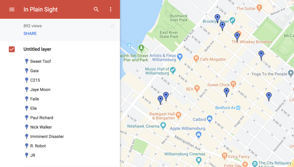
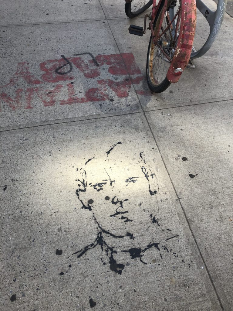
In Plain Sight’ is an exhibition held in Williamsburg, Brooklyn and features the works of eleven artists “to encourage visitors to rediscovery this city through a street artist’s perspective…. And imagine the artists on their search for the ideal urban canvas” (“In Plain Sight,” n.d.). As mentioned, most of the artworks are hidden or have been cleverly positioned so the viewer would pay attention to sites that are usually ignored and thereby, ‘rediscover’ the urban city. This won’t apply to me as much as I have never been to Williamsburg before. With nothing but a digital Google map, I took the subway to Williamsburg on a sunny Friday afternoon to embark on my urban scavenger hunt.  

Screenshot of ‘In Plain Sight’ Google Map

While searching for these artworks, it made me think about some of the topics discussed in class, such as the concepts of permeability and permanence. What happens when these places don’t exist anymore, will the artworks still be archived? How will it be archived – through photographs snapped and shared? I was only able to find two out of eight artworks and gave up on the last three. It may have been partly my fault, as I chose to go with the exhibition from 2012. However, this exhibition made me also think about the art world- how does this experience differ from an exhibition at a museum or gallery setting? In my opinion, the biggest difference was that this urban museum experience became much more personalized. I wasn’t confined to a physical space, I didn’t feel intimidated, and I loved how customizable the guide was. I could listen to music, pause the exhibition and grab a bite to eat, or even complete it over a span of a few weeks. It was also nice to know that my exhibition journey is unique in the sense that there was no specific path given to see the artworks, while museum settings usually give viewers a direct path to follow.

This exhibition also varies greatly from the online ‘In Plain Sight’ on Google Art and Culture. Instead of having everything presented at once on a single platform, SMoA was completely opposite: I had to physically go out and search for all these places myself. Unlike the ‘armchair traveler’ experience that Google Art and Culture provides, SMoA builds upon the ‘in situ’ concept of experiencing the art at its original place. Even though most of the artworks are no longer on view, I would say art in situ becomes more of a valuable experience because I had to physically travel and search for the places. Not knowing what to expect, then being incredibly amazed to find the artwork became a much more memorable, emotional, and personal experience than it would have been seeing it as a digital exhibition.

Thing: Little Robot Friends

I chose the Little Robot Friends (LRF) for my thing. I was searching for fun gift ideas for my nephew when these little tiny adorable creatures caught my attention. Hours later, I found myself still watching their YouTube videos and I ended up almost buying a robot myself.

LRF are programmable, customizable robots that teach kids aged seven or higher how to code. For $49.99, you can purchase a DIY kit or already assembled kit, which also comes with its own coding software filled with open-source-code to program new robot behaviors.

“They can sense the amount of light in a room, they can hear with a small integrated microphone, they can detect your touch and they can also communicate with other Little Robot Friends using infrared light (like your TV remote). They have two RGB LED eyes and a 250mW speaker for expressing their current mood. The brain is an 8-bit 32K microcontroller that provides a lot of space for coding behaviours and storing memories.”

(“Little Robot Friends,” 2016)

This project is similar to Google Art and Culture and SMoA because of the flexibility of customization for its users. For instance, you are welcome to alter LRF’s personality. I would say LRF is able to create an even more engaging experience than the rest because of the emotional connect. They are robots that are personalized, tangible, meant to be held in one’s hand that can elicit empathy with the robots, and empathy with coding.

“Each interaction with your Little Robot Friend is stored as a memory, and changes how it will behave over time. We are working hard to make this a profound experience, one that can surprise you and make you smile as you watch your Friend grow up.”

(“Little Robot Friends,” 2016)

This makes me think of our previous discussions of provenance, and the idea of treating archives as objects. If we are able to adopt this view and see archives as tangible, living objects such as the little robot friends, then perhaps we will be more mindful and remember that our interaction with the objects will also affect its context and memory.

References:

Appleby, E. (Producer). (2018, May 03). Episode 33: The Art of Connectivity: Suhair Khan from Google Arts & Culture. [Audio podcast]. Retrieved from http://sotapodcast.com/episodes/33

Gajardo, T., & Lau, Y. (2017). The Woman Who is Bringing Museums & Cultural Sites from All Over the World to your fingertips. The Artling. Retrieved from https://theartling.com/en/artzine/interview-head-google-arts-culture-suhair-khan/

In Plain Sight. (n.d.). The Street Museum of Art. Retrieved from http://www.streetmuseumofart.org/in-plain-sight-1

Little Robot Friends. (2016). Aesthetic Studio. Retrieved from https://www.kickstarter.com/projects/aesthetec/little-robot-friends

The Street Museum of art. (n.d.). The Street Museum of Art. Retrieved from http://www.streetmuseumofart.org/about

R. Scott Smith, Villa Farnesina, Brooklyn Museum’s Ask App.

Person: R.Scott Smith

During my years as an undergraduate at the University of New Hampshire, I was unsure what I wanted to major in. I began taking courses that interested me, to see if it was something I wanted to study long term. My first two choices were art history and mythology. 

When I walked into my mythology course that semester, a class that must have been over 40 students, I was handed a quiz that was intended to give the professor a better understanding of how much you knew about myths already. Amidst may serious questions, that I can hardly remember now, there was one question that stood out: “Who was the king of all Greek gods? A: Apollo, B: Hera, C: Zeus, D: Bill Clinton.” 

It was because of Professor Smith’s mythology course that I graduated with a minor in classics, and why 2 years later I traveled abroad to Rome and Pompeii on a one week course he taught in conjunction with another Professor. He even wrote me a recommendation to get into my graduate program. 

Professor Smith is not only a professor at the University of New Hampshire, but he also has a Ph.D. from the University of Illinois, and is an author with a plethora of publications. He has written many anthologies regarding myths, Ancient Rome, and translations from primary sources. At UNH he teaches classes on classical mythology, ancient Rome, hieroglyphs, Greek, Latin, and a course that reads only classical books in their original Latin. While teaching all of these courses and editing a book on Greek and Roman Mythography for Oxford University Press, he is also creating a digital platform called “Putting Greek Myth on the Map” which intends to show a relationship between mythical figures with real places. 

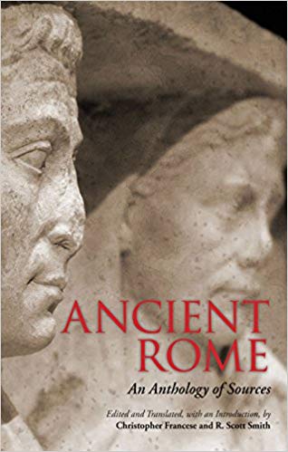
One of Professor Smith’s publications is Anthology of Classical Myth: Primary Sources in Translation. In this publication he and two others translated and anthologized over 50 texts. The authors include an appendix of evidence from Papri and Linear B tablets, as well as a thematic index, a mythological dictionary, and a genealogy.

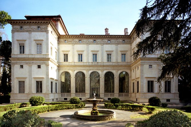
 Place: Villa Farnesina 

While on my trip abroad in Rome, I was given an afternoon off to go see one of my favorite pieces of artwork: Raphael’s Cupid and Psyche Loggia. I credit this one visit as what inspired me to go into the Museum field. 

If you research for your visit ahead of time, you will find the Villa’s website where you can learn the history of the building. Farnesina was built for Agostino Chigi by a pupil of Bramante. Inside you will find artworks by Raphael, Sebastiano del Piombo, Giulio Romano, and Il Sodoma. but it will also tell you that the Villa is located in Trastevere, a more suburban area of Rome just over the Tiber River. This location unfortunately makes it easy to miss, and I can tell you from experience that the Villa itself is very hidden. Still the Villa as a Museum is extraordinary. 

I did not do any research before going, before the trip had even started, I wasn’t sure if I would find the time to go. I was fortunate enough to be on a trip that was already scheduled for me. One day, after spending the morning in the Jewish Ghetto of Rome, my professor told me it was alright to take off the afternoon and go see it. Since I hadn’t had the chance to plan, I ended up getting there with only an hour until closing because I had gotten lost, and on the wrong bus. 

The Villa is beautiful and large, and ridiculously quiet. I’m not sure if it was because there were only a hand full of people inside, or if it was because of the state of awe everyone inside was in. The first room of the Villa is Raphael’s famous Galatea, larger than I expected, and much higher up the wall. I wish I had stayed longer, but I moved on quickly. The next room was the Psyche and Cupid Loggia. A Loggia is a ceiling, so the room was empty except for a few chairs so people could sit and look up at it. Everything you might’ve heard about it is true, the fruit looks like it is real and could fall right on you at any moment, the colors are as vibrant as if he had painted them yesterday. I spent a good half hour under the Loggia, amazed beyond believe and having trouble actually believing I was there. I was urged onto the next section of the Museum, which I passed through quickly, until I came to a section that described the restoration process on both the Galatea and the Psyche and Cupid pieces. From what I can remember the Museum show cased exactly how the restoration team took samples of the paints used in each fresco and how they recreated it. I had never before seen this side of art history that examined how painters created paint, or how it was applied. It was a scientific side I was obsessed with. 

When I returned from my trip I excitedly told my advisor about the Villa, and about the exhibition on the restoration. When I went online and tried to find information on it, I found little to nothing. The Farnesina website details the restoration process focusing on keeping the artwork looking the way it looks, for example restoring the adhesion between the plaster and artwork. They quickly mention testing the “traditional materials” with CIR and “experimenting with new approaches and materials.” I was heartbroken that I wasted so much time staring at the piece, that I ran out of time for this interesting side of the Museum, and that I could not find much information about it later. 

Being at the Villa Farnesina inspired me to want to work in restoration in museums, but on a much different side of it than taking a brush to the artwork myself. I want to study the artwork and figure out how they were made and how they can be fixed. I also want to work to make places like the Villa Farnesina more accessible to the people who can’t get there physically. Everyone should be able to experience their favorite artwork, even if they can’t fly to Rome. 

Thing: Brooklyn Museum’s Ask App

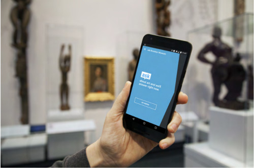
I am fortunate enough to be taking a class taught by Professor Devine, titled Museums and Digital Culture. Last week we had our class at the Brooklyn Museum, where Professor Devine is the Director of Visitor Experience and Engagement. We began the class with a presentation Professor Devine gives to investors and those interested about the app. It was created in three different phases. The first sent “Gallery Hosts” into certain exhibitions with vests telling visitors to ask them questions. The response was good, people would ask them questions about art, among other things. Phase two had “Gallery Hosts” in front of certain pieces of art, who would answer questions, but who would also hand out cards that showed visitors how to get to another piece of recommended art. This backfired, as most people wanted something more personalized than a preprinted card. Finally the last phase began, which is what inspired the Ask App. Ipods were given to members and select test groups upon entering the Museum with imessage that was sent to the Curator. With this phase the team was concerned the most with “screen suck” or that people would be too involved with their screens to actually look at art. They found that this wasn’t the case, especially when the curator could prompt visitors to look at specific pieces of the art he was describing. 

From the third phase, the Ask App was born. Now, anyone who walks into the Brooklyn Museum can download it off of the App store, and speak to an art historian about art. During this class we were sent loose in the Museum to try it out, and I had a fantastic discussion with one of the team members about their Egyptian art exhibit. After this, we got to meet the team and see how the system worked.

While the only thing a visitor sees is a screen similar to imessage, the team sees a screen full of coded numbers asking them questions. One team member showed us how she would split her screen between the incoming conversations and the Brooklyn Museums Wiki, something she updated when no one was asking questions. 

I had never been to the Brooklyn Museum before, but I couldn’t believe how fun it was to experience it with the Ask App. It’s a really cool tool to keep visitors interested that I believe all Museums should start to use. Not only does it get you to look at art closer, it also encourages you to see more of the Museum and stay engaged with it.

Miss Manhattan

Across New York City, there is a woman in various states of undress, so baked into the architecture that she is barely noticed. At the intersection of 59th and 5th, she stands atop a fountain. In front of the Merchant’s gate of Central Park, she considers the pigeons perched on her arms. On 107th and Broadway, she reclines on a bed; And on top of the Manhattan Municipal Building, she stands tall, cast in gold. She was my constant companion as I explored this city, from the financial district to the Metropolitan Museum of Art. This post explores three aspects of her identity- as a person, a place, and a thing.

Place

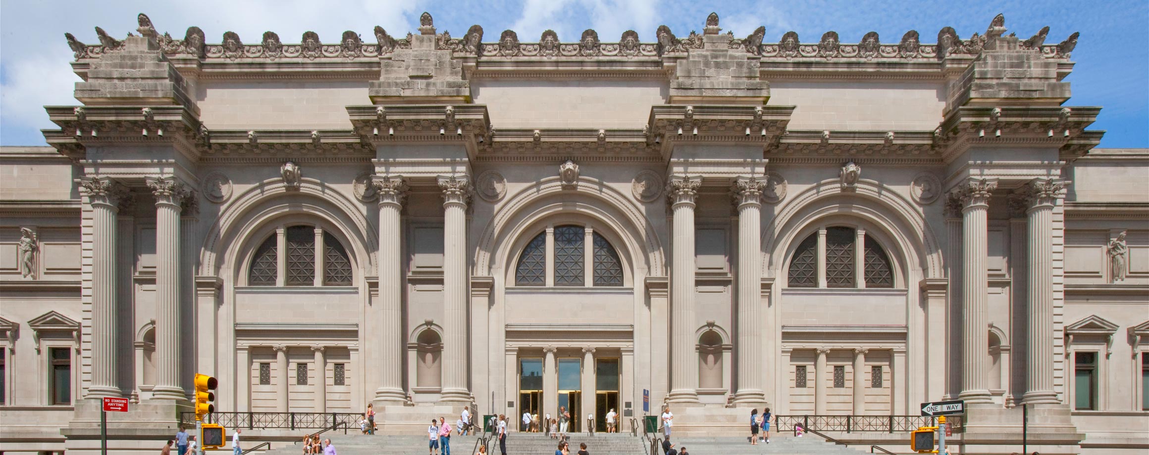
image from www.metmuseum.org

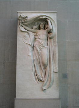
The Metropolitan Museum of Art, also known as the Met, is one of the largest art galleries in the world. If you enter from 82nd street, past the great hall, taking a right at medieval art and through European sculpture, you arrive at the American Wing. Here, she appears as one of the very first works you encounter as the Victory Mourning. A copy of the original statue present at the Melvin Memorial, a tribute to 3 brothers lost at the battlefront by the fourth survivor, she bears the weight of a hard-won triumph. The museum is a place where the sculptures are given a chance to talk, placed among their contemporaries, prefaced with a bit of context, lovingly maintained by staff, and visited by thousands upon thousands of travellers. 

Victory Mourning

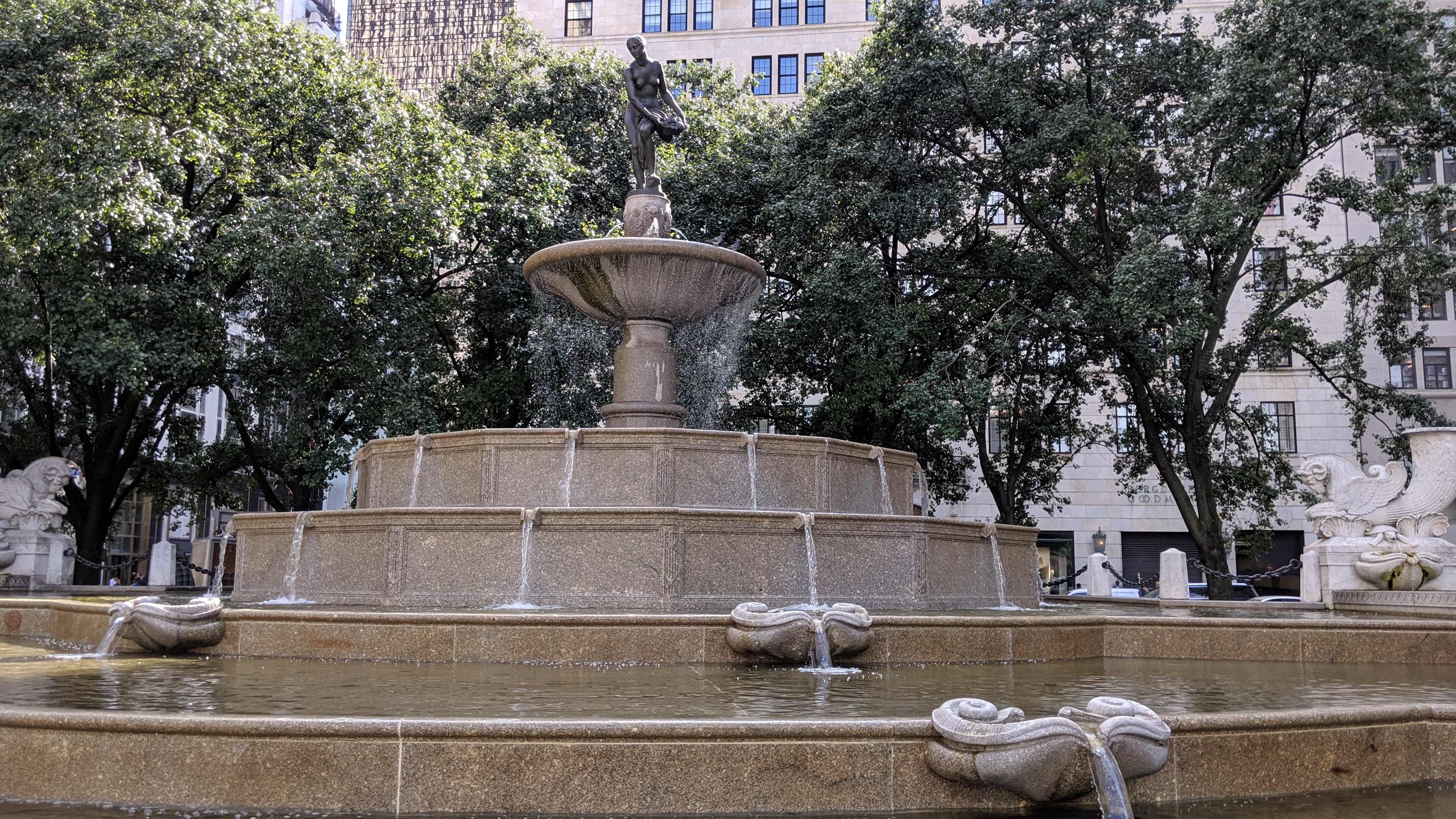
A few blocks away, she stands as Pomona, the goddess of abundance. Recently in the news because of political discourse involving her refurbishment, she isn’t given the time of day by the busy citizens rushing about their day. Sometimes, a penny is dropped into the fountain for a fleeting wish. It reminded me of the enormous power over memory and identity, over the fundamental ways in which society seeks evidence of what its core values are and have been (Schwartz, 2002) that is enshrined within the profession of information. The fountain itself is known as the Pulitzer fountain, after the man who commissioned it. It is sometimes referred to as Pomona or The Abundance, after the image the artist intended to evoke. But atop the fountain, we see a woman and she had no name to offer.

Thing

In stone and bronze a humble human shape, sculpted to represent glory, power, unity, memory, peace, purity, virtue… as it was seeking form in the public architecture of an emerging metropolis.

Andrea Geyer, This Site of Memory: Audrey Munson

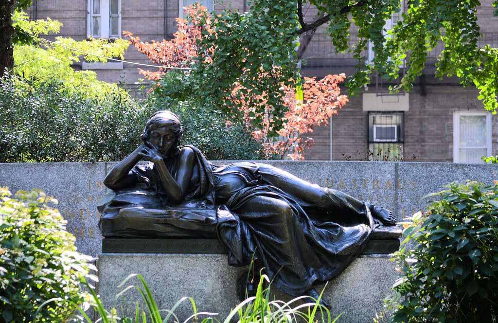
The statues posed by Miss Manhattan are all across the city, around 20 in number. Similar to Scott Nixon documenting the Augustas, the moment you look for her, you seem to see her everywhere. On West 106th street between Broadway and West End Avenue, she reclines on a bench. She’s meditative, relaxed, one foot dangling. Her eyes are lowered, her head is supported by one hand and the other hand holds her chin. She looks down into a pool, rather than out at the street or the pages of a book. She seems to be thinking of something or someone who isn’t present. 

She is Memory, a monument dedicated to Ida and Isidor Straus, a wealthy philanthropist couple who tragically passed away on the maiden voyage of the Titanic. It is believed that Ida refused to board the lifeboat without her husband, and Isidor refused to board the lifeboat until all the women and children were safely aboard. Survivors reported seeing the pair on deck, arms around each others’ waists, in the hours before the Titanic went down. In 1995, a park renovation effort replaced the reflecting pool with an easier-to-maintain garden, citing a lack of funds.

Person

Audrey Munson, 1915

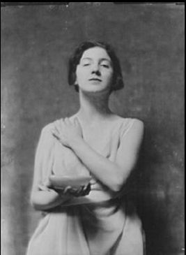
She has gone by several aliases: Priestess of Culture, Mourning Victory, Star Maiden, and Niche Figure. Her real name is Audrey Munson, once the most famous artist’s models in the United States and the world’s first “Supermodel”. In 1909 she moved to New York City with her mother, who was recently divorced and in search of work. Young Audrey wanted to study music and dance. Walking down 5th Avenue, her desire to be seen was paired with the coincidence of “being discovered” by a photographer. Upon his invitation, Audrey, still a teenager, dared to step first in front of a camera, then in front of an artist, then in the nude. She quickly became part of a scene of influential sculptors, artists, and their financial backers. 

Her story follows an all-too-familiar path: meteoric rise, sudden fall and quiet conclusion. In 1915, she was a household name. In 1920, she was penniless. In 1930, she was forgotten. This doesn’t paint the whole picture, however. 

In the city’s directory of 1909, she lists herself as an actress. After 1915 she will call herself, in this same directory, an artist.

Andrea Geyer, This Site of Memory: Audrey Munson

She was a writer who spoke of the artist’s studio as a marketplace of vanity, a strong advocate for women of her profession, a supporter of the suffragette movement. By the time Munson turned 30, her career was blighted by a media frenzy that speculated that her ex-landlord killed his wife for love of her. She spent the last 65 years of her life in a mental hospital after a failed suicide attempt.

Munson, in many ways, was a living archive of the city. Her likeness catalogues the dominance of the Beaux-Arts movement in the early 20th century, her career spans the rise of new professions that have since developed into a global enterprise, and her life is an unpleasant mirror to the struggles of women for agency, respect, and fair compensation over the past century. In 1921, she wrote about the need for artist’s models to be seen as co-creators of the art presented to the public. In 1922, she spoke of the perils of employment when rejecting the advances of men who held power in the industry. In many ways, things have changed since Audrey Munson was launched into the spotlight, and in many ways, they haven’t. One thing is clear, however: she deserved to be remembered, not just as marble, brass, and concrete, but as a person, flesh and bone.

References

Design is Storytelling

Person: Ellen Lupton

The person for this post is Ellen Lupton. She is a graphic designer, author and curator and is currently working as the curator of contemporary design at Cooper-Hewitt, National Design Museum in New York City. Her book Design Is Storytelling truly inspired me. Through this book Lupton uses real world examples inspired by fictional characters to depict how designers can harness the power of storytelling to create memorable experiences. I never really thought of designing as a way of telling stories. Even as a User Experience Designer, I believed that my job was to design interfaces that are intuitive and easy. “Good design is invisible”— was a motto I lived by until I came across Design is Storytelling. 

The first thing that caught my eye in the book was the phenomenology of paths. Lupton mentions various examples about how our eyes keep searching for a path (A google search for a forest will give you various results of  forests with some kind of path leading to somewhere). Another concept she talks about in her book is a Hero Story. A Hero Story is a tale about a protagonist (could be a person or a thing) that gets a call to adventure from the ordinary world to enter a new world, experiences hurdles, learns something new and then returns to the ordinary world.  Even rudimentary tasks like buying groceries or going for a jog involves a hero story and everyone desires it . A hero story creates delight. The way we design an interface or a space like organising the home page for a website or curating an exhibition can invoke a hero story for people who interact with it. Combining the two concepts here, as designers who create paths for people to navigate, to what degree do we provide infinite paths or to what degree do we limit them? Finding the right balance based on context such that it doesn’t affect the user’s hero story is how we become good designers. 

The third and most intriguing concept she talks about is that products can also have character. A product’s character could be centered around gender or age or profession and designers should use it to their advantage. For example when we think of Amazon, we associate it with quick delivery or Spirit airlines with cheap but awful flight experience. Similarly all products have some adjective associated with it and these adjectives make up their character. My favorite  aspect of reading this book was its pictorial nature. Even though the book is filled with illustrations, they are not random and meaningless. Each illustration relates to a theme Lupton tries to highlight. They all tell a story. Lupton through her book Design Is Storytelling taught me that good design is not invisible. As designers we must create products that take the user on a journey, provide them with a hero story such that their experience is memorable. Even a bad design is better than an ambiguous design. Therefore we should strive to create good experiences that are memorable.

Place : New York City Subway

Lupton’s Hero Story inspired me to select a place that resonated with this idea. That is why I chose  the NYC subway. Since I’m new to the city, traversing the subway system has been ,for the most part, a memorable experience. Even with the release of the MTA app to help you create your schedule based on the train timings, the subway has never ceased to surprise me and take me on an emotional journey. 

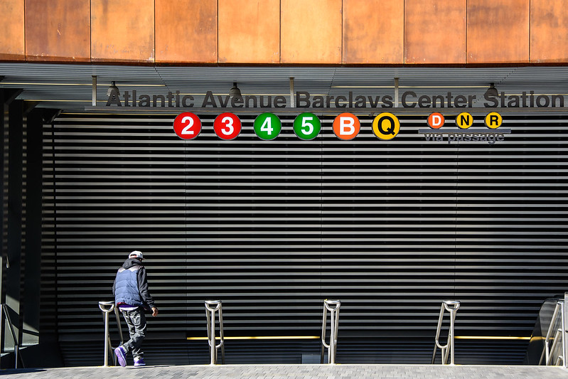
Atlantic Avenue Barclays Center
Atlantic Avenue Barclays Center Station

Last week my brother invited me to cook some traditional malayali food since I’ve been craving home food for a really long time. So I agreed to meet him at 11:00 am so that we’d finish cooking right on time for lunch. I checked the MTA app to see how long my commute would be and what transfers I would have to take and prepared myself to leave. As soon as I reached the station, I realised I did not have balance on my metrocard. When I tried to recharge, the metrocard recharge machine was only accepting cash in denominations of $20 or less and I had a $50 on me. I ran to a Deli store nearby to get change and finally managed to refill my metrocard but by the time I reached the platform, the train I wanted to take had left and the next one was scheduled to come in 12 minutes. This frustrated me. My next hurdle was transferring at Atlantic Avenue Barclays Center Station. I had not realised how extensive the station was and anticipated navigating through it would be difficult. On the contrary the signboards were very clear and I found my platform in less than a minute. My train immediately arrived and I was delighted by how easy that experience was. In a way I felt like a hero. Another aspect of the NYC subway that always catches my eye is the artwork at various stations. It’s also something that people keep talking about. As a matter of fact, I know people who use it to navigate. When my brother was giving me directions to his apartment, he told me to take the exit close to the mosaic of a woman in a saree. 

2nd Avenue Subway, 72nd Street Station
Exit close to the woman in a saree

The NYC subway is a great example for a good design system. Just as Lupton mentions in her book, the NYC subway system enables its commuters to create memorable experiences by taking them on an emotional journey. It helps them navigate to the path of their desire as well as provide them with a hero story. 

Thing: Nintendo Switch

For my Thing, I chose the Nintendo Switch. The Switch is both a handheld and a home console with exceptional graphics for its size and motion controls to elevate your gaming experience. The reason I love the Switch is because of how simple and interactive it is. The Switch was the first gaming console I used and even as a novice, it was extremely easy to navigate. My favourite part of the Switch are the Joy-Cons. Everytime I attach the Joy-Cons to the grip it produces a click sound which is very satisfying. As a matter of fact, the animation for the Nintendo Switch logo includes the click. In Lupton’s book, Design is Storytelling she talks about how products have character. The click sound is the character for the Nintendo Switch. Every action you perform on the Switch includes the click. 

Another thing I love about the Switch is how easily navigable the homepage is. The first thing you see are the games you have on your system below which are the menu items. The icons designed for the Switch, according to me, are well researched because even without reading the labels you can still understand what they try to convey. 

Switch homepage

The Switch includes a touch-screen interface and Joy-Cons with inbuilt gyroscopes, IR sensors and motors which create a rumble effect while playing games. The first few games I played on the Switch were Super Mario Odyssey and Okami HD, both of which used the motion detection and the rumble features. I love the rumble effect because it never ceases to amuse me. It was designed to induce delight

Nintendo Switch

Design is about creating memorable experiences and the design for the Nintendo Switch is exactly that. It caters to both seasoned gamers as well as amateurs like me. I tried using other gaming consoles like the PS4 but the interface was overwhelming. Nintendo’s user base is vast and to create something that accommodates them all is an exceptional feat. The Switch’s interface does not look extraordinary nor is it overloaded with features. What makes the Switch beautiful is that even though its design is intuitive and simple it’s not invisible and that’s the reason I chose the Nintendo Switch as my Thing. 

References

Ellen Lupton, (2017) Design is Storytelling published by Cooper Hewitt, Smithsonian Design Museum; 1 edition.

Ellen Lupton, <http://elupton.com/>

The Nintendo Switch Is the Future of Gadget Design,<https://www.wired.com/story/nintendo-switch-review/>

Nintendo Switch Technical Specifications, <https://www.nintendo.com/switch/tech-specs/>

The information of cryptography in people, places, and things

Place: Spyscape Museum

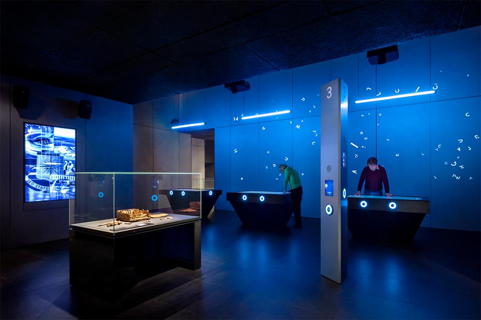
This summer, I visited the Spyscape Museum in Manhattan. It’s at once a museum and an activity: while it has exhibits about counterintelligence operations, cryptography, and other “spy”-related topics from across history, it also comes with a significant interactive component, leading visitors through quizzes and games.

Photo: Spyscape

The whole museum is centered around a challenge of sorts, geared towards discovering what sorts of skills you have that could be relevant to various professions related to spying, including field operators, handlers, researchers, and codebreakers, among other roles.

Beyond being a fun way to spend a few hours away from the summer heat, the Spyscape Museum actually made me curious about many of the things I learned there, such as the Anonymous movement, cryptography’s legacy in the digital age, and the role of covert operators across history.

As a museum, Spyscape is an institute of information, cataloguing and preserving different histories of covert operations. Spyscape, like many museums, teaches by a method called interpretation.

“Interpretation relies heavily on sensory perception—sight, hearing, smell, taste, touch, and the kinetic muscle sense—to enable the museum-goer emotionally to experience objects.”

(Alexander, 2008)

With visual and audio components to its exhibits, plus touch screens that allow visitors to play games and answer questions, Spyscape certainly makes use of the full sensory experience.

The subjects of the museum, cryptography and covert operations, also deal heavily in information: protecting it, freeing it, and controlling who has access to it.

“Nations go to great lengths to gain [information] by using the time-honored tools of espionage and codebreaking to gather information secretly. … Codebreaking evolved from the ancient art of pencil-and-paper puzzle solving to the science of cryptanalysis.”

(Gannon, 2001)

This evolution in cryptography mirrors the journey of the information field, from the simplest of roots to the complex webs of information we have today in the digital age. It’s this evolution that the Spyscape Museum catalogues, interprets, and shares for its visitors.

Person: Alan Turing

One of the most important people in the history of cryptography, whose story was given great focus in one of Spyscape’s exhibits, was Alan Turing. He’s famous for leading the World War II-era British counterintelligence team that beat the German Enigma machine, which encrypted messages according to regularly-changing ciphers that were difficult to crack. But he had a hand in many other information-related operations during and after World War II, and his life itself is a study in how information can have an impact on a personal level.

Turing’s claim to fame was his work for British counterintelligence on the Enigma problem.

“The science of numbers and symbols was in Turing’s genes … [He] ignored the intimidating numbers and put his trust in what he knew—mathematical logic.”

(Gannon, 2001)

Having an eccentric manner but an undeniably genius brain, he gained respect from his colleagues and managed to find a solution that reliably broke the codes created by Enigma machines.

Even after the war, Turing continued to work in information-related fields, going on to lay “the foundations for computer technology and artificial intelligence” (Spencer, 2009). His work, in large part, has been the starting point from which much of the digital age has sprung: computers, machine learning, and data analysis, in their modern iterations, have all been influenced by Turing’s work.

Of course, the sensitivity of Turing’s projects during World War II meant that he wasn’t publicly recognized for his contributions to ending the war; he had to keep his work a secret from even his family.

“Turing’s oldest niece, Inagh Payne … recalls sitting on his knee asking him repeatedly what he did at the office. Turing remained quiet about his work for the war effort.”

(Spencer, 2009)

And this wasn’t the only part of his life he had to keep a secret: his homosexuality, for which he was eventually criminally prosecuted, was another large piece of information about him that could not see the light of day.

It is this juxtaposition between his work and his life that strikes me most about Alan Turing. His life’s work, the achievement for which he is most recognized, is that of freeing information, revealing secrets, and saving lives by being able to break codes and open lines of communication. But in his personal life, neither recognition for his incredible deeds in the service of his country, nor the simple liberty of being able to love freely, were granted to him. Exposing and withholding information are two sides of the same coin; perhaps no one knew that coin as well as Alan Turing.

Thing: Cryptex

While I was at the Spyscape Museum, I couldn’t help but reflect back on one of the first books that ignited my interest in cryptography: The Da Vinci Code. Though I haven’t read it in a long time, a few of the concepts from the book have really stuck with me. One of the things that has always intrigued me is an object called a cryptex.

“A portable container that could safeguard letters, maps, diagrams, anything at all. Once information was sealed inside the cryptex, only the individual with the proper password could access it.”

(Brown, 2003)

This device struck me as a genius invention when I first encountered it — appropriately, it was credited to Leonardo Da Vinci in the story. For a while, I believed that was its origin, but actually, it was invented by Dan Brown, The Da Vinci Code’s author.

The cryptex itself is obviously linked with information: namely, it’s designed to protect information from everyone but its intended recipient. But the real-life story of this fictional object also has a lot to do with the way we interact with information, especially when it can be used for profit.

A year after the publication of The Da Vinci Code in 2003, a fan of the book named Justin Nevins created the first physical replica of the cryptex. Shortly thereafter, he trademarked it — which led to a dispute between Nevins and Columbia Pictures when The Da Vinci Code was adapted into a movie. Nevins wrote out his side of the story many years later on a forum website (Nevins, 2017).

As Nevins tells it, Dan Brown didn’t have a problem with him holding the trademark for the cryptex at first. But when The Da Vinci Code‘s movie was in production, Columbia Pictures wanted to make their own replicas for the movie, and wanted Nevins to drop the trademark. Nevins and Columbia Pictures eventually settled out of court: the movie was allowed to use the word “cryptex,” but Nevins was allowed to keep his trademark. He still sells cryptices online.

This part of the story is, understandably, not as well known as the cryptex itself; but it brings this device from a fictional object to a technology of the real world. Copyrights and trademarks are a big part of regulating how information can be used and received in the world, which echoes the original purpose of the cryptex itself: keeping information from certain parties, and revealing it to others.

The cryptex’s journey from fiction to reality illustrates the importance of information: the creativity that can happen when it’s shared with the world, and the monopolization that might ensue when it’s kept safeguarded in just a few, powerful hands.

References

Alexander, E. P., & Alexander, M. (2008). Museums in Motion: An Introduction to the History and Functions of Museums. Lanham, MD: Rowman et Littlefield Publishers, Inc.

Brown, D. (2003). The Da Vinci Code. New York: Doubleday.

Gannon, J. (2001). Stealing Secrets, Telling Lies: How Spies and Codebreakers Helped Shape the Twentieth Century. Washington, D.C.: Brasseys.

Nevins, J. (2017). The history of the Cryptex. Retrieved from https://forum.thecodex.ca/t/the-history-of-the-cryptex-r/70.

Spencer, C. (2009). Profile: Alan Turing. Retrieved from http://news.bbc.co.uk/2/hi/uk_news/8250592.stm.

Spyscape Museum. Retrieved from https://spyscape.com/.

It’s Prof. Cooley, in the Art Library, with the Useless Box

Person: Heidi Cooley

My person is Heidi Cooley, author of Finding Augusta: Habits of Mobility and Governance in the Digital Era. I was at the 4th floor library at PMC looking at the new books display, and this book caught my attention. The title and the cover image conveyed the perfect combination of artsy, academic, and applying theory to practice. A brief skim of the chapters revealed that this book encapsulates perfectly the four degrees taught at the School of Information.

So what is Augusta? Scott Nixon, a traveling insurance agent from Augusta, Georgia, used a 16mm camera to document places in the U.S. called Augusta, filming from about 1930 to 1950. These are towns and streets and villages and storefronts and some other surprising Augustas. The result is an 18-minute movie, available on YouTube and archived, along with Nixon’s home movies, at the University of South Carolina (USC).

Cooley was a professor of technology and media arts at USC, and during a visit to the archive, the archivist showed her The Augustas and these 18 minutes triggered this book. The book is interesting, clever, and well written, but the main appeal to me is how Cooley extrapolated meanings and applications of information in ways that are both deep and broad and directly connect to our school. The Augustas relate to technology, mobility, mobile devices, bodies in motion, managing the movement of “stuff,” the application of surveillance, tracking, indexing information, metadata creation, digital and physical preservation, archiving, display, and the implication on governance.

Cooley’s departure point is the traveling salesman problem, which asks, “Given a list of cities and the distances between each pair of cities, what is the shortest possible route that visits each city and returns to the origin city?” It’s a question that is relevant to information storage, retrieval, design, display, usability, findability, and more. Books and articles that reflect the intellectual landscape in an interdisciplinary way are few and far between, and Cooley’s study is an “example of digital humanities scholarship and critical readings of the political stakes of new media technologies” (Archibald, 2016). It can provide new appreciation for a broad and deep understanding of information.

Place: Brooklyn Art Library – The Sketchbook Project

I’m not sure what possessed me to make my way across town on one of the coldest days of last winter to visit The Brooklyn Art Library. I must have read about it someplace, but I can’t recall where.

Nestled in some abandoned (or maybe it was the cold) side street in Williamsburg, the library is one large rectangular room lined with bookshelves, and on them are uniform sketchbooks. People buy a sketchbook from the library, then draw, paint, write, collage to their hearts’ delight, and bring or mail it back to the library. The library digitizes the books, adds metadata, and places them on the shelves where they are arranged chronologically. To look at a book, you register on your phone or using one of their iPads, and request up to three sketchbooks. You can search by artists, by title, by region, by topic, and more. You receive the book within a few minutes and as a special bonus receive the book immediately preceding the one you requested. This aspect of the arrangement particularly appealed to my knowledge organization sensibility. It somehow reminded my of Aby Warburg’s library in London and its cross-disciplinary references between adjacent sections.

Photo: The Sketchbook Project

The books themselves are, as one might expect, very wide ranging. Every imaginable kind and color of ink and pencil and paint and every style of drawing. There are journals and landscapes and manga and books in all languages and from many countries. Some are magnificent, some are puzzling, but the effect is quite strong, and even the duller ones are lifted up by being part of a beautiful and surprising collection.

Toward the back of the library there is a community-style conference table where visitors can look at the books. There were few people during my visit (temperatures were in their 20s, after all) but there were some, two adults and a child, some other adults of all ages. The people who work there are conversational without being pushy and will take their cues from the visitor.

The library embodies some of the ideas expressed in Finding Augusta, particularly those about arrangement of information as mobile objects; as Cooley notes, “mobility, its organization and potentiality, is the defining problem of this present” (Cooley, 2014). To that end, the Brooklyn Art Library provides its Bookmobile, which brings the collection to locations around the country in a mobile library.

Thing: The Useless Box

For my Thing, I chose a useless box. How do I know it’s a useless box? Well, it says so in bold black lettering on top of a flimsy looking plywood box: Useless Box.

Photo: Debbie Rabina, Ph.D. 

Right under the lettering there is a slit in the cover, and below it, a simple mechanical switch. Push the switch and half cover lift open from the hinge to the center, only to immediately close again. Open close, open close—that’s all it does. Useless.

Measuring about six inches, I can hold it my hand, turn it around and examine it. Peeking inside I can see a small mechanical device operated by battery. Pushing the outside switch makes the top open and immediately close. The only use that comes to mind, or at least to my mind, it that this is some executive stress toy.

So what makes The Useless Box a worthy choice for my information-Thing? Well, it’s the legacy of the Useless Box that ties in to our information universe. Developed in the 1950s in Bell Labs, it is the brainchild of Claude Shannon, a pioneering information theorist:

“The first working model was constructed by his mentor, Claude Shannon, who later became known as the father of information theory. This context, the fact that the creators of this aggressively pointless gadget are emblematic figures in the ascendancy of machines over our contemporary world, lends a frisson of historical oddity to what is essentially an executive toy.”

(O’Connell, 2016)

Contemplating the box as an expression of meaning is an act of mediation that can take you in many directions, from the meaning of labor and mechanical objects to questioning usefulness itself. And finally I admit, one appealing thing about this Thing is that is reminds me of Thing. Picking up on some lines of thought from Cooley, this can take us to the latest in creating life out of dead brain tissue to Ted Chiang’s “Story of Your Life,” in which a woman learns how to see the future:

“From the beginning I knew my destination, and I chose my route accordingly. But am I working toward an extreme of joy, or of pain? Will I achieve a minimum, or a maximum?”

(Chiang, 2002)

In other words, even when everything is known (like a device that you know will close itself immediately after you open it), isn’t it still possible for wonder to exist?

by Debbie Rabina, Ph.D. 

References

Archibald, R. (2016). Review of Cooley, Heidi Rae, Finding Augusta: Habits of mobility and governance in the digital era. H-War, H-Net Reviews. Retrieved from http://www.h-net.org/reviews/showrev.php?id=43095

Chiang, T. (2002). Stories of your life and others. New York: Vintage.

Cooley, H. R. (2014). Finding Augusta: Habits of mobility and governance in the digital era. Hanover: Dartmouth College Press.

O’Connell, M. (2016) Letter of recommendation: The useless machine. The New York Times Magazine. Retrieved from https://www.nytimes.com/2016/09/04/magazine/letter-of-recommendation-the-useless-machine.html

Shaer, M. (2019). Scientists are giving dead brains new life. What could go wrong? The New York Times Magazine. Retrieved from https://www.nytimes.com/2019/07/02/magazine/dead-pig-brains-reanimation.htm