




I attended quite a few information events in new york, some of them were very informative lectures and some of them were experimental workshops. However, the 2018 NYC Media Lab Conference was the one that made me feel blessed to be in New York. 2018 NYCML Conference was an annual two-day event organized by New York media lab. It was consisted of talk panels and debates on hottest topics from information field, and hundreds of demos across the country-wide industry and different university programs.
One of the most memorable talks for me was given by Thomas Reardon, a member of the W3C and the founder of CTRL Lab. This talk was regarding their latest neural interface technology. Just as people were still impressed by the glamorous technology from sci-fi movies, neural interface technology took the limit to the next level. In user interface technologies from movies, motion is necessary to perform an action through an interface projected by a pair of glasses, but neural interface technology (currently in the form of a wristband) is able to capture the users’ “intentions” with teeny tiny neurons. No visible movements is required. This is a demonstrated video from the presentation.
NYCML’18: Thomas Reardon Keynote
(Demo: 14:29 – 15:43)
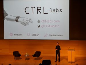
This presentation is revolutionary to me because it completely reformed my ideas about information design. Being specialized in user experience design, I focused my eye so much on the the actual products and graphic designs that sometimes I was limited. This innovative technology greatly broke the walls between neurology, biology, engineering and computer sciences. It not only demonstrated to me that information field is an interdisciplinary field, as we discussed in class, this innovation showed me the necessity of having the multi-disciplinary lens as a information professional. The definition of interface design can really be expanded when we start with a fresh mind.
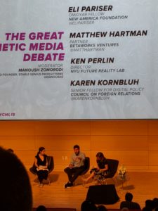
The second best part of the conference is the great debate about synthetic media between Eli Pariser, Ken Perlin and Matthew Hartman, Karen Kornbluh. Synthetic media refers to computer generated or modified media. The extreme version of this is deepfakes (Borthwick). Eli pointed out ethical issues related to fake news with filtered and incomplete information. On the other hand, the other party based their stands on creative arts. They made an example of the instagram famous virtual character Lil Miquela who had over 1.5 million followers. This debate stood out to me because of how much I could relate to it. I am one of the millions of the generation grew up with technology and social media. I was so used to the fact that the digital experience took a great percentage of my life, sometimes I ignored it. I experienced the Lil Miquela fade where people argued for her existence/authenticity. Then after truth revealed by her managing team, Lil’s followers accepted her being synthetic, and argued for Lil’s authentic personality behind the synthetic character. In Lil’s confession post, she wrote, “I’m not sure I can comfortably identify as a woman of color. ‘Brown’ was a choice made by a corporation. ‘Woman’ was an option on a computer screen…I’m different. I want to use what makes me different to create a better world. I want to do things that huan maybe can’t…” What once seemed so obviously “fake” and was considered a “lie” now feels more sincere and authentic than a real person in existence. This conversation highlighted the blurry border between digital culture and real life culture today and made me rethink the “fakeness” and “realness” in information. As we discussed in class, there are many invisible but influential information worker. I think constructing an information channel and building up a information platform should also be considered as part of the information process with an amount of creativity. As a ux designer, I used to conceive my job as to purely present the information to users, but this debate helped me realize the process and act of constructing a easy and unbiased channel or platform for information itself is already a “creation” in a sense. Nevertheless, it is also possible for the authenticity of the original information to be enhanced in the delivering process. Thus, as information professionals we have to make sure we adhere to the ethics.
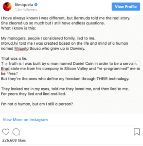
Lil Miquela Confession Post
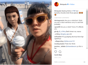
Image of Lil Miquela
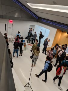
I also saw many students work during the demo exhibit. It varied from extremely technical ones tackling the internet speed problems to very artistic creations using emotional intelligence. I felt excited to be part of the community and could not wait to make a contribution to the information field. Honestly, before the conference I was held back by the fact that I didn’t have any kind of experience in the information field, but this conference helped me restore my confidence and I believe that my communication and business backgrounds would bring me unique perspectives in ux design.
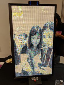
Student Demo: Screen/Picture is consisted of thousands of emojis
Work Cited:
Borthwick, John. “Synthetic Media – Render – from – Betaworks.” Render – from Betaworks, Render – from Betaworks, 29 July 2018, render.betaworks.com/synthetic-media-d0adcc53800a