INFO 601-02 – ASSIGNMENT 3 – OBSERVATION – MADDY NEWQUIST
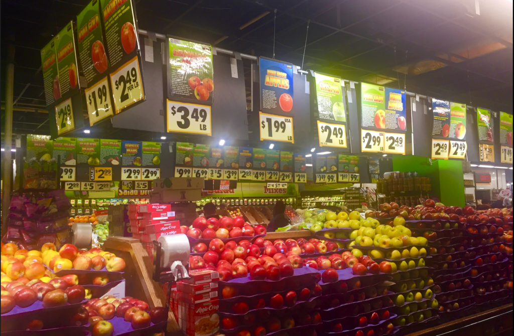
The first item on my list was lemons and I found them easily; then I turned up another aisle, and there were more lemons—ostensibly the same kind, but a different price. And although it was easy to realize that I had simply been moving too quickly and had initially grabbed organic lemons by mistake, it did make me start thinking about signage (and consumer traps!) and how the shoppers in a grocery store interpret that signage, and so the setting felt appropriate for this blog post about the observation of an information environment. I returned to the store a couple weeks later to view it as both a shopper trying to make the most efficient use of their time and an observer taking notes on how well I was able to accomplish that task.
Physical Layout
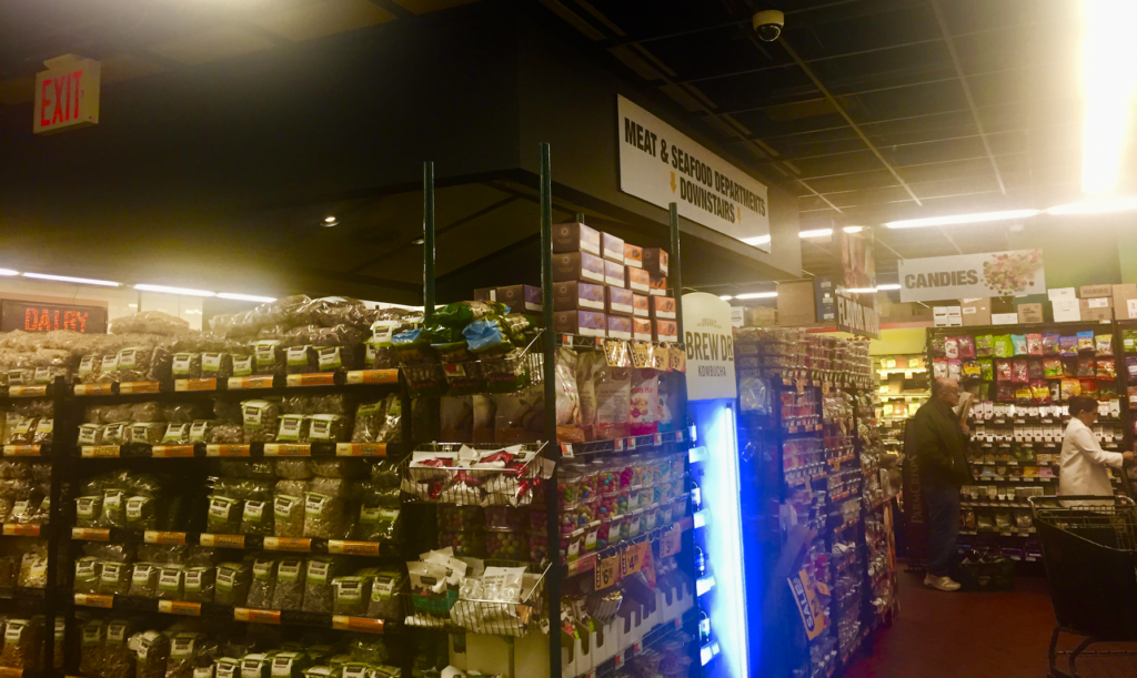
Constraints on the environment are perhaps owed to the fact that this is a two-story store with the check-outs and the exit existing only on one floor—the same as the entrance. And while this is an unchangeable feature of the space, it is absolutely necessary point out how well the internal staircase is camouflaged. (Three elevators line the back wall, but who has the time?) There is one sign and it is easy to miss, especially as it is positioned well above most people’s line of sight and is only marked on one visible side. It also only makes note of the meat and fish departments being downstairs, ignoring two larger details: (a) that it is pointing to/at stairs and not just informing people that somehow they need to get downstairs, and (b) that all departments save those for produce and cheese were located downstairs.

Consumer Navigation
I couldn’t find the peanut butter. I’d waited too long to ask for help and I wasn’t going to fold now—for whatever reason, I needed to prove that I could do this in spite of my resistance to ask for or seek out help at the beginning of my search. Doesn’t that sound familiar? Kuhlthau’s Information Search Process, although primarily applied to students in a paper-writing capacity, felt like an apt lens through which to view my, and really anyone’s, travels and travails through a grocery store:
At initiation, I recognized the need for new information so that I could complete my shopping: I had to know where things were in this particular store. At selection, I picked items on my list to begin searching for as a way to become familiar with general navigation. Exploration and formulation were the biggest obstacle for me, as well as for Kuhlthau’s original study subjects, and I could only reach stage five’s collection after asking an intermediary or finally locating signage directly relevant for my search. I achieve search closure at both the location of each object on my list, and in the check-out line.
Although upon looking back it maybe shouldn’t have surprised me so much, but I did find it surprising how little interaction there was between user and digital technology, unless it’s through an intermediary—cashiers, or employees weighing meat or fish behind counters. Intermediaries were available during the shopping experience and it was at the discretion of the shopper-user to seek them out. And although there were more employees (and all willing to help) visible than at other grocery stores, none were there just to help direct users.
But with the sheer amount of signage, despite whether or not each sign actually imparted information, it felt like the store was saying to its shoppers: Why would you need us to help you? Can’t you figure it out yourself? Look at all the signs we made to make it easy for you!

Suggestions
My general difficulty with navigating this information environment came from the overwhelming proliferation of signage. Without sacrificing the necessity of grocery stores to send their users on a bit of a wild goose chase in order for them to stock up on items they may not have on their original shopping lists, I would suggest a focus on these three action items to start:
- A better typographical system: while real estate on an individual sign is limited, it is even more difficult to decipher when categories are formatted as run-in lists, separated only by commas, rather than by columns which are easily deciphered visually. The size of the font is also difficult to read, and it felt that the aisle number was given superficial importance over this.
- Often supermarkets will have a general index attached to the end of each (or every other) aisle, which serve as a quick guide for both employees and users. An info guide such as this, or a blueprint map by department (similar to the ones they have in IKEA stores), would be a helpful addition to a user’s experience.
- A clearer labeling of store staples with a typography setting it apart from the other signage would help call out the stairs, elevators, checkout lines with restrictions (e.g. “15 items or less”), and even the entrance and exit.
Reflection
This observation setting could explore Buckland’s information-as-process (reading and interpreting signs to varying degrees of success) definition, but it is also an interesting look at how an information environment assumes certain inherent knowledge or ability to navigate its internal system from its users. While I’m not sure I can quite claim “hard-to-reach users” as a factor here, there are some barriers to entry (or at least to efficient use of the space), with increasing specificity: (a) knowledge of how grocery stores are generally laid out (i.e. produce near the entrance); (b) knowledge of how Fairway (or other chain brand) stores are generally laid out; and (c) knowledge of this specific [Fairway] location. This relates back to the first two stages of ISP, and can further be applied to suggestions for improvement. Through this observation, I gained a greater appreciation for the balance retail businesses must maintain between helping and leading astray their users; and I am convinced that there is a way to stabilize that balance without sacrificing one or the other.
References:
Buckland, M. K. (1991). Information as Thing. Journal of the American Society for Information Science, 42(5).
Kuhlthau, Carol (2004). Seeking Meaning: a process approach to library and information services. London: Libraries Unlimited.
For further reading on grocery stores as information environments:
Ocepek, M. G. (2017). Passive information behaviors while grocery shopping. Proceedings of the Association for Information Science and Technology, 54(1), 507-510. doi:10.1002/pra2.2017.14505401058