
Attempting to Visualize Local Arts Agency Constituent Network(s)
December 18, 2018 - All
Network mapping is a useful tool for exploring complex and interconnected systems. Systems that develop organically (whether biological, social, etc.) don’t behave the way that we expect them to because we didn’t compulsively design and order them.
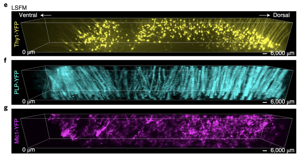
If we had, they would not be nearly as interesting, and our mapping of them would not prove nearly as insightful.
Goals and Inspiration
In an effort to stay on-topic with my interest in arts agencies and public arts programming, I sought to create a visualization mapping connections between arts agencies and their communities. My goal was, from the start, orderly and directed, and — as I would discover — prohibitively narrowing.
In a dataset that I previously referenced but did not use, the 2015 Local Arts Agency Census, I had been struck by a particular survey question (fig. 2).2
Does your [Local Arts Agency] consider the following groups to be a part of your [Local Arts Agency’s] primary constituencies?
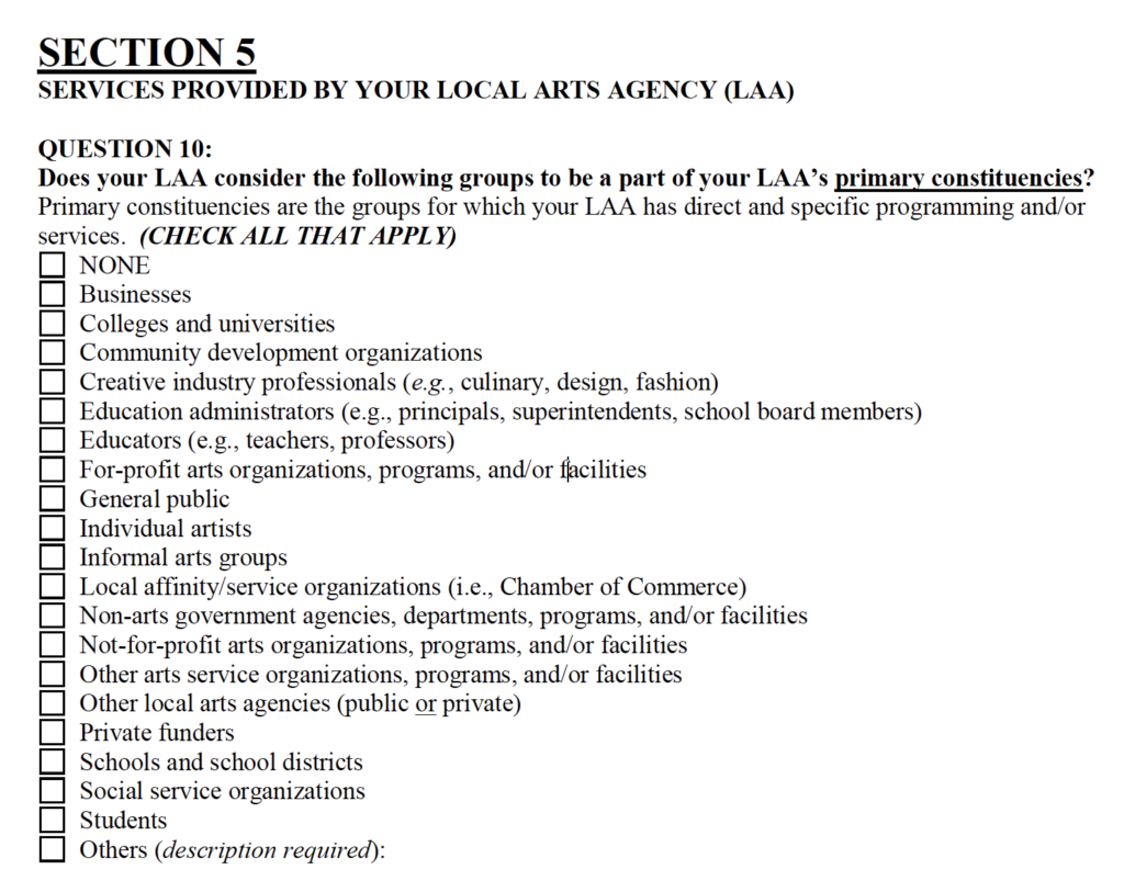
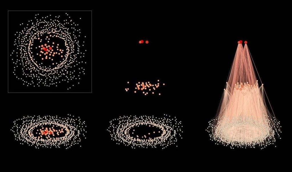
If I only parsed out and coded each response, I would have enough data to represent a meaningful network of relationships between local arts agencies and all of these possible constituencies. Inspired by the visualization potential of “network splitting,” I downloaded the Gephi plugin that produced the visualizations below and set to work on my datasets (figs. 3, 4).
Tools, Datasets, and Resources
I knew that I would be working with a large amount of data, and that it would be difficult and time-consuming to format that data according to my needs. For this reason, I planned to rely heavily on OpenRefine.
Tools |
|
| Type | Name and Source |
| Plain-text editor | Sublime Text |
| Data manipulation software | OpenRefine |
| Spreadsheet Software | Google Sheets |
| Visualization Software | Gephi |
| Gephi Plugin | Network Splitter 3D (Author / Source: Alexandre Barão) |
Datasets and Resources |
|||
| Agency / Individual | Source | Dataset / Resource | File type |
| Americans for the Arts; National Endowment for the Arts | National Archive of Data on Arts & Culture | 2015 Local Arts Agency Census, United States (ICPSR 37041) | .xls |
| Codebook | |||
| Institute of Museum and Library Services | Surveys and Data: Museum Data Files | Museum Universe Data File | .xls |
| Documentation and User Guide | |||
Decisions About Data
From the museum universe database file, I isolated arts agencies by their discipline code and began a new, arts-agency-only spreadsheet. After formatting and unabbreviating museum name strings, I eliminated columns of information that did not seem relevant to my purposes. I then adjusted agency and museum names from the respondents of the Local Arts Agency Survey to match the same naming convention applied in the Museum Universe Data File. I combined multiple constituent types into larger categories (e.g. an “Education” column for colleges and universities, schools and school districts, students, educators, etc.).
OpenRefine significantly lessened the difficulty of not only normalizing large amounts of data, but also combining it into an appropriately formatted edge file to import into Gephi. All of the decisions about data that I applied prior to making my nodes and edges file had reshaped and recoded my datasets entirely.
Developing the Visualization
In Gephi, after my edges and nodes files were imported, I experimented with different layout tools and filters to explore what might happen naturally. It became clear very quickly that my data lacked dimension. Having reduced the constituencies to 5 constituent types incontrovertibly limited the potential for Gephi’s true strengths — mathematical models and statistical analysis — to process or interpret my data in surprising ways.
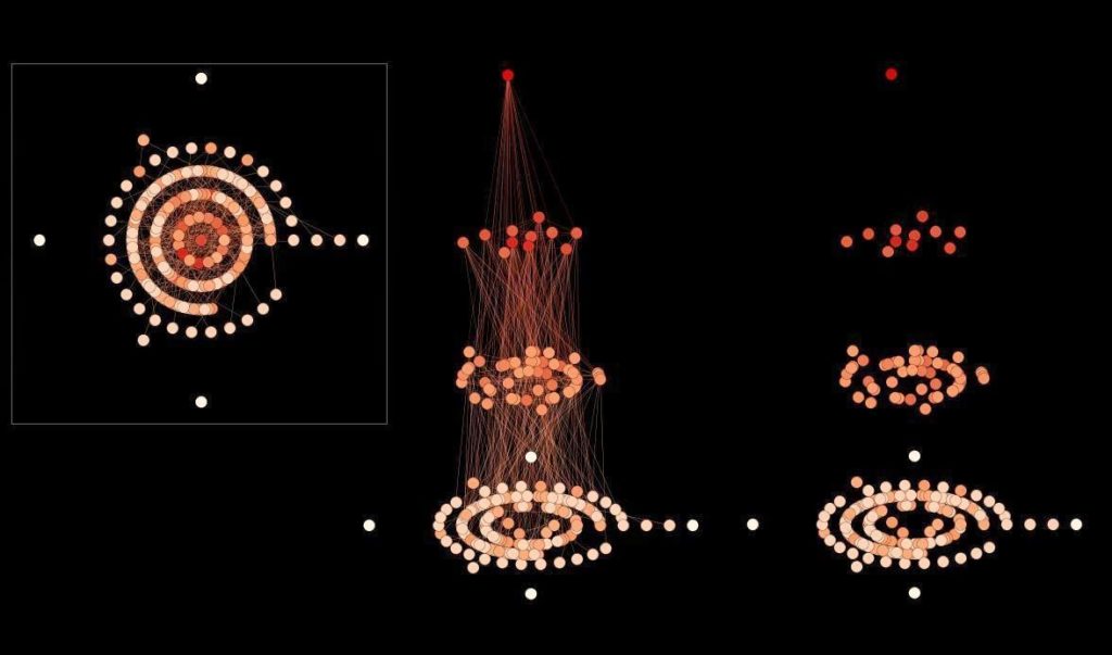
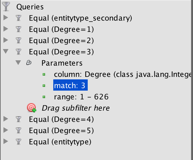
Despite having 644 nodes and 2,532 edges, all paths led to the constituents. In this network, there was no interconnectivity, but only single-degree connections that gave Gephi’s layouts little to work with. Determined to carve something meaningful out of my dataset as it was, I created custom filters to select art agency nodes by number of constituency relationships, manually isolating them and modifying them separately (fig. 5). I thought a radial layout might complement the consistency of my dataset nicely.
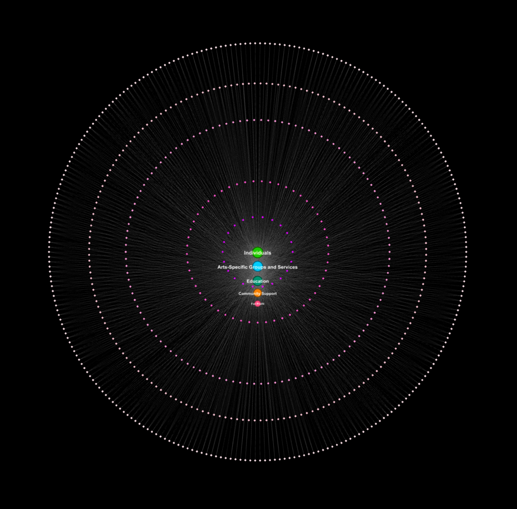
Still too ordered, static, and dull.
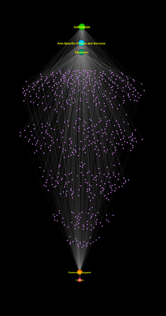
I then attempted to mimic the network splitting effect manually (fig. 7).
 |
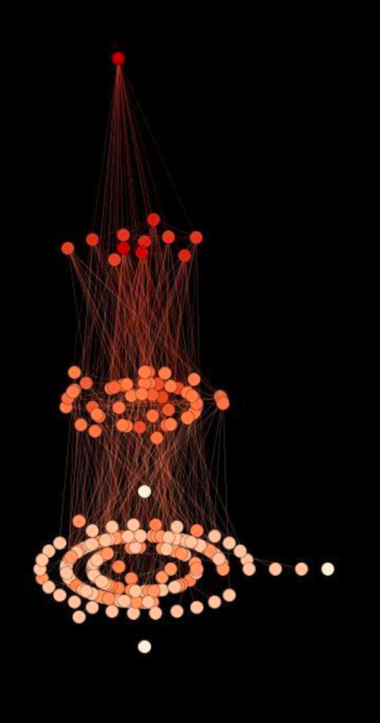 |
| Figure 7. The visualization pictured on the left is nspired by, but not approaching, the success of the network split filter (pictured right). |
|
Ultimately, I had to accept that to create the kind of visualization I had imagined, I would have start from scratch.
Walking Away, Learning More
This experience was frustrating and time-consuming, and could have been so easily avoided. Rather than repeating attempts to manually arrange a visualization, I will return to these datasets and begin again another day. Next time, I will have a better practical understanding of what networks actually are and think more deeply about how to select the data to build them.
Additional Reading and Sources
1. Tatsuya C. et. al. “CUBIC-X for whole-brain expansion and hyperhydrative RI matching.” A three-dimensional single-cell-resolution whole-brain atlas using CUBIC-X expansion microscopy and tissue clearing. Nature Neuroscience. Vol 21, April 2018, 628.
2. Americans for the Arts (Organization), National Endowment for the Arts, Cohen, Randy I., Kahn, Graciela, and Davidson, Ben. 2015 Local Arts Agency Census, United States. Ann Arbor, MI: Inter-university Consortium for Political and Social Research [distributor], 2018-06-01. https://doi.org/10.3886/ICPSR37041.v2
The post Attempting to Visualize Local Arts Agency Constituent Network(s) appeared first on Information Visualization.