2016-2017 NYC Park Felony Data by Borough
October 10, 2018 - All
Introduction
My project focused on data of reported felonies that occurred in NYC parks from 2016-2017. I began this project with an exploratory approach and as I became more familiar with the data I noticed that some boroughs (Manhattan and Brooklyn specifically) were increasing in number of reported felonies committed in parks from 2016 to 2017. This lead me to my main question of which crimes are being reported most often and why they are so prevalent in particular boroughs.
Visualization Inspiration
Before beginning my project I conducted a search for examples of crime data visualizations. Of the various visualizations I was particularly interested in attempting to replicate the following:
London Burglary Rates in November 2007
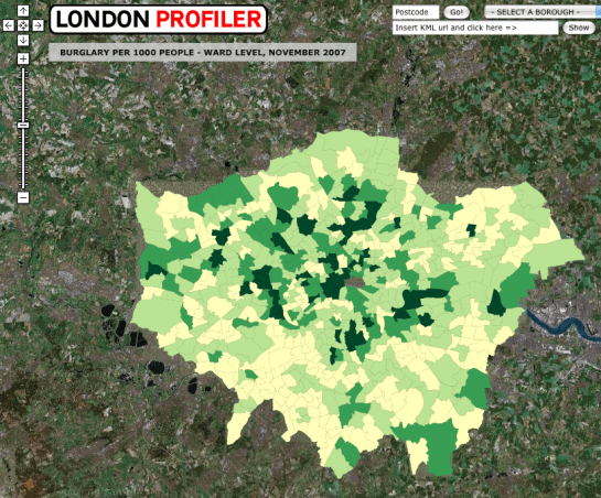 I liked this map of crime data because it allows users to get a direct sense of where burglaries are happening as well as how often. There are also a few helpful filters that would allow users to view the data in a more concentrated or specific are if they would like. The main issue with this map however it that it does not provide more traditional map elements like streets and names that might be more helpful for a user that is less familiar with this map of London.
Boston Crime Data
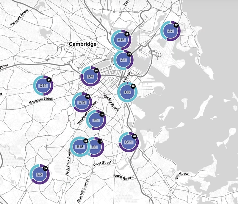 This map was interesting because not only does it display the crime rates by region, it also shows the difference between the amount of Larceny (blue) versus Motor Vehicle Crime (purple) is being committed per region. Additionally, unlike the previous map, this one keeps the streets and names which I believe may be more helpful for users. One disadvantage with this map is that since there is no specific data that represents where the crimes took place specially and because they are being displayed as circle points, it may appear that crimes are all occurring in one concentrated area rather than across a large district.
Materials
- 2016-2017 NYC Park Crime Data: NYC Parks Crime Statistics
- Data cleaning/organizing software: Excel and OpenRefine
- Data Visualization software: Tableau Public
Methodology
To create my visualizations I first gathered data from the NYC Parks Crime Statistics online database. Originally, I intended to use data from 2016-2018, however I realized that the 2018 data only included the first half of 2018 and would throw off any visualization when presented with the other years. So, for this project I used data from 2016 and 2017 only. Then to consolidate the multiple data files into one spreadsheet and further clean/organize the data I used Excel and OpenRefine. The original data files were broken up into individual sheets by quarter, so to get all of my data into a single sheet I added a date column and moved all the data into a single sheet. Then I uploaded the new data file into OpenRefine to transpose the felony categories into two columns labeled Felony Type and Felony Count. Finally, I uploaded the data into Tableau and began creating the visualizations. I created about 12 different visualizations before deciding on the final four that are displayed on the dashboard.
Results
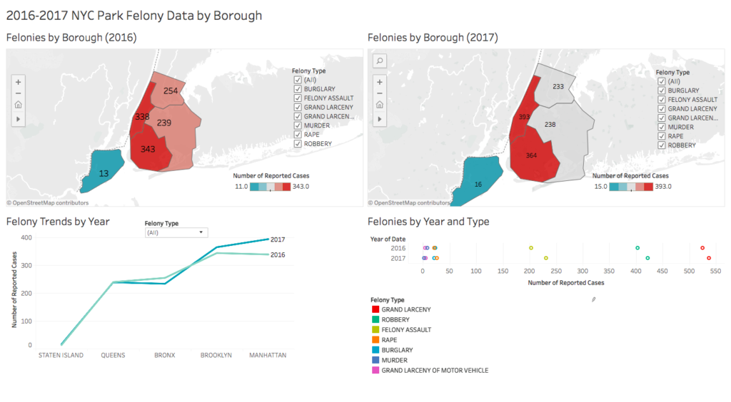
2016-2017 NYC Park Felony Data by Borough Dashboard
I chose these four visualizations to convey the overall trends of the reported felonies being committed in NYC parks and to understand which crimes are being reported most often and why they are so prevalent in particular boroughs.
Felonies by Borough Maps

These maps show the total number of felonies reported per borough and allows users to filter the map based on felony type. Boroughs that have higher numbers of reported felonies are shades of red with the lower felony counts being shades of blue. Originally, I wanted to create a visualization similar to the London burglary rates map. However, I realized that because I did not have the geodata or zipcodes for each park, the best I could do is show the data by borough.
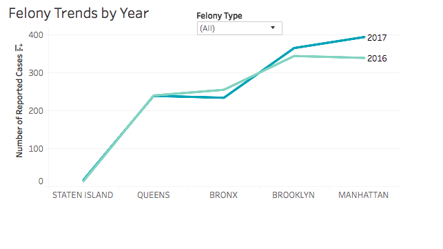
Felony Trends Line Graph
I included this line graph to further demonstrate the differences between crime rates from 2016 to 2017. I also included a filter that would allow users to choose which felonies will be included to generate the trend lines. I wanted to include this visualization specifically because it demonstrates the differences between the numbers of reported felonies very well and in a way that I think is easier to recognize that when just looking at the Felonies by Boroughs Maps. This line graph also makes it clear that despite crime rates staying mostly consistent from year-to-year, there is a marked increase in Brooklyn and Manhattan.
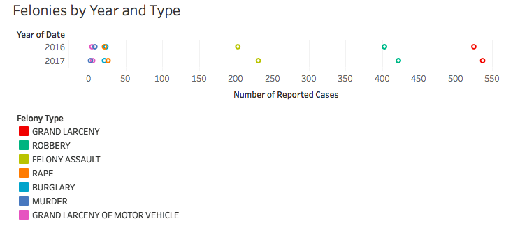
Felonies by Year and Type
Finally, I included this visualization to demonstrate which types of felonies are most common and how they vary over the years. I think this visualization is helpful in that it directly communicates which felonies are most prevalent in all NYC parks across the boroughs.
Reflection and Future Directions
Overall, I really enjoyed using Tableau and will definitely continue to practice using it so that I can create more interesting and robust visualizations. From this project I realized just how much data is needed to create even a simple line graph. In the future, I would like to include more crime data from previous years, zip codes/geographic data, and population data. I think these types of data would help tell a more interesting and complete story about crime rates in NYC parks. Specifically, population data may be helpful in answering the questions about why certain boroughs are increasing in rates of crime rather than decreasing.
The post 2016-2017 NYC Park Felony Data by Borough appeared first on Information Visualization.
