
Timekeeping Over Time: Temporal Visualizations Across History
December 18, 2018 - All
Our Relationship with Time
Time is a universal dimension of human experience, but the ways in which time has been measured, expressed, and adapted throughout history vary. The practice of timekeeping is ultimately a pragmatic one. Time must be kept to make future plans, to record past events, and to make decisions relative to time as a resource. The kinds of plans, events, and decisions that people make are not only based around practical matters (like resource availability or seasons), but are also shaped by social and cultural matters (for instance, religious observation).
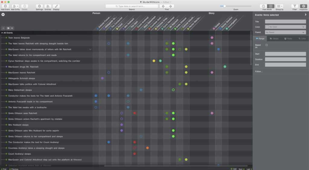
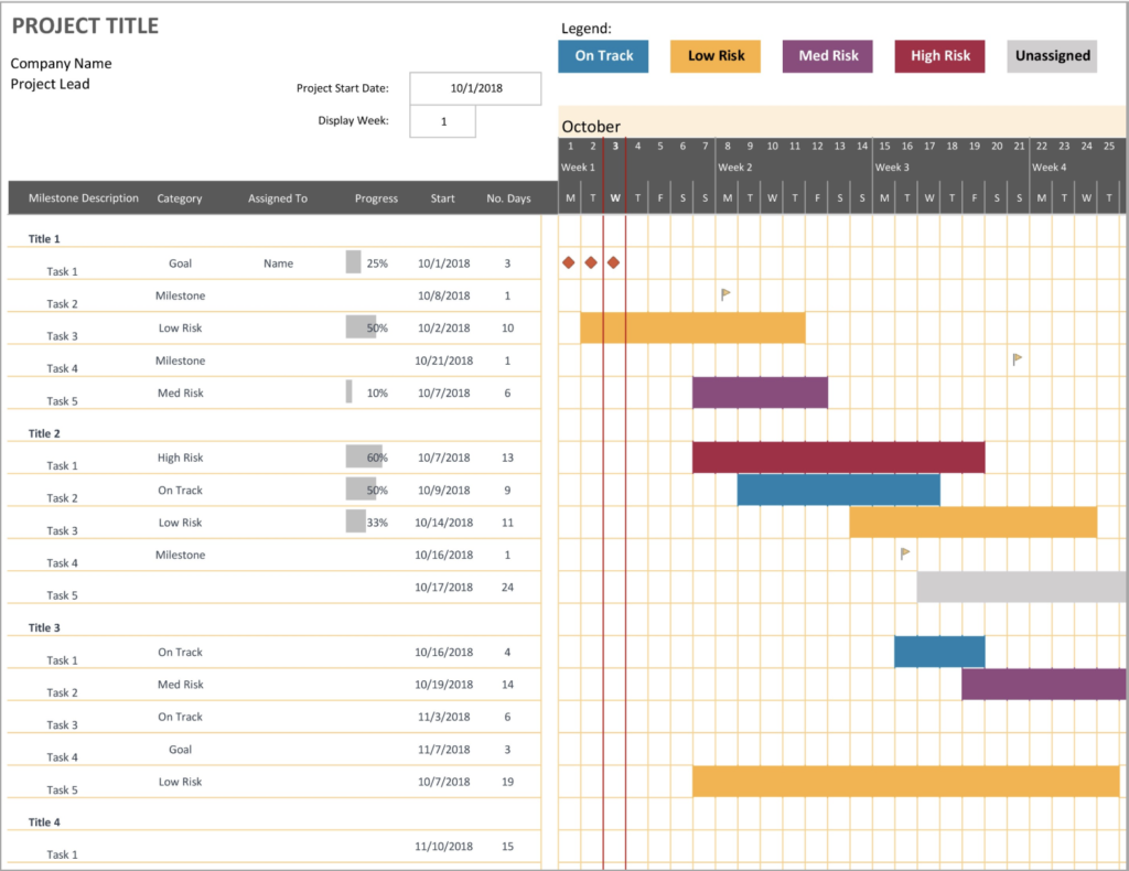
The visual-narrative potential of timelines assists us in explaining ourselves and our stories, as well as in managing practical endeavors. For instance, writers often use timeline software like Aeon Timeline, while project managers use GANNT software to keep track of parallel tasks (figs. 1, 2).
Inspiration and Goals
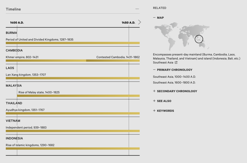
Just like time provides a framework through which to interpret and organize our worlds, time-based visualizations create conceptual frameworks for educational and cultural content. Often used to illustrate cross-cultural and cross-period relationships, the “timelining” of time itself highlights both difference and commonality between cultural groups and periods of thought across history (fig. 3). Depending on the variance with which an interpretation of history is accepted, the way we conceive of time has the potential to be destructively self-perpetuating, or, to challenge anachronistic views of the past.
The Metropolitan Museum of Art’s Heilbrunn Timeline of Art History is a resource that I frequent for both research and and personal interest. When approaching creating a timeline, no matter how simple, it was important to me to communicate something about the world and how we move through it. Further than timelining time, I decided to timeline an aspect of the timelining of time — which, for my purposes, meant creating a timeline of clocks and watches.
Tools, Planning, and Assembling the Dataset
Knowing which tools would be used from the outset was helpful, giving me a set of parameters to plan for. Tasked with using Timeline.js as the platform for my visualization, I knew that I would be using their Google Sheets template to organize the data I found, and also, the kind of information required of my dataset.
Tools |
|
| Type | Name and Source |
| Time-series visualization web application | Timeline.js |
| Spreadsheet software | Google Sheets |
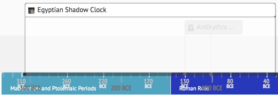
Finding objects that I wanted to feature in my timeline was not difficult — but finding objects with consistent metadata standards that would support my narrative across the history of timekeeping was exceptionally challenging. Looking for regulated metadata and proper citation information across numerous cultural institutions was more time-consuming than I had imagined, but I eventually cobbled together a small dataset of nine rows that I felt represented both digital and analog timekeeping methods, various approaches to visualization, and spanning sufficient historical periods to take advantage of Timeline.js’ “era” data type (see references at the end of this post for source information).
Data and Visual Formatting
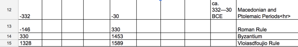
Several time periods and the earliest of my objects were estimated to originate in BCE, and their date ranges had to be input as negative values (fig. 4).
To create hyperlinks to my media citation sources in a way that Timeline.js’ styling did not prohibit, links had to be hard-coded into the provided spreadsheet. (This is not best practice, as the mark-up syntax that I used has been deprecated since the adoption of HTML5, but it accomplished my immediate goals.) Simple HTML was also used to force the kind of spacing that I wanted to see in the visual design of my timeline.
Eras, ultimately, were something I had to let go of. They neither looked very good or served a useful purpose, as my object dates were often too distant from one another to illustrate meaningful relationships using eras (fig. 5).
Results and Reflection
In the future, should I use Timeline.js again, it would be ideal to adjust the timeline’s appearance using proper CSS. The final timeline design is the result of working within the rigid restrictions of Timeline.js’ template — and attempting to circumvent its limitations with archaic, ill-advised HTML hard-coding. However inflexible that may have rendered the visualization, it still displays nicely on desktop devices, where resources like this are usually viewed from.
References and Additional Reading
Scott, Nora E. 1935. “An Egyptian Sundial.” In Bulletin of The Metropolitan Museum of Art, vol. 30, no. 4 (April), pp. 88–9
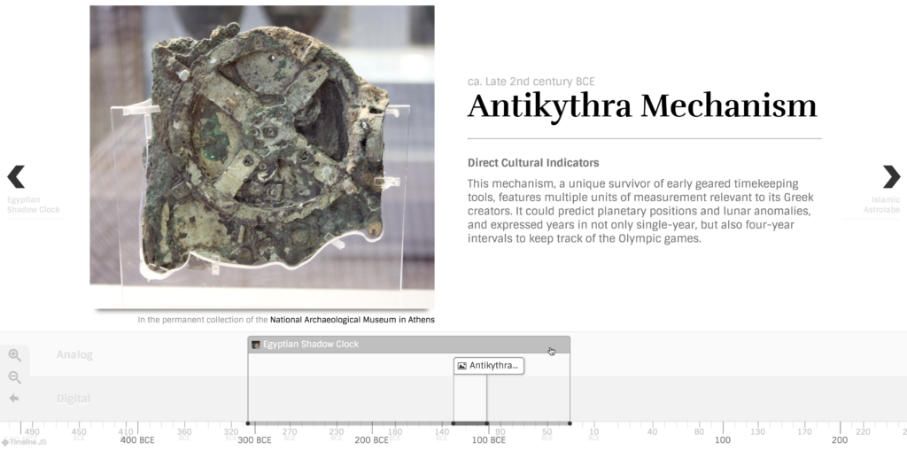
The Antikythera Mechanism, ca. 130—101 BCE. National Archaeological Museum of Athens, Greece, X 15087.
Wright M.T. (2012) The Front Dial of the Antikythera Mechanism. In: Koetsier T., Ceccarelli M. (eds) Explorations in the History of Machines and Mechanisms. History of Mechanism and Machine Science, vol 15. Springer, Dordrecht
Astrolabe. The Metropolitan Museum of Art Collection Online. (artwork in the public domain; The Metropolitan Museum of Art)
Terrestrial Globe Clock. National Maritime Museum, Greenwich, London.
Schneider, Boris. Digital Mechanics Designed for the Wrist. 2018. IWC Schaffhausen.
Digital Clock – ‘Plato Clock’, England, circa 1910. Museums Victoria Collections.
Pulsar Electronic Wristwatch. National Museum of American History, Smithsonian Institution, Washington D.C.
International Business Machines Corporation. IBM Simon Communicator Users Manual, 1994.
Hein, Buster. “iOS 10’s ‘Raise to Wake’ only works on new iPhones.” Cult of Mac, 2016.
The post Timekeeping Over Time: Temporal Visualizations Across History appeared first on Information Visualization.