Fluctuation of Funding for State Arts Agencies Over Time
December 14, 2018 - All
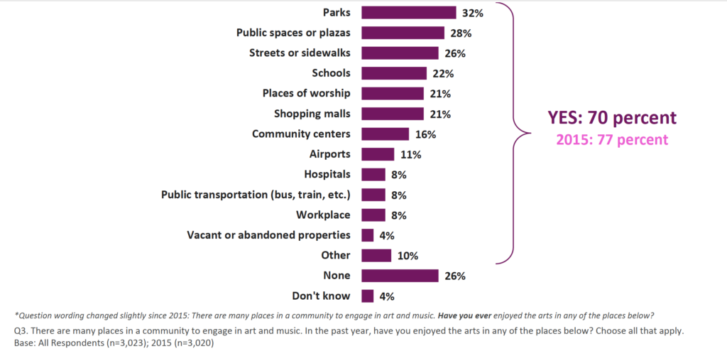
Americans value the arts now as much as ever, citing that arts empower our communities and enrich our lives. Public arts and arts in public places are accessible to most, and a social equalizer, proving to be the most popular sources and locations of American arts engagement (fig. 1).1

According to Americans for the Arts’ public opinion poll of 2018, more Americans today than three years ago believe that arts improve their understanding of and empathy for those from cultures different than their own.
Poll respondents also exhibit an understanding that funding for the arts has a deep relationship with public policy, frequently confirming that they “support government arts funding at all levels” and “will vote for candidates who increase arts funding.”2 This sentiment has been echoed in the past by numerous polls of Americans consistently over time.
American views regarding the arts are well documented by public arts agencies who use data collection, research, and analysis as a tool for art and social advocacy. Using one of their publicly available datasets, a previous visualization I created for this course revealed an acute awareness of the link between arts and public funding (fig. 2).3

The climate for the arts in America in 1980, when the Reagan administration enacted dramatic budget cuts to the National Endowment for the Arts (NEA), is not unlike our climate today. The NEA faced the threat of being shut down completely by the current president’s proposed budget at the beginning of this year. State arts agencies — who receive 40% of their federal grants through the NEA — ultimately continue to operate because of cross-party support.4
Goals and Inspiration
Support and advocacy for the arts, especially arts that are publicly accessible, doubles as support and advocacy of personal meaning, community development, and social good. Information visualization is an indispensable tool for all veins of social advocacy.
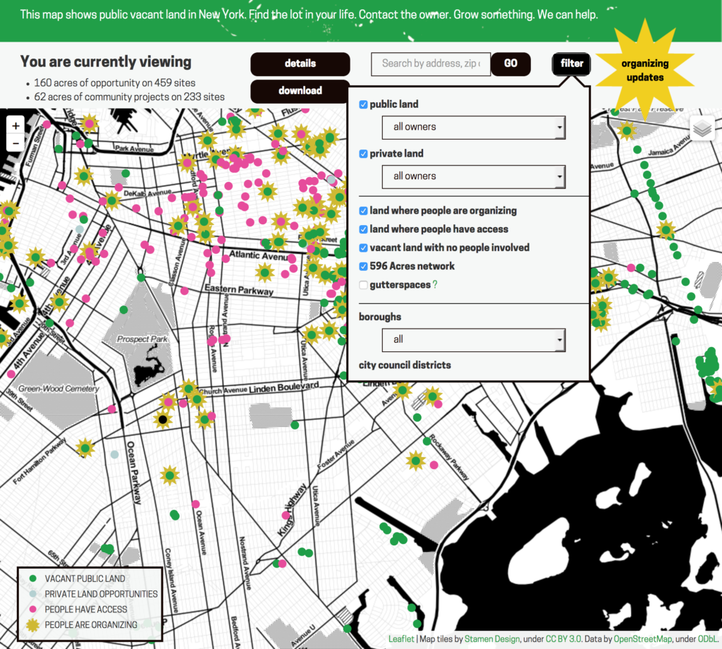
Inspired by Living Lots NYC, a land advocacy tool created by 596Acres, I hoped to develop a tool to raise awareness of and inspire curiosity about public arts funding in America (fig. 3).
Planning & Tools
Instability is a hallmark of public arts funding. Creating a tool that could illustrate this quality would require large amounts of time-based data. Additionally, to reflect state arts agency funding in terms of state-level impact, equally large amounts of population data was needed to correspond with years of funding information. For the purposes of this project (being conducted individually), I limited the initial scope to around fifty years of data (1970—2017).
Principally, education and advocacy tools must be useful, allowing for users to engage with them actively and follow their own curiosity. Any meaningful representation of public arts agency funding over time needed to visualize large-scale relationships, while also allowing users to explore and narrow criteria to investigate relationships on a more granular level. Tableau Public was selected to accommodate these design requirements.
Tools |
|
| Type | Name and Source |
| Plain-text editor | Sublime Text |
| Integrated Development Environment (IDE) | R Studio |
| Spreadsheet Software | Google Sheets |
| Visualization Software | Tableau Public |
Data Cleaning and Aggregation
The core dataset used for the project was the National Assembly of State Arts Agencies’ Public Funding Sourcebook. Their revenue data was already tidy, but state population datasets retrieved from the U.S. census took strikingly different forms. State population data for 1970—2017 was collected across thirteen separate files that infrequently shared common formats.
Datasets |
|||
| Agency / Institution | Source | Dataset | File type |
| National Assembly of State Arts Agencies | Annual Appropriations Revenue Survey Data | State Arts Agency Public Funding Sourcebook | .xls |
| United States Census Bureau | State Population Totals and Components of Change: 2010-2017 | National, State, and Puerto Rico Commonwealth Totals Datasets: Population, population change, and estimated components of population change: April 1, 2010 to July 1, 2017 | .csv |
| State Intercensal Tables: 2000-2010 | Intercensal Estimates of the Resident Population for the United States, Regions, States, and Puerto Rico: April 1, 2000 to July 1, 2010 | .xls | |
| Intercensal State and County Characteristics Population Estimates with 1990-Base Race Groups | 1999 | .txt | |
| 1998 | .txt | ||
| 1997 | .txt | ||
| 1996 | .txt | ||
| 1995 | .txt | ||
| 1994 | .txt | ||
| 1993 | .txt | ||
| 1992 | .txt | ||
| 1991 | .txt | ||
| State Intercensal Tables: 1980-1990 | State Population Estimates and Demographic Components of Change: 1980 to 1990, by 5-Year Age Groups and Sex | .txt | |
| State Intercensal Tables: 1970-1979 | 1970-1979 Intercensal State Estimates by Age, Sex, Race (PE-19) | .xls | |
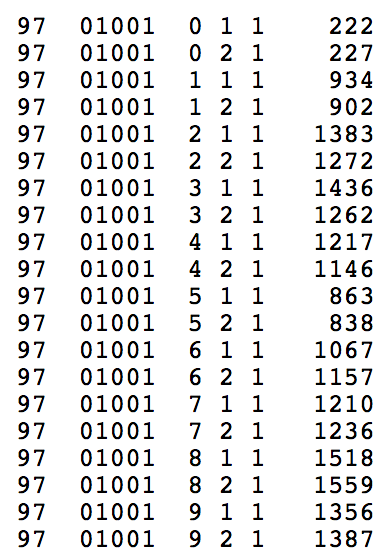
State population datasets for the nineties were particularly scattered. Available as text files by individual year, these datasets took some time to normalize. Population estimates divided by county code were summed after replacing county code numbers with their corresponding states, checking against county FIPS codes (fig 4).
 |
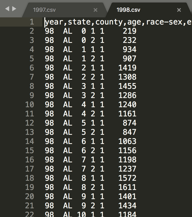 |
| Figure 4. Population estimates divided by county code were summed after replacing county code numbers with their corresponding states. | |
Once the data was combined and prepared for Tableau, new columns were created to calculate the percent change of funding from one year to the next to better communicate the volatility of public arts agency funding,
Developing the Visualization
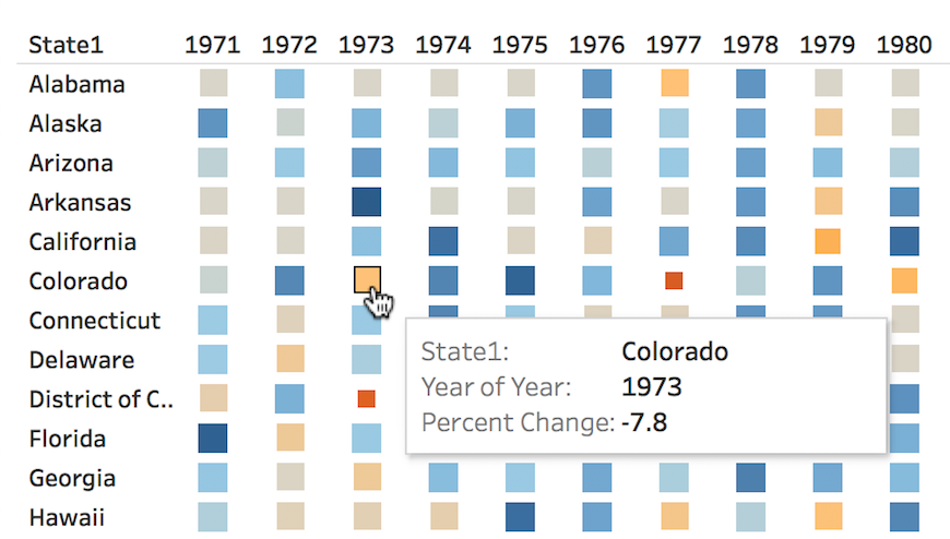
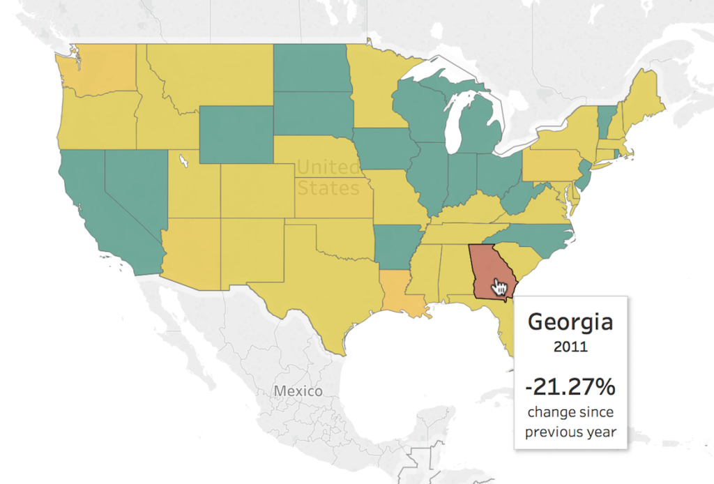
Several kinds of visualizations were tested for exploratory purposes. Although helpful for observing broad trends or exceptional outliers, highly representational options like area charts and abstract heat maps would not be useful in practice (fig. 5). Geographical representations characterized physical trend groupings and outliers well, but were not ideal for expressing change at multiple levels (fig. 6).
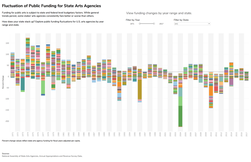
The wealth of time-series data combined with state-specific data lent itself to a stacked bar chart (fig. 7). National trends could be seen easily over time, while individual states could be filtered and isolated. Experiments with multiple visualizations on a dashboard established that a single time series of such size stood better alone. An initial state color legend was eliminated, as there were simply too many colors to usefully organize visual information, but the colors themselves were retained to establish visual difference between groups of information.
The visualization prototype had few but promising features.
Testing the Prototype
Qualitative feedback was needed to identify usability issues or areas for potential improvement. A convenience sample of six participants with a love for art (the only screening criteria) were recruited at Brooklyn College for an in-person, task-based usability study. Each consented to have their voices recorded throughout the study, and for their actions to be captured via screen recording on the laptop provided for the test.
User Testing
Participants were given a moment to look at the visualization without influence. They were then given and asked the following semi-structured tasks and questions. Throughout the process, they were encouraged to describe their actions and impressions aloud.
- Could you describe to me what you see, or if anything stands out to you?
- Show me how you would look for information about a state that you feel connected to.
- What do you notice about this information?
- Is there anything you wish you could do with this tool that you can’t?
- Do you feel like you’ve learned anything from using this tool, or discovered something you’d like to know more about?
- What did you like about this tool? Was there anything you disliked, or that you think would have improved your experience?
Results and Observations
It was observed that participants consistently did not read the descriptive text below the title, and more specific feedback informed design changes.
Participants found personal meaning in trends.
Seeing positive trends represented with data can give people hope for the future.
There’s a positive trend currently — that really surprises me. That makes me feel better.
Outliers inspire questions — and require answers.
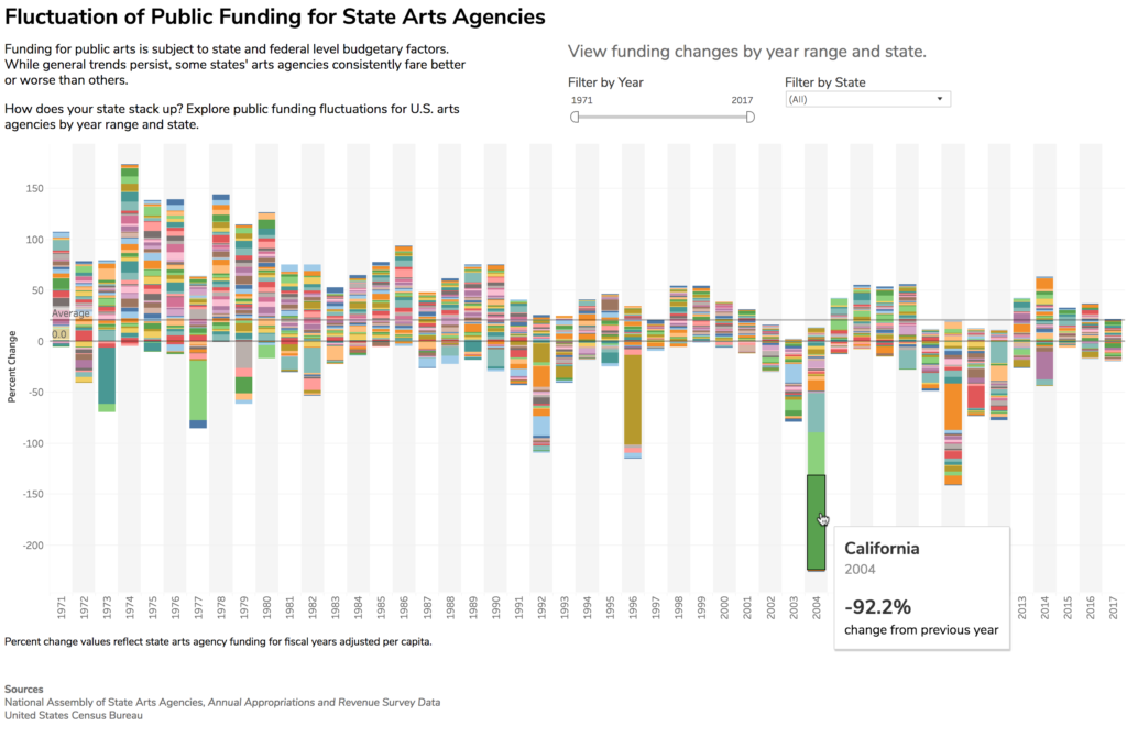
Users immediately focused on outliers and wanted additional context to explain their differences.
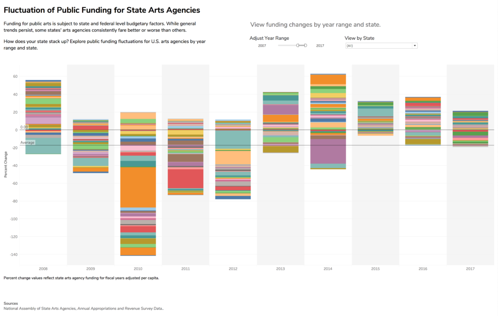
For something really severe, it would be nice for there to be an indication of what might have happened — like here in 2004, almost all the states had a decrease in funding, especially with California. That’s negative 92 and change. That’s almost their entire budget completely slashed. What exactly happened?
Multiple state filters were needlessly confusing.
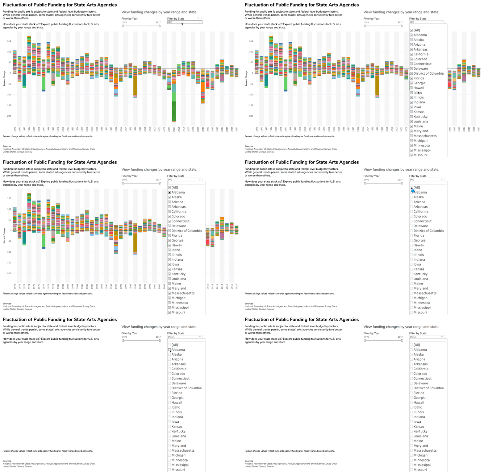
Users found too many options overwhelming.
I don’t really know what this is for — I just want to look at one state. Why do I have to uncheck all of them first?
Revisions, and Future Development
User feedback, as well as observation informed several design changes:
- Descriptive text was limited to a call to action and brief overview.
- Filter names were changed to active statements that are easier to understand, like “Adjust Year Range” over “Filter by Year.”
- More negative space was incorporated to mitigate visual overload.
Features that provide additional information about trends, events associated strongly with certain years, and other meaningful context will be added in the future for further testing.
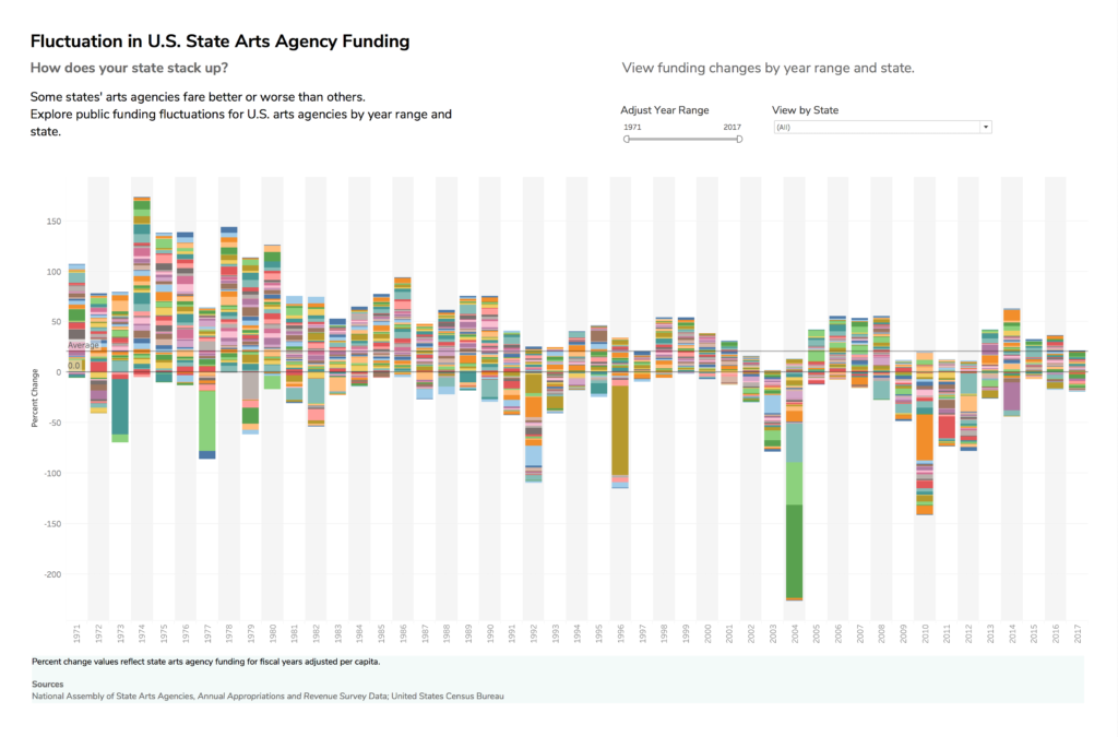
View the revised visualization here.
Additional Reading and Sources
1. Americans for the Arts (2018, September). Americans Speak Out About The Arts in 2018: An In-Depth Look at Perceptions and Attitudes About the Arts in America. Retrieved from https://www.americansforthearts.org/node/101584.
3. The National Research Center of the Arts. Americans and the Arts [1973 – 1992]. Ann Arbor, MI: Inter-university Consortium for Political and Social Research [distributor], 2015-03-19. https://doi.org/10.3886/ICPSR35575.v1
4. National Assembly of State Arts Agencies. About State Arts Agencies. Retrieved from https://nasaa-arts.org/state-arts-agencies/.
The post Fluctuation of Funding for State Arts Agencies Over Time appeared first on Information Visualization.