Mapping Hurricane Sandy’s Impact on Brooklyn
November 28, 2018 - All
Introduction
In late October of 2012, Hurricane Sandy made landfall in southern New Jersey. Sandy’s storm surge flooded parts of the city in all five boroughs in addition to every subway tunnel under the East River. The city is still feeling the effects of this surge today. As the climate changes, NYC is likely to experience more storms on the scale of Sandy, or potentially worse. Because of this, I felt an exploration into the potential financial impacts of such storms could generate public interest in climate change. For this project, I address the question of the financial value of real estate flooded by Sandy’s storm surge, as well as the extent of the flooding.
Inspiration
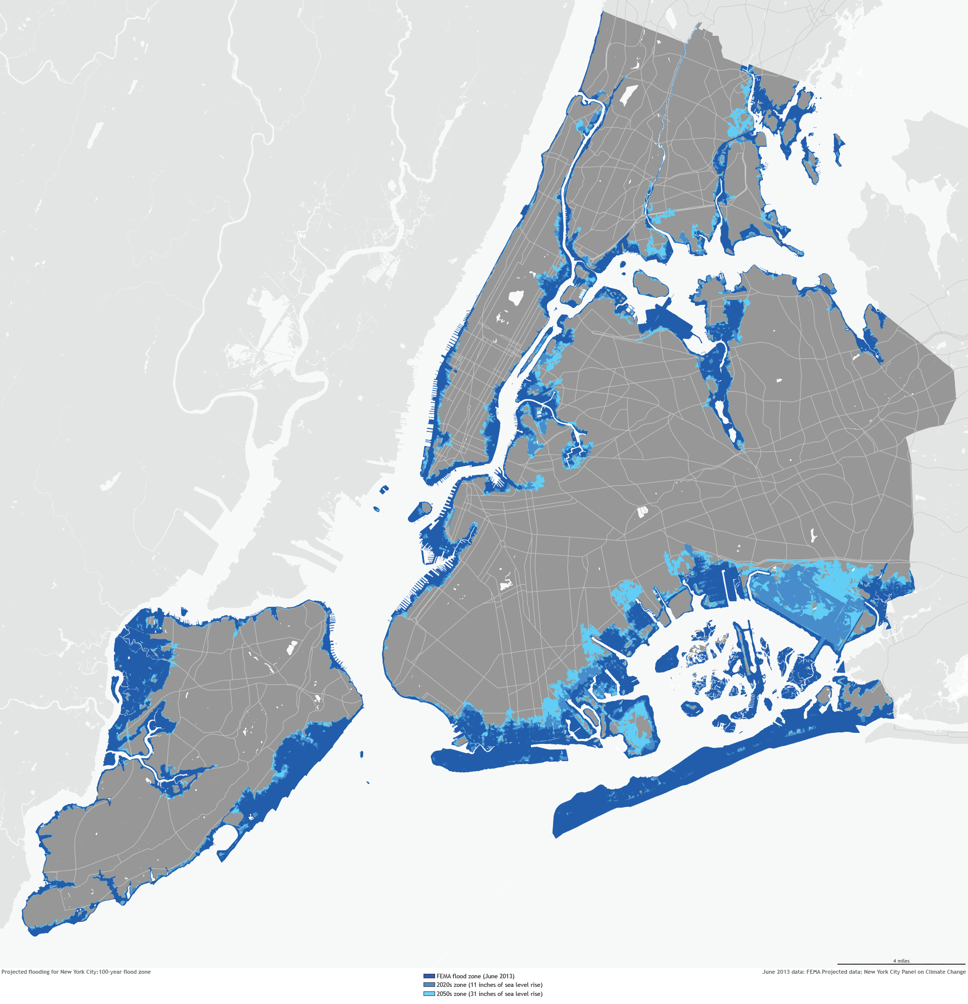
This project was initially inspired by NOAA’s “Future Flood Zone Maps for NYC“. Their visualization of what a hundred year flood could look like assuming a sea level rise is powerful.

This map does an excellent job at conveying the scale of the impact of flooding. However, I also think it downplays the true human cost. It shows us that Brooklyn and Staten Island will be hit hard, but because of the level of detail presented in the static map, the true impact to people appears to be smaller than it actually would be. It’s hard to tell the density of the areas as risk for flooding, which is a shortcoming for this map.
Materials
The data powering this map comes from the City of New York. The Sandy Inundation Zone shapefile is from opendata.cityofnewyork.us.
The Brooklyn tax lots shapefile is MapPLUTO data from NYC’s Department of City Planning. Tax lot valuation data is regular PLUTO data in csv form, accessed through the same site as the MapPLUTO data.
This map was assembled using Carto Builder. Shapefile manipulation and creation was done using QGIS v3.4.
Methodology
Initially, this project was supposed to highlight buildings that had experienced flooding during Hurricane Sandy. However, because I knew that I also wanted to do some basic financial analysis around the impact, I ended up using tax lots for ease of joining financial data from PLUTO. So, for this map, tax lots are a sort of stand in for individual buildings. For the most part it’s fine, though there are lots that contain multiple buildings in some places.
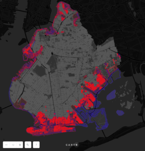
To get a shapefile of just the impacted tax lots, I used QGIS’s ‘Select by location’ processing functionality to select all individual polygons in the tax lot layer that were overlapped by the Sandy Inundation layer. These selected polygons were then copied to a new shapefile.
All three shapefile layers (Sandy inundation zone, all Brooklyn tax lots, Sandy affected tax lots) were added to Carto and styled. An additional dataset, the PLUTO data with tax lot values and other data was then added to Carto. This data was joined to the Sandy affected tax lots spatial file with a join on a unique lot identifier in the data. With this join, analysis was run formulating the total value of all affected lots in Brooklyn.
Results and Interpretations

Click here for interactive version.
The first thing to notice is the scale of the lots affected by Hurricane Sandy’s storm surge, nearly 13% of all lots in Brooklyn. That’s a huge number. Second, the value of all the lots affected is nearly $9.3 billion. Clearly southern Brooklyn is a problem area, showing inundation quite far from the coast. Red Hook was completely flooded, affecting every lot in the neighborhood. Greenpoint also suffers badly. This map shows the need for some sort of flood mitigation system for the City of New York.
Reflection for the future
This project was originally designed to span the whole city, but due to Carto’s limitations on file size, and number of data sources, I had to scale back to just Brooklyn. Overall, I’m pleased with the results, and I feel that this map does a good job conveying the scale of the impact of Sandy. The analysis on the financial impact works as well, though it does imply that a lot was a total loss after Sandy, which isn’t true. I also wasn’t attempting to portray that, I was just making a point about the potential cost should we not pursue negating efforts around climate change. The scale of the impact remains impressive, and that was my main goal with this map.
For the future, I would like to rebuild this project without the limitations imposed by Carto, allowing a full exploration of NYC. Additionally, using NOAA’s projected flood zones to build a projection of the potential impact of a catastrophic storm would be of interest, and pursuable in a similar fashion.
The post Mapping Hurricane Sandy’s Impact on Brooklyn appeared first on Information Visualization.