Visualizing US Household Incomes using Carto
November 28, 2018 - All
![]()
Introduction
The Idea
I have always been really fond of maps in general and I never miss out on any opportunity to play around with them. The moment I was introduced to the tool Carto and I was shown its powerful abilities to help visualize geo-spacial data, I immediately felt the need to experiment with it and explore its set of features. As a graduate student who would soon be looking for jobs, I thought it would be a good idea for a project to analyze US household incomes across various geographical regions and figure out what places pay well, and hence I set out on searching for a good dataset for this topic.
The Inspiration
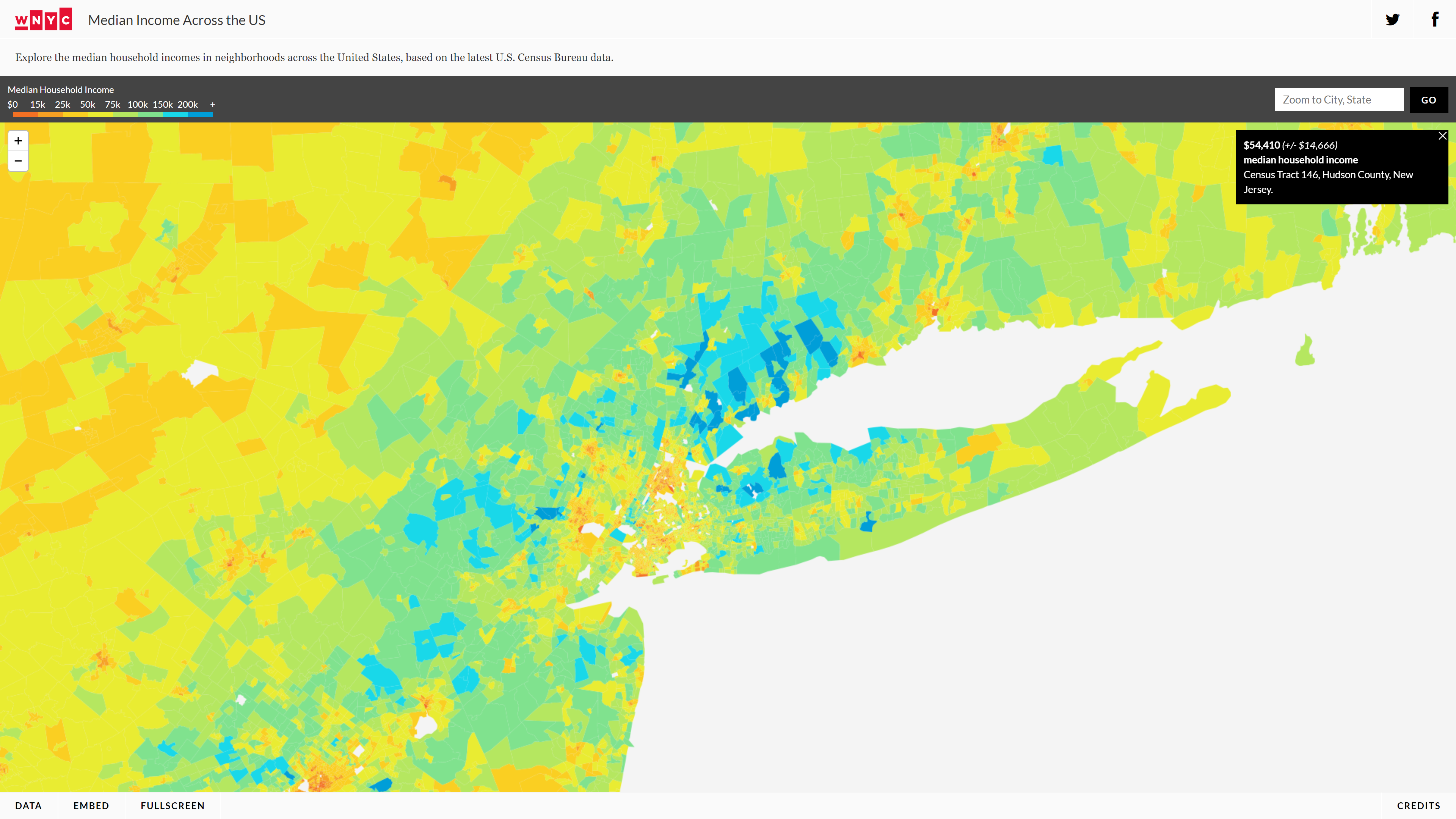
My very first source of inspiration for this project was WNYC’s Median Incomes Across the US. This visualization displayed how the incomes varied across various regions with the use of a color scale. I was able to clearly differentiate between these regions and I found the use of mouse-hover to display the median income in a box to the top-right, quite useful. The hover box was non-intrusive and would immediately update on changing the pointer location to another region. The color scale, however, did not completely seem intuitive to me, as orange depicted the lowest incomes, green – about average and blue, the highest. My mental model did not agree with this color mapping for some reason and I always felt the need to look at the scale again.
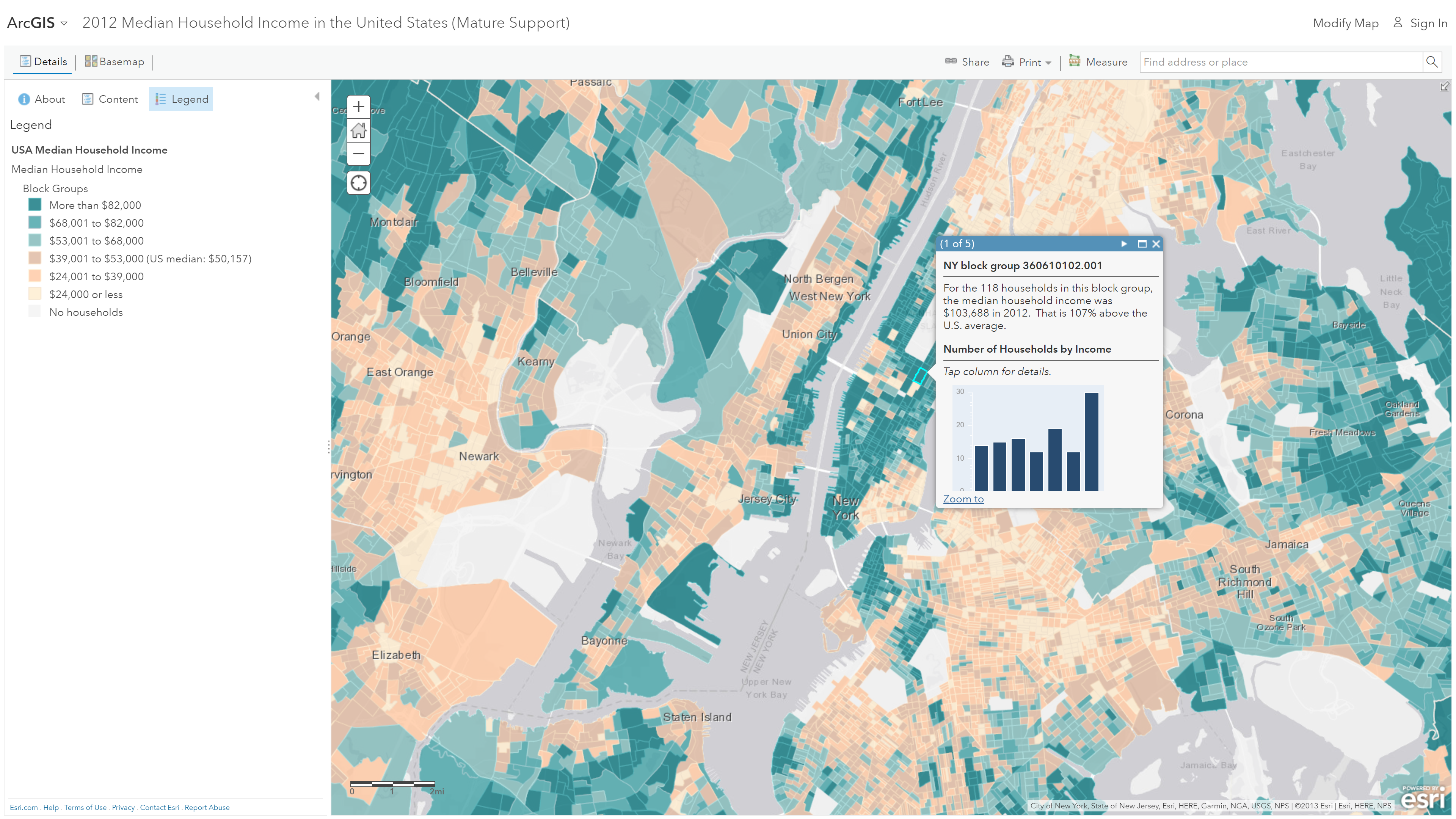
The next and the most helpful source of inspiration for my project was ArcGIS’s 2012 Median Household Incomes in the United States. This visualization used a very good color palette to differentiate high median incomes from lower ones, and I could immediately understand it at first glance. I found the use of pop-overs on clicking on a region to display more information, very helpful. These pop-overs not only displayed how many households were within that region for which the median income was generated but also displayed a distribution of the number of households across various buckets of income ranges. I also thought that the website’s use of click-interaction on the map made more sense than a mouse-hover interaction due to a large amount of data that had to be displayed for each region. Furthermore, the bar charts that displayed the distribution of incomes was interactive, which also required the pop-over to be open until the user manually dismissed it.
Materials
Tools
Carto – A Software as a Service (SaaS) platform that provides ‘Geographic Information System (GIS)’ and ‘Web Mapping’ tools for displaying in a web browser. I used this tool to create my final visualization using geospatial datasets.
Microsoft Excel – A spreadsheet software by Microsoft, part of the MS Office suite. I used it for viewing the dataset CSV files and understanding them before plugging them into Carto.
Dataset
My primary dataset was found on Kaggle – US Household Income Statistics. This consisted of over 32,000 track and geographic household income statistics. This dataset did not require any cleanup as such, but there was some bad data in the counties column, so I decided to ignore it while creating my visualization.
Process
Feeding the dataset into Carto
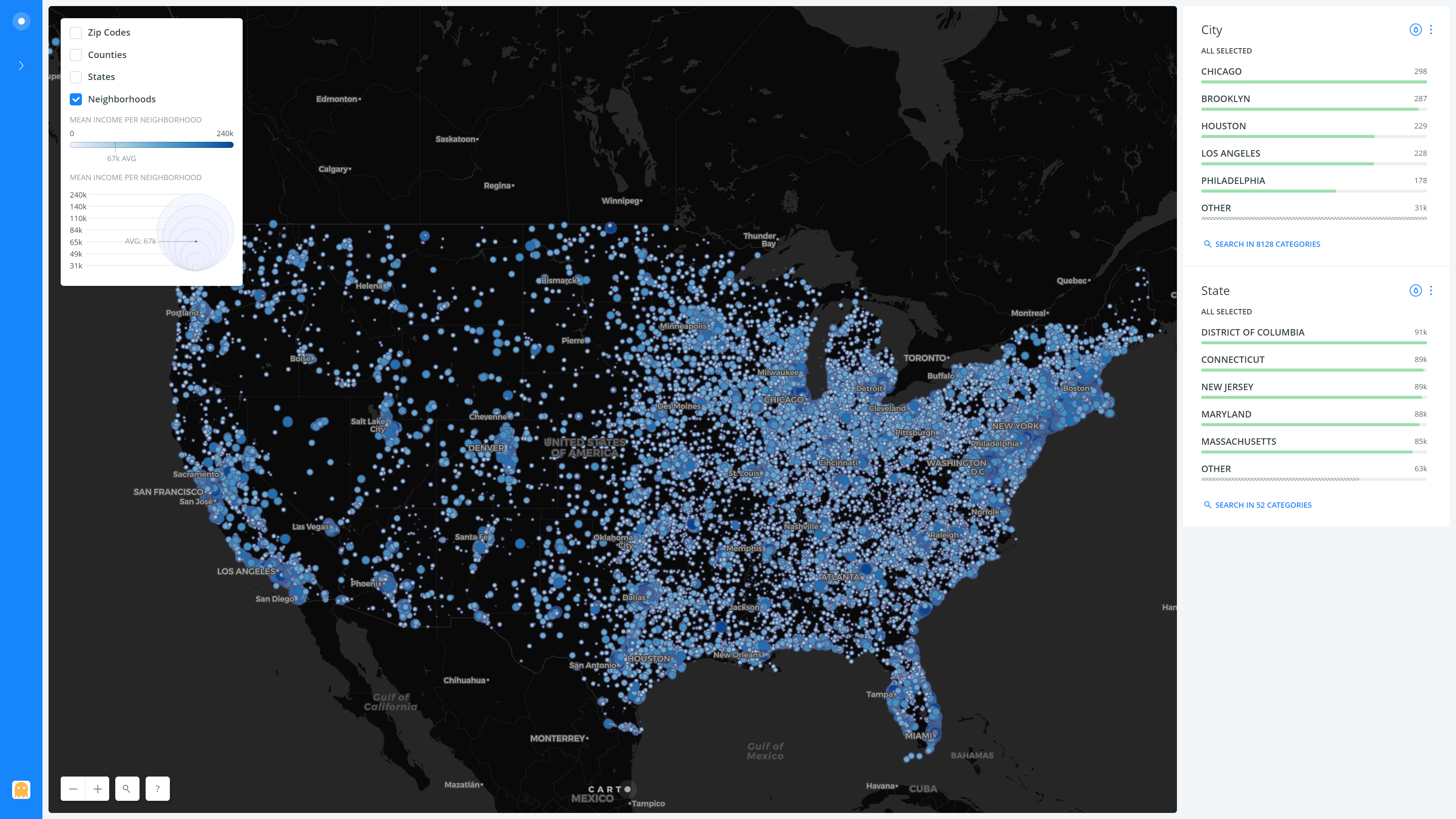
Although the first step would be to upload the acquired dataset into Carto, I wanted to examine the dataset beforehand to understand what all I could leverage for my project. I, therefore, opened it in Microsoft Excel and went through all the columns carefully. Upon inspecting the data, I found that some of the columns were not required, so I simply deleted them in Excel. Finally, I uploaded this modified file to the datasets section in the Carto interface. The first iteration of my visualization came to life once I chose to display data on the map and vary the size by ‘mean household income’. However, the results weren’t favorable as all I could see was ugly humongous dots all across the map of the United States of America. These points were also of the same color, and there was no way to distinguish between them. This visualization, therefore, needed many improvements in order to make it more usable.
Improving the usability of the visualization
Firstly, I had to reduce the size of the monstrous blobs on the map and to remedy this I used the size feature and set the minimum size to 1 and maximum to 15 so that there is not too much variance. Furthermore, I also set the number of buckets to 7, so that the range of mean household incomes are split up into more buckets of smaller ranges, hence showing more variation in the different points on the map. I also experimented with colors combinations for the map and the various dots on the map based on mean household income. I found that a good contrast was obtained by using a dark colored map in the background and vibrant blue dots that would stand out. Also, I set the colors of the dots to vary from a very light shade of blue for the lower mean incomes to a darker one for the wealthier. For this again, I used 7 buckets to show more variation, similar to how I had done for the size. These changes really helped improve the usability of the visualization as all the points were clearer and differentiating between them was easier.
Adding Boundary Layers
The dataset I obtained from Kaggle had household incomes by neighborhood and I wanted to expand the visualization to include a method to compare values by Zip Code, County, and State. To do this, I had to make use of the layers feature of Carto and a kind of dataset known as a ‘shapefile’, that consists of boundaries (Shape) of the geographical regions of interest. I found these shapefiles from the United States Census Bureau – US States, Zip Codes and Counties. I added these as layers to the Carto visualization and used the ‘aggregation’ method to collect all the data points contained within each of the shapes/boundaries. For instance, Carto automatically captured all the neighborhoods that came within the New York state boundary and calculated the average of the mean income of all these points. The same process was followed for Zip Code and County boundaries. Finally, I also followed the same color scheme that would vary on the mean of the household incomes over 7 buckets for each of the additional layers. The purpose of maintaining the same color scheme was for the users to easily understand what each color signified without having to rethink or refer to the legend.
Adding interactive pop-overs
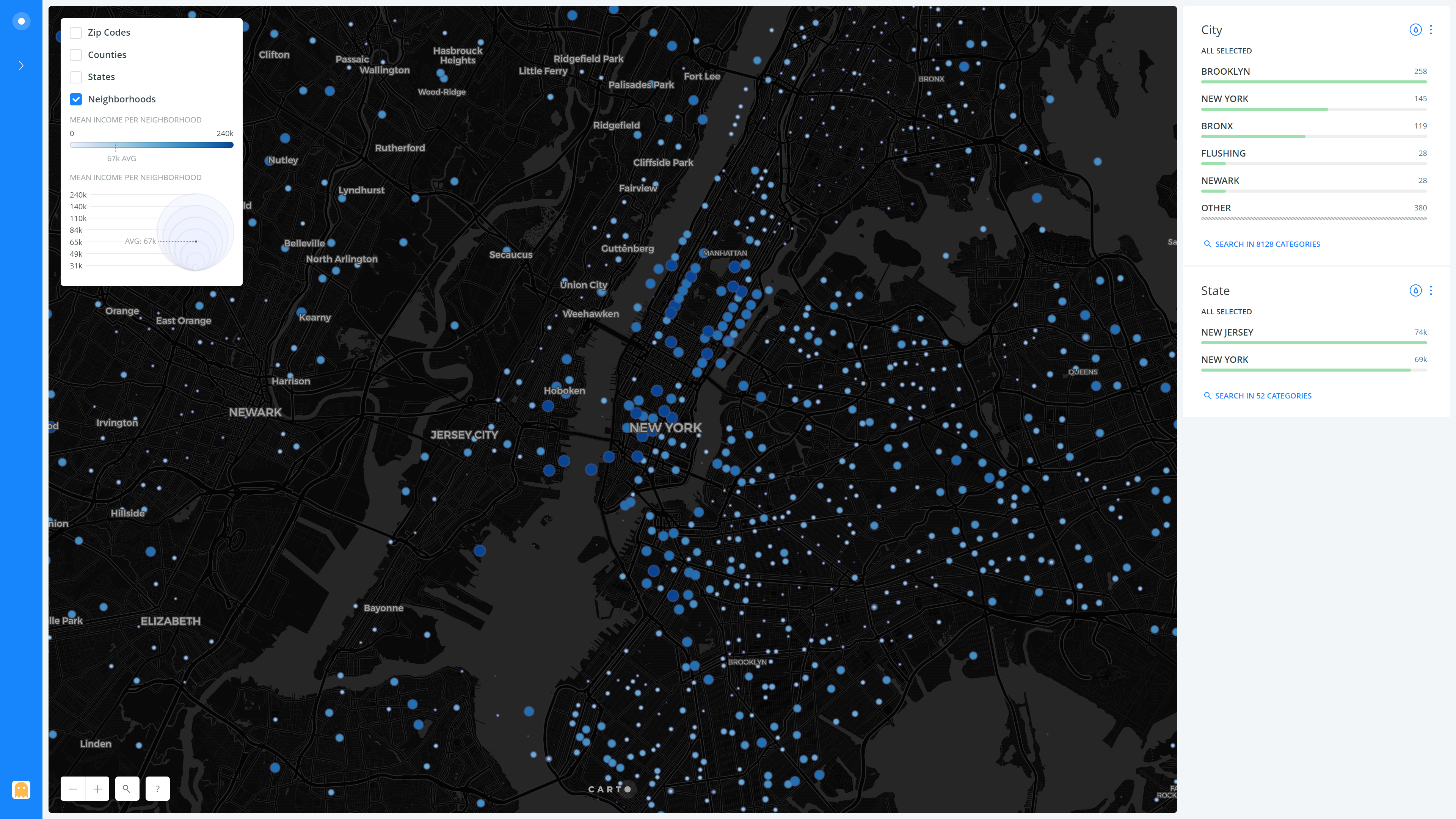
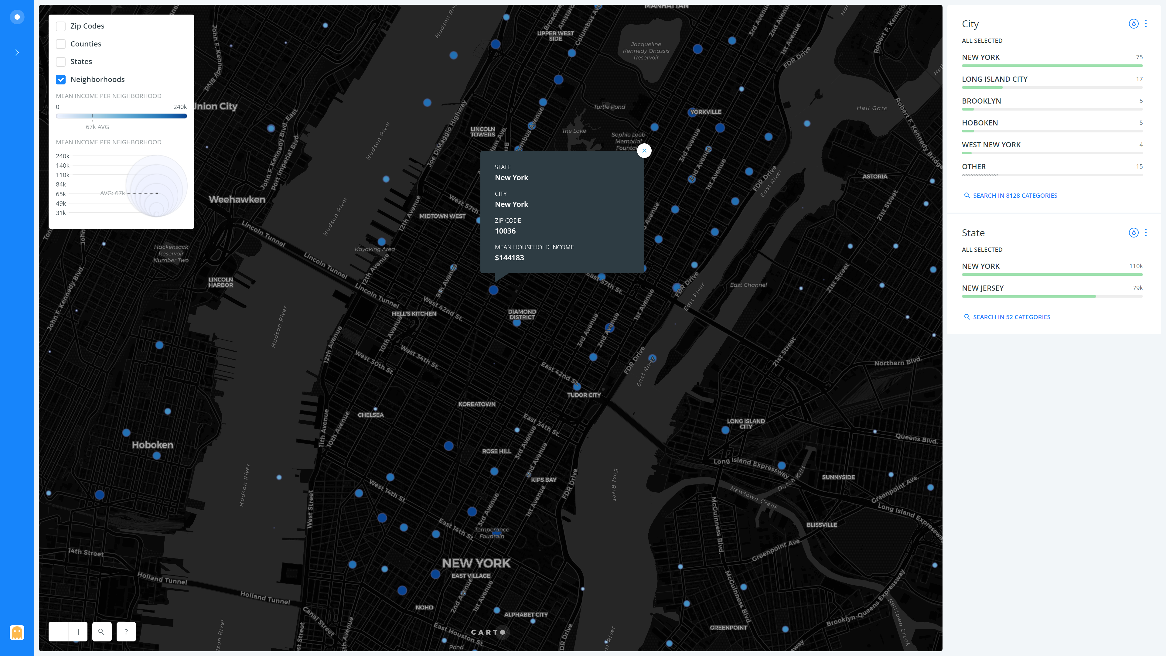
As I was heavily inspired by ArcGIS’s 2012 Median Household Incomes in the United States and its detailed pop-overs I decided to add interactivity to my visualization as well. I added an on-click pop-over to every layer so that if the user were to click on a neighborhood point, a zip code, a county or a state in the respective layers, it would open up a pop-over showing more details about that region. I added details like ‘State’, ‘City’, ‘Mean Household Income’ etc. which would vary based on the layer selected, so as to make the popovers useful.
Adding legends
Finally, to have a guide for the users to refer to, I added a legend for each layer which would describe the color variation and also the size variation (applicable only to the Neighborhoods Layer) to describe what they meant for each.
Results
View the full-fledged US Household Incomes Visualization in your browser (Carto)
The result of all the above steps and several other tiny tweaks and refinements is as follows, presented layer-wise (Neighborhoods, States, Counties, Zip Codes) –
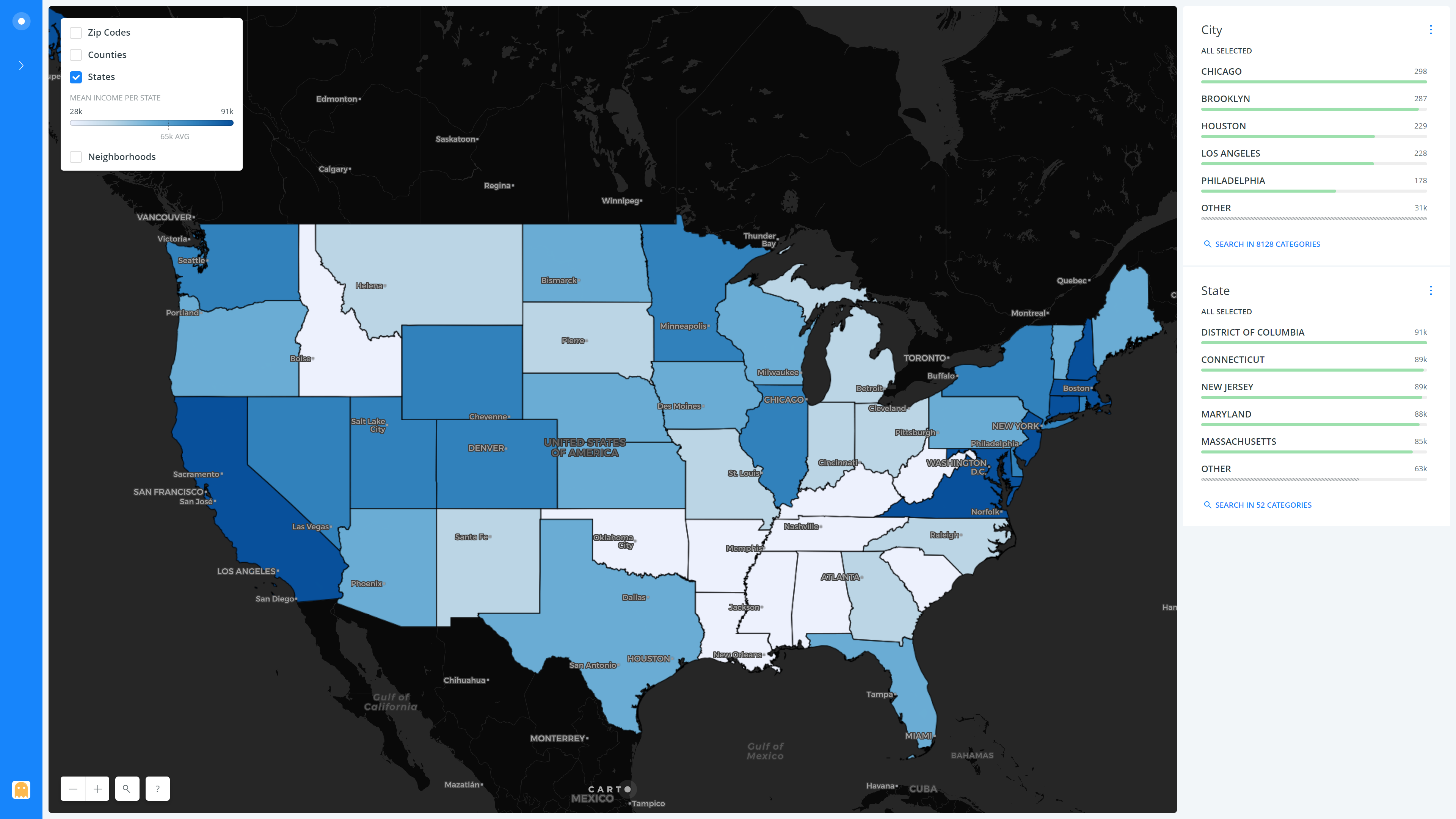

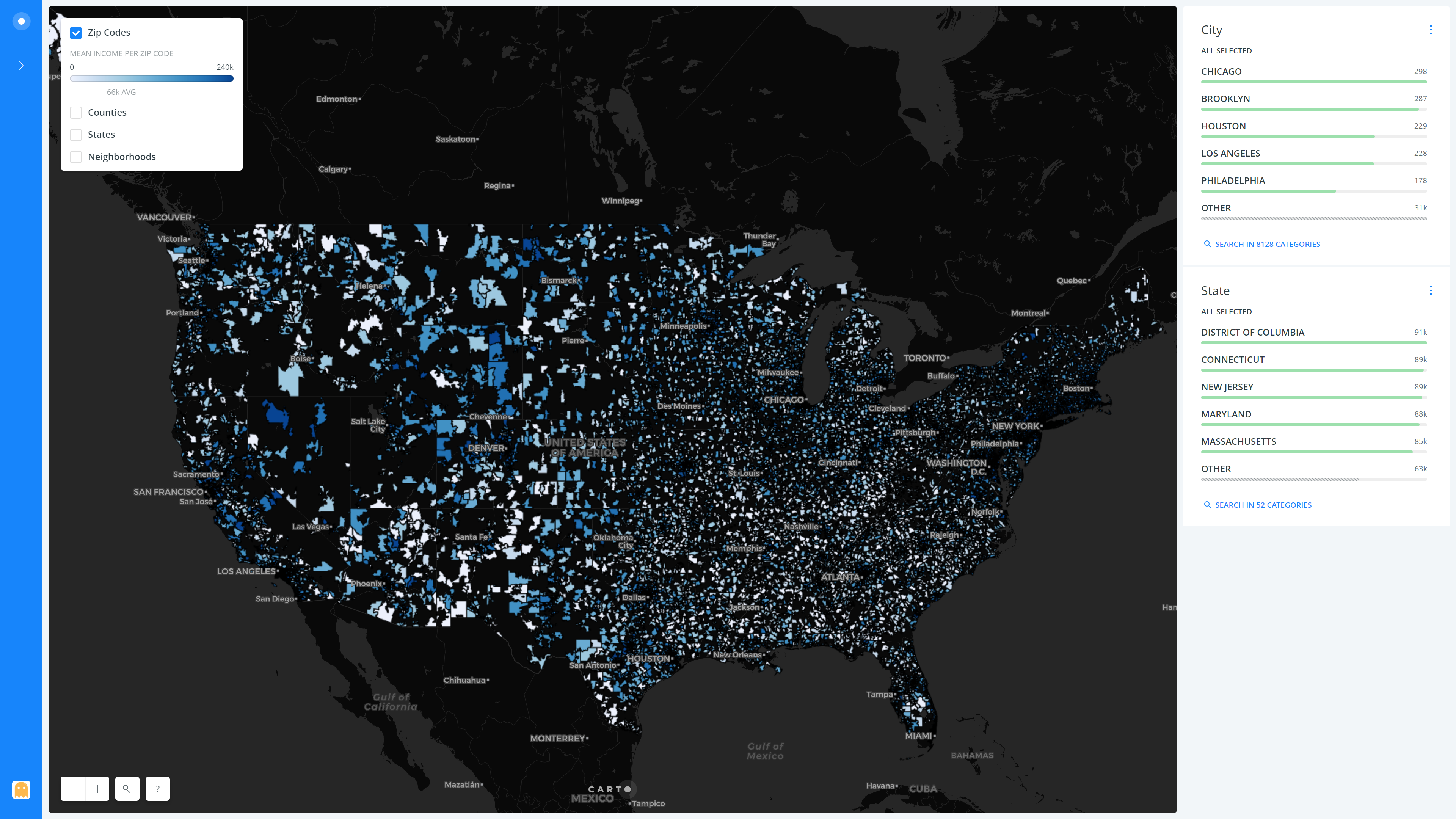
Overall, we can see how the incomes are quite high in the California Bay area, as well as the New York City region. The mid-west is less populous than the East and the West coasts (Can be observed by the lower count of points in that region in the ‘neighborhoods’ layer) and has a lower mean household income than them. The lowest mean income state is Mississippi with $48,924, while the highest is Connecticut at a whopping $89,509 (Surprisingly, it’s not California as I had anticipated!). It is interesting to note that both New Jersey and Connecticut have a higher mean income as compared to New York state, which I feel is mostly due to the fact that many people that work in New York City commute from the other two states. Also, the primary contributor to the mean income of New York State is New York City, while the rest of the state is quite sparsely populated, with a lower overall contribution.
If we were to zoom in to the New York City area, we can see how the incomes vary between the five Burrows and their surrounding areas. It is evident that Manhattan has a much higher mean household income than Queens and Brooklyn. But it can also be seen that some parts of Brooklyn like Dumbo and Brooklyn Heights also have high mean incomes, very much comparable to that of Manhattan. It is also interesting to see how the East Village side of Manhattan is lower on the income as compared to the rest of it, and heading North towards the Bronx also drastically pulls down the mean incomes. Similar to the New York City area, we may make use of the visualization to zoom in to any other point of interest on the map of the US and compare the incomes.
You may also view the full-fledged US Household Incomes Visualization in your browser (Carto).
Reflection & Future Direction
Carto has become my favorite geo-spacial data visualization tool ever since I started exploring it and worked on this project. I love how easy to use the interface is and I am particularly fond of the many features it offers.
However, there are a few pain points I experienced while using it. One of them that I feel is worth mentioning was the lack of the ability to set the layer selector to show just one layer at a time. My visualization’s main purpose was to allow users to compare household incomes by neighborhood, zip code, county, and state, and the only way this is possible is to isolate these as their individual visualizations. Having any two or more layers overlap would not make any sense and completely defeat the purpose of the visualization. Therefore, having only a single layer selected at a time was very important, and without this feature, users need to manually select a new layer and deselect the previous layer to make complete sense of the visualization. Hopefully, Carto adds this feature in any upcoming versions.
Overall though, I feel that my project allowed me to get a good idea about how the household incomes vary across states, counties, zip codes and neighborhoods. For the future, I believe it would be a great idea to find a dataset about the cost of living index of each region so that I can use it along with the household income and figure out how wealthy (or not) they are.
The post Visualizing US Household Incomes using Carto appeared first on Information Visualization.