
New York City Crime Mapping 2018
November 28, 2018 - All
https://savi.carto.com/u/peko612/builder/1a23c8e7-98fc-412c-8523-cd1d3b2d8c65/embed
Introduction
For people who are living in New York, safety is something that we always care about. Our judgement of whether this district is safe or not often depends on the news or even stories we hear. So are those rumors truth or just bias? The best way to know it is to see some data.Because of this reason, I created a crime map of NYC in 2018 with two data sets.”NYC Arrest Data” and “NYC Shooting Incidents Data” .
Inspiration
For this lab, I was inspired by data visualization on “Neighborhood Scout” which shows the crime map of New Jersey. This website is very helpful for people who are planning to buy new houses and move to a new district. One of my friend spent a lot of time on doing research of all communities in NJ and finally made his choice with confidence because of the data shown on this website.
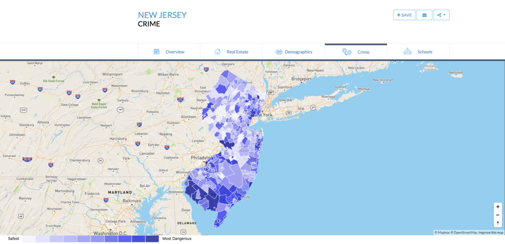
On this website, you can see maps filtered by “Crime”, “Demographics”,”Real Estate” and for parents who are looking for better education, you also have a filter choice of “schools”.
My goal is to provide a similar map for NYC focus on safety. So I searched dataset about crime on NYC OpenData. I found two related dataset, one is about “arrest” the other is about “shooting”. Both are very rich with numerous categories, and geolocation coordinates that are perfect for CARTO.
Materials
- NYPD Arrest Data (Year to Date) :List of arrest incident that occurred in NYC during the current calendar year.
- NYPD Shooting Incident Data: List of every shooting incident that occurred in NYC during the current calendar year.
- Carto: visualization software used specifically to create location-based maps.
Methods
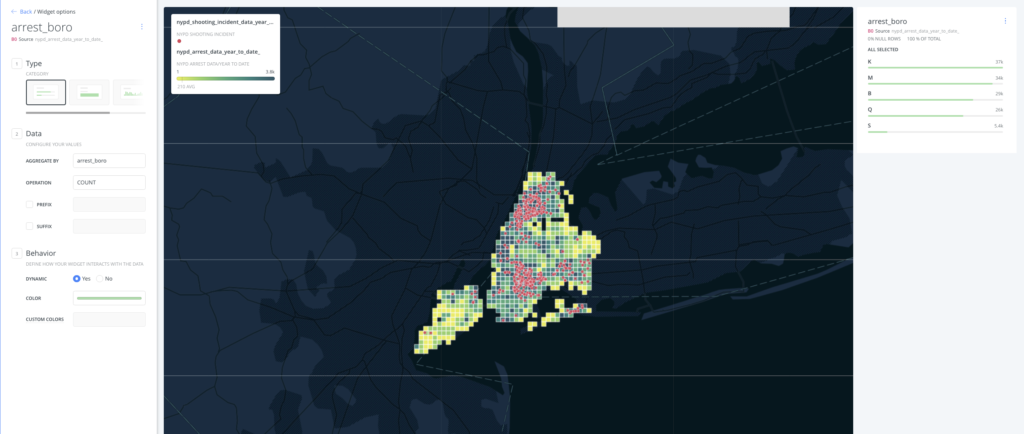
I first imported the Arrest Data file into Carto, and linked both data together by adding a “new layer”.
I chose contrast color for their aggregation in order to make both layers visible.
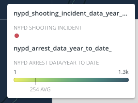
Then I added widgets to make it more clear and interesting. The widgets indicate that shooting incidents are red dots, and number of arrest are displayed by light green to dark green aggregation, lighter means smaller amounts, vice versa.
I also added a widget of arrests boroughs, K(Brooklyn), B(Bronx), M(Manhattan), Q(Queens), S(StateIsland).
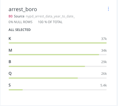
Users can click on each bar toIsland). Users can click on each bar to only show arrests amount in that particular borough. Results example is shown below.
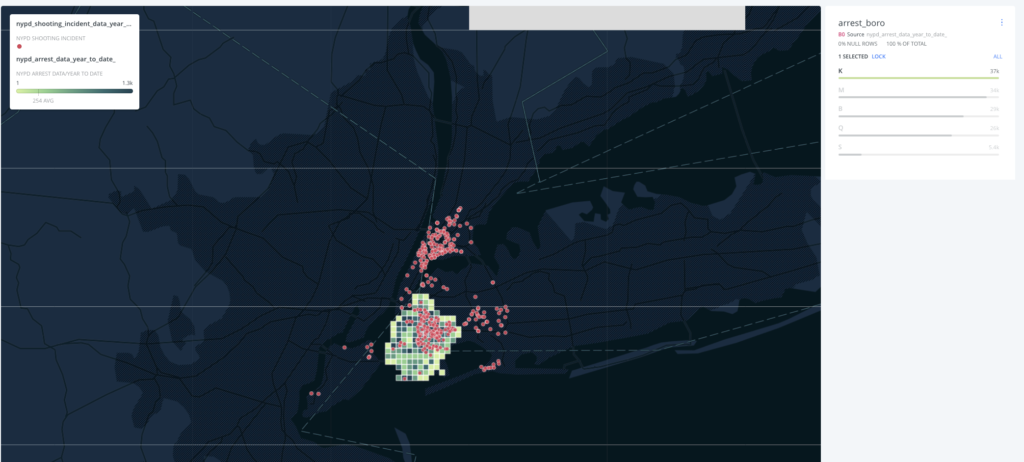
This map only shows arrest amount in Brooklyn. It’s not hard to see that the arrest amount and shooting incidents are corresponding to each other.
Reflection
The most difficult part of the lab was finding data that I could use. I was trying to find dataset about Income which I thought maybe related to crime for some reasons, but failed to find a geocoded dataset at at last. The relationship between poverty and crime was only my hypothesis, and probably bias. I look forward to do more research and visualizations upon this topic in the future. Over all, I really enjoyed learning this tool. The learning curve of Carto was not very steep, and it is strong enough to create interesting, interactive visualizations. Except the stylizing of each layer was too limited for me, In the future, I hope to find a stronger visualization tool for mapping just in terms of better design.
The post New York City Crime Mapping 2018 appeared first on Information Visualization.