Museums in NYC
July 23, 2018 - All
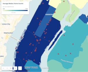
The topic of this information visualization mapping lab are the museum’s in New York City’s five boroughs in comparison with the average median household incomes for the different neighborhoods in said boroughs. I hope to analyze the relationship between these two subjects in the city. As museums in this country do not wholly depend upon money from the government, it is important for them to attract consumers to sustain the operation of the museum. For this reason, their location in high rent neighborhoods is more likely to bring in more visitors, as these neighborhoods are more likely to be tourist attractions. I am also curious to see what outliers there are in the five boroughs. Perhaps I will discover a new hidden gem or two through this mapping information visualization.
Inspiring Visualizations
I was inspired by these information visualization mappings about art and income, the research topics I plan to explore in my visualization.
First, the Museums in the United States mapping visualization on Carto is a more expansive visualization of the topic I plan to map. This maps the museums across the country using points of two different colors, some are red, while others are orange. The distinction between the two colors was not apparent to me. It would have been helpful if this had been made more clear in a legend. The number of points is slightly overwhelming to the eye. The creator could have narrowed his or her focus to a certain type of museum. There is also a lack of comparison, which lessens the impact of the visualization. While the pop-ups are helpful in telling the viewer about the individual museum, they also contain some unnecessary information.
The Cultural Map of Boston contains a sidebar to the left, with the museums all broken up into seven different categories. This was helpful in helping the viewer distinguish all of the museums. Various images and colors were used to go along with the categorization, such as a red palette for art museums and green fish for science museums. It would have been helpful to have made this interactive map its own full site or to have added a search function, so users could look up what museums were closest to their itinerary. It would have been interesting to have added another component to the map, such as restaurants and cafes that would interest visitors to the city.
Finally, the NYC Museums Map uses a similar dataset to the one I hope to find. I appreciate that links to the museum’s website and directions are included in the pop-up. The palette icon with a red background is also helpful in highlighting where the museums are. However, I found the size of the icon to be too large, in that they visually cover up streets and the exact location of the museum. The hover and click pop-ups were slightly distracting for me as well. The list with all of the museums and links under the map was a nice feature. As with the Boston map, an added element would have made the map more compelling.
Materials and Procedures
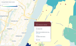
To create my Museums of NYC map I used the Carto software and three public datasets. I found the New York City Museums dataset on the NYC open data website. I was able to download the dataset as a csv file that already included the coordinates of the 130 museums listed. I then uploaded the geojson dataset at data.BetaNYC, which Professor Sula had shared with us, revealing the median home income by area in New York City. Finally, I employed the shapefile for the Community Health Survey to divide the map of NYC by neighborhood. All of these datasets were put into Carto to develop my GIS map. Through analysis, I intersected and aggregate the shapefile with the median home income dataset, so that larger neighborhood areas could be highlighted based on the average median household income of the area. I colored the average median household income for the each neighborhood by value and put a choropleth legend at the top of the map to describe the meaning of the different color gradients. I made a neighborhood pop-up that gave the name of the neighborhood and its average median household income. I attempted to use the image pop-up for the museums by configuring the HTML code, although I encountered various issues combining the image with the text and decided to employ a standard hex code for the pop-up with color. I was also able to include a link for each museum’s website in the pop-up window. I coded for the style of the points, using a different hex code and changing the size of the museum icon I had chosen to represent the building.
Results


I am happy with my Museums in NYC map. I would have liked to have slightly more control over the legend and creating a more searchable interface that described the cost of admission and the kind of museum, however it was not possible for me to achieve this in such a short time and with the Carto software. I have developed a more precise understanding of where museums in NYC are located based on the income bracket of each neighborhood. While most of the museums are in Greenwich, Chelsea, and the East and West Villages, I was surprised to discover a number of museums in Washington Heights, Long Island City and Astoria.
Future Directions
This would be an interesting map to develop further and possibly use to increase expansion and development in the cultural makeup of this city.
The post Museums in NYC appeared first on Information Visualization.