Mapping the New York School Crime Rates
July 24, 2018 - All
Introduction
Not only the Tableau Public, Is there any other tools can analyze data by mapping?
3 Inspirations

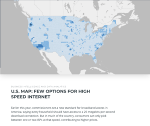
https://carto.com/gallery/internet-standards/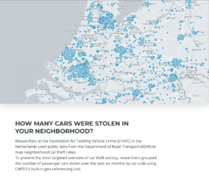
https://carto.com/gallery/stolen-cars/
https://carto.com/gallery/lifewatch-inbo/Process
Carto is a complexed tool, which requested the designer has to have clear thoughts about putting data in order. The process of refining the data is more complicated than others.
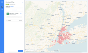
I download the data from the NYC Opendata.
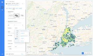
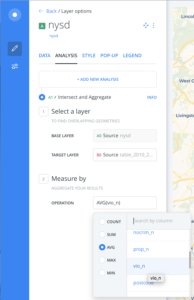
Before importing the data to Carto, it is important to trans all the column to Numbers. After this, Carto can automatically recognize the data that can merge to the map. The School Information and the crime information were separated data.
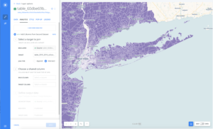
After separately importing the two data, Carto supplies different types of ways to analyze the data.
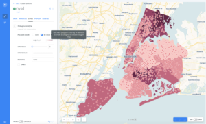
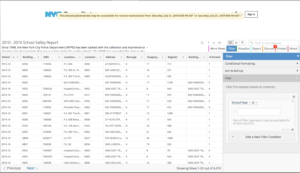
Final Results
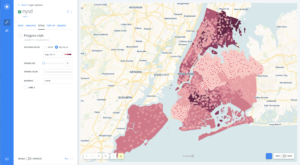
https://ememily.carto.com/builder/5853f180-10af-4e06-87d0-d9acc5649844/embed
The post Mapping the New York School Crime Rates appeared first on Information Visualization.