Visualizing the 2018 April Approved-build projects
July 9, 2018 - All
“The higher the quality of the data, the greater the potential for revelation.” — Stephen Few
Introduction

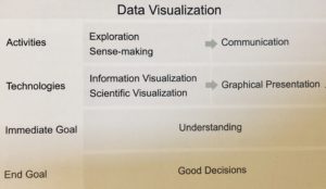
(Figure 1.1)
Throughout the last week, I explored two software. One is OpenRefine, another is Tableau Public. According to Stephen Few, the Figure 1.1, I think OpenRefine will do the job of making the “Exploration Sense-Making – Communication”, by using the filter function and deleting facet elements function. OpenRefine helps with depicting the ideal information elements from generous databases; The Tableau Public will do the job of making the “Information Visualization/Scientific Visualization-Graphical Presentation”, by using the visualizing tools. During the lab process, I wonder,
3 Inspirations


I found 3 simple and good inspirations from the Tableau Public Gallery, I found that the map version can easily bring people the clear geometric scale, and limiting the color palette will also bring the fresh and believable impressions.
Materials and Procedures
I downloaded the public resource from the NYC Open Data website. A file called DOB NOW: Build – Approved Permits caught my attention, this file lists the all approved permits in DOB in 2018 till now. I want to know which area’s new buildings in the city has the highest rate of being approved by the DOB. First, I imported the original CSV file to OpenRefine, deleted some additional columns, made the file focusing on only the New York State.
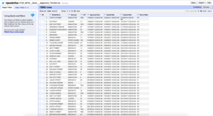
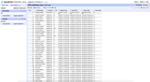
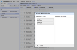
Second, I want to know, from January to July, which month has the highest rate of approving the new buildings. So I tried to edit the filter in different months; It turns out that April is the month which has the highest rate of being approved by DOB. I decided to visualize only the April data. I wonder which area of the NYC is the one that will have the most constructions.
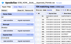
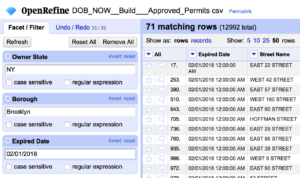
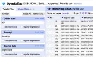
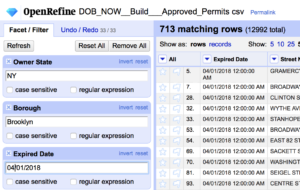
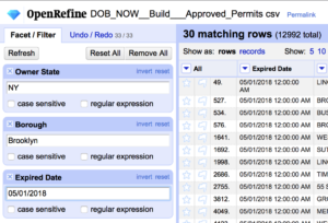
After I exported the edited file, I opened it at the Tableau Republic. And filtered by only April.
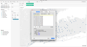
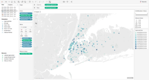
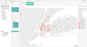
About the Color, I thought about using the Blue-Teal color palette, because of the blue represents business and teal represents fresh feelings. However, I found this color is too neutral to depict the idea of a database. I switched the color to red, and I think red works extremely functional as the color to represent the highlight of each visualized data.
Results and Visualizations
https://public.tableau.com/views/2018April-Approved-NYCBuild/Sheet3?:embed=y&:display_count=yes&publish=yes
It is surprising to see, Manhattan is the area that has the highest rate of potential constructions, even I thought that Manhattan has been built well already. Specifically, the visual shows that the Downtown Manhattan will be in heavy constructions; Which means, this area will face more traffic issues rather than others. To the drivers, this means that they will need to check the road status more if they are tending to go to this area; To the residents, it means it is going to have more possibilities that they will face the heavy dust and chaos.
Future Directions
According to this lab, I think the OpenRefine and the Tableau Public can be a great tool for front business research. For example, when a company intends to advertise they brands through flat public media, like subway billboard posting etc. It will be helpful to visualize the data of the visitors’ flow rate of each MTA entrance.
The post Visualizing the 2018 April Approved-build projects appeared first on Information Visualization.