Mapping: Visualizing the World Around Us
July 3, 2018 - All
Introduction
Viewing a map can feel like an invitation to share a path and an experience. As information visuals, they are rich in storytelling. Maps can be inspiring, insightful or manipulative. They can capture not only practical knowledge but can provide historical, social, economic or political information. All maps are an effort to visualize the world around us into digestible bits.
Inspired by the Hydrographic Map of Ocean Motion by Athanasius Kircher from An Interactive Timeline of the Most Iconic Infographics (http://infowetrust.com/scroll/), I decided to do some research into the earliest forms of mapping, particularly those with a worldview. Viewing world maps you can ascertain the author’s knowledge and familiarity of the world along with how they see their place in it.
Process

Results

Future Considerations
The subject I chose was too vast to do justice with a dozen screens. In hindsight, I would have chosen a smaller subset, such as star maps or sociological maps, rather than attempting to do an overview of key developments in world maps. I also chose not to include political or propaganda maps although there are several world maps of this nature. I felt it would have changed the tone of the timeline and begged more explanation.
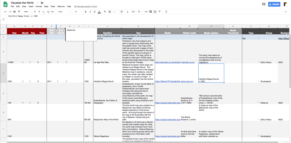
TimelineJS is a great tool for providing a few snapshots of information along a timeline. It is easy to learn and creates a good looking product but it is challenging to get much deeper with the material. I did not have much luck with formatting the body paragraph or adding any URLs. It would also be nice to add a bibliography at the end and allow HTML in the description body.
The post Mapping: Visualizing the World Around Us appeared first on Information Visualization.