Visualizing NYC New Construction Data Using Carto
April 12, 2018 - All

https://vsaunder.carto.com/builder/1812fc93-fd8a-4f96-aad4-179c91bcd1dc/embed
Carto offers analytical and visualization tools for use with location and spatial data. Working with multiple data sets to get a feel for how the application operates provided me with a starting point for grasping their “location intelligence” methodology (carto.com). Carto offers numerous analysis tools to work with different data types. Ultimately I experimented with subway stop data and new construction data, both spatial data sets with latitude/longitude fields, with the goal of observing any correlation between buildings being built in proximity to New York’s underground train lines. Particularly considering new construction outside Manhattan, are developers more actively working on projects that will be convenient by subway?
I initially practiced with education data for New York’s five boroughs. To create an attribute analysis with the education metrics, I imported shape files for the five boroughs to connect with borough data in the Department of Education CSV. Looking at the data on a borough-by-borough scale did not give enough granularity to create a truly rich visualization. I then experimented with school district shapefiles combined with school district information about test scores. This provided more details to examine and play with using analysis and widgets options. Next, I tried working with the subway and construction datasets which provided spatial analysis using longitude and latitude values for mapping. Working with the different sets gave me some welcome practice with Carto and clarified what fields to analyze.
VISUALIZATIONS FOR DESIGN CONSIDERATION AND INSPIRATION
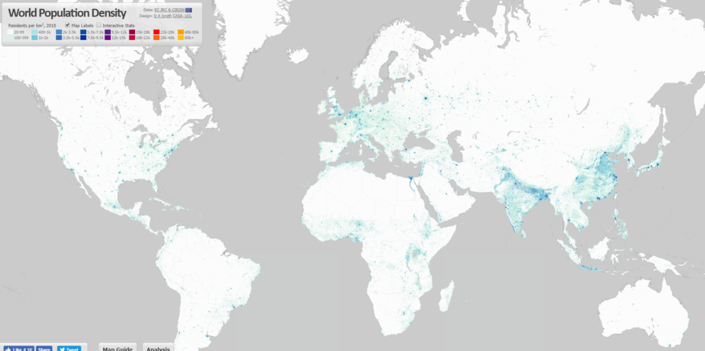
The simplicity of the color treatment on this world population density map is simple and beautiful. I found the blue and white an appealing combination. Heat maps can be highly colorful and overwhelm the background. The continents here are not obscured by the information (Figure 1).
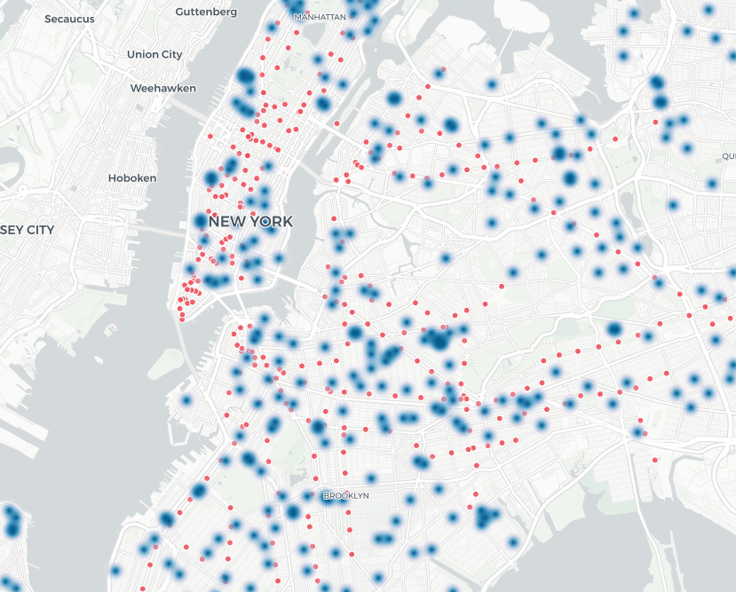
This grey, muted NYC map helps the data points speak for themselves without too much distraction from street lines (Figure 2).
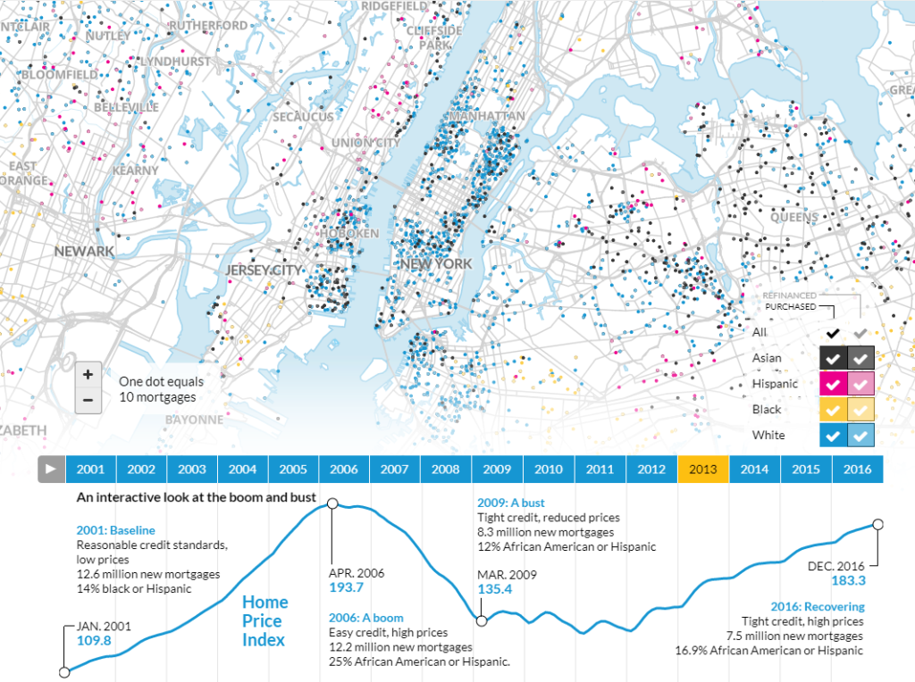
In working with the education data, I had hoped to filter the district test scores by race and gender. This map effectively visualizes locations where different races are obtaining mortgages. The detailed map points allow the viewer to drill all the way down to see precise street locations if they wish (Figure 3).
MATERIALS
DATA
Subway data was sourced as a geojson file here.
New construction data for New York City was sourced as a CSV here. The construction data was last updated in March 2018.
Though a number of fields in the construction data are not of interest, the data was clean and easy to import.
METHODS
Subway station layer: I made the stations red dots on the map. Though not connected by visual lines, the paths of the train routes seem apparent (it would be useful to conduct some user testing here to determine whether I am right on this). Those unfamiliar with NYC geography might not make the mental leap that these train stops are connected.
New construction sites layer: Because there are numerous construction sites, the heat map in the default sizing looked like a massive blob. I sized the points smaller and changed the color to blue, based on the visualizations I had collected for inspiration.
Base Map: “Positron” to tone down the background and give it a grey scale. This helps the data points emerge more clearly and I found it more visually appealing to reduce the range of colors for the overall experience.
Widget 1: Boroughs by Category Name. The ability to filter by borough name and see the number of construction projects for each gives a sense of new construction trends and helps the viewer who may not have immediate recognition of NYC geography to get their bearings for each borough.
Widget 2: Community Board by Histogram bucket. This filters for narrower neighborhood focus in NYC and the viewer can see which specific areas are expanding with the most projects. Because the community board number does not have much meaning for the average viewer this filter requires clicking on the buckets to see where most and least projects show up on the map.
I used blacks and greys for the widget colors to keep them consistent with the overall base colors so they do not compete with the heat map of construction or the dots of the subway stations.
RESULTS AND DISCUSSION
Practicing with multiple data types and sets in Carto helped me gain a basic understanding of how the application works. The data that I used here does not provide obvious results or correlation. Manhattan construction projects cannot be easily correlated because most Manhattan locations are near enough to public transport regardless of where they are, and Manhattan real estate is at such a premium, and at such geographic density, that it is unlikely to be directly affected by proximity to subways at this time. The most visible correlation appears to be in Queens, where the construction projects quite directly follow the path of the 7 train and the E/R lines in the borough. Because Queens has limited subway access, there is a strong case for purposely developing building projects near mass transit.
Seeing the large volume of projects in Brooklyn and Queens (the number is visible in the borough widget) vs. the other boroughs, is an enlightening metric for where NYC is growing right now.
I experimented with “Creating lines from points” in the analysis options to see if I could create the subway map lines, but this analysis feature simply connected all of the stations to each other with hundreds of lines and looked a mess. CartoDB data library offers the subway lines but I did not find a way to make it look simple on the map. It is a series of dots that created a cluttered visual. There are options from the MTA as well that may work. They can be used as long as you obtain a license and this would be of interest to explore.
The education data gave more options for working with the analysis tools. Time series data, such as the DOE test scores over different years, was not well supported in Carto—or if it is, I have not yet learned to manage it through the application. I also had trouble with the quantitative student scores data and making it display correctly (the primary reason I chose not to publish that visualization, as it would be inaccurate).
Importing data files frequently met with an error message that there were too many lines, even when that did not make sense. The “clear” function for the filters did not always work, forcing me to refresh the browser to get the visualization back to “all.” I would have liked an “undo” feature in Carto, as well.
FUTURE DIRECTIONS
The data for new construction lists variables of “project type” and “project description” which could allow for narrowing what we are studying in this visualization. As is, the data includes all kinds of construction, including schools and renovations. If I were to do some research into what the codes mean, I could look for new condominiums or specific developers who create rental and sales units. These would be even more likely to correlate with subway access to enhance the properties’ values. Ultimately, what I have shown here is not that enlightening. However, I have the humble beginning of experience with Carto to continue exploring mapping data to look for interesting patterns.
References:
Carto.com https://carto.com/location-intelligence/ Retrieved on March 29, 2018.
Luminocity3d.org (2015). http://luminocity3d.org/WorldPopDen/#3/30.90/10.90 Retrieved on March 30, 2018.
Obure, Renice (2012) Visualizing and Tracking Homicide Cases in NYC. https://healthmap.wordpress.com/2012/10/03/visualising-and-tracking-homicide-cases-in-new-york-city/ Retrieved on March 30, 2018.
Apps.urban.org (2013). http://apps.urban.org/features/mortgages-by-race/# Retrieved March 30, 2018.
The post Visualizing NYC New Construction Data Using Carto appeared first on Information Visualization.