Project Description
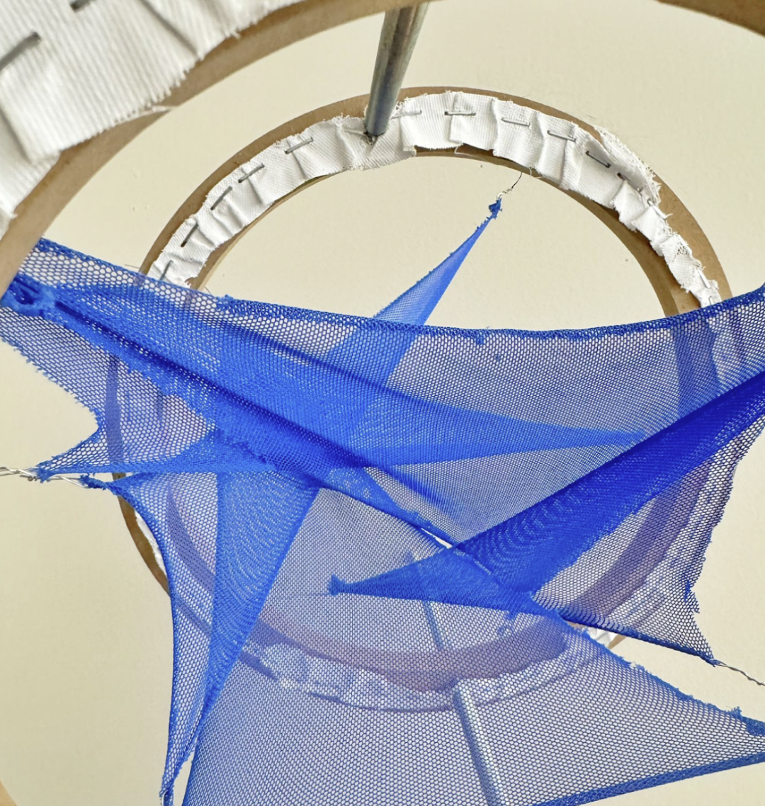
I used the data from the NYC tree census and population data to create a physical object using fabric pieces stretched between two circular frames, representing NYC’s unequal distribution of tree canopy (tree count per person by boroughs).
Data Source: 2015 NYC Tree Census, 2020 US Census
NYC’s Tree Canopy Per Capita by Borough
Trees are important for a city’s health and resilience, as they help fight climate change, absorb runoff, and cool neighborhoods. However, New York City’s tree canopy is not evenly distributed, with some neighborhoods having more trees than others. For example, according to the 2015 Tree Census and the 2020 US Census, Queens has the most street trees with 250,551 trees and a population of 2,405,464, while Brooklyn has 177,293 trees and a population of 2,736,074. For this data physicalization attempt, I used the data from the tree census and population data to create a physical object representing NYC’s tree count per person by boroughs.
The Data
I came across a post on Medium called New York City Needs More Trees. Where They Are Planted Matters which included a data visualization showing NYC’s calculated tree count per person by borough.

However, while I looked closer at the data provided by the author, I realized they made a mistake in the calculations. The ‘Tree Count Per Person’ column was calculated by Population/Tree Count instead of Tree Count/Population. So the data and the subsequent conclusions drawn in the medium article was actually inverted.

After double checking the Tree Count and Population figures from the source, I re-calculated the Tree Count Per Person column and produced the following chart. This is the data I will be trying to represent with my physical object.

Design + Ideation
While experimenting with different types of fabric in the course, I became interested in how fabric’s thread density and stretch can mirror density in a given data set. In the case of this project, I wanted to use stretched fabric to represent how much total tree shade there is to cover the inhabitants of each NYC borough.
| Reality | Data | Physical Representation |
| Amount of Tree Canopy | Tree Count | Original Size Of Fabric |
| Borough Inhabitants | Population | Area that the Fabric is Stretched Over |
| Scarcity of Tree Canopy | Tree Count per Person | Stretch of Fabric |
Partly inspired by Martín Soto Climent’s art pieces of stretched and overlapping tights, my idea for the prototype was to use meshed fabric stretched over a dual-layered circular frame setup. Each piece of fabric corresponds to one of the five boroughs—Manhattan, Brooklyn, Queens, The Bronx, and Staten Island. The first circular frame will act as labels and the second frame will act as a proportional representation of the boroughs’ population. Each fabric piece was attached at specific points on the frame to reflect the proportion of trees per borough, with denser areas having less stretched fabric and areas with fewer trees displayed as more taut and thinly stretched.

I first began with 2D drawings to lay out the basic design. Then, to better visualize the 3D aspects, I crafted a mock prototype using paper cutouts arranged to mimic the fabric layers. This helped in adjusting the design to ensure clarity and visual impact.


The Process
- Converting from design to fabric size: I calculated the actual size of each piece of fabric to proportionally represent the number of trees in each borough relative to the frame size.
| Borough | Tree Count | Area of Fabric(cm^2) |
| Bronx | 85,203.00 | 42.91 |
| Brooklyn | 177,293.00 | 92.97 |
| Manhattan | 65,423.00 | 35.76 |
| Queens | 250,551.00 | 132.30 |
| Staten Island | 105,318.00 | 53.63 |
- Converting population to frame anchors: I printed a pie chart of NYC’s population by borough and used it as a guide to mark out the population percentages on the frame.

- Drawing out the fabric pieces: I was able to produce estimates for the height and base length needed for each of the triangular-shaped fabric pieces by measuring the frame set up. From there, I created stencil pieces on paper to make sure that the total area of each triangle stayed true to the area I calculated previously.The exact length of each side was not as important as long as the total size was proportional to the tree count.
| Borough | Tree Count | Area of Fabric(cm^2) | base | height |
| Bronx | 85,203.00 | 42.91 | 6.6 | 13 |
| Brooklyn | 177,293.00 | 92.97 | 11.6 | 16 |
| Manhattan | 65,423.00 | 35.76 | 7.9 | 9 |
| Queens | 250,551.00 | 132.30 | 17.6 | 15 |
| Staten Island | 105,318.00 | 53.63 | 5.1 | 21 |

- Fabric Cutting and Assembly: Using stencil paper as a guide, I cut the actual fabric pieces, then anchored them onto the frames using wires and pins.

Final Prototype and Reflections


One of the unexpected frustrations of the project came from the data I used. I began my ideation using the data directly from the medium article. Because of the article’s miscalculation, I had thought that categorizing the data based on boroughs will be sufficient to show how tree canopy is unevenly distributed across NYC, since in the article, the wealthier Manhattan has a significantly higher tree count per person. However, halfway through my own calculations, I discovered that the data was actually inverted, and the actual representation by boroughs isn’t all that indicative of the tree canopy inequality in the city.
A way to improve this will be to change the scale from boroughs to neighborhoods. When looking at the data a little more closely (for example, in this visualization of street trees per capita by NYC neighborhoods), it’s easy to see how wealthier neighborhoods tend to be greener. Additionally, handling and cutting a stretchy fabric isn’t the easiest thing to do. I’d like to improve the physical representation by adding a seam to the fabric pieces that I cut-out and use that as a way to encode more details of the tree census data set.

Leave a Reply