
Summary of NYC Projected Population over 2010–2040
July 11, 2018 - All
Introduction
In keeping with getting to know more about my surroundings, I decided to investigate any significance in the population of NYC. In particular, in particular, this study became a way to discover patterns in the population summary by plotting it over time. NYC OpenData gave way to more particular information that is a summary of the projected population for the years over 2010–2040. Besides including totals, the summary breaks the population information down into categories of age groups and by borough (Brooklyn, Queens, Manhattan, Bronx, and Staten Island). After gathering examples, sources, and materials, the results gave way to surprising details about patterns in the project population between the boroughs of NYC.
Discussion
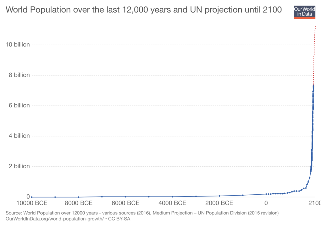
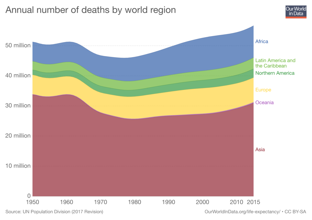
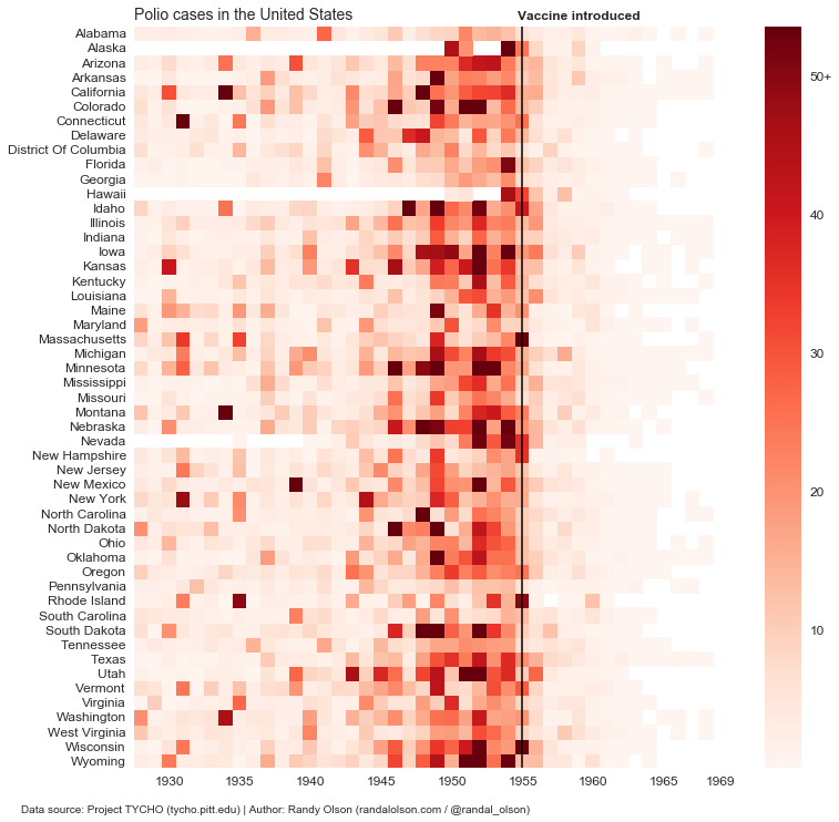
Few suggests that “most time-series analysis can and should be accomplished using line graphs.” Accordingly, heat maps also help to identify particularities in further inspecting the qualitative data. The following are examples of these types of graphs that I referenced to help and lead me in plotting the population summery.
Materials and Procedures
The population summary from NYC OpenData came in the way of a spreadsheet. This sheet was further analyzed in OpenRefine, which allows the breakdown of the information into categories for time-series visualizations. It gives us the per-borough distributions, a further breakdown by age, and the population of each age group as they progress through time.
After parsing the data in OpenRefine, the CSV file was opened in Tableau, where I was able to set the date ranges as time on one axis, and either the age groups or population on the other axis. Tableau also allows the information to be broken down by borough to see distributions based on percentages. The comparison led to a heat map and variations of line graphs.
Results
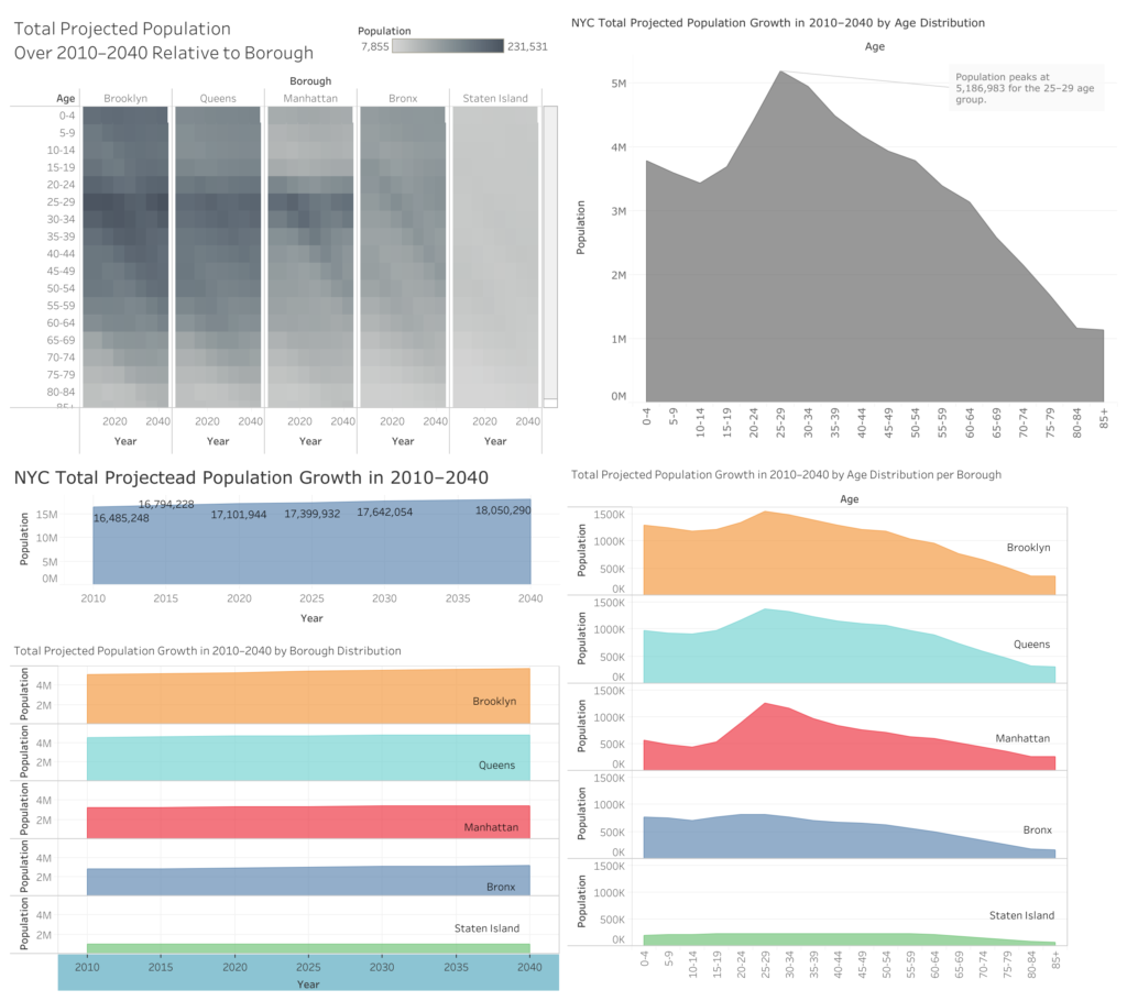
To discuss the results, I will complement my discoveries with some of the six basic patterns that are most helpful when analyzing change through time: Trend, Variability, Rate of Change, Co-variation, Cycles, and Exceptions (Few, 2009). If you study the heat map, it can be noted that the larger population in Brooklyn is mostly due to the age groups below 34 years old when compared to the other boroughs. Manhattan follows closely. Another important observation, is that you can infer that as Brooklynites and Manhattan inhabitants age, they tend to leave those boroughs, but this data does not tell us where they go exactly. We can note that the population tends to be equal in those age groups.
When we look at the graphs with the overall totals, whether NYC total or per Borough total distribution, one can observe that the trend in increase in population over time is a steady. By looking at these graphs, which are essentially line graphs filled in with the area, you can tell that the rate of change isn’t impactful either. The exception is the age groups between 21–34; they cause a spike in the population for certain boroughs (like Brooklyn and Manhattan).
View the official visualization by clicking here: https://public.tableau.com/views/NYCProjectedPopulation20102040byBoroughandTotalsbyAgeGroup/Dashboard1?:embed=y&:display_count=yes&publish=yes
Future Directions
Tableau is a flexible program that comes with plentiful options to develop time-series graphs and maps, amongst an unlimited amount of visualizations. To lessen the strong learning curve, I recommend Tableau re-asses their menu and navigation links. Some essential functions tend to be a click away, while others result from user-performed, drag-and-drop actions. There is a top-level navigation that is in-pane, as well as the application’s drop-down menus at the top. I suggest labeling the top-level navigation to support the description of the icons and their associated actions. Some menus are hidden by a right-click when you select specific sheets in a dashboard, or elements in a sheet. Those menus can be transposed and dispersed to the in-pane, side and top menus. There’s no need to hide the important stuff. And with some labeling, users can support their tutorials. Other than that, I am excited to learn more about handling mapping options through plug-ins, and in general, to support more exploration of different types of visualizations.
References
Department of City Planning (2014, April 22). Projected Population 2010–2040 – Summary. Retrieved July 3, 2018, from https://data.cityofnewyork.us/City-Government/Projected-Population-2010-2040-Summary/ph5g-sr3v
Few, S. (2009). Now you see it: Simple visualization techniques for quantitate analysis. Oakland, CA: Analytics Press.
Olson, R. (2016, March 04). Revisiting the vaccine visualizations. Retrieved July 5, 2018, from http://www.randalolson.com/2016/03/04/revisiting-the-vaccine-visualizations/
Roser, M., & Ortiz-Ospina, E. (2017, April). World Population Growth. Retrieved July 5, 2018, from https://ourworldindata.org/world-population-growth
The post Summary of NYC Projected Population over 2010–2040 appeared first on Information Visualization.