
United Nations 2030 Agenda for Sustainable Development
May 7, 2018 - All
INTRODUCTION
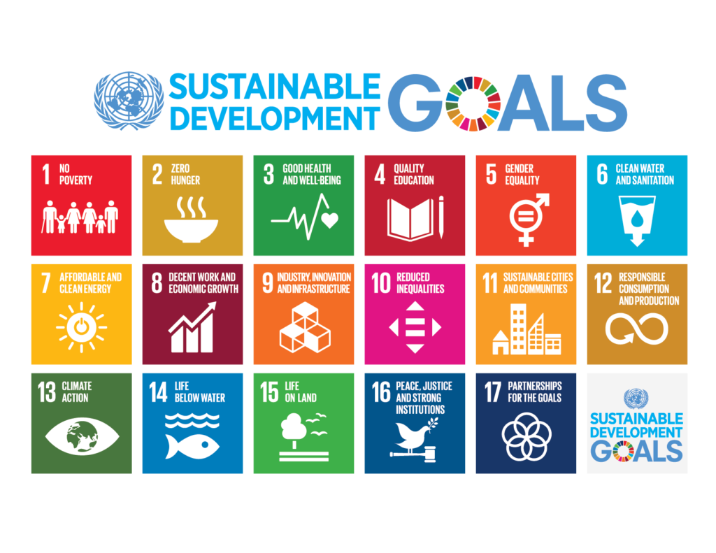
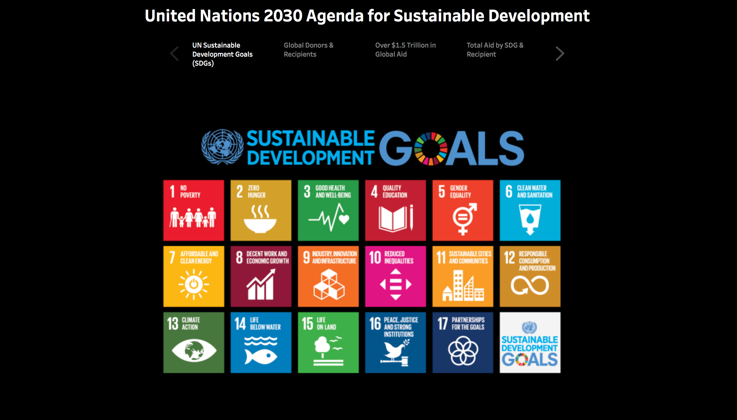
In September of 2000 world leaders came together at the United Nations in New York City and adopted the United Nations (UN) Millennium Declaration committing their nations to a plan to reduce poverty through 8 targets or goals – with a deadline of 2015 – that have become known as the Millennium Development Goals. In 2015 the UN members adopted a new agenda, the 2030 Agenda for Sustainable Development, reevaluated the 8 Millennium goals and expanded upon them, bringing them to 17 and renaming them as Sustainable Development Goals (SDGs). This new agenda was given a target date of 2030.
I recently took a course on Information and Human Rights. In this course I was introduced to the United Nations (UN) 2030 Agenda for Sustainable Development. Several discussions and readings from this course inspired my interest in aid money, who provides it, who receives it, etc. As I began my search for datasets for this final project in Information Visualization, I found the website of AidData, an Institute for the Theory & Practice of International Relations at William & Mary, titled Financing to the SDGs Dataset, Version 1.0, published in November 2017. It was here that I discovered they not only had geocoded Aid datasets, but they also had datasets specifically coded for the 17 UN SDGs. The dataset I chose is very robust and provides a comprehensive report on more than $1.5 trillion dollars of Official Development Assistance (ODA) cross-walked to the United Nations 17 Sustainable Development Goals from 2000 – 2013. My intention with this final project was to make this large amount of information readily accessible to the user via 3-4 visualizations that would include the following elements: geographic representation, bar or line graph, and perhaps a symbol map or bubble chart. It was unclear to me at the beginning, whether or not I would be creating a dashboard, individual visualizations or a visual story. I chose Tableau because I felt confident with the software, and I hoped I would spend less time trying to figure out what I was doing and more time actually producing something interesting. I do think I made the correct choice with Tableau but I also think that this dataset would be a lot of fun to experiment with in Gephi or Carto.
PROCESS
As I mentioned above, the SDG dataset is quite large which made this project exciting but also challenging. The initial dataset was over 1.2M rows and after it was transformed, nearly 5M rows. I thought this might be problematic for Tableau or my laptop, but I was pleasantly surprised that they both performed admirably. My first instinct was to create a visualization that conveyed the global nature of the UN and the SDGs, the obvious choice to me was a map. I felt that with a picture of the world right in front of them, the user could immediately see who was donating and who was receiving aid. As they say, it’s all about the money, so I thought this would be the ideal place to start as I was curious to see what story this data would show me.
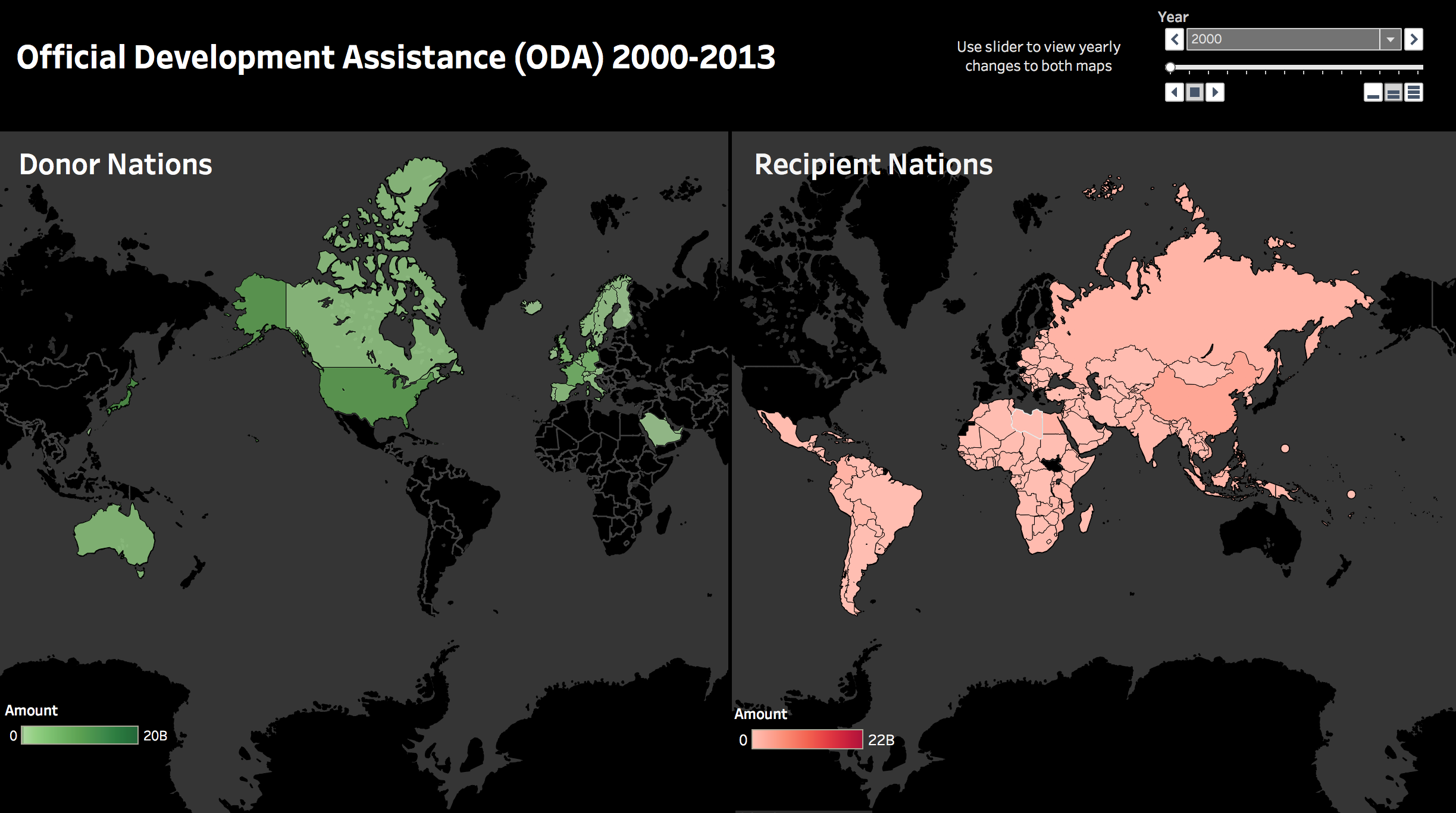
The result of these first two maps was not surprising, the two maps side by side (see Figure 2) divided the globe pretty much in half, one providing aid and the other on the receiving end. It was here that I began to realize working on such a large scale might be more complicated than I first imagined. I kept asking myself, how can I possibly put all of this on a single dashboard in Tableau? I used the Pages Shelf in Tableau to create an “animated” map that would start at 2000 cycle
through each year until 2013. I did this for both the donor and recipient maps giving the user control over what they wanted to see. I also learned that when including one of these “year sliders” on a dashboard that contains more than one map, the slider will animate both maps simultaneously. It was with these maps that I began my informal UX testing by showing these to several users who were familiar with the SDGs and the UN. The initial reactions were positive and they liked the ability to look at different years within one “page” rather than having to click through several pages. In addition, they liked the tool tip which displayed details as they hovered over or clicked on the map as they both did intuitively. I felt pretty good about the maps (everyone loves maps) though they still had a lighter background at this point.
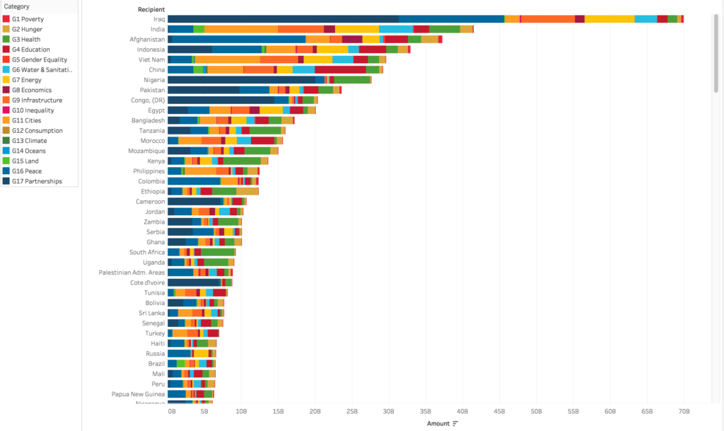
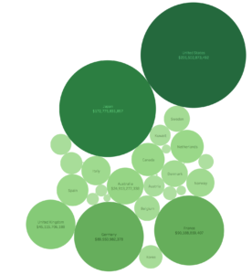
My next attempt was to somehow show how donor money was distributed across the 17 UN SDGs, the 188 countries, and 13 years included in the dataset, which brought me back to the above mentioned question, how do I get this all on one page? I tried several different visualizations, first a good old fashioned bar graph (Figure 3). Unfortunately, I felt as if I was looking a strips of Ghanaian Kente cloth (Figure 4), which is beautiful, but not exactly what I had in mind for this project.
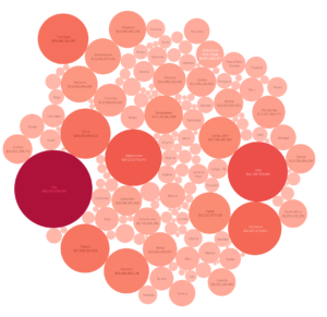
I then moved on to bubble graphs. I attempted several different bubble graphs, showing the same data as my maps with the hope that when reviewing these with my users, I would begin to see a preference. I created one bubble graph showing SDGs represented by their corresponding colors, similar to the bar graph in Figure 3 and also two bubble graphs one showing the recipients of aid (Figure 5) for all 13 years, largest to smallest and a second doing the same with donors of aid (Figure 6), both of these used the same red and green color schemes as the maps. None of these tested particularly well with my users. Several testers were drawn to the colors of the UN SDGs in the line graph, saying “it’s cool the way they match the SDG colors” or “I think they are nice, I like the colors” while another thought they were “too much and too colorful”. As I reflected on my users comments and the visualizations themselves, I was not terribly excited about the colors either and I just could not put my finger on what was the issue.
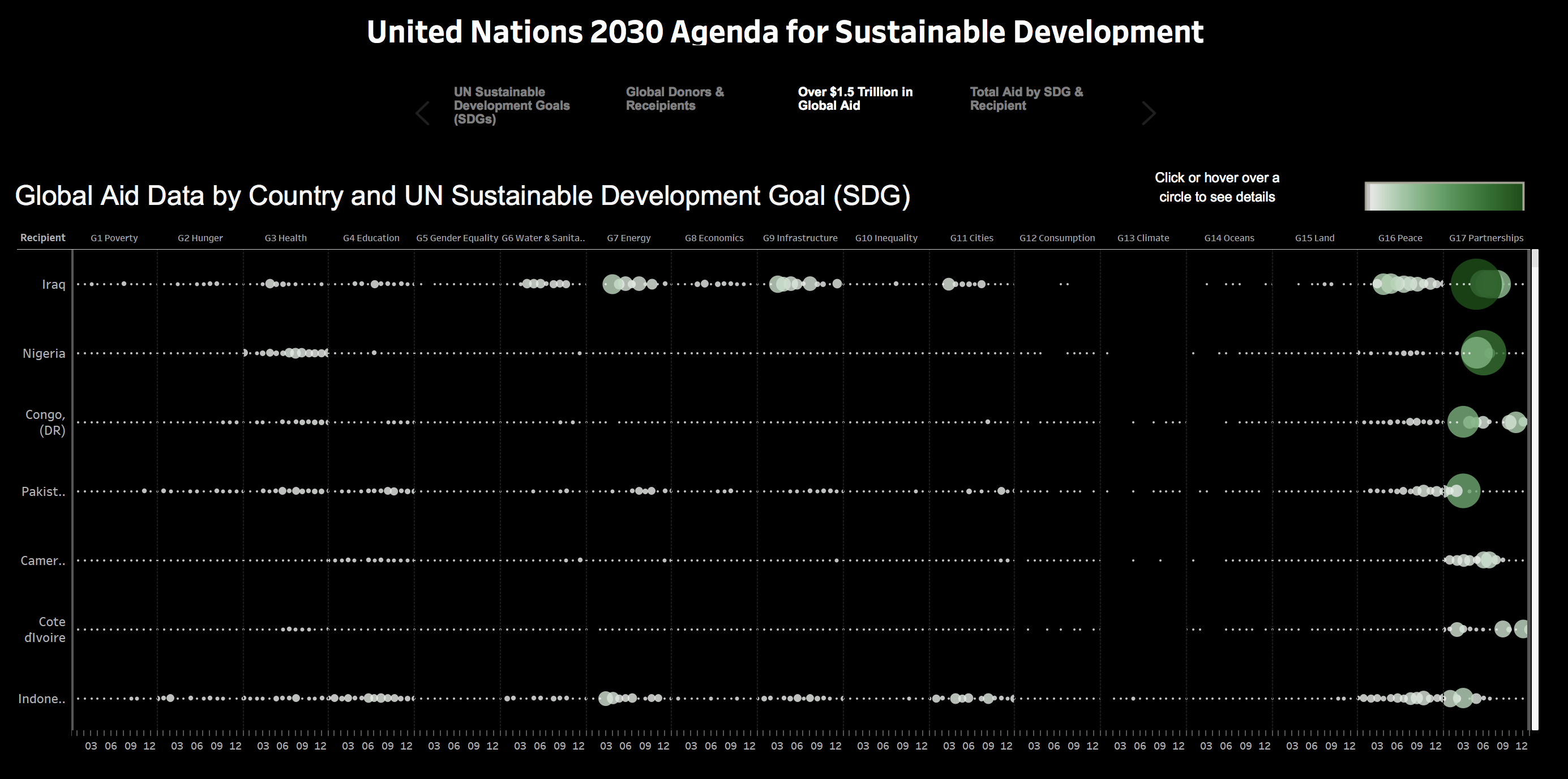
After this I then had several conversations with Dr. Sula who provide insight into how I could manage this large dataset and get a reasonable amount on one screen, at least with only one scroll bar. This was the first time I had completed a symbol map and it worked quite well visually. I played around with the size and colors of this map and then tested it with several users. Each one liked the idea but found it difficult to see what was going due to the small size of the information displayed. I continued to work with the size of the data until it finally dawned on me that maybe it was not the size but the color that was the problem. I was torn on how to approach this issue and decided to try using different colors in the background of my chart that I hoped would enhance, make the data easier to read and decipher. By changing the background color of the symbol map to something much darker, in this case black, created a really nice contrast with the light colored data circles (Figure 7). Once this was done, I retested with the same users and received positive feedback from both. With this change, I decided to experiment with my other worksheets by changing all the backgrounds to black and I was quite happy with the outcome.
UX Research
I kept my recruitment of UX participants very simple, I contacted five people who I knew were familiar with the United Nations 2030 Agenda and the 17 Sustainable Development Goals. Two of these participants were colleagues from my Information and Human Rights course and three were colleagues outside Pratt who have prior work experience with the UN. I presented my visualizations to them one or two at a time and asked for feedback. I watched them navigated around each one as I took notes and asked questions. In addition to the “guerrilla” UX research I did with these testers, I also conducted numerous think-alouds with several colleagues from Information Visualization and Professor Sula. All of these conversations provided interesting and sometimes contradictory information regarding my design choices, primarily around color. As I previously mentioned, all my users had difficulty seeing what was happening in my symbol map before I changed that background.
As noted above, colors were huge for this project. I chose my color schemes to represent what I thought would be the most obvious associations for my users. I picked green for donors to represent money, red for recipients to represent need, with the idea that the user would see red and sense there is something alarming that needs to be addressed, thus they are recipients of aid. All of these choices tested well with my users. It is still debatable whether or not the mapping of color with the UN SDG colors was a good idea or not. My user testing was inconclusive on this point.
RESULTS
Final Project Results can be viewed here.
In the end I chose to represent my visualizations in a story form rather than a dashboard. I think the story format is better suited for my dataset as it gives each visualization enough space for while still maintaining cohesiveness. I am really happy with the use of the black backgrounds for this project. This was something I was drawn to when I was looking through numerous Tableau examples for inspiration.
FUTURE DIRECTIONS
I love this dataset and with more time, and data visualization knowledge, I hope that I can continue to work with it. During the process of this project there were numerous suggestions made by users, colleagues and Dr. Sula, that got me thinking about different approaches and software that I could have used. The idea of creating a large network with Gephi is definitely first on my list, though it will require quite a bit of data wrangling. Additionally, the suggestion of showing both donor and recipient in one map was something that came up several times during users testing and “talk-alouds” as well as a map showing the paths or relationships between donor and recipient ie money in and money out. I would also like to explore “lightboxing” in Tableau, which is something I discovered as I grappled with how to express so many rows of data in a reasonable and aesthetically pleasing way in this project. And finally, I would really like to know how to change the color of scroll bars in Tableau.
REFERENCES
Sethi, T., Custer, S., Turner, J., Sims, J., DiLorenzo, M., & Latourell, R. (2017). Realizing Agenda 2030: Will donor dollars and country priorities align with global goals? Williamsburg, VA: AidData at the College of William & Mary.
https://www.un.org/sustainabledevelopment/
The post United Nations 2030 Agenda for Sustainable Development appeared first on Information Visualization.