Introduction
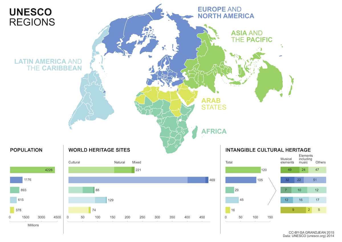
For this project, I have visualized the Heritage Sites around the world. There is no particular reason of choosing this topic, it was just that I was searching for some data visualization examples and I came across one of these visualizations, which intrigued me and I decided to go with it. Finding the World Heritage Sites dataset was easy, it was on UNESCO’s website for World Heritage Convention. There were some global statistics mentioned on the site and since it was my data visualization project, I wanted to create something similar.
Method
The .csv format for this dataset was not available on the website, so I downloaded the .xsl and converted it using Excel. Also, I used Open Refine to cleanup this data. Since, it was a public dataset- there was a large amount of inconsistent and unnecessary data. I used the text facet feature to cleanup the names (countries & regions), years and also got rid of some unnecessary data. Next, it was transferring the dataset to Tableau public and creating the data visualizations.
Referring to the statistics given on the UNESCO website, I started making the visualizations. At the start, it was bit difficult to figure out how the things would be made using the dimensions and measures but with some help and trial and error, I got it done. The first one that I created was a pie chart representing the number of sites in different regions of the world. Here, I wanted to make the circle bigger to accommodate the names but this was the maximum size.

The heritage sites are divided into 3- Cultural, Mixed and Natural. So, I wanted to show the distribution of all three across all the above mentioned regions. I chose a bar graph to represent it, that way I could even show the number of sites each entity took up. I got this one in my first try.

Next, I created a line graph of the number of sites that were inscribed into the World Heritage List throughout the years. I took number of sites and regions in the row and date in the column. I got separate line graphs for each region although it wasn’t my desired result. I wanted one graph showing all region at once. All I had to do was to remove regions from the rows (something so simple) and I wasn’t able to figure that out for long time.

For my final visualization, I wanted to create the same thing that I was inspired by (mentioned above) but I learned that it was something that cannot create using statistics. So, I tried creating something similar- map of the world with each country displaying the total number of heritage site they have. Hovering over the country will display its name and the number of sites.

Although, I was able to complete some visualization that I had planned to do, I still like to create a visualization where I could show the sites which are included in the danger list. To conclude, the first lab was quite useful in getting familiar with Tableau Public and I hope to do more with it.