Introduction
The disastrous withdrawal of American troops from Afghanistan has prompted numerous reflections on the impact of the United State’s deployments in the region and the wider world. In the ongoing mission to hold governments accountable for waging war, visualizing data can draw our attention to the patterns of political decisions made in the last 25 years. This lab will attempt to address questions of accountability by using data to break down the history of votes for troop deployments.
Inspiration
Two popular data visualizations provided the guiding principles for this lab: Charles Jospeh Minard’s visualization of Napoleon’s march to Moscow from 1812 to 1813 and “The Most Violent Cities in the World” by Federica Fragapane.
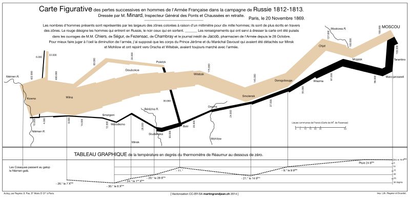
Like my visualization, Minard’s visualization of Napoleon’s march deals, essentially, with troop movements. The use of time, size, and color elegantly summarize a complex narrative.

Similarly, “Most Violent Cities” uses three variables to condense information that feels essential to understanding complex narratives. Using position, size, and color simply and coherently ensures that readers always have enough context to draw meaningful conclusions. However, I do think the pinwheel shape detracts from comprehension even though it adds to overall visual appeal.
Tools
This lab uses the OpenRefine tool to clean data and Tableau Public to visualize and share data. OpenRefine is an open-source data editor that facilitates easy data cleaning, such as splitting and joining columns, batch editing text, and filling missing data. Tableau Public is a free business intelligence tool that allows users to visualize data in a variety of familiar graphs and public their work to the web.
The Parliamentary Deployment Votes Database, the dataset used in this lab, is published by a group of political scientists, cited at the end of this post, interested in questions of democratic government and legitimacy with regards to war powers. Their dataset, with its accompanying codebook, covers 1,022 votes between 1990 and 2019 across 21 countries.
Method
The dataset did require a little housekeeping. The csv file accidentally encoded percentage points as commas. In OpenRefine, I split the three fields where this issue occurred on the comma and converted the first column to a percentage. I did not feel that my analysis warranted the granularity captured by 90.5% compared to 90%. To use the data in Tableau, I then had to convert any boolean variables, coded as 1s and 0s, to text so that I could use them as true/false filters.
With such a tidy dataset in hand, I could rapidly explore the different dimensions and measurements in my data. Most astoundingly, I found extremely high support for interventions across the board, which prompted me to use Tableau to visually answer some of my follow-up questions: is support for withdrawal correspondingly low and does this support for intervention change across regions or over time? Tableau makes it essentially a drag and drop process to create bar charts, scatter plots, and line graphs that expose interesting trends that may answer these questions.

Results
Using the method described above, I selected four charts, refined from the exploratory analysis, that I found interesting.

In this chart, I filtered by the boolean variable “withdrawal” to isolate votes for troop withdrawal missions. As a result, we can see a bar chart representing the percentage share of votes in favor of withdrawal by mission for each year a government voted on the withdrawal. Like the model charts, this graph attempts to use three non-competing elements (size, number, and reference) to show the low historical support for withdrawals when governments actually vote on them. The shaded reference area provides context by distinguishing the presumably failed (under 50%) votes.

This heatmap uses several elements (size, color, and position) to bring out my key findings while transparently representing the limiting factors of the dataset. For each area of deployment, a variable explicitly provided by the dataset, size encodes the number of missions and gradient represents the median percentage of support for intervention for all missions. Each point is positioned according to year; the chart proceeds chronologically.
While I think this graph essentially accomplishes the goal of giving a birds-eye view of troop deployments, it is visually limited. For instance, viewers can compare size to size and color to color (they never need to compare color to size directly), but neither color nor size vary enough within their categories to make the results pop. There is also an inconvenient amount of white space. Lastly, this chart makes missions that received something like 70% support appear to have low support. Despite my appreciation for the conclusions this chart lets viewers draw, I do think these faults are major limitations.

To address my concerns for the heatmap, I explored making more experimental charts that provide both context and further insight. Here, I break the panels out by the same areas of deployment as in the heatmap and draw a line graph that shows the difference each year in support for intervention compared to the previous year. This rough and ready “heartbeat” chart (akin to small multiples organized linearly and tested without the header or axis labels) much more successfully draws out trends, bypassing the challenge of clustered data. Without further analysis, I feel comfortable inferring that it essentially shows years where opinions about intervention shifted in a meaningful way for the global community. It is a little funky: the dramatically spiking peaks might hide other interesting trends throughout the chart, but I felt that excluding or downplaying them as if they were outliers would diminish the value of the chart. However, I did exclude years with many null values in Africa.
Next steps
I concluded that this particular dataset, which mixes aggregates and details, would benefit from interactive visualizations. If I continued to work on visualizing the plenary votes, I would want to find ways for users to drill down from areas of deployment to more specific information and even hyperlink to the text of resolutions. An interactive system would facilitate research and discussion and better realize the potential of this rich and interesting dataset.
References
Ostermann, Falk, Cornelia Baciu, Florian Böller, Dario Čepo, Flemming J. Christiansen, Fabrizio Coticchia, Daan Fonck, Anna Herranz-Surrallés, Juliet Kaarbo, Joo Hee Kim, Kryštof Kučmáš, Philippe Lagassé, Benjamin Martill, Kenneth McDonagh, Michal Onderco, Rasmus B. Pedersen, Tapio Raunio, Yf Reykers, Richard Sonneveld, Michal Smetana, Atsushi Tago, Özlem Terzi, Sigita Trainauskiene, Valerio Vignoli, Wolfgang Wagner (2021): Parliamentary Deployment Votes Database, Version 3. Harvard Dataverse. https://doi.org/10.7910/DVN/LHYQFM.