Introduction
For this lab, I analyzed data from the “Goodreads Best Books Ever” list . I found the dataset on Kaggle. I was drawn to this dataset because I enjoy reading and I thought it would be a fun topic to visualize.
The questions I wanted to answer were:
- Books from which genres made the “Goodreads Best Books Ever” list?
- Which ten genres most frequently appeared in the “Goodreads Best Books Ever” list?
- How are the ratings for the ten most frequent genres distributed?
- How do the average ratings differ between the ten most frequent genres?
- Which books are the highest rated for the five most frequent genres?
- How do the number of books that made the “Goodreads Best Book Evers” list differ by publication year?
Review of Other Visualizations
I looked at all the visualization options in the R graph gallery to get a sense for how to visualize the data. I wanted to try using different graphs for my visualizations so I decided to use a different graph for each of my research questions.
I also found visualizations online related to my topic such as this infographic and this tableau dashboard which gave me a sense for the kinds of visualization formats other people have used to visualize data on a similar topic. The infographic inspired me to create a visualization that shows how many books made the “Goodreads Best Books Ever” list for a given publishing year.
Dataset and Tools
The dataset I used for this project initially contained 52,424 rows and 25 columns. I removed some columns that I didn’t think were important for the purpose of visualizing the data such as the description of the book or the isbn number of the book. The categorical dimensions in the cleaned dataset are:
- Title
- Series
- Author
- Language
- First-listed genre
- Second-listed genre
- Third-listed genre
- Publisher
The quantitative dimensions in the cleaned dataset are:
- Rating
- Pages
- Number of Ratings
- % Liked
- Price
The time-oriented data is the publish date.
I used OpenRefine, an open-source data-cleaning software to clean the dataset such that it meets the guidelines of ‘tidy data’. According to these guidelines, “each variable forms a column, each observation forms a row, and each form of observational unit forms a table” (Wickham, 2014). I created all of my visualizations in R Studio. I looked up code and questions related to code on websites like StackOevrflow and Statology.
Methodology
I looked through multiple datasets on Kaggle and The World Bank’s data repository for a dataset that was about a topic I found interesting and which also met the requirements for this project. I finally landed on the “Goodreads Best Books” dataset from Kaggle since it seemed like a comprehensive dataset which contains information about the books that made the “Goodreads Best Books Ever” list. I was curious to dig deeper into the data and it met the requirements for the project, which is why I selected this dataset.
I cleaned the dataset in OpenRefine. The first step in the cleaning process was to delete any columns I did not deem necessary for the visualization process. The dataset had listed multiple genres in one column, separated by a comma. I split the column into multiple columns using the “split into several columns” feature in OpenRefine. However, the result was the following:
| Genre1 | Genre2 | Genre3 | Genre4 | Genre5 |
| [Fantasy, | Fiction, | Young Adult, | Horror, | Mystery] |
I used the “split into several columns” feature to separate the text from either the comma and/or the square brackets. The result was:
| Genre1 1 | Genre1 | Genre1 2 |
| [ | Fantasy | , |
I deleted the columns which contained the special characters. I repeated this process two more times, for Genre2 and Genre3. Some books had up to 10 genres but to prevent the scope of the data from getting too large or complicated, I only kept the columns for Genre1, Genre2, and Genre3, and deleted the rest. I initially wanted to combine the data from the columns titled “genreTwo” and “genreThree” into the “genreOne” column, but I realized that this was just complicating the process. Hence, for the purpose of this project, I only looked at the genres in the column “genreOne” which I assumed to be the primary genre for a given book. Lastly, I renamed columns to remove any whitespace and numbers. I visualized the data using R Studio.
Discussion of Visualizations
The first graph I created was a circular bar chart to answer Q1: Books from which genres made the “Goodreads Best Books Ever” list?
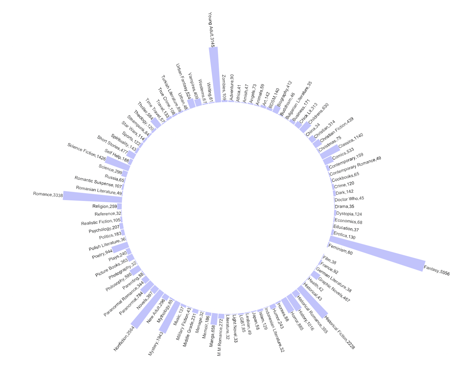
A circular bar chart allows you to visualize many data points in a bar chart format without looking too cluttered. I also wanted to challenge myself to learn how to code this kind of chart in R Studio. I filtered the data in this graph to show only the 100 genres in the column “genreOne” that occurred the most frequently to keep the visualization clean and easy to read (otherwise, this graph would have had 400+ data points!).
The main takeaway from this graph is that books from a wide range of genres made the “Goodreads Best Books Ever” list but just by looking at the lengths of the bars, one can infer that the most common genres on the list include “Fantasy”, “Romance”, and “Young Adult”.
The second graph I created was a lollipop plot to answer Q2: Which ten genres most frequently appeared in the “Goodreads Best Books Ever” list?
I had never seen this type of graph before, but I really liked it when I came across it on the R graph gallery website. I think it’s cute and is a creative way of visualizing data you would normally represent with the help of a bar chart. And once again, I wanted to challenge myself to go beyond the usual visualization options and try something new.
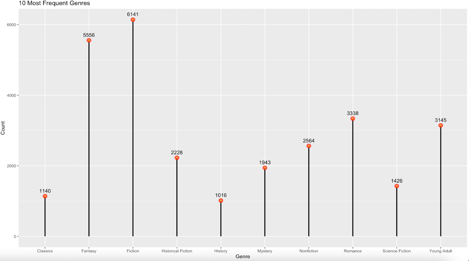
I added labels for each lollipop which represents the number of times a book belonging to a certain genre made it onto the “Goodreads Best Books Ever” list. “Fantasy” and “Fiction” are in the lead out of the 10 most frequently occurring genres.
The third chart I made was a ridgeline chart to answer Q3: How are the ratings for the ten most frequent genres distributed?
I was drawn to this chart because in one chart I am able to visualize the distributions of ratings for the top 10 most frequent genres. I like the fact that you’re able to consolidate a lot of information in the chart, without looking cluttered or being difficult to interpret.
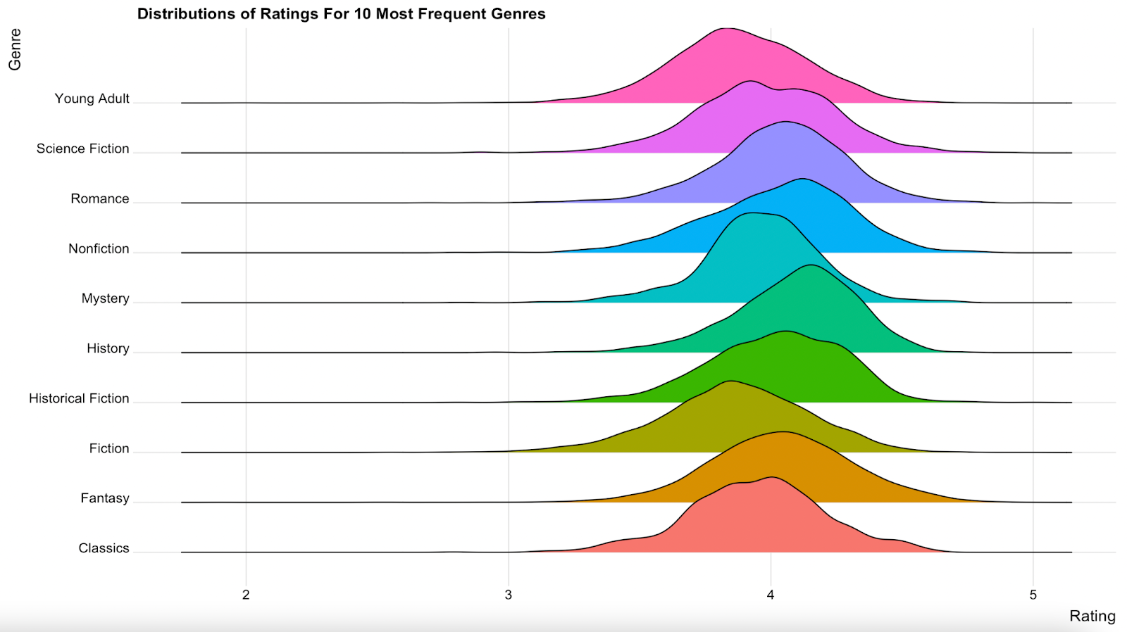
By looking at this chart, one can quickly conclude that the ratings for the 10 most frequent genres all tend to fall mostly between 3.5 and 4.5 stars, with all peaking somewhere around 4 stars.
My fourth visualization is a bar chart to answer Q4: How do the average ratings differ between the ten most frequent genres?

This is a simple visualization which shows viewers that there isn’t a stark difference between the average ratings for the 10 most frequent genres. This chart also supplements the ridgeline chart and provides viewers with additional context.
Initially, the y axis markings started at 0 and went up to 5. My peer reviewer suggested I change the markings such that they start at 3 to make it easier for viewers to distinguish between the differences in average ratings by genre. I am glad I followed my peer reviewer’s advice because I do think this visualization makes it easier to see the differences and it also highlights how all average ratings fall around 4 stars.
My fifth visualization is a bar graph to answer Q5: Which books are the highest rated for the five most frequent genres?

I used a circular bar graph to answer this question. I know the differences in the lengths of the bars are not that noticeable because the ratings for these books are all quite similar (since the length of the bars is based on the rating), but I do think this chart is a visually-appealing way of displaying categorical data. Charts typically used to display categorical data such as word clouds can look too busy and cluttered and in my opinion, this chart looks cleaner and is also creative. The colour-coded bars provide viewers with an additional layer of information which in this case, is a given book’s primary genre (pulled from data in the column titled “genreOne”). My peer reviewer suggested I group the books by genre. I had thought of doing this as well and I looked up the code to separate groups by spaces in a circular bar graph on the R Graph Gallery website. However, the code didn’t work the way it was supposed to and my hunch is that it is something to do with the way my groups are set up. I tried to troubleshoot the code to the best of my abilities but given the time constraints, I wasn’t able to submit a version of the visualization that is grouped by genre and has a space between each genre. In the future, I would improve this visualization by fixing the code such that the bars are grouped by genre and there is a space to separate the different genres from each other. I would also increase the font size of the labels so that they are easy to read without having to zoom in.
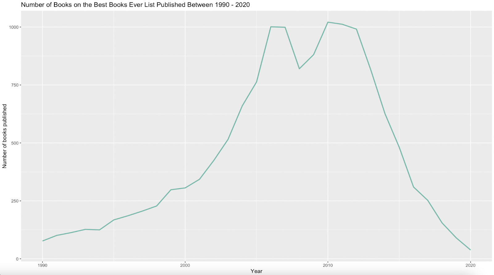
I used a line graph to answer my last question: How do the number of books that made the “Goodreads Best Book Evers” list differ by publication year?
A line graph is appropriate for this question since this visualization uses time-based data. To keep the scope of the data manageable and relevant to today’s times, I only looked at publish dates between 1990 – 2020. It’s interesting to see how the most number of books that were included in the “Goodreads Best Books Ever” list were published around 2005 – 2008 and 2010 – 2012. It’s very interesting to see that the number of books that made the list declined steadily between 2012 – 2020.
Reflection
I am quite pleased with the final outcome given the fact that this was the first time I created visualizations in R Studio. R Studio has a steep learning curve and without any previous experience, it’s difficult to tell why the code doesn’t work in some instances. The syntax also has to be absolutely perfect and sometimes, I spent 20 minutes combing through the syntax trying to figure out why the code wasn’t working only to realize that it’s because of an extra plus sign or quotation mark. This was a quite tedious and at times, frustrating, but once I got the hang of it, I actually began to enjoy the process. R Studio is an extremely powerful tool and now I want to try my hand at more complex visualizations e.g. visualizations which include animations. I also like how customizable everything is, because it’s all code and not any predetermined settings or functions.
I also noticed that I was thinking about the scope of the data more during this assignment and made judgement calls to delete certain columns or filter the data using certain parameters to keep the visualization clean and uncluttered. This is an improvement compared to Lab 2, when I was creating charts from the entire dataset, without really thinking about its implications on the aesthetics of the visualizations. I was also glad that I challenged myself to try my hand at creating a wide range of visualizations instead of sticking to the charts I’m familiar with.
Improvements
There are several ways I would like to improve my visualizations going forward:
- The biggest lesson I learned is to start early. I started working on this project a week before the due date, but I underestimated how long it would take for me to find an appropriate dataset, clean the dataset, understand the R Studio code, and create the visualizations.
- I want to get better at finding quality datasets. When I look for datasets, I just look for datasets that meet the requirements for the assignment that are on topics I’m interested in. However, I want to be able to identify datasets that are high quality in terms of the visualizations they will result in.
- Since I ran out of time, I wasn’t able to customize some charts (the bar chart, the second circular bar chart, and the ridgeline chart) the way I would have liked to. In the future, I would like to customize these charts in terms of colours, font sizes, and axis markings.
- I want to get better at telling a story through visualizations. I think I’m in the mindset right now to just create as many visualizations as possible without really focusing a lot on what I want viewers to take away. Hence, I want to approach visualizations more from a storytelling mindset.
References
Holtz, Y. (n.d.). The R Graph Gallery – Help and inspiration for R charts. The R Graph Gallery. https://r-graph-gallery.com/index.html
https://www.statology.org/. (n.d.). Statology. https://www.statology.org/
Kaggle. (2022). Kaggle: Your Home for Data Science. Kaggle.com. https://www.kaggle.com/
Lorena Casanova Lozano, & Sergio Costa Planells. (2020). Best Books Ever Dataset (1.0.0) [Data set]. Zenodo. https://doi.org/10.5281/zenodo.4265096
Reynolds, S. (2022). Lizzy’s Goodreads 2022 [Review of Lizzy’s Goodreads 2022]. Tableau Public. https://public-pantheon.tableau.com/en-us/s/gallery/lizzys-goodreads-2022
Stack Overflow. (2022). Stack Overflow – Where Developers Learn, Share, & Build Careers. Stack Overflow. https://stackoverflow.com/
Wickham, H. . (2014). Tidy Data. Journal of Statistical Software, 59(10), 1–23. https://doi.org/10.18637/jss.v059.i10