For this article, I analyzed the USA air traffic network in 1997. I chose this topic because I have explored plane accidents for previous articles, so I decided to work on related data. US airports have the busiest traffic network in the world. I will be using Gephi to work on the Network analysis for US Air Network in 1997. This network visualization will show which airports have the most traffics and the connection between airports in the USA.
Inspiration
After I finalized the dataset for this article, I searched for multiple inspirations. One of them is a youtube video, “Gephi Tutorial #1: Visualizing Airline Routes Network”, I found this video very useful and inspiring. This author created a map using a node to show visualization. I tried downloading the plug-in he suggested and entered the longitude and latitude into the dataset, but it doesn’t work.

Yizhong’s blog is also a beneficial source to help me get started.
Process
Download data
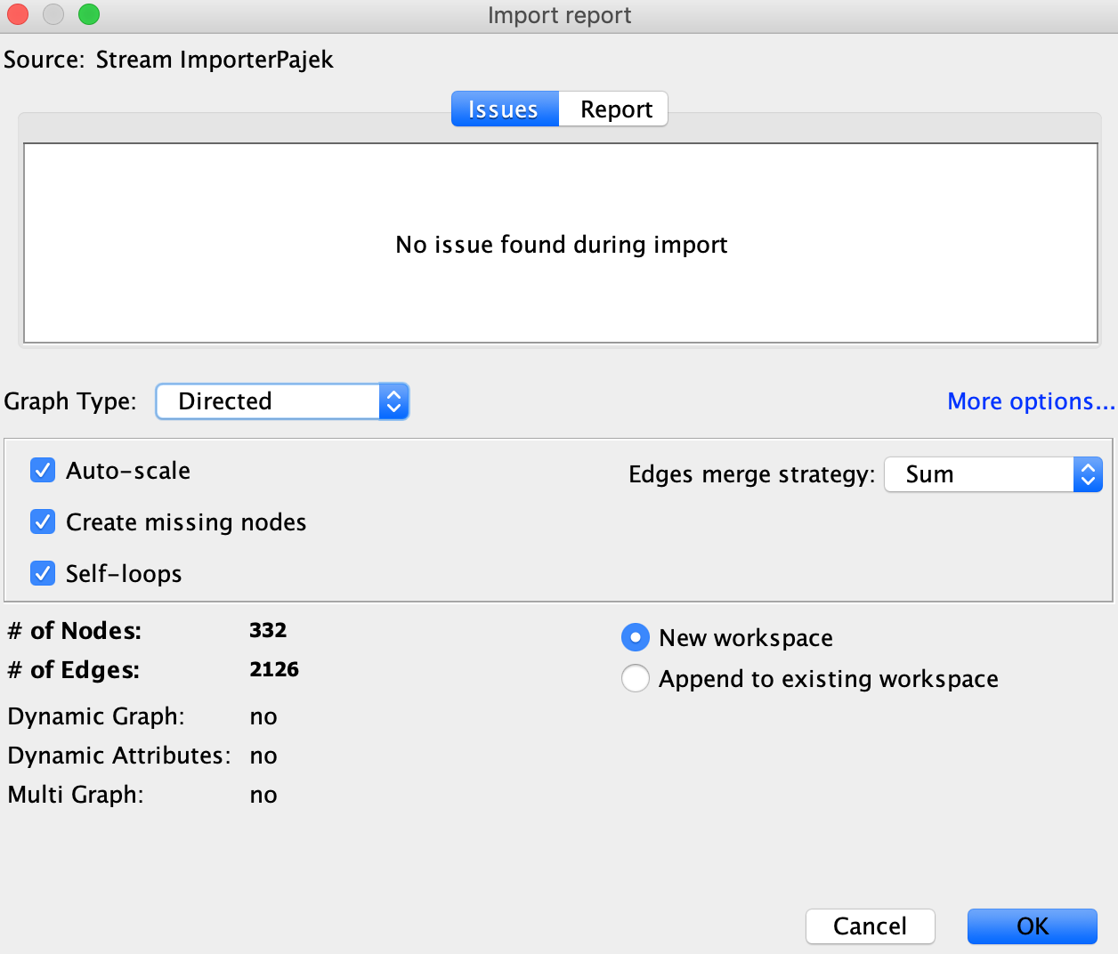
For this project, software Gephi is used to generating network graphs. I download my dataset from the Gephi wiki. I found that Gephi Wiki has the most user-friendly datasets compare to other databases. After looking through numerous interesting topics, I selected US Air97; this data was already in .net format that can be easily imported into Gephi without extra work. I can always edit the data within the software, such as adding tags or any additional data. I selected “Directed” as graph type to hope the graph can be easier to read and generate.

Layout and visualization
When I open the file, the graph looks very confusing; everything is jammed together(see figure1).

I followed the demo that Professor Sula provided. In the first layout, I tried Force Atlas to generate a more understandable graph. I also added color and adjusted node sizes by the degree to show US airports’ traffic patterns or popularity.


You can now see which airport is the busiest from the graph above, such as Chicago O’hare Internation Airport and Dallas International Airport. I also tried to use multiple colors to show different modularity (community). The relationships among other airports are more explicit (see below graph).


I wanted to explore more layout, so I give ForceAtlas2 a try and worked with the filter to eliminate some data so viewers can read better. I think Force Atlas2 is more visually pleasing.


Export Result
After I finalized the layout, I exported the file into PNG. The graphic below shows which airport has the most traffic and the connections among airports in 1997.


Reflection
This project is challenging. There are a lot of trials and errors; I think I restarted 4-5 times. As you can see on my final graph, it’s still hard to follow the edges because of the number of contents. I found it challenging to show a clean graph since all airports are connected like a spider web, and it’s not ideal to create multiple graphs.
I also wanted to try the Geo Layout plug-in using latitude and longitude to generate a map to understand the location relationship better. I think that’s crucial when learning about traffic patterns nationally. Hopefully, this could make the graph clearer to view.
Overall, Gephi is a powerful visualization tool but not the most beginner-friendly tool. There are lots of things to learn to get a desirable graph. I wish there are some error messages; Gephi left me a blank screen several times, forcing me to restart. I also have to watch multiple tutorials to start, and I still don’t know much about the software.