
INTRODUCTION
As a person living in New York, we often see homeless people on the street, subway, or anywhere that is comfortable to sleep. Meanwhile, protests about minimum wage can often be seen on the street and so many government projects housing exist in the city. Yet about 1.7 million New Yorkers still lived below the poverty line in 2011-2015. This visualization and the analysis of the data explore the impact of poverty and its related topics in New York City, and seek to answer the following questions:
- How many people are unemployed and how many jobs are currently available for them;
- What are the consequences of unemployment? What is the cause of low income?
- Compare the low-income rate between each ethnicity;
- Will low-income citizens be able to afford a house/apartment?
- What is the relationship between crime and poverty?
The ultimate goal for the project is to dive further into the available data to understand the scale of the issue in different aspects, therefore, to bring awareness to the public to explore the nature of poverty. The team will be looking for the dataset from multiple data resources including NYC Open Data, US BLS and utilizing Tableau Public and Carto to visualize and analyze the data related to the topic.
Team – Wenjun Zhou & Flora Li
MATERIALS
Data:
Unemployment Data – Local Area Unemployment Statistics – New York City
Jobs Availability – DOB Job Application Filings
Family Income Data – Low- to Moderate-Income New York State Census Population Analysis Dataset: Average for 2013-2015
NYC Property Sales – Rolling Sales Data
Housing Support Project Data – Housing New York Units by Building
Shelter Location – Directory Of Homebase Locations
Complaint Records – NYPD Complaint Map
Tools:
Microsoft Excel – A spreadsheet software by Microsoft, part of the MS Office suite.
Tableau Public – A data visualization software, which has many visualization techniques built into it.
Carto – Open-sourced visualization software used to create interactive location-based maps
RESULTS & FINDINGS
Fact 1: As the unemployment rate goes high, the job applications rate goes high

https://public.tableau.com/profile/wenjun4978#!/vizhome/finalv1_1/JobApplicantsvsUnemployment
Once people lose their jobs, they tend to start looking again. Since the number of job applications is directly related to employment. We decided to take a look at the relationship between them. We want to see if NYC has enough jobs to support unemployed people in the past.
Starting in 2001, the changes in movement between the unemployment rate and job application rate are very close and balanced. However, the employment rate increased and the job application slowly decreased (Figure 1). It means people are losing jobs but they are not looking for a job. About the high peak of unemployment is possible that due to the Trump immigration policy, more immigrants are moving to New York, where is an immigrant-friendly city.
Fact 2: unemployment rate directly lead to homelessness

https://public.tableau.com/profile/wenjun4978#!/vizhome/finalv1_1/HomelesssvsUnemployment
As we can see here, every time when unemployment goes up, the homelessness immediately goes up (Figure 2). Once people lose their jobs, they are not able to afford rent or mortgage, which leads them to lose their homes and become homeless. Around 2008, the unemployment rate is very high, it is mostly because of the 2008 financial crisis that led to the Great Recession. The Great Recession cost millions of jobs initially and high unemployment lingered for years after the official end of the recession in June 2009. However, many unemployed people were from the middle & upper class, it is likely for them to own one or few properties, so they did not become homeless.
Fact 3: Compare to other ethnicities, Hispanic has the most people struggle with the low income

After studying employment, we decided to learn about people. The data is from 2013 to 2015 about New York State Census Population Analysis. Since we focus were focusing on NYC, we had to clean up the data and only keep the NYC part. The goal is to understand the low-income percentage of total income on each ethnicity. We compared low-income to others, the combination of moderate-income and high-income. It showed that Hispanic has 47.93% of low-income and 52.07% of others, the low-income percentage is higher than the other ethnicities (Figure 3).
Update based on presentation feedback:
During the presentation, there were few audiences were uncomfortable about ethnicity. To avoid targeting ethnicity and get more insights from people, age was also checked.

Age above 70 has the most people with low income, followed by 50-59 and 60-69 (Figure 4). The young adult and adult have the least. At the age of 70, most of the people already retired and have limited ability to continue working due to health issues or aging. It is possible for people between 50 – 69 are getting close to low income, but because they are still working and they can still make money. However, after retirement, the money they received from 401k is mostly less than the money before retirement. These people eventually become low income, therefore; you can see the group 70+ has almost double the number of group 50-59 & group 60-69.
NYC has so many different social services. It is important to learn about the data of people, it tells what resources or materials these organizations they should provide and prepare, such as the numbers/types of interpreters, cultural differences preparation, health assistance, and so on.
Fact 4: Lower education is one of the causes of lower-income


This is the most interesting graph in this study. On section of the very low income, low income, people own a high school diploma have the largest population and it is very close to moderate-income compares to bachelor’s, and graduate degrees (Figure 5). People who only went to high school can also have a chance to make good money. The population of people with less than a high school diploma decreases as the income increases. The people with moderate income have the highest records of associate’s, bachelor’s, and graduate degrees, so having these degrees will have a higher success rate to make a good income. It is also very interesting that the records of a high school diploma are higher than the records of some college. It can be related to personality as well. We can see people who decide to only go to high school already figure out what they want to do. Meanwhile, people with some colleges probably still wander around and unsure of what they want to do then give up pursuing college later. If people not knowing what they want and give up things easily, it has less possibility to be successful in their career.
Bad loop 1: Housing projects and the shelters are placed in/near the same communities
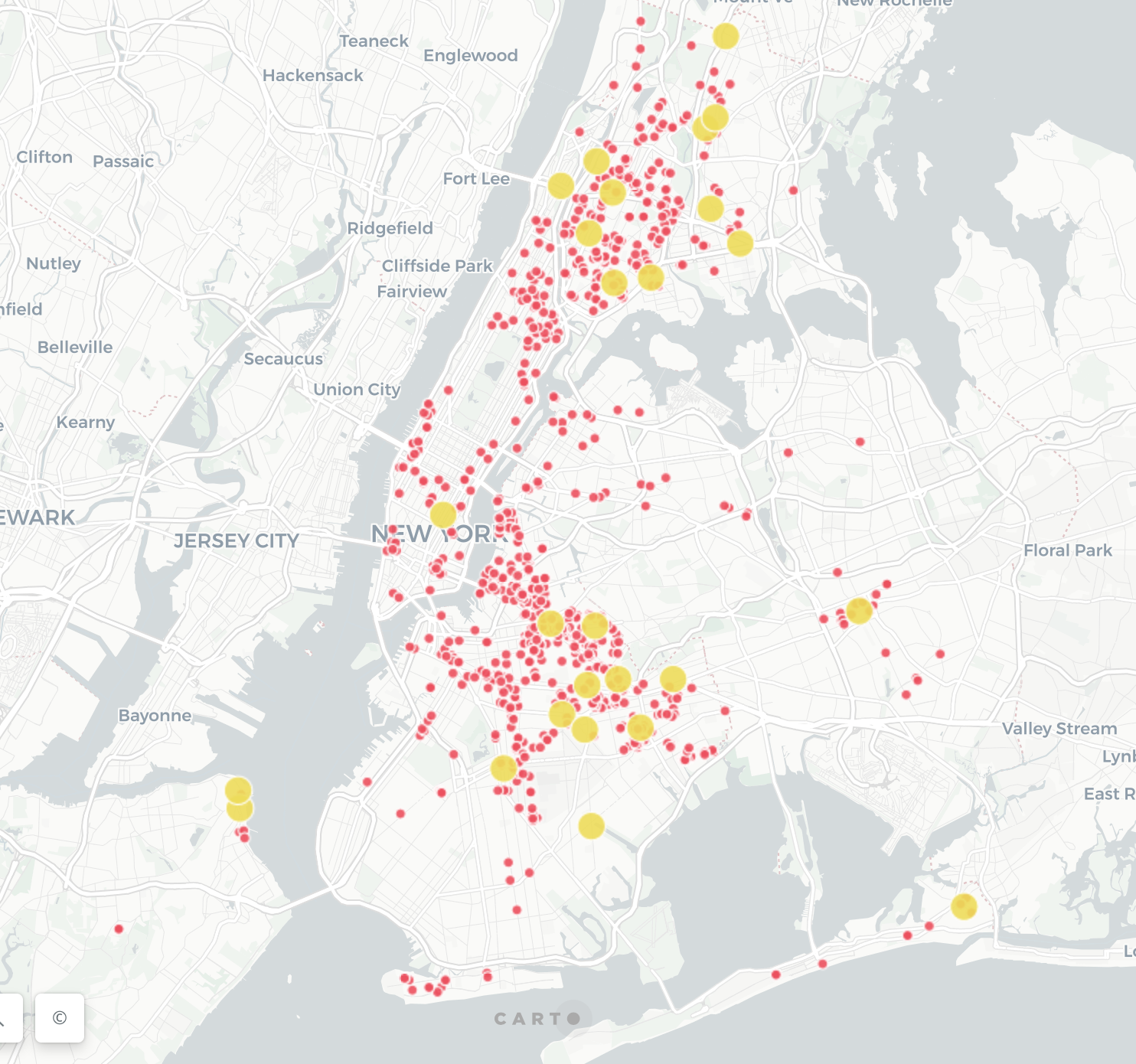
After studying people, we started looking at the location. We believe that the community always has an influence on people. Researchers have described three primary models for thinking about how economic factors influence families: the family stress model, the investment model, and the interactionist model. Costello and colleagues (2003), for example, found that children whose families were lifted out of poverty when a gambling casino opened on an Indian reservation showed improvement in both psychiatric symptoms and conduct problems. To better understand the geography of housing projects, the housing project location data is visualized into a map (Figure 6). On this map, the majority of housing projects are being placed on the Bedford-Stuyvesant area in Brooklyn and the area between Harlem & Bronx. We then added the shelter locations on the map. We found out if there is a housing project area there are always shelters are nearby, which means there is a population of homeless living in that area. Since the projects are near each other, it can have a bad influence on people with low income. Limited resources, mental stress about low income, which often causes information avoidance and health issues. Once people get sick, they are mostly like to stay in a house and not doing anything all day and it leads to greater depression. Since these people are living together, it is very limited for them to support each other while they are trying to support themselves.
Bad loop 2: Petit Larceny (the crime of theft of another’s property or mone) has the highest complain number within the housing project area
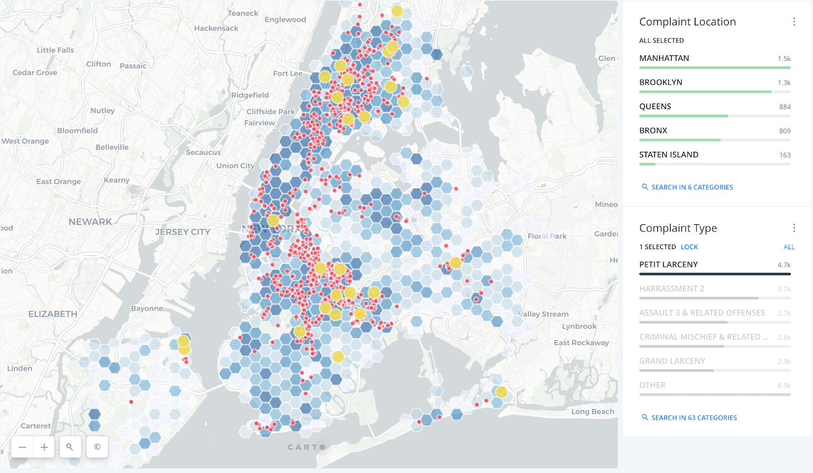
The 311 complaints record was added on the map later. Except for the lower-mid manhattan area due to the tourism, Bedford-Stuyvesant area in Brooklyn and the area between Harlem & Bronx have the highest density of complaint records. Meanwhile, the highest complaints in those two areas are petit larceny(Figure 6). Living in an unsafe area will definitely increase the mental stress level. People are unsure when they will get attacked or robbed. It is also possible for people to commit a crime easily in a high crime rate neighborhood since it commonly happens. With limited resources and opportunities, people will find whatever way to survive on their own.
Bad loop 3: People with low-income can’t afford to buy a home
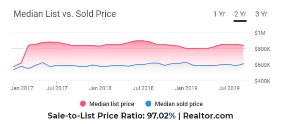
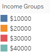
On the 2019 real estate report on Redfin.com (Figure 7), the median list price of a home is $899,000, the median list $/sq ft is $1,000, the median sale price is $625,000 and $389/sq ft. In NYC, A salary of $58,450 or less annually is now considered low income in the New York Metro Area. According to the dataset of Low- to Moderate-Income New York State Census Population Analysis, none of the family make more than 40k annually (Figure 8).

They will have to save their money at least 22.5 years without spending a single penny. As a result, people with low-income will not be able to buy a home and are forced to pick housing projects so they can have a place to stay.
USER EXPERIENCE RESEARCH & RESULTS
To ensure that the visualizations are well structured and easy to understand, the team invited four scholars and professionals living in New York City to conduct user testing, each involving a think-aloud method followed by interview questions.
First, the participants were asked to explore the interface freely while verbalizing all of their thoughts and feelings, then some questions about the information were asked, e.g. how easily they found the visualization is understandable to read. Finally, they were asked to provide some qualitative feedback about the visualizations. I designed the UX research method in accordance with usability theory methods, to ensure a qualified end result.
From the user tests, we received valuable and insightful feedback from participants, which helped us to identify the following usability issues with the current visualizations:
- The fact 1&2 can point out the greatest gap that leads users’ attention;
- The fact 3 can use different color coding to represent negative figures;
- The fact 3 graph contains too much information;
- The fact 4 graph need to be more specific (the type of property, sales numbers & value);
- The bad loop 2 can use a different color for shelters to create more contrast
In general, user testing was very successful. All the feedback we received from the users are been redesigned and implemented to the dashboard. Interestingly, some users point out that they would like to see more detailed information from the graphs, i.e. the detailed housing per square foot in each borough, instead of the overall home information at Bronx and Brooklyn.
So, as a result, for the graph demographic vs. income, we changed the bar chart into the pie chart and merged low income, moderate-income, and very low income into one section. So that the audience can easily compare the low-income percentage of each ethnicity. We also changed the color and transparency of the complaint data in the project housing vs. complaint graph, to bring more contrast and clarity. See visualization before and after UX-test feedback below:


Before – Project Housing Graph 
After – Project Housing Graph 
Before – Project Housing & Complaint Graph 
After – Project Housing & Complaint Graph
FINAL THOUGHTS & FUTURE DIRECTIONS
Throughout the project, most of the time we spent on is cleaning, refining, and merging the data. But this was a crucial step for us to determine what the central theme of the project would be, and how we could explore it from a variety of angles. Although we started with a general vision for our visualization, the way we achieved the final result was a gradual process that emerged out of trial and error.
The next steps in terms of the dataset, there is still a lot for us to explore, i.e., to discover the low-income jobs and its application rate to understand the popularity between each role, and then to explore the pre-filing date vs. sign off date to understand the stability of the position.
To continue improving upon the visualization, we would first refine the work that is not able to be thoroughly carried out as planned due to the data sizes, and then to make an interactive poster to compile all the graphs together if possible.