Introduction
As the United States moves through the 2020 election season, recent actions by the Trump administration have left many asking whether the country is becoming less democratic. This is a difficult question, and it is not immediately obvious how to measure something as amorphous as “democracy”. But history shows us that the level of democracy in countries does change over time, and a historical view provides important context for understanding the current state of affairs. My analysis uses the Polity5 dataset from the Center for Systemic Peace, exploring global trends in democracy at the country level.
Review
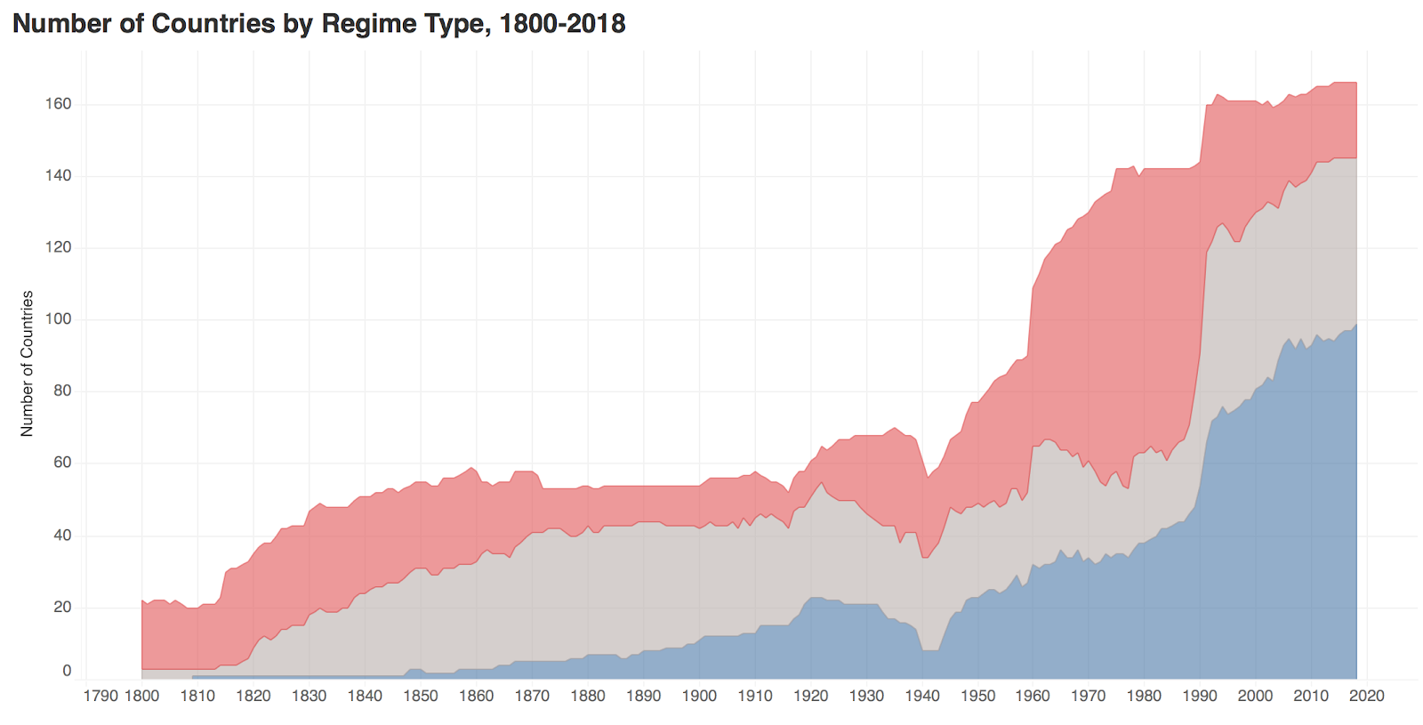
There are many visualizations of this dataset and similar data which provide helpful starting points. One is from the Center for Systemic Peace showing the number of democracies, anocracies, and autocracies from 1800 to 2018:
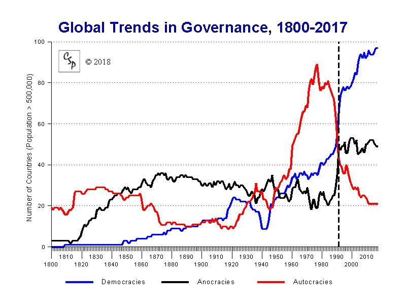
This is useful as a baseline, and shows some interesting trends such as the rise and fall in the number of autocratic regimes in the second half of 20th century, and the increase in the number of countries in the world over time. This shows these trends very clearly; however, it only tells us about the number of countries, not the number of people. It also simplifies the data’s complex “polity” index to three categories, hiding the gradations of the level of democracy or autocracy which is contained in the data.
A more informative view from Visual Capitalist incorporates population data to show the number of people living under different types of regimes over this time period:

The direct labeling in associated colors makes for a very readable chart, and the annotations include interesting story points.
The Economist’s own democracy index also shows an interesting approach, combining a map and a sort of stacked bar chart to show the distribution of countries over a much more limited time period:

This approach shows helpful nuance in the type of regime, and shows the value of a map view to illuminate individual countries.
Tools
I used Tableau Public, the free version of Tableau’s data visualization software. In addition to being a powerful tool with many visualization capabilities, Tableau is an ideal tool for exploring data because it is very easy to quickly try different types of visualizations.
Tableau expects data in a “long” format, and so was well suited to this particular dataset, which uses a long format where each row in the data file represents an observation and variables such as country and year are contained in single columns.
Process
I used the Polity5 annual time series dataset, where each row is a country-year instance of a regime. After finding the data, I explored the data structure in Excel and looked through the documentation. The data is highly organized and the documentation is detailed. The only data cleaning required was to remove certain values (-66, -77, -99) which were encoded as numbers in the polity column but represent unavailable data.
I then began exploring the data in Tableau. My first step was to recreate the line chart shown above to verify I was using the dataset correctly. This required creating a calculated field simplifying the polity score (integer from -10 to 10) to democracy, anocracy, or autocracy.

I then tried other visual approaches, such as a map with a filter to limit to a specific year, a histogram also filtered to a year, and experimenting with other calculations such as the median country score. I also tried different color palettes, settling on a diverging red-blue color scale which emphasizes the midpoint (polity score of 0).
Results
These methods led me to produce the following interactive dashboard (link to view on Tableau Public):

My goal was to show the historical trend and geographic distribution, and preserve the detailed polity scale rather than the simplified view of three regime types, in order to show how the level of democracy is nuanced, and not just a binary state. The simplified view of democracies, anocracies, and autocracies is still useful however, providing a helpful quick read:
The histogram provides a clearer view of the distribution of countries 2018, showing the largest portion have a score of 10 (the highest democracy score):

Finally, this gantt chart approach is a bit overwhelming, but the most useful for picking out individual countries’ trends over time (link to view on Tableau Public):

There are many lessons to be drawn from these graphics. For me, the most important is that democracy is not a natural or inevitable type of government – over the last 200 years, most regimes have not been democratic, and many countries have changed in the negative direction over time. The data shows how the power struggles of the 20th century were particularly important moments in this regard. We can assume that different outcomes of World War II or the Cold War could have resulted in many fewer democracies.
Reflection
Future work could explore the component variables in the dataset which are used to calculate the polity score, allowing analysis of more specific elements of democracy. It would also be helpful to incorporate population as in the Visual Capitalist example.
It would be particularly interesting to examine the U.S. data in more detail – the country has fallen from a 10 to an 8 in recent years, and reviewing why would be a timely project.