Introduction
I have been interested in data journalism for a few years now. But while I have seen many graphics in publications like the New York Times and FiveThirtyEight, I know relatively little about how graphics were used in media before the 2010s, and so I chose to focus my lab on the history of news graphics. Through my research, I hoped to better understand when news media began incorporating graphics in their content, who were the pioneers, and how the design of the graphics has evolved.
Process
I used TimelineJS, a product from Knight Lab which allows for creation of an embeddable timeline. The timeline is populated by a templated Google Sheet, making it easy to use. One nice feature is that TimelineJS automatically adjusts text and background colors to ensure a high enough contrast.
I wanted to cover major milestones in the history of graphics in the news, showing as many significant “firsts” as possible while limiting to a manageable number of events. I chose to focus mainly on the use of charts and maps in newspapers (and their online versions).
There were a few resources that were particularly helpful in my research, both for finding examples and getting a sense of the historical trends in the field.
- Reading through R.J. Andrews’s History of Infographics first clarified that news graphics would have a very long history and provided inspiration about what a timeline could accomplish.
- This series of posts by Scott Klein was fascinating, unearthing some interesting historical examples of data journalism.
- Priceonomics published an analysis of the New York Times’s use of charts over time, collecting some historical examples and charting the increase in graphics over time.
Results
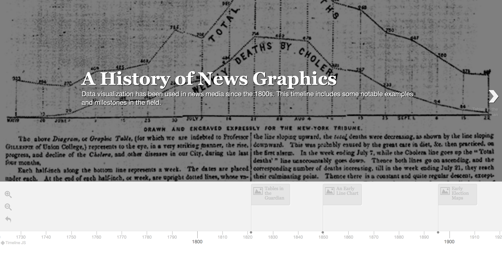
Click the image to see the interactive timeline:
One design choice I made was to represent a number of different types of graphics and technologies. Determining the absolute first instance of each generally wasn’t possible, and so in some cases I opted to show a graphic that exemplified a trend, even if it wasn’t a particularly significant graphic in itself.
Another choice was to feature a range of publications – some of my sources looked primarily at the New York Times, which has often been at the forefront of innovation, but I wanted to include a wider array of news outlets. Finally, one aesthetic choice was to use a bold serif typeface for the headers that mimicked the style of newspaper headlines.
Reflection
This project highlighted for me how pioneers of news graphics pushed boundaries. One way they did this was technologically: publishing innovative graphics required overcoming technological hurdles, whether in early printing presses or HTML. Deadlines and profitability are critical in the news industry, and these pioneers had to figure out new ways to create graphics efficiently. Another way they pushed boundaries was in the public’s understanding of graphics: in many cases, they took a gamble that people would be able to understand a new type of chart if it was explained.
There are some major limitations in this project. Searching newspaper archives for examples of graphics is a tedious task, and our understanding of the history of news graphics is dependent on what archives have survived, and interested parties taking the substantial time to dig through them. Because of the large volume of archives, and the fact that a large amount of content is not archived or digitized, it is usually not possible to identify the first use of a certain type of graphic. We also can’t know how the public reacted to these graphics at the time, or how they inspired editors at other publications. To better understand the history, we must either rely on the research of others or do a large amount of digging.
One possible future direction could be to do some selective sampling of archives to better understand not just the first instances of graphics but how they became widespread in the 20th century. Another could be to focus more on the history of a specific type of graphic, such as U.S. election maps.
Sources
- ProPublica: Infographics in the Time of Cholera
- The Guardian: The first Guardian data journalism
- D3.js
- Priceonomics: When Did Charts Become Popular?
- Journalistic Instinct: CAR Through the Ages
- Michael Friendly and Daniel Denis: Milestones in the History of Thematic Cartography, Statistical Graphics, and Data Visualization
- Newspapers.com
- Scott Klein: The Follow-Along-at-Home Election Map of 1875
- Christopher Sterling: The Encyclopedia of Journalism
- Mindy McAdams: Flash Journalism
- The Washington Post: Why outbreaks like coronavirus spread exponentially, and how to “flatten the curve”