
BACKGROUND
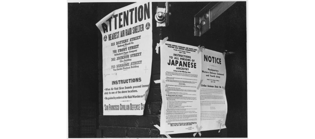
On February 19, 1942, President FDR signed Executive Order 9066, which authorized the removal of civilians from designated “military exclusion zones” spanning much of Washington, Oregon, California, and Arizona. This consequently resulted in ten concentration camp locations dispersed throughout the United States. These camps were run by the War Relocation Authority and concentrated Japanese peoples behind barbed wire under the surveillance of armed guards.
The camps and their dates of operation:
1. Poston/Colorado River (Poston, AZ) (May 8, 1942 – November 28, 1945)
2. Tule Lake (Newell, CA) (May 27, 1942 – March 20, 1946)
3. Manzanar, CA (June 1, 1942 – November 21-1945)
4. Gila River (Rivers, AZ) (July 20, 1942 – November 10, 1945)
5. Minidoka (Hunt, ID) (August 10, 1942 – October 28, 1945)
6. Heart Mountain, WY (August 12, 1942 – November 10, 1945)
7. Granada (Amache, CO) (August 27, 1942 – October 15, 1945)
8. Topaz/Central Utah (Topaz, UT) (September 11, 1942 – October 31, 1945)
9. Rohwer, AR (September 18, 1942 – November 30, 1945)
10. Jerome (Denson, AR) (October 6, 1942 – June 30, 1944)
My motivation for this project derived from my current growing interest in Chinese and Japanese American histories, which are both a part of my family’s heritage. The presence of Asians in America has been a tumultuous history worth studying, evaluating, and memorializing. I also wanted this project to highlight a landmark period of discrimination in American history that finds further relevance today in light of the ICE detention camps (https://www.ice.gov/detention-facilities) and racism that has been perpetuated by those highest in power. In these times we must remember and acknowledge the damaging effects of the camps.
“In times of war, the laws fall silent,” warned late Supreme Court Justice Antonin Scalia, reflecting on the 1944 Korematsu ruling during a speech at the University of Hawaii in 2014. “It was wrong, but I would not be surprised to see it happen again – in time of war.”
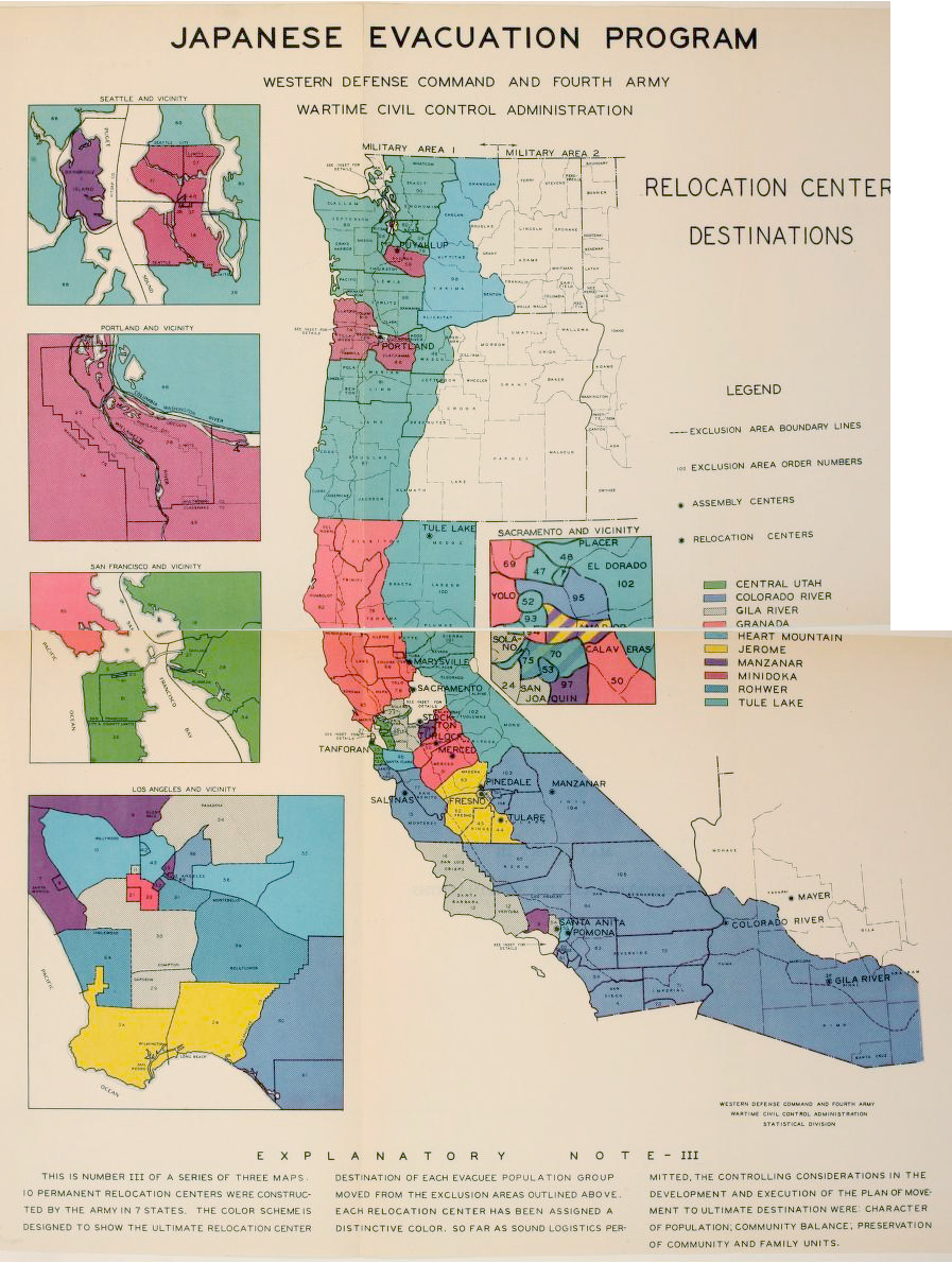
The visualizations use data from an official War Relocation Authority (WRA) report documenting the mandated movement of Japanese people. I chose to specifically focus on people from the West Coast due to data inconsistencies/constraints.
PROCESS
Step 1: Transcribe select datasets
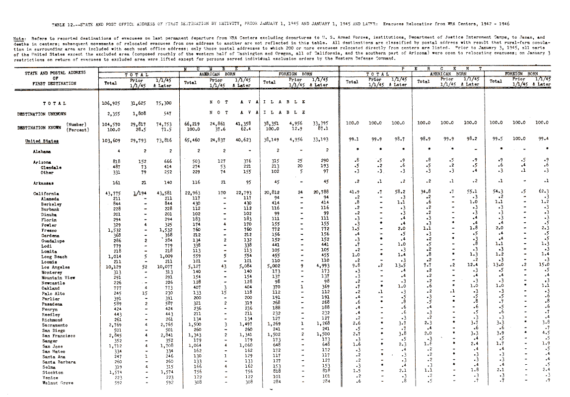
Table 12 “State and Post Office Address of First Destination by Nativity, Prior January 1, 1945 and January 1, 1945 and Later: Evacuees Relocating from WRA Centers, 1942-1946”
Table 13 “Number of Evacuees Known to Have Returned to West Coast States Compared With 1940 Population of Japanese Descent by County, and Post Office Address: California, Washington and Oregon”
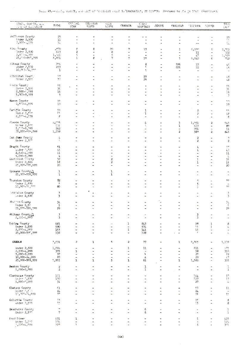
Table 19 “State, County, and Size of Community Prior to Evacuation, by Center: Evacuees to WRA in 1942”
It was tedious to transcribe these scanned documents because some text was spotty or had entire columns missing. Fortunately for the datasets I used, simple math and some quick Google searching was all I needed to verify values and location spellings.
Although some internees came from states outside of Washington, California, and Oregon, data for these other states were more sparse and lacked the same specificity in recording the relocations of people. The primary reason for this data imbalance was that only a few states were under jurisdiction of the 108 exclusion orders, which meant they were the only areas subject to removal by the U.S. Government. Additionally, the state with one of the largest Japanese populations, Hawaii, was not subject to the same removal or incarceration as WA, CA, OR, AK, and AZ because of General Delos Emmons, commanding general in Hawaii post-Pearl Harbor, who “rejected anti-Japanese pleas to remove persons of Japanese ancestry from Hawaii. He knew there was no evidence of Japanese American espionage or sabotage.” (Densho Encyclopedia)
Step 2: Find coordinates for concentration camps and counties
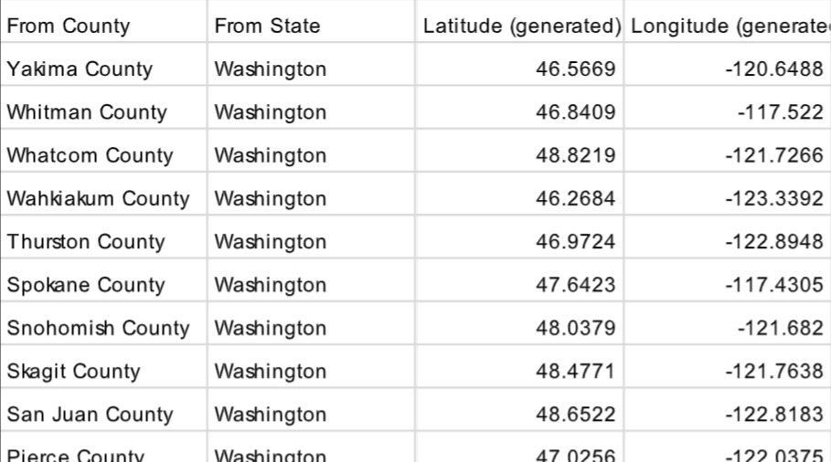
I used Google maps to locate the camps and their coordinates. The coordinates for the CA, WA, and OR counties were generated in Tableau. I imported the dataset I created for Table 19 into Tableau. Tableaus then automatically created the latitude/longitude points for each location and appended them to my dataset, where I was able to next drag the “Longitude (generated)” and “Latitude (generated)” attributes into the “Columns” and “Rows” fields, respectively. The next step was to change the “Marks” type to “Map” and drag the “State” and “County” attributes into “Detail.” I then downloaded the newly calculated County latitude/longitude dataset from the web version of Tableau Public.
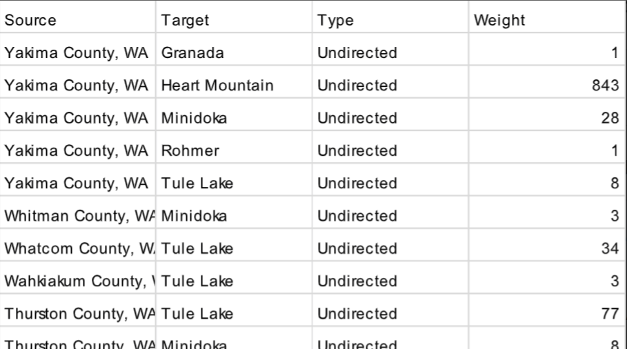
Step 3: Create nodes and edges datasets
From here, I created separate nodes and edges datasets in order to create a network visualization in Gephi. Below are screenshots previewing what my datasets looked like.
Step 4: Create network visualization in Gephi
For my network visualization, I imported the two datasets and left the selected presets populated by Gephi. Since my nodes were specific geographic locations, I wanted them to be arranged by their latitude and longitude points. I installed the “Geolayout” plugin into Gephi and played with the scale until I liked the dispersion of nodes. I ended up deciding on a scale of 7500.

I colored the War Relocation Centers (orange) a different color from the counties that the internment prisoners came from (blue). Since I knew I could make a separate bar chart summarizing which camp had the highest population of West Coast internees, I decided to place an emphasis on the amount of people who were removed from each county by adjusting node sizes based on their degree. I selected a scale based on the out-degree of each node, setting the minimum size at 30 and the maximum at 80. I had to use a size 30 minimum node for the camps to show up properly, any lesser values were hard to see. I then decreased the opacity of the nodes because the counties heavily overlapped with one another. Although some of the nodes obscure others, I still like how the nodes are organized because they emphasize what areas most of the internment prisoners came from and the overlapping colors create a darker hue, which aligns with the reality of the Japanese population’s concentration. I made the edges varying shades of blue and the thickness of each line all based on the weight of the edge (which was the number of people sent from each county to each camp).
Step 5: Layer network visualization over map of the US

Unfortunately, the “Map of Countries” plugin would not fit my visualization exactly, so I decided to use a blank map and layer my network over it in Adobe Illustrator. When plotting the camp locations in Google Maps, I realized that I needed a Mercator map rather than a curved globe distortion, so I made sure to find one in that perspective. I used this blank map from 4GeeksOnly.
Step 6: Create visualizations in Tableau
I created three dashboards in Tableau, which combined my Gephi network map, some archival photos, and four Tableau visualizations.
1 – DISPERSION OF CA, OR, AND WA COUNTIES INTO THE CAMPS
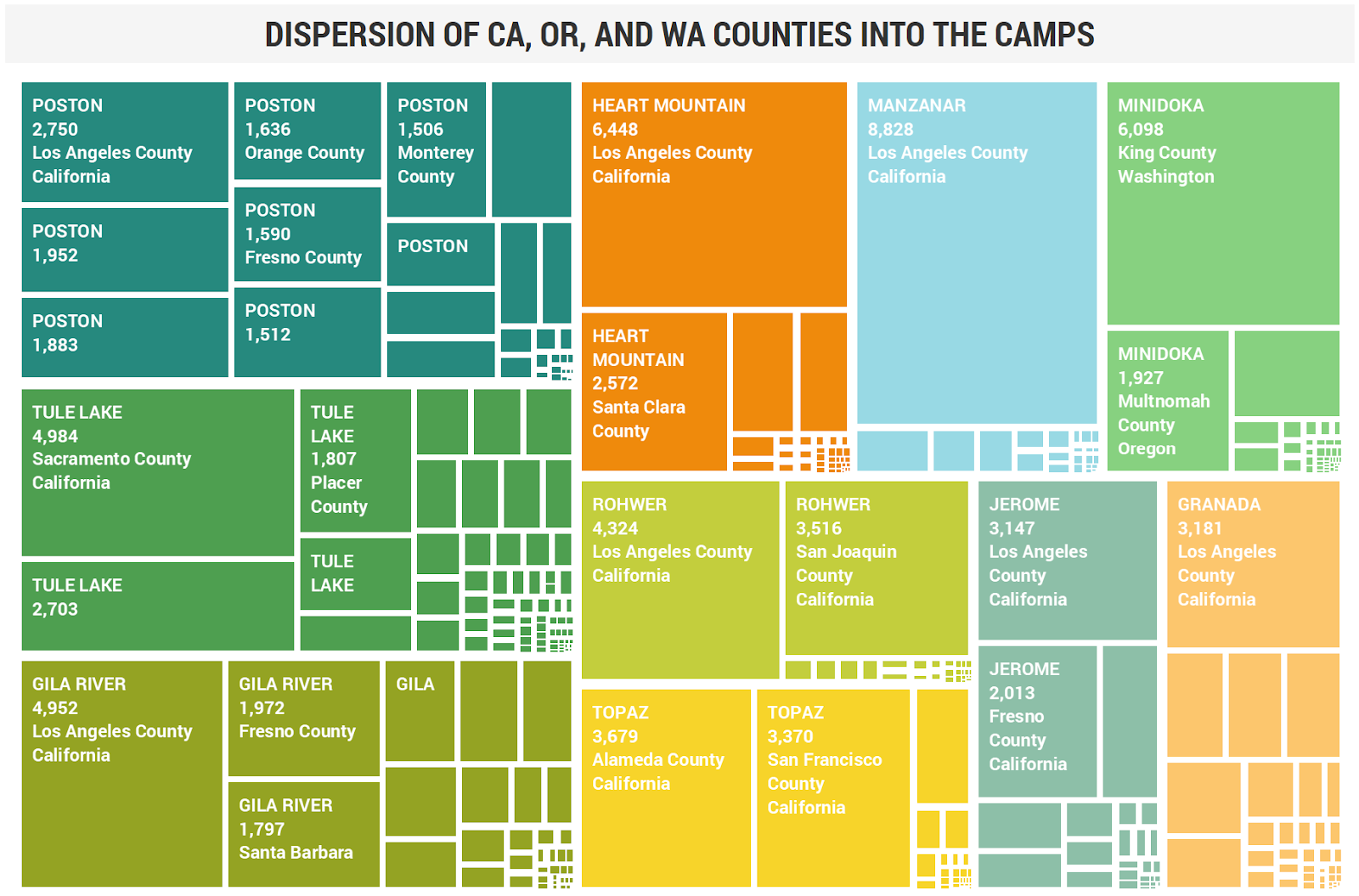
The first visualization shown is a treemap of the ten camps divided by the counties from which the internees came. I decided to include labels to better clarify what data was shown and color coded the blocks according to the camp they referred to. By adding the internment camp label specifically, I was able to remove the legend and allow users to read the map via recognition rather than having to consistently refer back to the key. During usability testing, Participant 1 and Participant 2 could not determine which camps received the greatest amount of people from the West Coast. They did not associate the size of the squares with the amount of people. Additionally, the small squares that cannot display full labels were confusing. Since I couldn’t adjust the labels to show on all the rectangles, I changed the color scheme to have darker colors for the camps with larger West Coast internees and lighter colors for the other camps in order to visually imitate density. Each camp still has a unique hue. I also added a “County” filter on the right so that users can explore the distribution of whatever counties they are interested in, which eliminates the label readability issue, but only when looking at individual counties.
2 – THE 1940 JAPANESE POPULATION VS. INTERNEES WHO RETURNED
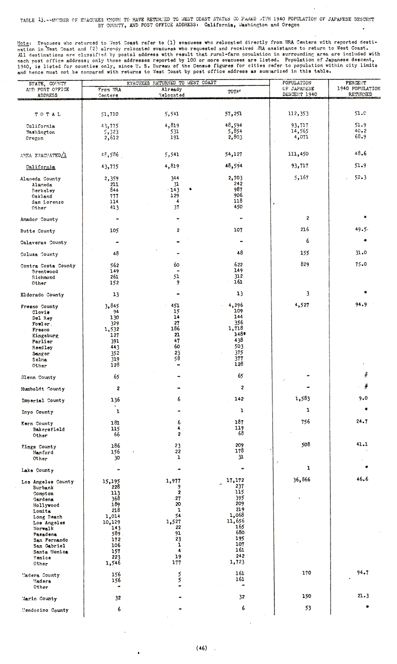
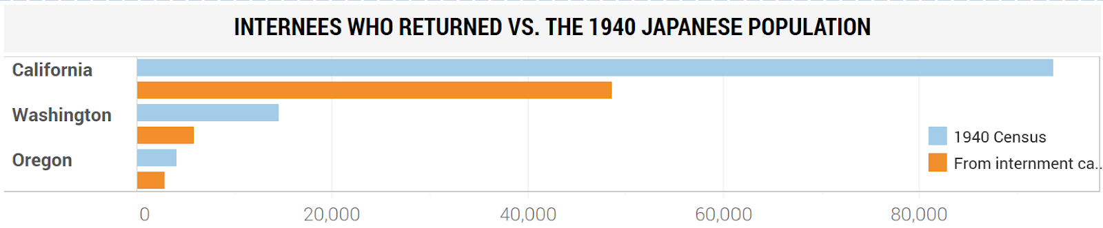
The second visualization comes after my Gephi network map and synthesizes data showing how many Japanese residents moved back to the West Coast compared to the most recent census records. The original dataset in The Evacuated People: A Quantitative Description directly compares this information in Table 13. I thought showing the disparity between the two population measurements would be best displayed in a bar chart. I could have included Arizona, Alaska, and Hawaii since that data was in Table 12 and I could obtain census information for those states, however I didn’t want to confuse the user since my Gephi network only showed WA, CA, and OR relocation.
3 – WHERE DID THEY GO AFTER THE CAMPS?
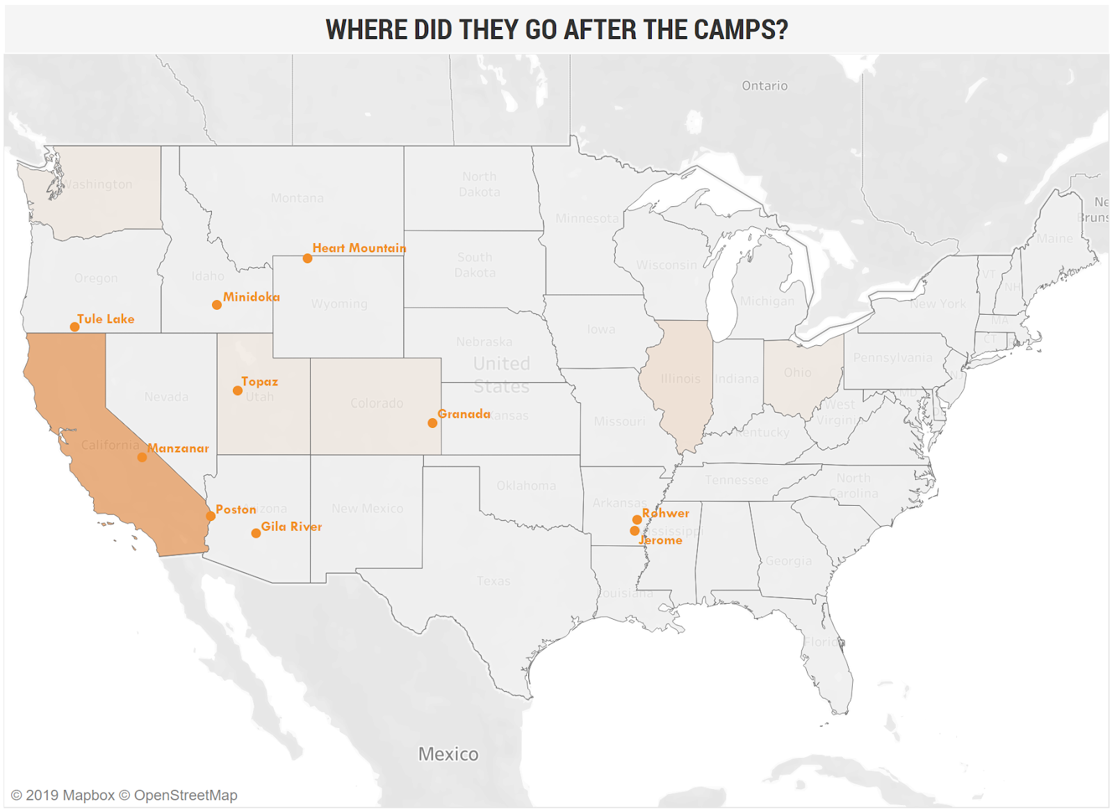
The third visualization is an overview map of where internees moved after the camps. This map was created after our class critiques. I considered combining the choropleth map with the Gephi network map, but I wasn’t sure the colors would be enough to express a narrative, so I instead included this map on the page after. Participant 1 mentioned that she had difficulty centering the map, so I removed the functionality from it since it wasn’t relevant to zoom in/out of the states or pan over the country. I added annotations for where each camp was located, which highlighted the possibility of close proximity a camp being a determining factor for what areas people chose to move to after they were released. Participant 2 stated that the color gradient was unclear, so I adjusted the color range to the brown gradient. Unfortunately, the colors do not allow for much adjustment and when you do change the color, Tableau automatically selects light gray as the color representing the lowest values.
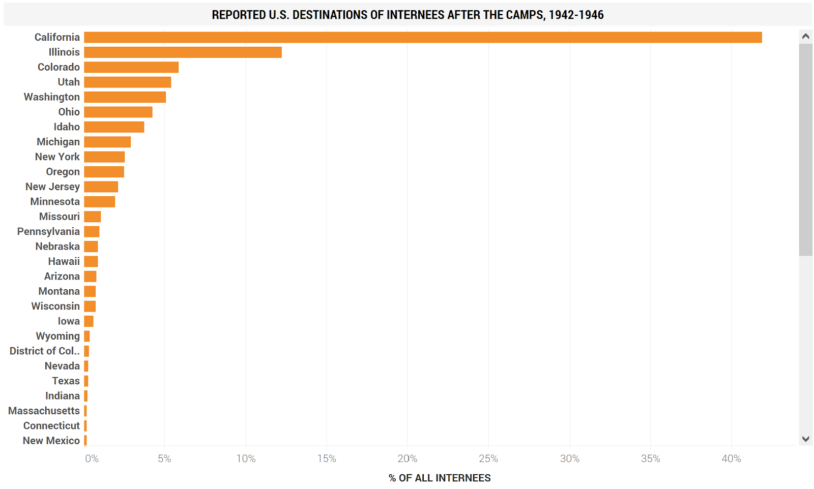
The fourth visualization supports the previous one, emphasizing how many people moved to certain states in comparison to the others. Again, a bar chart most clearly communicated the quantitative population differences, so I used this format and sorted the bars from the greatest number of people to least. I also adjusted the values to the percentages of all people who left the camps, which helped to provide a bigger picture of post-camp populations.
FINDINGS
Displaying the relocation process on a map highlights how spread out the camps were and how this affected the dispersion of large Japanese populations. The data I specifically used for this project revealed that the relocation of Japanese people resulted in the displacement of many communities. Because people were removed from their homes into areas or states that were far from their original homes. Over half of the internees did not return to the West Coast. They likely selected their post-camp destinations based on proximity to the camp they were released from. This is most evident in California, Colorado, Utah, Washington, and Idaho.
Further research could look into verifying why internees selected the states they did and what was special about Illinois and Ohio rather than staying in Arkansas or moving to a neighboring state. I would also be curious to find out why Oregon was such a low reported state when many internees were evacuated from there. Camp Tule Lake was the last of the ten camps to close, in 1946, which may have also produced an aversion for Japanese people to move there immediately after their camp’s release.
On my third dashboard (page 3), I decided to include the commentary “It is also worth mentioning that the movements of internees recorded here do not include the 4,724 people deported to Japan; 2,355 joining the U.S. Armed Forces; 1,862 deaths; and 1,322 being sent to other “institutions.”” I included this because it specifically affects the number of people who were not recorded in the tables I used to create my visualizations, but does not take away from the fact that Japanese people were displaced from their homes. These statistics were found in Figure 1 from page 8 of The Evacuated People: A Quantitative Description.

APPENDIX: USABILITY TESTING
I wanted to gather feedback from four different users, specifically 1 Asian American, 1 Non-Asian American, 1 Asian Non-American, and 1 Non-Asian Non-American. Unfortunately due to time constraints I was only able to test my visualizations with Participant 1 (Non-Asian Non-American) and Participant 2 (Asian American). The two participants performed the evaluation by completing four tasks and providing miscellaneous comments after each task.
The tasks and responses
1A. Go to page 1 and determine which camp received the most Japanese people from the West Coast. Next, determine which camp received the least Japanese people from the West Coast.
(Answer: Poston / Granada)
Participant 1 – Heart Mountain / Tule Lake
Participant 2 – Heart Mountain / Granada
1B. Please explain if there was anything you liked or disliked about page 1.
Participant 1 – Like the colors and the concept of the graphic
Participant 2 – In the Dispersion charts, there is inconsistency in labeling–some will have “…County”, some do not; some have “California” and do not. There are some boxes with numbers but no counties, which does not give the reader an idea of those numbers representation. Also, there are boxes with the camp name, but no other information. If these are the camp title, then you may want to color the text differently from those with data.
1C. Did you find it easy or difficult to discern information on page 1? Please explain why.
Participant 1 – It was hard for me at first. I had to look at it for a while to figure out the smaller boxes meant or that they had info
Participant 2 – More difficult than initially thought. I had to use a calculator to add up the numbers and determine which numbers to include. I also interpreted the sentence “The majority of internees came…” a couple of ways and felt the sentence could be worded with more emphasis on the government’s designation of “military areas”.
2A. Using the map on page 2, summarize what you think the map is showing and explain any insights you find.
Participant 1 – Explains where people were sent (ie from home in west coast to various states) I didn’t know it was haphazard where they sent the people.
Participant 2 – People from the blue areas were sent to the camp where the arrow pointed. It looks like San Francisco area and Sacramento/mid California had the highest concentration to move. I am assuming that the dark arrows meant that there was a high population from those areas going to the specific camp. The Geographical Distribution map shows a good number of Japanese in Colorado, Utah, and New York. The map with the arrows doesn’t show this non-West Coast population. It would seem that the focus is on West Coast, but that wasn’t the impression from the project title.
2B. Please explain if there was anything you liked or disliked about page 2.
Participant 1 – Map was interesting
Participant 2 – I liked that you color coded the wording to reflect the population and camps. I think the last sentence, “Less than half returned.”, should be its own paragraph above the bar graph. May be reword to “Less than half of the Internees returned to the West Coast.” The picture titled “Geographical Distribution…” should be the second picture on this page, not third, since it’s tied to the 1940 census and introduces the data of the bar graph. The title of the bar graph may be switched: ‘1940 Japanese Population vs Internees Who Returned”, since you see the blue bar first. Use the title as the wording for your key. In the last paragraph, rather than “lucky”, maybe “fortunate” could be used.
2C. Did you find it easy or difficult to discern information on page 2? Please explain why.
Participant 1 – Seemed clear and easy to read
Participant 2 – I thought there was a lot of good data and information from these pages. As mentioned earlier, focus is on West Coast (and justifiably so), yet what about the non-West Coast states.
3A. Go to page 3 and determine if there are any states that no internees moved to.
Participant 1 – I can’t tell
Participant 2 – It would seem that they did not move to the majority of the other states.
3B. Please explain if there was anything you liked or disliked about page 3.
Participant 1 – I was hard for the map to be in the center of the page so, unless I made it really small I couldn’t see the whole map
Participant 2 – The color gradient make it seems like most people didn’t go to certain states, yet on the bar graph, there were people who did go (ex: New York). I really thought the last paragraph (about the others not recorded) was great data to make note and end.
3C. Did you find it easy or difficult to discern information on page 3? Please explain why.
Participant 1 – No, I thought it was straight forward
Participant 2 – As stated earlier, the color gradient is not discerning enough to identify have and have nots.
4. In one sentence, please explain what you learned from this series.
Participant 1 – The relocation displaced many Japanese from their homes forever
Participant 2 – Less than half of the internees returned to their original state (or West Coast?) and distribution to the various camps.
5. Do you have any recommendations or feedback to improve the project?
Participant 1 – It was really interesting and interactive
Participant 2 – Earlier indication (in title?) of impact to West Coast.