INTRODUCTION
Chicago. The Windy City. Few people, especially Chicagoans, understand how the city got its name. The city has a rich history and a magnificent range of buildings. Chicago has a rich architectural history. What are some well-known Chicago buildings? The Home Insurance Building was a skyscraper in Chicago that stood from 1885 to 1931. Notable historic buildings in Chicago, such as the Wrigley Building, feature some of the best architecture. It was the first building built on Chicago’s iconic Magnificent Mile, right beside the Michigan Avenue bridge, which was still under construction at the time. The ground was broken for another of Chicago’s most well-known historic buildings in 1924, just two years after the Wrigley Building. The Tribune Tower, located across the street on the Magnificent Mile, was originally the second home of the Chicago Tribune, Tribune Media, and Tribune Publishing newspapers. The original Tribune Tower was built in 1868 but burned down during the Great Chicago Fire. This project is exploring the Temporal building footprint of Chicago.
INSPIRATION
Before diving into the dataset and designing, I started looking for inspiration. Although the OpenData Chicago website has one it was a basic map. I already had one in my mind which was shared in class.
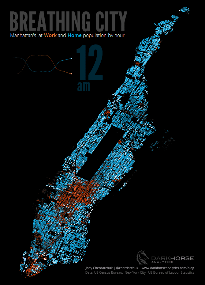
Breathing City: This visualization is a perfect example of a Temporal map. It was designed by Joey Cherdarchuk at Darkhorse Analytics. For the past few projects, I was trying to make an animated interactive visualization. I like idea of how there is no elements of map are added to keep the focus of the audience intact on the main Manhattan map visualization. I also like the font and the color used in to highlight “work” and “home”.
MATERIAL & PROCESS
Tools
Tableau Public – A data visualization software.
NYC Open Data – open data resource of NYC data
Adobe Photoshop – Adobe Photoshop is a raster graphics editor developed and published by Adobe Inc. for Windows and macOS.
Process
Searching and Cleaning up the data
I did did extensive research to find a good dataset for making a similar map. I tried building footprint data from San Francisco and NYC. Chicago buildings, like those in New York, I believe, are well-known. I thought it would be fun to work with Chicago Building’s footprint data. I also used city boundary data. All data were in good shape so I directly used them.
Creating Visualizations
Although I was not using Tableau for the first time but it was challenging to connect data in Tableau. I struggled a lot to connect data, and due to the very large size of Building footprint data, I was not able to add any other data to my map. Tableau was working slowly with this data. So first, I added the city Boundary data, after that, I added the footprint data and connected them as shown below.

After that, I experimented with the available data. I divided the year into groups to make it easier to visualize and analyze. For every year, I added color. ” Hues” from Tableau’s color palette library were used. This palette was chosen because I believe it will beautifully depict the flow and change of the year. As I was unable to add any more data, I decided to play with what I had and added a small graph to the dashboard displaying the number of buildings built by year. I attempted to use the Tableau” page” tool for animation, but it was not generating the desired results, so I decided to improve the visualization by creating a small gif in Adobe Photoshop. Below are some screenshot of the process and the final Dashboard.


RESULTS
This animation tells the age of Chicago buildings. The color of the dates and buildings on the map is the same for better understanding. I did not feel necessary to add some intro on this topic. I did not included additional map elements like water bodies, roads etc so the focus will remain on the main map and the changes.
REFLECTIONetc
Limitation & Future Directions
The faced two big challenges for this project . First, connecting the dataset. I was unable to connect csv files pFor this project, I faced two major challenges. First, I was unable to properly connect CSV files and received errors as a result. In comparison, the GeoJason data were less complicated to connect and visualize. As previously stated, I wanted to add a few more data points to this map but was unable to do so due to the large size of the “building footprint” dataset. The second challenge was that due to the large size of the dataset, any changes I made to the map took a long time to process, and 2-3 times stopped responding, forcing me to recreate the map.
In the future, it would be really great if I could anyhow manage to add more forms of data to it without crashing tableau or my mac. I believe animation is a very powerful way of telling a story and presenting data. I In the future, it would be fantastic if I could add more types of data to it without crashing tableau or my Mac. I believe that animation is an extremely effective medium for telling stories and presenting data. I’d like to tell a story using this data as well as other information related to it.