Introduction
The call for transparency, responsibility, and reparations that was reenergized in 2020 has found many museums reevaluating their own roles in perpetuating inequality. Museums are not neutral institutions; their collections policies and procedures affect the way millions of visitors a year learn about history, art, and culture. When one perspective is ingested into the holdings in excess of others, representation is skewed. As long as museums have been collecting institutions, they have invariably valued the work of white male artists over that of other demographics. The objects displayed in museums are purported to be the peak of art and history, the canon of what is important or beautiful to society. However, so many worthy artists and notable people do not make it onto the walls of museums and galleries. This marginalization flows into the public’s understanding of who is capable of creating art and who is capable of creating change.
The Museum of Modern Art (MoMA) was founded in New York City in 1929. It began as an educational institution, and now deems itself “dedicated to being the foremost museum of modern art in the world.” The founding members were, at the time, three progressive patrons of the arts, determined to change the conservative policies of contemporary museums and create a repository for modern art. The mission statement of the museum includes this sentence: “Central to The Museum of Modern Art’s mission is the encouragement of an ever-deeper understanding and enjoyment of modern and contemporary art by the diverse local, national, and international audiences that it serves.” In the past century, the collections have grown to over 200,000 paintings, sculptures, drawings, prints, photographs, media and performance art works, architectural models and drawings, design objects, and films.
The central question of this report was to investigate whether the Museum of Modern Art held true to its values of diversity and progress. As the collections expanded, did the curators fill the halls with diverse and creative perspectives to expand on the canon of art? Or did they fall into the trap of the traditional museums they strived to move away from by collecting from artists other than the western, white male?
Methodology
To tell the story of MoMA’s acquisitions, I wanted to create a visualization, helping viewers to make sense of the huge amount of accession data. Kaggle, an online community for data scientists, hosts a repository of free datasets. MoMA has two linked sets available. The first explores the 15,039 artists whose work has been accessioned. This set contains metadata for artist ID, name, nationality, gender, birth year, and death year. The second dataset has 130,000 rows, with columns for title, artist ID, name, date, medium, dimensions, acquisition date, credit, and catalogue. Once I downloaded these .csv files from Kaggle, I uploaded them to Tableau, an interactive data visualization software.
When the data was uploaded, I used the common column in both datasets – “artist ID” to link them together. Artist ID is the field that MoMA uses to enumerate the artists it has accessioned, which each artist denoted by a unique identifier. By linking the sets together, I was able to see how artist demographics such as nationality or gender related to the total number of pieces accessioned per year.
Beginning this project, I had two main graphs in mind for a dashboard- a world map shaded to show where most artworks originated, and an area graph to show the number of artworks by males, females, and other or unknown gender artists over time. I started out with these two graphs and then looked back to my thesis question: how have MoMA’s collections diversified over time?
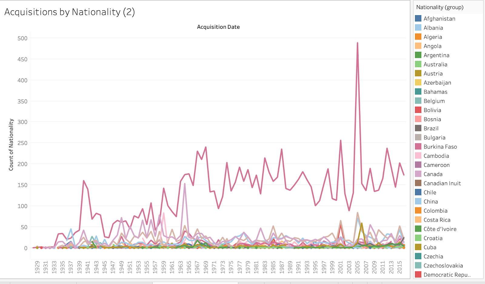
The figure below shows a prototype of a graph, analyzing the number of works acquired per year by artists hailing from each country. Hinting at the extremely American and Western-centric collecting policies of the institution, the lines correlating to any other country than the United States, Germany, and France are almost unreadable, stacked one on top of the other.
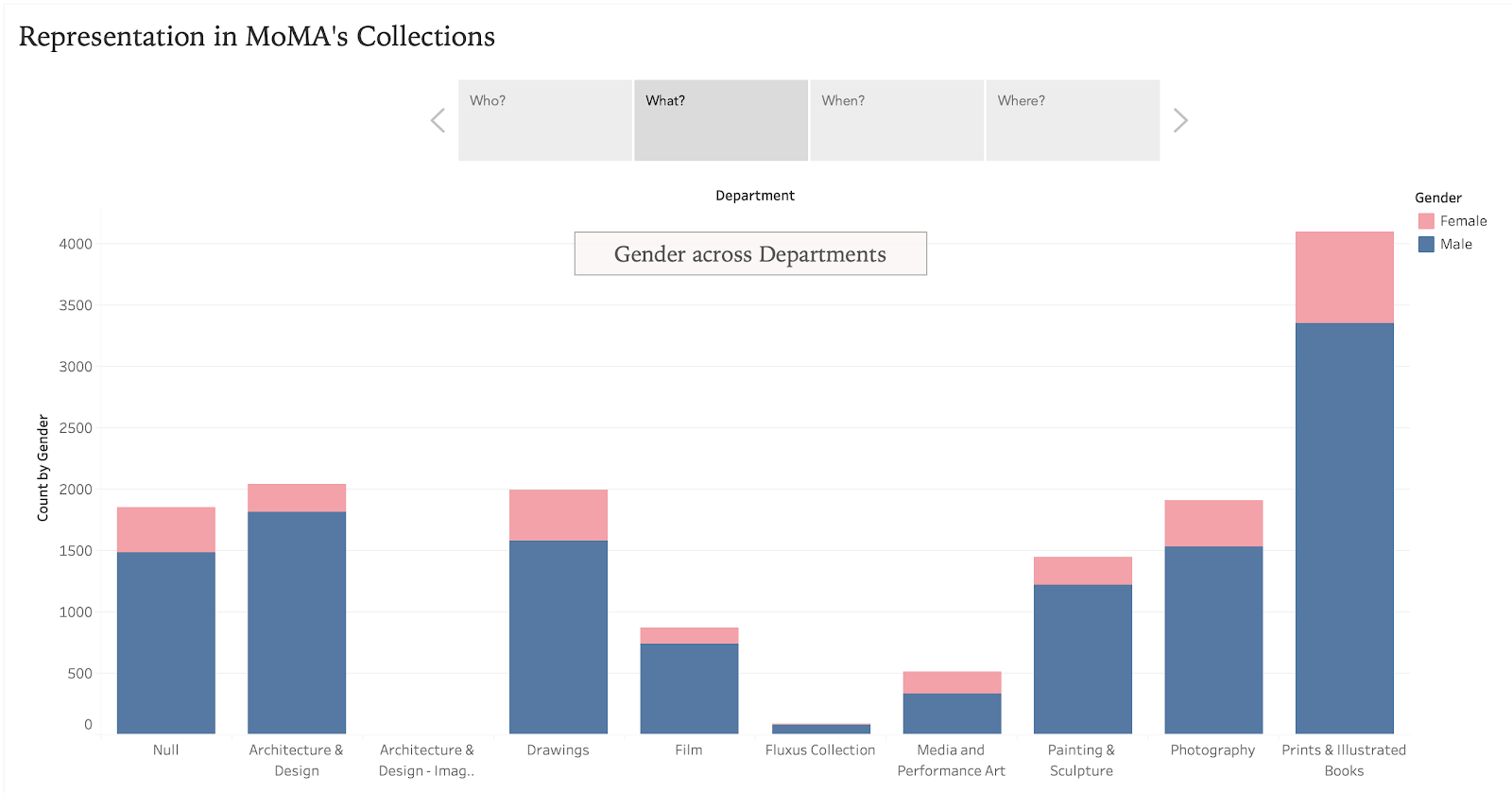
As I analyzed the data further, I was curious to see if there were differences across departments. A stacked bar graph sufficed for this purpose, showing the gender distribution as a whole and by gender. I found that while there is not a department that is obviously more female-based than male, mediums that require less technical training (i.e. drawing or prints vs. architecture) tended to have a relatively higher female representation.
Process
Originally, I had planned this visualization as a simple dashboard, Tableau’s main feature. In past visualizations I have created using this program, I found it useful to organize the screen by datatype; for this project that meant having the gender-related graphs on the left of the dashboard and graphs dealing with nationality on the right.
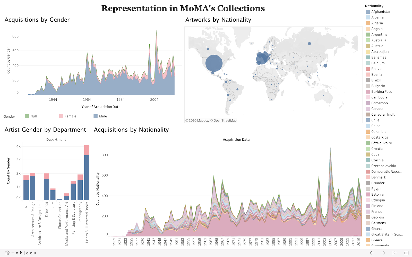
After exploring more into Tableau’s features, I learned that I could create a “story,” which organizes graphs into slides. I found this to be much more digestible than a dashboard, especially one with so much information and many colors. The story format allowed me to place each graph into a different page that users can swipe through to view the data. A huge plus was the ability to add text boxes, thus giving me the opportunity to annotate the graphs. One of the questions I was hoping to answer through this project was whether or not social revolutions, such as the Civil Rights movement or Women’s liberation, had any effect on the collections policies of MoMA. Adding text blocks to the graph on gender brought in contemporary events to explain trends.
I chose to organize the story in four parts, one graph on each page. The captions for each slide, respectively, have four question words: who, what, when, and where. This format lays out for the user exactly how each page will analyze the data and what they can expect to glean from the graphs.
A link to the final story: https://public.tableau.com/profile/anna.size8574#!/vizhome/RepresentationinMoMAsCollectionsStory/Story1?publish=yes
User Testing
It is imperative to conduct usability tests to determine whether or not the data is readable to others than the researcher. The visualization may be aesthetically pleasing but if it cannot convey meaning from the raw data then it has not successfully done its job. With this story, I wanted to ensure that users would come away with a better understanding and critical thoughts on the subject of representation in museums, rather than just viewing this as a case study specific to one institution.
As a usability study, I asked a UX designer, a museum professional, a friend with no museum or UX experience to analyze the Tableau story. I chose these three personas because they represent a diverse group of age ranges, backgrounds, and skills in exploring data visualizations. This project should be accessible to those without explicit knowledge of how to navigate a Tableau dashboard or even a dataset. Each test took the form of a casual conversation, with very little prompting just as a user who encountered this story on their own might have. Participants were asked to scroll through the slides or explore the dashboard, depending on when the test occurred. As the three users explored, they narrated their struggles, findings, and feedback.
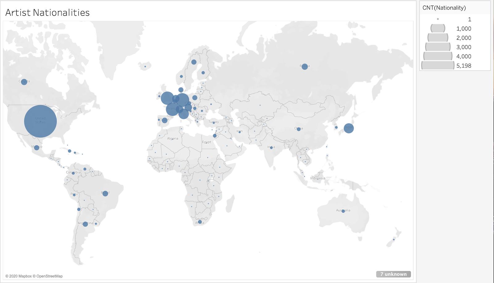
The main element that the UX designer and I discussed was the map. Originally, I had the circles denoting how many artists in MoMA’s collections were from each country. What I realized in our conversation was that the number of artists might not represent the total holdings as much as using the number of artworks produced by artists from each country. What the first iteration failed to account for is that one artist might be very prolific but only accounted for once, while another artist may have only one work, thus overrepresenting an area. The map did not change drastically but did, in the end, more accurately visualize MoMA’s accessions.
From the less experienced volunteer, I learned that while the dashboard had a good and clear overall presentation, the nationality area chart was too busy and confusing. At this time, the key was not included on the dashboard for space purposes. The assumption was that users would know to scroll over the area chart to see which color corresponds to which country. However, this was not obvious to this user and hence was added into the final visualization. She also appreciated the choices used for color, with blue corresponding to male, pink as female, and green as other/unknown, as these were common-knowledge signifiers.
As for the museum professional, her thoughts were mostly consumed by the data instead of the formatting. I took this as a good sign; instead of struggling with usability issues, she was able to focus solely on the data. The slide that shows gender distribution among departments was the most intriguing to her.
When presenting my work to a group of my peers, they suggested that instead of presenting the gender distribution graph as an area chart, it would be more meaningful to see the percent share that each gender had as a whole of the collections. This afforded me the ability to maintain scrutiny of the accessioning of female vs. male vs. other/unknown artists over time. Changing to a line graph altered the way users would look at the data: instead of seeing a larger pink or green area, they could look to see if the lines converged to determine whether the representation of gender was changing.
Inspiration
One of the great features of Kaggle is that gives insights into how others have used the same dataset to come away with different conclusions and different designs. As a public domain document, the MoMA collection data has been viewed almost 24,000 times and has over 2,800 downloads in the four years since its upload. One user, “fangya”, used Python to evaluate the two datasets. In their analysis, they also chose to focus on nationality and gender, along with most collected artists and age distribution in the artists overview, and the collection method, artwork collection time, and dimension of artwork when looking at the overall artworks.
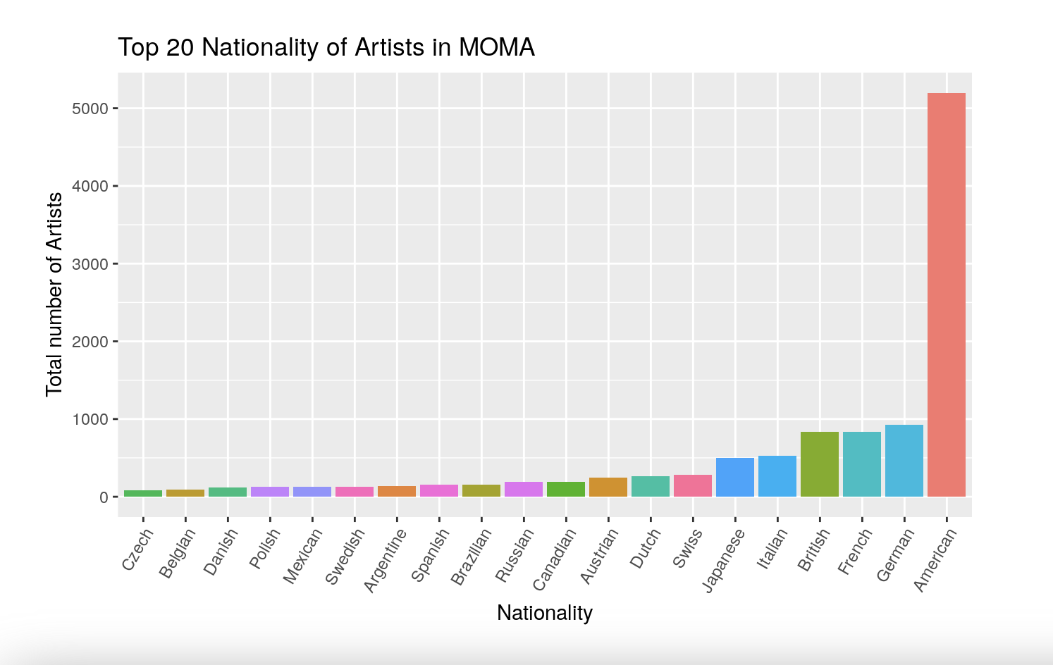
I drew inspiration from these visualizations and used them to expand on my own research questions. The kaggle user included a bar graph showing the top 20 nationalities of artists in MoMA’s collections. While I think this is a clean graph and is easy to read, I wanted to include more information in my version, not only looking at the total numbers but seeing how trends have changed over time.
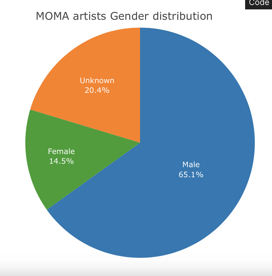
In their data analysis, they noted that the gender distribution of the artists was 65% male and under 20% female, with the null category accounting for unknown artists, groups, or institutions. To relay this information, they used a simple pie chart. Again, while I think this is a very straightforward way of presenting the findings, I did not think that it provided enough context to the questions I was attempting to answer, though it did reaffirm my suspicion that MoMA was not holding true to its mission statement of diversity.
Though I was happy with the way this story came together, I do think there are limitations to the format and the dataset. In terms of formatting, I would have liked to incorporate more narrative information into the time-based graphs. I think that by including events along the graphs like a timeline, as I attempted to do with the text boxes, users would have an easier time contextualizing the data around real-world events and being able to analyze the reasons for certain trends in accessions.
Reflections
The datasets did not have all of the demographic I would require to provide a real testimony to the diversity of the collections. From these graphs, viewers will find that MoMA’s collections are indeed indicative of a predisposition towards male American and Western European artists. What the data does not explicitly tell us is the race, ethnicity, or culture of these artists. A huge share of the artists come from the United States, but we are unable to analyze the representation of minority groups within our country.
Another problem with the datasets is that not only does it treat genders other than female or male as “null,” grouping them within the unknown category, but some artists are blatantly misgendered. For example, Sadie Benning, a video artist, has a biography on the MoMA website with the pronouns they/them, but in the Getty record is referred to as female with she/her pronouns. MoMA’s efforts at diversity are slim in terms of representation and, in this case, only causing further harm and erasure.
This project was eye-opening to me and my usability study participants. For an institution that claims to be founded on progressive ideals and values of diversity and inclusion, its accessioning habits do not support this mission. MoMA, just like every other museum, has much work to do to decolonize and diversify its collections. My hope is that through this data visualization, those in and out of the museum field can be awakened to the long-established exclusion of artists outside the typically white, western male demographic. Audits like this are one step to breaking the traditions of privilege in the art and cultural world.
Link to “Representation in MoMA’s Collections”
Sources
https://www.moma.org/about/who-we-are/moma
https://www.kaggle.com/momanyc/museum-collection
https://www.kaggle.com/fangya/moma-artwork-analysis