INTRODUCTION
In continuation of my Lab 3, where I visualized two networks of co-exhibiting artists by gender from MoMA’s exhibition history data available on GitHub in Gephi, I was curious to explore the data in another “dimension” via an interactive network graph. Enabling the user to encounter the data in a way that is meaningful to them was a main driver for this interactivity functionality development. More importantly, in understanding the types of exhibitions that artists co-exhibit through a gendered lens, the hope is to raise awareness of the disparity between the binary and highlight how gender diversity can be explored /understood through data. The nodes are the exhibits and the edges that connect them are a set of co-exhibiting artists.
PROCESS
My approach was loosely scientific in that I wanted to replicate the conditions of the initial Lab, so care was given to honor those process steps. The only difference was the dataset expanded in timeframe. Luckily I have been working with Jonathan Lill, Head of Metadata and Systems at MoMA Archives, Library, and Research Collections, who played a great role in curating and enriching the exhibition dataset. With this connection, I was able to gain direct access to the dataset in its most current iteration, which extends to exhibitions up until 2018 (as opposed to the GitHub dataset which only goes up until 1989).
Data Clean | Enrich | Reconciliation
Since the dataset I had access to at MoMA had some blanks in the gender fields, added effort was implemented to extract the gender recorded from the various authorities and resources through Linked Data: Wikidata, Virtual International Authority File (VIAF) , and Getty’s Union List of Artist Names (ULAN). These authorities provide standardized and structured metadata about people and objects. This enables some uniformity between disparate datasets from various sources. This effort took many hours to complete.
In looking at the dataset, the rows of exhibit records that had undefined artist gender listed (caveat- this data has historically only been available in the binary) were compiled into a separate dataset to be uploaded into OpenRefine to be reconciled against the above mentioned authorities.
Method 1:
I used existing Wikidata QIDs (unique identifiers) that were present in the dataset to reconcile to Wikidata in OpenRefine to pull in the value populated for the Wikidata property P21 (sex or gender).

For any row in my dataset that had a QID, the Wikidata value for the (sex or gender) property was pulled in to populate the blank “gender” field in the dataset through the “add columns from reconciled values” function in OpenRefine.
Method 2:
If the QIDs were not populated in the dataset, but there was a value for the ULAN identifier, I performed the following step: I reconciled against Wikidata through the “DisplayName”. To yield a higher confidence rate of reconciliation, I selected the “ULANID” field in the dataset to use as a mapping to the Wikidata identifier “Union List of Artist Names ID” property (P245). Once reconciled to return a QID value, I followed the process in Method 1 to retrieve the gender value.

Method 3:
If couldn’t identify a QID with using the ULAN ID, I resorted to manually looking up the ULAN ID through Getty’s online resource as the total amount was n=18.
Method 4:
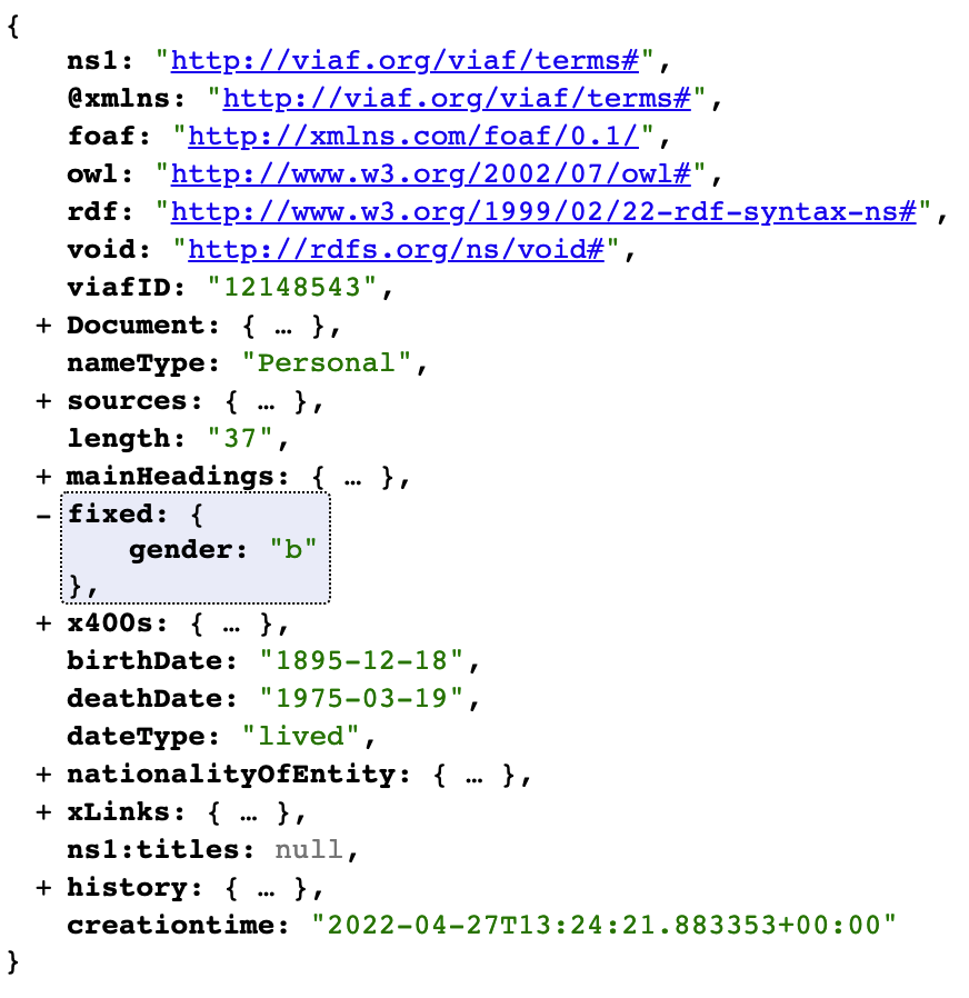
I heavily referenced this Pratt alumna, Karen Li-Lun Hwang’s, process to use VIAF’s reconciliation service within OpenRefine (using VIAF ID to return VIAF URI (in JSON) to then parse the JSON to obtain the gender indicator). The below example of the JSON returned from the VIAF URI highlights where the gender value is indicated ( “fixed”: {“gender”: “b”}, ) where b = male and a= female.
I then used GREL (General Refine Expression Language) to parse the JSON to return just the gender value. Since I was pulling in the complete VIAF ID URI for each artist as JSON into the corresponding artist’s row , this took a VERY long time. Ultimately, given all the iterations I performed to get more gender values populated in the dataset, when it was all said and done, I was able to obtain about 600 values for the whole dataset. In retrospect, this may have too much time than was really worth the yield. I justified the process, however, with the knowledge that I enriched the corpus to its greatest potential given the authorities available.
Next came processing each dataset (male and female artists separated), through Python to create the nodes (exhibitions) list sources and target data pathways (edges), which resulted in a nodes and edges list.

The Python script remained the same from Lab 3 with changes to “row” location and file naming conventions.
There was an option in the the Python script to include additional attributes of the exhibition data. At this point I took a maximalist approach and carried over many data points like start and end date, the MoMA exhibition URL Wikidata QID (in the hopes of someday connecting to Wikidata’s knowledge base), and even artist information like the MoMA pull in different attributes. This would come to haunt me later, as I discovered in the UX testing.
FROM STATIC TO INTERACTIVE
At this point, both sets of nodes and edges lists were run loaded into the Gephi (a set for each gender) where the software compiled the data to form a network graph. This enabled statistical analysis and visual algorithmic parameters to be applied to yield the network graph visualization to show the node and edge spatial organization, assign color to the modularity (node communities), and size of node through degree.
Once the graph was in a visually sound state, the sigma.js plugin was used to export the graph file as a packet of various code languages that enabled display and interactivity on a webpage. Those files were then run through the self hosting web application Glitch, which allows users to create websites and other apps through code. This provided at website platform where the code packet ( JSON, HTML, CSS, JS) could be run to host the interactive visualization.
PRE UX RESULTS


UX
I asked Jonathan (JL) and a member of Art Libraries Society of North America (ARLIS / NA) to both respond to the following UX review: “Please provide your feedback, notes about your experience looking and use of the two network graphs (respectively male constituents and female constituents) that I created from the MoMA Exhibition data 1929 to 2018). If you could try the search, zooming in and out, clicking on the nodes, click on the hyperlinks where they show up, look at the info presented (did you want to see more? if so , what data point are you looking for?)”
Feedback – JL:
1. Add more definitions and clarity around the terminology of graph aspects
2. JL questioned how could 2 nodes exist if one of those nodes had only 3 artists that weren’t exhibited in other exhibitions (I then started to suspected a data issue….this is where I was haunted)
3. Need more understanding with how the connections are formed between the nodes
4. Would love to see a way to overlay to the graphs to allow for easier comparison, the static labels were a bit distracting
5. Never saw this dataset visualized in this manner and was very intrigued
6. Requested Data removed from the dataset (It was identified, due to Jonathan’s familiarity with the corpus, that the following should be excluded in order to meet the goal of the project- exhibits connected by arts-read people- exhibiting):
-No constituents listed or connected to the exhibition or missing constituent ID (MoMATMSID). (This was an unfortunate limitation of the dataset because there were artist name listed, but were not yet assigned a unique identifier from the source of TMS, the collections content management system. In the future continuation of the project, it would be beneficial to invest more time and completing this field). Including this data in the dataset results in matches of “co-exhibition” when there is a value of null (thus proliferating and making incorrect pairing patterns).
-Non-artist roles (this was then supplied post UX discussion and will need to match the constituent IDs to the role and remove all iterations of exhibition with a value other than “artist”)
-Remove the “artists” that are recorded as ConstituentType “Institution” (this was then supplied post UX discussion and will need to match the constituent IDs to the ConstituentType and remove all iterations of exhibition with a value other than “Individual”)


These items reflect companies that had provided objects to the exhibition and thus considered “artists”
Additional data cleanup was need to then rectify the following scenario:
IF THERE WAS A GENDER LISTED + INSTITUTION – manually validate if it was a person of group of individuals to keep in dataset. If all were identified as either one of the genders- the gender label remained, if mixed genders in the collective or group, the gender label was removed (but they were at least validated as people and not an institution). An example of this would be “Guerrilla Girls“, a collective of female artists. In the dataset, there were labeled as “Institution” because they were a group of people.
Feedback – ARLIS/NA Member:
1. Add /expand to the interface language: “The color indicates a community of exhibitions where there are repeated shared co-exhibition patterns”Perhaps with an example?
2. Having trouble making the connection between the visual groupings, that (above in quotes) descriptive sentence, and what this means in reality.
3. Thinks it is really cool and interesting!
Post UX = Re-do the data
Receiving this feedback was marginally defeating, but also encouraging as it would allow for a more accurate rendering of this dataset visually. I learned so much more about the subject matter throughout this process as well, an invaluable bonus. Time to remove the values, reprocess through the Python code to create the edges and nodes flies, and process through Gephi to rerun statistics and spatial organization algorithms…
RATIONALE
The following was considered as the network graphs were being rendered in Gephi:
Explanation of activity between the nodes:
After the feedback received from Jonathan with regards to the need to better understand how the graph was depicting the activity between the nodes, I created this example below to describe how the Python script was creating the edge table ( i.e. the instructions on node connection and amount of connections):
For Artist A, they exhibited artwork at both exhibition #6 and exhibition #7. No other artists followed that pattern. The weight of “1” reflects that singularity of occurrence. However, for exhibition #6 and exhibition #18, both Artist A and B had work exhibited. The weight reflects that shared occurrence by the number “2”.
| Source Exhibit# | Target Exhibit# | Artist Exhibited | Weight |
| 6 | 7 | Artist A | 1 |
| 6 | 17 | Artist B | 1 |
| 6 | 18 | Artist A and B | 2 |
| 6 | 20 | Artist A and B | 2 |
| 6 | 53 | Artist A and B | 2 |
| 6 | 85 | Artist A and B | 2 |
In looking at a heavily weighted pairing example in the male artist network graph (source exhibit# 290 and target exhibit# 567 and the weight = 120), this starts to make sense as the exhibit# 290 = The Museum Collection of Painting and Sculpture and the exhibit# 567 = XXVth Anniversary Exhibition: Paintings from the Museum Collection. These 2 exhibitions were large scale exhibitions that spanned a breadth of the collection, so the likelihood of artists having work in both shows is very high (also taking into account the pull of artwork is from the same “collection”).
Design choices:
The labels were obstructing the interactivity, as was noted from the UX testers. In order to mitigate this, I adjusted the config.json code through Glitch to increase the labelThreshold. This would allow the already existing hoverBehavior to work (displaying the exhibition title upon mousing over a node) without having to also contend with the static node labels populating the graph automatically.
Color assignment of the communities:
The color key was devised to align the communities (modularity) between the male and female network graphs. In looking at the exhibition titles for indication of similarities, patterns arose with the mediums listed in the titles (e.g. “photographs”, “film”, “paintings and sculpture”). The modularity color assignment was manually altered to align on “Medium Grouping” assessment.

It should be noted that the female artist network graph served as the driver for color assignments, mainly due to their greater variation in types of mediums listed in their modularity communities. This was a very intersting finding, which indicated the monolith of the male artists communities where many of those artists were cross-exhibited with each other. One thought about that could be that female artists were relegated to more medium specific shows instead of intermixing with the larger collection-type shows. There is much more to delve into there.
RESULTS


FINDINGS
Since the objective was a continuation of the LAB3 network study and a major data-haul post UX with the dataset creator, keeping the consistency with the aspects of the network work graph in comparison was crucial. Since modularity and degree were the main statistics used to understand differences between the two graphs, I kept that ethos a part of my assessment and analysis by comparing and contrasting the
Modularity = color and Degree = size of node.
SOME STATISTICS:
Female: 1224 nodes | 29,308 edges
Male: 2,177 nodes | 233,092 edges
As mentioned before, it was really surprising to note that the male artist communities were not as varied from each other as the female artist communities were. The “medium grouping” for orange = design was almost completely buried within the tightly connected web of lime green (era/epochs), dark brown (prints- paintings from the collection), and baby blue (photography) communities in the male artist graph.
Orbit of isolates:
Both network graphs demonstrated a community of isolates (a node without any neighbors or connections – or degree of zero). Although hard to see when looking at the graphs while in default mode, once selected from the group selector on the web interface, the pattern becomes apparent. In the images below, I took screenshots and enhanced them in an image editor to try to make the pattern more visible.


Other interesting takeaways/thoughts:
1. With all the data excluded in the re-work, how many institutions or collective of people create artwork that are just not included in this analysis approach? It’s hard to reflect accurate contributions of artists when gender is only considered on the binary, especially when many people use the authorities like VIAF or the Getty vocabularies to return the gender values of a person. What is missing and how can we better elevate their respective contributions?
2. Many companies in the “artists” list! It would be interesting to pull just that data to see what companies are hosted in a museum setting. Perhaps it is more temporal in nature (new companies coming out into the market and highlighting design feats via design theme exhibitions ). Intersting to pursue in the future.
3. Many bands listed as artists! If members were all one gender, they were accounted for in the dataset, but what if mixed (same as the collective issue above)?
RECOMMENDATIONS
Invest more time with the interface, that would be my major takeaway from both the UX feedback and my own self-reflection. Given the steep learning curve with sigma.js, I look forward to learning more about the tool to enhance these network graphs to meet the UX feedback, namely with the labeling of the color key, expanding context and defining the terms to allow for better user understanding. The suggestion to overlay the two graphs if very tantalizing, a definite stretch goal for future iterations. An additional thought that surfaced for next steps would be to enrich the panel with images that complement the exhibition (although, Jonathan mentioned that not all exhibitions had corresponding archival images).
The main problem faced with the approach to compare the modularity groups between the male and female artist graphs was the process was extremely assumptive. In looking at the titles as main indicator of the “type “ of medium , essentially you are essentially judging a book by its cover (or some one’s decision in naming the exhibition). If you are not 100% familiar with the corpus, you are relying on assumptions. I asked Jonathan if that data point had been collected during the dataset creation, but advised it wasn’t unfortunately. This could be an interesting data point to add to the dataset in the future, but would take a great deal of effort.
I am extremely thankful for the rare opportunity to have the dataset creator UX the the visualization. His feedback allowed for a more accurate translation from data to visualization with the intended goals in mind. Additionally allowed for data reprocessing that without which, would have lead to inaccurate outputs (de-railing and misleading the narrative). I learned so much more in hearing how he conceptualized the data while viewing the data visualization than analyzing the data visualization output (once the data was corrected). Vital lessons were absorbed for the next iteration of this project.
EPILOGUE
I envision this project to expand to incorporate other datasets, namely from Wikidata. With the ongoing work of the Pratt fellows to render the MoMA online exhibition data into linked open data, there is great potential to understand where this dataset sits within the context of other GLAM Open Data initiatives. MoMA has paved a way to model the data in consideration of the exhibition as event, but with the artists connected instead of relying on the artwork as object. You can take a look at this SPARQL query (Wikidata’s query service) to understand the current state of MoMA exhibition data within the knowledge base.