Introduction & Visualization Critique
There was an interesting path for me during this week’s lab and visualization. I started out the process thinking I was going to make a vis from a survey about fake news and how Americans felt about it that was done by the Pew Research Center. This survey can be found here: http://www.journalism.org/dataset/2016-fake-news/. With this topic in mind, I wanted to create a vis that would be map based or show relationships to news in some capacity. During my research, I found two visualizations that were very different in content but had an interesting relationship to its data. The first depicted the spread of real and fake news on social media (Fig. 1). While this visualization is hard to understand without the context of the article it was published with, I really liked how the creator was able to show how far fake news spread compared to news based on truth. Because social media is so connected between news sites and users, I believe this visualization does a great job at showing that web.
The second was a map of flights in the U.S. on Thanksgiving (Fig. 2). It shows flight patterns over time through an animated visualization. I feel that this visualization is successful because it easily shows trends of peak travel time and routes. While it isn’t the most precise, the viewer can quickly identify major trends, which is the goal of the vis. I was also hoping to find some pattern through the travel of fake news that would be mappable.
While these two visualizations are very different in what info they are depicting and how, I liked the expression of both. I was hoping to create something in between these two. However, after coming to class with my dataset, I realized that the data I had would not work with Tableau. Because of this, I decided to not use the dataset or the visualizations as examples.
I spent some time looking for more appropriate data and was able to find a dataset about legal reason for abortions in different countries. I wanted to see what was the most popular legal reason for abortion and if there were any geographical patterns on abortion legality.

Fig. 1 (Source: http://science.sciencemag.org/content/359/6380)

Fig. 2 (Source: https://bit.ly/1XsL1JO)
Materials and Datasets
The materials I used for this project were the UN database to find appropriate dara, OpenRefine (http://openrefine.org) to clean my data, and Tableau Public (https://public.tableau.com/en-us/s/) to create my visualization. The dataset from the UN I used can be found here: http://data.un.org/Data.aspx?q=abortion&d=GenderStat&f=inID%3a11.
Methods
With this dataset, there were seven legal reasons for abortion listed: Economic social reasons, foetal impairment, on request, rape or incest, to preserve mental health, to preserve physical health, and/or to save woman’s life. Because my data was subdivided by country, I immediately assumed the best visualization for it would be a map.
I started building an animated map that showed one legal reason at a time with the countries that accepted that legal reason filled in. As an example, Fig. 3 shows a screenshot of all the countries that legally allow abortions because of rape or incest. Countries that allow it are marked in orange and countries that are marked in grey do not. A user could also hover over a country to get the country name and a yes/no option. I played around with the speed of the animation and the color of countries.
However, after watching the animation and considering the speed, I concluded that the map wasn’t as effective afterall. A user would have to rely on their own memory to compare reasons between one country as the different reasons progressed. Also, a user may struggle with looking at all the countries in one version with the time allotted. While I liked the animation and interactivity of the map, I decided it wasn’t appropriate after all if my goal was for people to be able to discern by country and/or reason for abortion legality.
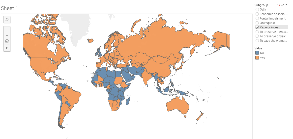
Fig. 3
Results and Interpretation
Because of this decision to not do a map, my resulting visualization was a table (Fig. 4). The table allows users to extract precise data, which is ideal for the type of content being displayed and for most of the reasons that a user would be consulting this data. Because of this, I decided to use a table with countries as rows and reasons as columns to depict legality reasons accepted by country. If a country allowed a certain legal reason, an “X” was placed in that column. It was considered if an “X” would be misinterpreted as a no; however, I changed the color to green with the hopes that the positive connotations of the color would help the users to interpret the “X” as a yes instead.
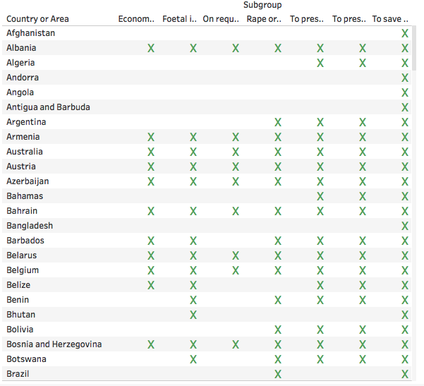
Fig. 4
Reflections
Now that I know what type of data Tableau can handle, I feel more prepared in finding more appropriate data for future labs. During this process, I also realized it is important to keep in mind function when creating a visualization. For this particular visualization, I had to come to terms with the fact that while it would be easy and more visually interesting to create an animated map, it isn’t always appropriate to do so. The table isn’t a stunning example of info vis, but it is functional and does the job it needs to do: convey precise information succinctly.
My full visualization can be found here: https://public.tableau.com/profile/taylor.norton#!/vizhome/Abortion_15513927812690/Sheet2