Introduction
The airplane has been the most popular way of transportation for international and domestic travel since the 1950s. Even with technological improvements, people are concerned about airplane travel safety, especially with the most recent airplane incidents such as Malaysia Airline Fight 370 and Boeing’s 737 MAX crisis. But looking at the statistics, the chance of dying as a plane passenger is low: 1 in 188,364, compared with 1 in 1,117 for drowning and 1 in 103 for a motor vehicle crash, based on 2017 United States census data. People are unlikely to die from airplane accidents, but even one is too many, especially it’s totally out of the passenger’s control.
This information visualization project will explore all fatal commercial passenger plane crashes since 1993. By providing visual presentations of the accidents, the viewer can better understand the cause, location, trends, plane types, and hopefully the improvements throughout the years.
Inspiration
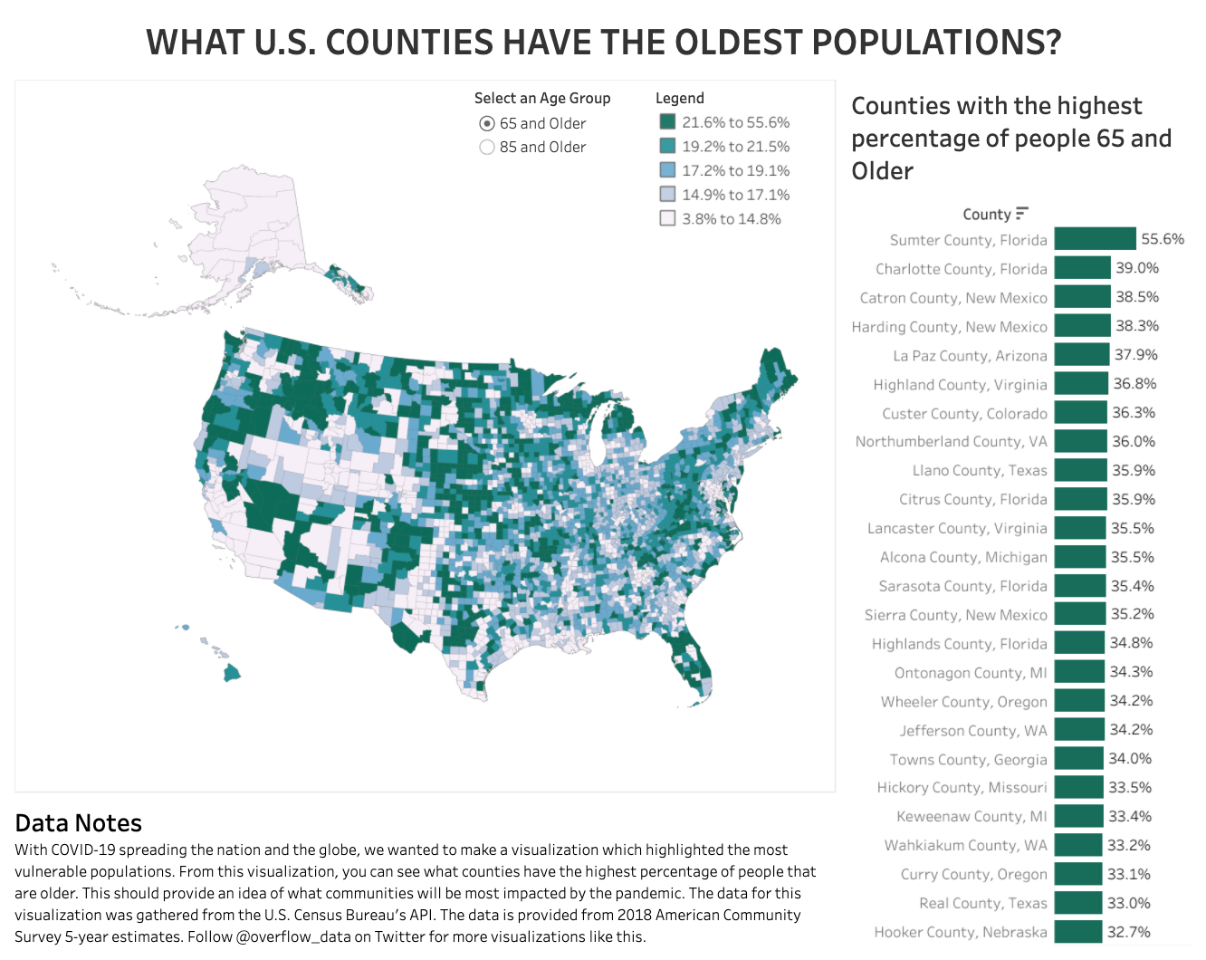
It is my first time using Tableau, so I started my learning journey by browsing the gallery and exploring the possibility of visualizing my data. I was inspired by the “What U.S. Counties Have the Oldest Populations?” visualization. This map shows excellent detail of the data and geographic relationship, which is what I wanted.
I also got great feedback from our professor Chris Sula. He suggested connecting the data and making them interactive, which became the essential aspect of my dashboard.
Methods
Step 1 Collecting Data: Information is Beautiful
I downloaded data from the Information is Beautiful website. There are lots of great data on a variety of topics. I chose the one that interested me the most.
Step 2 Data Preparation: Open Refine
The data provided was in a usable format. Still, some sections need some cleaning due to repeated information in multiple writing formats, which is not ideal for creating a chart or diagram. In this step, I worked with Open Refine to filtered through the data and revised the location, causes, aircraft number, and others needed to make sure the file is as clean as possible for the next step. Finally, I exported it into a Google Sheet and saved it my Google Drive.

Step 3 Visualization Production: Tableau
I linked my updated Google Sheet directly to Tableau Public to make the datasheets and dashboards. My main challenge was setting up each sheet and how to make the visualization looks understandable. After a series of trial and error, I started to have a clear idea of what I want my dashboard to communicate.
- What is the cause of the airplane crash?
- Where did the accident occur?
- The number of the accident by year, did it increase or decrease?
- Which phase that the crashes are more likely to occur in?
Results & Discussion
Dashboard 1 The Map
I used multiple charts in this dashboard to show a variety of information related to the accidents. I used the Map as the filter, so if you click on the US(see below image), you will find out the number of accidents by year, cause, exact location, and aircraft information. This way, users able to narrow down the data. For this dashboard, I used multiple graphs such as a map, pie chart, bar graph, and chart. I chose the diagram that can best portray the information and, at the same time, look appropriate in the dashboard.

Dashboard 2 The Phases
For this dashboard, I focus on the aircraft and accident itself instead of worldwide data. Users can use the phrase as a filter to explore which phases most crashes occurred, what caused the accident, which aircraft has the highest accident number, and the location. There are lots of colors in this dashboard, I tried to avoid using the same color for other graphs.

Reflection
Next step, I want to explore more possibilities of the graph and the visual layout. In the Tableau gallery, there are lots of visualizations that are very creative.
Overall, it was a great experience working in Tableau, It makes data visualization easy and understandable. I have started using this software in my other class because it is easy to use and makes data much easier to read.