
INTRODUCTION
For my final project I chose to create visualizations from quantitative data available to highlight some effects of the gentrification of NYC neighborhoods using publicly available quantitative data. My goals were to develop interactive visualizations which would assist users in gaining deeper understanding of the topic and challenge held biases by encouraging and enabling exploration. The process documented in this report includes topical, technical and user research (pre/post surveys), evaluation and modification of datasets, visualization development, and recommendations for revisions and/or enhancements.
NYC & GENTRIFICATION
New York City has always been gentrifying. The benefits of gentrification include lower crime and new services but they come with higher housing costs and the displacement of original, usually poorer, residents. Recently, these changes have occurred more rapidly than in past decades causing government, special interests groups, and residents to seek strategies for mitigating the ill effects. NYC Mayor DeBlasio has a progressive plan to slow the rate and preserve affordable/low-income housing in those communities through a mix of re-zoning & mandatory inclusionary housing laws. The visualizations look at where gentrification has happened without intervention as in, Williamsburg and Bedford-Stuyvesant, Brooklyn and the associated issues of housing costs and demographic changes. They also invite comparisons to non-gentrified or newly rezoned neighborhoods.
USING DATA VISUALIZATION
The gentrification discussion lends itself to visualization as it deals primarily with changes over time involving demographics and place. Afforded by the availability of federal and municipal open data, data visualization has become a commonly used communication tool to express the interrelated facets of complex topics such as gentrification and other social issues. Visualizations can be found in blogs like Data-Smart City Solutions as well as embedded in news and research articles. The Atlas of Gentrification is a print collection of data visualizations, graphs and maps addressing gentrification and related issues.
METHODS
User Research
To determine what gentrification “story” to tell and how to visualize it, I conducted an online survey to gather views on the topic. The goal being to understand New Yorkers’ attitudes and their self-assessed knowledge informing those attitudes then conduct post-viz research on effectiveness of the visualization. Though limited in scope an online survey was a means to quick responses without getting bogged down in weighty, philosophical discussions.
Participants were recruited among friends and acquaintances who are current or former residents of NYC. The 8 question survey covered demographics, attitudes towards gentrification, and use of technology.
Findings:
- The majority of (+70%) respondents consider themselves to be knowledgeable or very knowledgeable about causes and effects of gentrification.
- Higher rent was deemed the most significant characteristic of gentrification when considered among lower crime, racial diversity and improved services.
- Despite this result, over 40% maintain a generally positive attitude towards gentrification.
- Significantly, over 85% of respondents read long-form articles on mobile devices.
Results from the survey led me to focus visualizations which would explore housing costs and affordability as well as to consider options for mobile.
Visualization Plan
Tableau Public, Color Oracle and data from CoreData.nyc were the tools used to develop the visualizations. Tableau’s features, including mapping, facilitate interactive graphing of time-series and correlated elements. Tableau also has a storyboard functionality which can be used to present multiple dashboards in a captioned format. The story and visualizations were planned as follows:
- Highlight NYC gentrified/ying neighborhoods on a map
- Focus on Brooklyn to show rates of changes in indicators/factors
- Reflect on lack of affordability
Dataset
My research included news articles, blogs, and podcasts for information and context and visualizations for inspiration. Of the many available datasets from government and nonprofit sources I chose multiple datasets from CoreData.nyc a datahub for NYC housing and neighborhoods presented by the NYU Furman Center. The hub standardizes over 20 datasets from a variety of city, state, and federal sources including the US Census Bureau, US Dept. of Housing and Urban Development, NYC Department of City Planning. Already comprised of several indicators spanning 15 years, the dataset limited the need for standardizing various data sources myself.
The structure and content of the datasets did need to be normalized for import to Tableau. The data included income, rent, crime rate, racial mix, population, home sales, home prices, sales volume, housing units built at the borough and neighborhood level. The data tables were downloaded as csv files then edited in Excel to normalize year ranges to 2000, 2005-2015. The data tables also differed between Community Districts and Sub-borough Areas for names of neighborhoods though they varied minimally. I created a dataset for each then used OpenRefine to transpose and reorganize the columns. I downloaded a shapefile of the community districts to represent the data spatially in Tableau.
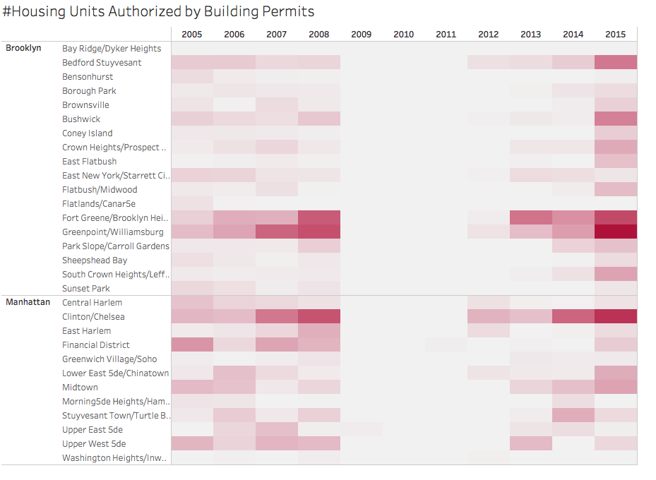
Visualization Development
I started by creating maps highlighting areas of rapid changes in rents and incomes to reflect typical gentrification indicators. Tableau easily mapped values but mapping calculated percentages became a challenge initially addressed by calculating and adding the percentages to the dataset but ultimately resolved by creating a new dataset unioned with the map geometry. Tableau will not map a calculated value from a secondary source.
Key to the overall story was to highlight the “then and now” of gentrified neighborhoods. The ten year range, 2005 – 2015, presented strong options for time-series graphs and exploring covariation among the indicators. I initially considered scatter plots to show correlations but determined that correlation among these indicators is already known. Perhaps not obvious is the rate of the changes within neighborhoods and how the neighborhoods compare in relation to these indicators.
A strong neighborhood snapshot could be a diverging bar chart where each side is a different year but the different measures would not work with the single axis. Alternatively, a standard bar chart of the % variance between 2005 and 2015 clearly presented the data. The challenge was clearly delineating the neighborhoods. Rotating and stacking the graphs made the neighborhoods easier to compare. Additionally, reducing the ink-to-data ratio by removing superfluous header information and column lines improved the look.
A bar chart was also the strongest representation of the gap between rents considered affordable and actual market rents. In this visualization, the contrast color highlights the gap.
Considerations for time-series graphs involved which values most clearly represent the changes over time. Graphing the values produced smoother graphs but did not reflect the actual rates of change. The line graphs of year over year rates of change were not as easy to understand due to the volatility in interim years. I preferred graphing the values to keep contextual information and making the graphs understandable to my users.
Dashboards
Color, filtering, and interactivity were factors in building the dashboards and storyboard. I used a color blindness simulator to evaluate palettes while creating the visualizations. Color Oracle installs a widget in the main status bar which allowed for quick tests for common types of color blindness.
The filtering and interactivity options were limited to the boroughs, neighborhoods, and year. Initially, I wanted a more dynamic representation of the indicators, particularly with maps, but because the data is so correlated there were no significant insights.
FINDINGS & RECOMMENDATIONS
The storyboard concept as executed offered limited opportunity for exploration of the data.
Although users were able to grasp the main ideas, “very telling…talk about pushing people out”, this format works best when telling one strong story and required omitting good visualizations (like this one) that were related but didn’t flow. Also, multiple visualizations and interactivity interrupted the flow of the story.
One recommendation for use of the storyboard would be to go deeper by further drilling down the narrative. Instead of filtering on neighborhoods across the city, limit the neighborhood options to a comparison and create and filter the visualizations on the different measures. Keep the narrative concise by moving interactivity to one page at the end as in “explore the data”. Alternatively, using one large dashboard could also clarify the focus of the story. The narrative becomes more interesting by adding images and text rather than visualizations only.
Although the dataset was strong representation of topic data, visualizations limited by the its content and structure.
The CoreData.nyc dataset being already standardized from over 20 datasets greatly facilitated further normalization for this project but not all of the original components were represented. Notable was the absence of the number of households for the appropriate indicators. Better analysis would have resulted from understanding the number of households at various income levels in addition to medians.
Additionally, New York City community district/sub-borough area designations are relatively large making the indicators more general than using zip code or census tract data.
A recommendation for dataset planning and organization would be to use census tract or zip code data where available for analysis and mapping. Also, the CoreData.nyc indicators could be used a guideline for the appropriate measures to retrieve at those more detailed levels.