
Introduction
Since the 1950s, people have been migrating en mass from rural areas to urban areas. This rural-urban shift has transformed our environment more drastically, rapidly, and pervasively than ever before. In 1900, roughly 15 per cent of the world’s population resided in cities; in 2000, about 50 per cent now call the city their home. The increase in human quality of life and economic development in cities has come at the expense of our natural world. Cities are now the primary human ecosystem habitat. This has depleted the Earth’s store of natural resources and raw materials.
Urban metabolism is such that cities consume vast amounts of raw materials and natural resources and turn them into either profit or waste. Although urban areas cover only 3.8 per cent of the world’s landmass, urban populations’ demand for food, fibre, raw materials for industry, freshwater, materials for construction, fuel, recreation, and timber has placed great strain on neighbouring areas and ecosystems. In fact, cities expropriate natural resources from areas across great distances directly or indirectly. In most cases, the needs of the city outrank ecological needs and conservation efforts. Not only are raw materials extracted, but the waste generated by cities also put strains on the environment. Solid waste demands landfill areas and liquid waste create dead water. In both cases, the environment can no longer sustain life and cease to be ecosystems.
Climate scientists widely agree that urban expansion is no longer sustainable, and its effects, in large part, are also no longer reversible. But it is also clear that the change that is so desperately needed is not happening. Partly, this is due to urban populations being unable to truly feel the effects they are having on the ecosystem as technology and shield them from environmental changes.
This project aims to visualize the explosion of urban populations. It will contribute to existing information to improve decision making concerning macro-environmental policies, to highlight the need for the reimagining of urban metabolism, and most importantly, to show just how drastic the rural-urban shift has been in the past half a century. It will paint broad brushstrokes on urban expansion globally.
These questions guide the development of this project and the final design of the visualization
- How much have city populations actually grown since 1950?
- Which cities, countries, and continents have seen the most urban population growth in recent decades?
- Does the slowing growth rate of urban populations mean smaller city populations?
Inspiration
In researching urban population expansion, I found many visualizations highlighting the growth of urban populations over the past few decades.
These visualizations by Our World In Data uses show trends comparing urban and rural populations in different countries, sometimes explicitly and sometimes implicitly.
This one comparing the population growth in urban areas with rural areas shows the number of urban dwellers overtaking rural populations in the 2000s.

This one breaks down the global trend into continents, showing continents leading in urban to rural population ratio, and those that are trailing.

This visualization zooms out and analyzes the trend over 500 years in key countries, really highlighting that the exponential growth in cities in recent decades is singular in history.

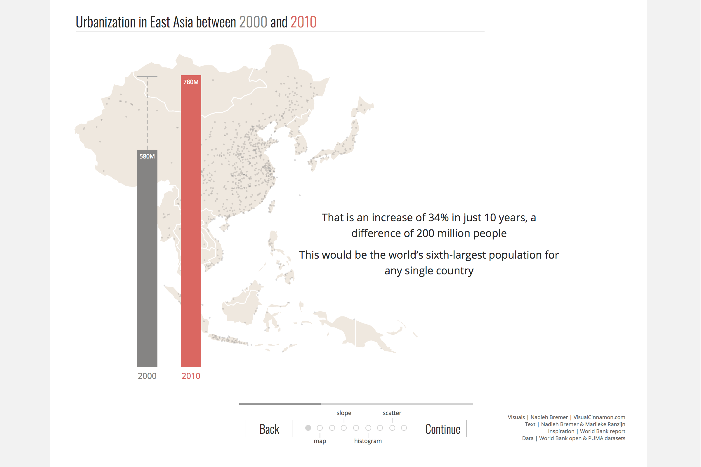
I found this visualization by a designer focusing on urban growth in East Asia. The overall tone of her piece is optimistic, portraying urban population growth as an opportunity to rethink cities.

Her portfolio piece on urbanization has more visualizations that are interesting and effective. It can be accessed at this link: https://www.visualcinnamon.com/portfolio/urbanization.
Most of these visualizations, and others I found, visualize data on the global, continental, or country level. But as the topic is cities and urbanization, I wanted to use more granular data documenting the growth of actual cities.
Methodology
Data Cleaning
I found a database on urbanization as part of NASA’s Millenium Assessment (or “The Millenium Ecosystem Assessment”) on rapid land cover change from 1950-2015. This dataset contains total population numbers as well as the rate of change in the number of different cities around the world. It includes most metropolises that come to mind like London, Paris, New York, Shanghai, and Tokyo and cities that saw a drastic increase in populations in the past 60 decades like Kinshaha, Chongqing, and Lagos. Overall, it contains data spanning 60 years, at five years intervals for 178 cities in 69 countries.
Originally, the data came in three different shapefiles and I chose to use Carto, a SaaS platform that turns data into maps. However, the data was not filterable by year because of the format. In the end, I converted the shapefiles into CSV, in order to be able to clean it. The data was cleaned with OpenRefine, an opensource desktop app for data clean up and transformation. Initially, years were listed as columns with the initial T for total or C for change. I transposed these columns into rows and removed the leading initial so that Tableau would be able to identify the numbers as years. After transposing, I used the fill down cell function in order to ensure that all the rows are consistent and that each population data point has a corresponding city and country. I removed the columns denoting the shape of the files as I believed it was irrelevant when having a global map. I also made some common corrections on spaces and typos in order to standardize the data. After cleaning the data of three sheets, I combined them into a single sheet.

Design
As the data was now in CSV formation, the visualizations were created with Tableau Public, an interactive data visualization tool that also generates maps that are more filterable than Carto.
I created three visualizations as sheets before placing them on the same dashboard. I applied the same city filter to all three visualizations so that users could see the holistic view of how a particular city’s population has changed over the years.
I created a map showing populations in different cities around the world expand from 1950 to 2015. The temporal constraints depended on the data. I used the latitude and longitudinal coordinates from the database which were provided in columns labelled X and Y. The autogenerated longitude and latitude values were not effective in creating a map visualization. I also added city and country labels to give users more contextual information.
I created two line graphs. One showing the actual change in population and the other showing the rate of change. For the line graph showing the rate of change in urban population over time, I added a gradient with a fainter red for lower numbers and a stronger red for higher rates of change.
The second line graph shows urban populations exponentially increasing despite slowing rates of increase. Although the curve is faint, the change is definitely non-linear when you exclude giant metropolises from the analysis. I added a similar gradient to this line as well, with the fainter red denoting lower population numbers and the stronger red for higher population numbers. By setting the starting number for the gradient as 0 and leaving the ending number blank, Tableau re-calibrates the gradient every time a new selection of cities is made.

User testing
I designed and implemented user testing to make the visualizations easier to understand, interpret, and interact with. I recruited 3 participants who were passionate about sustainability and urban systems.
User 1
Age: 29
Country of Residence: U.S.A
Area of Interest: Disparities in global urban development
User 2
Age: 27
Country of Residence: Canada
Area of Interest: Circular economies and rethinking urban metabolism
User 3
Age: 24
Country of Residence: Japan
Area of Interest: Historical development of cities
I gave them identical instructions in order to ensure testing was uniform and conducted the tests via zoom.
Task
Explore the dashboard for 5 minutes and talk me through what you’re seeing.
Post task questions
- What was something interesting that you found out from these visualizations?
- Was there anything confusing?
The takeaways from the user tests are as follows:
Users were on the whole surprised that the populations of bigger cities have changed less than that of less famous cities. I believe this is because although in raw numbers the population increase may have been more, on a percentage level the change was less significant than cities that have doubled or tripled in size.
Users were also surprised to see that city populations have grown exponentially at least until 2015 and wondered if the pattern holds true for 2020. I don’t have the data to answer this question.
Users expressed an interest in having more information about each city than just the population size. Two of them pointed out that the carbon emission per capita is vastly different when you compare city inhabitants in the developed nations to those who reside in cities the UN likes to call “least developed”. Although carbon emission is not the full picture of consumption, I do largely agree with this view but unfortunately do not have the data to answer that question.
Changes to Graphs
Problem: Having a drop-down to select the year for the map visualization was clunky. It does not map well to how users perceive time and made for an inconvenient experience that involved too much clicking.
Change: To use a year slider instead of a dropdown.
Problem: when selecting and deselecting cities, the changes are much more apparent on the map than the line graphs.
Change: I do not have a good solution for this
Changes to the Dashboard
Problem: The lack of a title made the whole visualization difficult to navigate and make sense of.
Change: Adding a title and some contextual information
Problem: Users wanted more ways to filter locations
Change: I decided to add a continent filter
Problem: The initial selection of 13 cities didn’t make sense to users. These were the cities particularly highlighted in the dataset without explanation.
Change: Have all the cities in the dataset initially selected as I had no good reason to place special emphasis on the 13 cities chosen by the creators of the database.
Final Design
Sheet 1: Populations in Cities Expand Over 60 Years
Symbol map showing the population of cities as circles. A filter for year is used to show the progression and transformation of city populations. The default is set at 1950, and the “All” option is disabled as it was counter to the purpose of the visualization.

Sheet 2: The rate of change in urban population over time
The second visualization is a line graph showing the rate of change in five-year intervals. The rate of change is on the Y-axis and years are on the X-axis. The default is set to all cities. And a filter is available for users to choose cities. This graph shows that the rate of increase is declining on the whole since the 1950s. However, if the user selects cities outside of OECD countries, the pattern in the rate of change is not as obvious.

Sheet 3: Urban population exponentially increase despite slowing rate
The third visualization is another line graph showing the increase in population size with the number of total inhabitants on the Y-axis and the years again on the X-axis. This graph shows that despite the apparent slowing rate of change, city populations were still expanding exponentially as of 2015.

Final Dashboard

To interact with the dashboard, go to this link: https://public.tableau.com/views/FinalProject_16074680981020/Dashboard1?:language=en&:display_count=y&publish=yes&:origin=viz_share_link
Analysis & Next Steps
This visualization is completely exploratory and doesn’t really have a story or narrative. It can be a good start to understanding how city populations have expanded over the past six decades. It adds to existing visualizations by having data points for expansions on the city level instead of the country or even global level. I think this allows for more nuanced arguments to be made and more interesting information to be extracted.
From a data perspective, while this visualization has a good global coverage of major and minor cities, it does not dive deeper and as a result, users cannot ask more interesting questions. The next step would be to identify cities of interest and to look for more specific databases concerning the consumption of different resources of neighbouring areas to those cities. Researchers can analyse the amount of consumption, type of resources being consumed, the areas that supply these resources, and the infrastructure that the consumption has necessitated. Researchers can also look at waste. How much is generated? How is it dealt with? What impact does it have on the surrounding ecosystems?
From a design perspective, Tableau’s lack of design customization tools are frustrating. If designers can do more to change the appearances of dashboards, I believe Tableau would be more widely used and its dashboards more widely embedded, perhaps even on B2C applications.