
Introduction
For this lab report, I chose to use data on dog bites that have been recorded by the NYC Open Data portal. I decided to use this dataset because it was interesting and something I was genuinely curious about. Being a dog lover myself, seeing this data set and topic reminded me to think twice before going up to dogs on the street and asking their owners if I could pet them! According to a study on dog aggression and gonadectomy, the procedure of removing reproductive organs, dog bites account for a lot of hospital visits annually, posing a huge risk for children. Not only that, when humans are attacked by animals such as dogs, we tend to euthanize them as a means of protecting ourselves (Farhoody et al., 2018). I believe that we should learn to understand dogs and their behaviors more, it’s important to be reminded that these animals are not toys, they are sentient, autonomous beings with their own needs and motivations that we must seek to understand and respect.
Methodology
I obtained the data set from the NYC Open Data website, available under the “Health” category, formally known as the Department of Health and Mental Hygiene (DOHMH). This data set has over 22k records, beginning in the year 2015 and ending in the year 2021. The data consisted of the victim’s Unique ID, date of the bite, the dogs’ breed, age, gender, and whether they were spayed/neutered. The data also showcased the borough and zip code of where the dog bite occurred.
I exported the data and loaded it first into Google Sheets in order to get a sense and understanding of the information and create my own pivot tables that would help me plan how I might want to manipulate the data via R and view it via ggplot.
I added new columns to break down the provided date (in format “Month Day Year”). I separated the month, day, and year into three separate columns using =LEFT and =RIGHT formulas, just in case I would need to easily group or plot data based only by year. I then created a pivot table in Google Sheets on the breakdown between Female and Male dogs that were spayed/neutered in order to get a sense of the numbers, which would make me feel more comfortable when using R. I then began coding in R realizing that I would need to filter out for data that was unknown or not available – choosing not to do it in Google Sheets since I knew that filtering can be quickly done in R.
I decided to only focus on certain categories such as borough, gender and whether the dogs were spayed/neutered. There was inconsistent data, such as breed and age, that I therefore did not include.
After churning out some charts, I got feedback from my lab partner, Wenge, who mentioned that some colors were difficult to compare side by side. Wenge also mentioned that the chart labels can be more explicit (e.g. showcasing “Dog Gender” as opposed to “Gender”, which could be mistaken for the gender of those bitten by the dog and not the dog itself). I amended the charts to have clearer labels and adjusted the colors in the chart, utilzing the resource: https://www.learnui.design/tools/data-color-picker.html.
Results
I found interesting results from the data, which was not conclusive by any means. What was most interesting was the drop in the number of reported incidents of dog bites in the years 2020 and 2021 shown in the trend line below (Figure 1). I also included a chart broken down by the boroughs, where the decrease of dog bites (for most boroughs, but not all) can be seen in Figure 2.

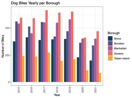
If I were to continue with this project, I would research how many people moved out of the city during those times (given the COVID-19 pandemic) to potentially see if there would be a correlation there. I would also research whether people walked their dogs less frequently during the pandemic – though I personally feel like that likely might not be the case (given my experience of owning a dog during the pandemic).
What was also interesting to see was how much more likely people were to be bitten by male dogs (Figure 3 and Figure 4). An interesting angle to further research is dog behavior based on each gender’s physiology. Based on my experience, male dogs tend to be more dominant than female dogs, which aligns with this particular data, shown below.


What would be important to further explore is whether there are more male dog owners as opposed to female dog owners, or if the percentage is pretty even. This information would be best to have before drawing a definitive conclusion that male dogs tend to be more aggressive than female dogs.
Another interesting finding is that dogs that were not spayed or neutered tended to bite more often (Figure 5). In this example I included all incidents, and filtered out the data where the gender was “Unknown”, since there were a lot of incidents where the gender was unknown.
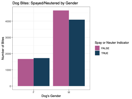
Though according to the same study by Frontiers in Veterinary Science, there is no direct evidence that gonadectomy alters aggressive behavior in dogs, since there are various other indicators that can lead to dogs behaving aggressively. This is an interesting research study I found that is not aligned with this data, so further research and exploration on this would be ideal.
Reflection
I found this lab quite interesting because I felt like I was focusing on writing the correct code to filter and group data according to what I wanted to do. This was pretty cool since in the prior lab, where I used Tableau, I was viewing an entire database and filtering directly in the software’s UI. I can see that one of the benefits of using R is that it allows for more control of what you want to do and how, and allows you to manipulate the data and play around with results on the fly. One of the downsides is that you need to learn a new programming language and run scripts in sequential order, and manually, if any changes are made to one snippet which is referenced in another snippet. I also found that it was cumbersome to see an audit of all the visualizations I had run. I tried to be as organized as possible to avoid overwhelm, by saving my charts as I deemed appropriate and by keeping the code format as organized as possible and including personal notes throughout my script. I enjoyed using this tool and would be interested in further developing skills in R to really reach its full potential.
References
DOHMH Dog Bite Data | NYC Open Data. (2018, July 11). NYC Open Data -. Retrieved March 19, 2023, from https://data.cityofnewyork.us/Health/DOHMH-Dog-Bite-Data/rsgh-akpg
Farhoody, P., Mallawaarachchi, I., Tarwater, P. M., Serpell, J. A., Duffy, D. L., & Zink, C. (2018, February 26). Aggression toward Familiar People, Strangers, and Conspecifics in Gonadectomized and Intact Dogs. Frontiers. Retrieved March 19, 2023, from https://www.frontiersin.org/articles/10.3389/fvets.2018.00018/full
Holtz, Y. (n.d.). The R Graph Gallery – Help and inspiration for R charts. Retrieved March 18, 2023, from https://r-graph-gallery.com/index.html