Introduction
Similar to many animals, dolphins like to travel in packs, or pods. These pods can range from 2 to 30 dolphins or be as large as 1,000 dolphins, also known as a super pod. The reason for these pods comes down to basic survival strategy. Dolphins are more intimidating to predators when in a group. However, studies have shown that dolphins are also highly social and sophisticated animals. They exhibit similar behaviors to humans like, empathy, cooperation and altruism. When in their pods they are playful and mindful of one another. If a member is in distress the pod comes to its aid. With this in mind I was curious to see what a network map of dolphins would look like.
Materials
For this lab I found data from the Center for Computational Analysis of Social and Organizational Systems, CASOS, on 62 dolphins that swim together off Doubtful Sound, New Zealand. The data set was organized by “Source”, “Target” and “Type” to be properly read by the software Gephi. Gephi is an open source visualization software. Gephic dynamically links data together by analyzing relationships and drawing connections and weights to those relationships.
Method

This visualization shows the relationship between pollinating animals and the plants they pollinate. Node size of the plant indicates how many plants are pollinated by the node animal. The color indicates how many animals pollinate the node. The bluer the node the more animals. The chart shows that honeybees pollinate the most plants and in some cases honeybees are the only pollinator, creating a surprise ego chart.
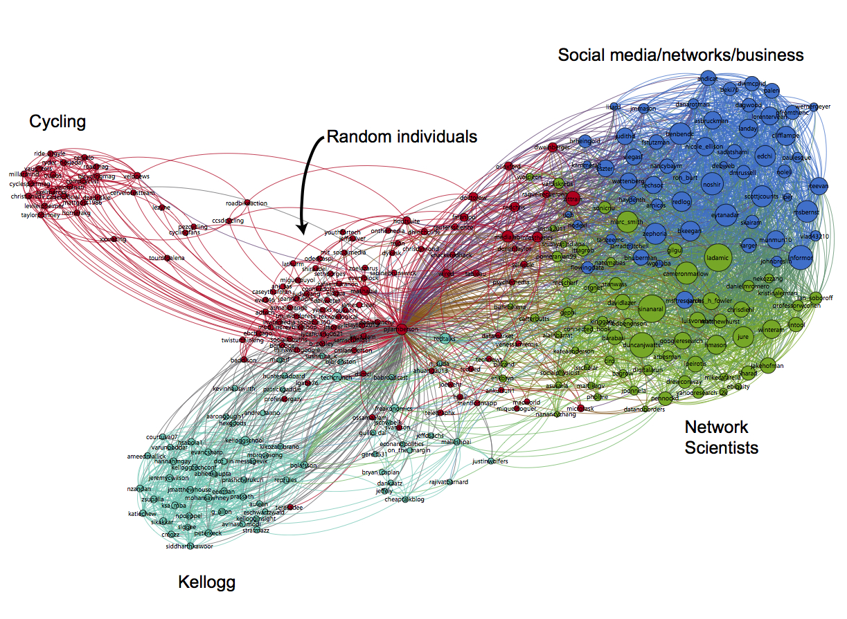
 Another ego map. This chart shows an individuals social network, their Facebook connections. For this visualization I find it interesting that the “random individuals” are so close to the central node. I would assume greater more meaningful connections would be there. However, the if clusters like “network scientist” were closer the visualization would have been difficult to read. This chart also utilizes color to show different cluster categories and annotations. These elements make the clusters much easier to identify.

For this last chart, scientist wanted to identify the relationship between chemical flavor compounds in recipes. They did this to prove or dispel the idea that food with similar compatible flavors are chemically similar. They took into account foods from different regions of the world, understanding that North American cuisine combines similar compounds while East Asian dishes do not. I choses this visualization because of the very helpful key on the right side of the chart. The node size shows the prevalence of an ingredient in the dishes. The thickness of the edges shows how many compounds are shared between ingredients.
Results
For this lab I brought in the dolphin file as a CSV. For “source” and “target” I referred to the dolphins as numbers 1-62 rather than by their names for visual clarity. I understood that the chart was going to be an indirect chart, Dolphin 1 swims with Dolphin 2 and Dolphin 2 swims with Dolphin 1. After my chart was imported I began by choosing “Force Atlas 2” for my layout. I tried a few of the other layouts and found this choice to be the clearest.
I then configured the:
Degree – node size
Density – how complete the graph is. Complete graph will have a score of 1
Diameter – the maximum distance between pairs of nodes
Modularity – creates sub networks based on score. A high score means more cluster.

Imposing modularity produce four network groups that I colored to show distinction. I was able to change the size of the nodes using degree, which I set the range at 1 – 13. Nodes that had higher connections were larger. I choses to label all the nodes but gave the larger nodes their dolphin names and omitted the number. The thought being that the user would remember the name more than they would remember a number.
From the chart I was able to identify four clusters, could these be considered pods? Trigger who is dark blue never swims with Web who is Yellow. After further research, I discovered dolphins are not exclusive to their pods. Dolphins are like “free spirits” and will often leave a pod for another, and maybe come back later. Also, it is important to note that dolphins are so sophisticated that they recognize each other like humans do. An example would be if a human ran into an old friend from high school after five years and immediately was able to place who that person is to them. Dolphins can do that too! Therefor it makes sense that Web and Trigger might be the leaders of their pods, with other periphery dolphins swimming in and out of their pods.
Further Discussion
Overall, seeing the chart fully realized is very satisfying. Creating the chart however is not so satisfying as Gephi is not intuitive. After researching and getting to know the program better, it was easier to create this chart, and also understand where else it may be applicable. I think charts created in Gephi are visually stunning but need supporting charts and data to make sense of the visualization. In this case I had to do outside research about dolphins to fully understand why the chart may have looked the way it did.
If I could change my visualization I would like to add more information about the larger node dolphins. What do they look like? Are they male or female? If they are male this may support my theory that they are pod leaders. Also there are three types of pods in the Bottlenose dolphin community: Mother/offspring, Juvenile and Male pods. I would be curious to know if any of these pods fit those groupings.