Introduction
This project is an extension of a previous visualization project. With the previous project, I explored relationships between community boundaries, empowerment zones, and public art, in Chicago, IL. While working on those visualizations, I thought that I would be creating something in support of the idea that public art has the potential to create stronger communities, but as I spent more time with the maps, I realized that one of the empowerment zones, which lacked city-identified public art, marked exact boundaries of what I recognized as a strongly-connected immigrant community – the Pilsen neighborhood. Historically, the residents of Pilsen have put forth a continual effort to protect their cultural representation in the city. Instead of making discoveries related to potential beautification projects, it seemed that I was looking at targets of gentrification.
 Public Art and Empowerment Zones, in Chicago
So, to move forward with the idea, I decided to visualize graffiti clean-up in Chicago, in order to show the contrast between city-identified public art, and “illegal” images that are community-produced. I proceeded with the following questions in mind:
1/ Is there a correlation between sites of graffiti removal, and the areas that have been city-identified as economically distressed (i.e. empowerment zones), in Chicago?
2/ Which empowerment zone seems to be the most affected by graffiti clean-up efforts?
3/ How do the locations of public art compare to the sites of graffiti removal, especially in relationship to empowerment zones, in Chicago?
Materials
For these visualizations, I used the following datasets:
- The City of Chicago’s “Boundaries – Community Areas (current)” shapefile (2016)
- The City of Chicago and The Empowerment Zones/Enterprise Communities (EZ/EC) program’s “Empowerment Zones” shapefile (2011)
- The City of Chicago’s “311 Service Requests – Graffiti Removal” (1926 – 2016)
Since the Graffiti Removal dataset was too large for Open Refine, and too large for Carto, I brought it into Excel, and broke it out into 6 files, 1 for each of the following: 2010, 2011, 2012, 2013, 2014, 2015. The data available for 2016 did not represent a full year, as the year has not yet completed, so I left it out. Also, some sparse reports were collected from years preceding 2010, dating as far back as 1926, but 2010 appeared to be the first complete year, so I started there. These are the steps that I took, in order to create the 6 new files:
- Selected top row (column labels) of the original dataset
- Clicked “Filter”
- Clicked the downward arrow on the “Creation Date” column
- Clicked “Sort Oldest to Newest”
- Created new 6 new tabs in the workbook, and named them by year
- Manually copied the rows by year, and pasted them into the appropriate tabs
Then, I connected all 6 of these new datasets in Carto and Carto Builder, to allow for experimentation in both programs, but ultimately, all of my resulting visualizations were created in Carto Builder.
Methods
Starting with the year 2010, I layered the “Chicago Graffiti Removal 2010” dataset with the “Community Boundaries” and “Empowerment Zones” shapefiles, ordering the layers as such (to make all of the parts visible): graffiti on the top, empowerment zones in the middle, and community boundaries on the bottom. Then, in the community boundaries layer, I added the “Intersect Second Layer” analysis, intersecting the graffiti layer, and coloring the results “By Value” (Selected “Fill,” “By Value,” and then, “count_vals”). In the empowerment zones layer, I brought the “Fill” transparency to 0, and increased the “Stroke” value to 3. In order to make these boundary lines pop, I made them a warm color (red), and chose a cool color for the analysis results (blue). Finally, for the analysis’ legend, I used the title “Graffiti Density” for the community boundaries dataset (appears as the legend’s title), and the title “by Community Boundary” for the legend (appears as a subtitle).
Next, in the graffiti layer, I played around with a couple of ideas. At first, I brought the “Fill” and “Stroke” transparencies to 0, to entirely eliminate the points. This helped to clear some visual clutter, resulting in a more impactful view of graffiti removal density, but it also made for a less impactful view of the high concentration of points in the 2 empowerment zones nearest to the Pilsen neighborhood. So, I went back and increased the “Fill” to 4, and chose a more neutral color (black) to decrease visual competition between elements.
Here, it would have been helpful if I could have added an annotation, to signal the location of the Pilsen neighborhood, but Carto Builder does not currently offer that option. Under “Elements,” it says, “Unfortunately, map overlays are not available yet, but they will be very soon. Stay tuned!” Knowing that, in Carto, annotation is done by adding a “text element,” I assumed that Carto Builder’s “Elements” is where annotation options would have been found. In the meantime, I settled for the addition of “Pop-ups.” In the empowerment zones layer, I went to “Pop-Up, “Show Items,” and selected “Section.” While this did not completely satisfy my desire for an original annotation, it was enough to show “Pilsen” as the section title for both of the empowerment zones with heavy graffiti removal.
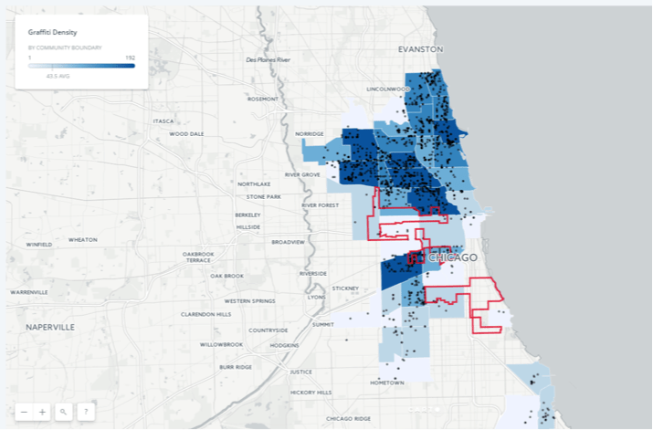
Chicago’s Graffiti Density, by Community Boundaries – 2010
At this point, I followed all of the same steps described above to create maps for the years 2012 and 2015, to show a time range across the graffiti datasets. For the most part, it was a smooth process, but I did come across a couple of problems. First, I discovered a software glitch; I wanted to employ a hex code, in order to achieve precisely the same colors across all of the maps, but this option, while seemingly available, did not actually work in Carto Builder. Then, I encountered a design problem; I realized that the sharp increase in graffiti removal data points from 2010 to 2012 made my previous approach to designing the map’s points completely chaotic, and unclear. I spent some time adjusting the “fill” and “stroke” elements, and briefly experimented with the shape of the points, but nothing alleviated the near-complete coverage of black points on the map. For the sake of consistency, I eliminated all graffiti removal points from the 3 maps, but ultimately, this problem inspired me to take an entirely new approach to these visualizations.
 Chicago’s Graffiti Density, by Community Boundaries – 2010

Chicago’s Graffiti Density, by Community Boundaries – 2012

Chicago’s Graffiti Density, by Community Boundaries – 2015
Starting fresh, with a mid-point year, I duplicated the 2012 visualization, deleted the analysis that I had placed on the community boundaries layer, and made the “fill” transparent on that layer so that only the outlines of the boundaries could be seen. Then, I repeated the steps to add an “Intersect Second Layer” analysis on the empowerment zones layer, intersecting it with the graffiti removal layer. I also repeated all of steps for labeling the legend, and eliminating the graffiti removal points.
For the coloring of the analysis, I chose a warm (pink) color scale. I would have preferred to have created a “custom color set” with a range of red shades, but it was too difficult to be consistent across all of the maps, due to Carto Builder’s hex code glitch, so I settled for the pink. I also changed the analysis’ number of “buckets” from 5 to 4, in order to show a higher contrast between the empowerment zones. For the coloring of the community boundaries, I chose a cool (blue) color to contrast with the warm analysis color scale, and brought the layer to the top, so that the boundaries could be seen over empowerment zones; I made this choice in order to show that Pilsen is the only empowerment zone completely contained within a single community boundary.

Chicago’s Graffiti Density, by Empowerment Zones – 2012
Before repeating all of the above steps for the years 2010 and 2015, I prepared some UX research, to gather feedback on my visualizations.
UX Research
Being a native of the Chicagoland area, I have access to some local (New York area) friends who have also migrated. I reached out to 3 of these friends, and asked them to participate in my UX research. Luckily, they all agreed. I met with each of them in person, and used my Macintosh laptop to conduct the research in a quiet, one-on-one setting.
Methodology
For this UX research, I utilized task completion, think-alouds, and observation. Using the 2 visualizations that I had created for the year 2012 (chosen as a mid-point, but also as the year closest to the focus of my public art visualizations), each of my 3 participants were asked to complete the following tasks, while thinking aloud:
- Identify which communities have the highest density of graffiti clean-up.
- Identify which “empowerment zone” seems to be the most affected by graffiti clean-up.
- Identify the “empowerment zone” that is completely contained within a community boundary.
Serving as a make-shift dashboard, the participants were presented with this view of the 2 visualizations (made possible by Safari browsers):

With a participant seated at the computer, I read aloud each task, allowing the participant plenty of time to complete a task, before hearing the next. As they worked, I took observation notes.
Findings
Numbers need to be explained
This may seem obvious, but it was not obvious to me. It did not occur to me that the legend of the map would have any other title than one that expressed “density,” and yet, that does not at all explain the numbers on the gradient’s scale. One of my users said, at multiple points, that he wondered what the numbers were representing, and since the title of the visualization already expressed density, I knew that the title of the legend needed to be doing different work.
Less is more
The whole of my user research directly pointed to the strength of 1 of my visualizations, and the less effective, repetitive nature of the other. For example, I thought that the “Graffiti Density by Community Boundary” visualization would provide a better comparison between communities, but all of my users made comments about the stark contrast between “Pilsen” and “The South Side” sections, while viewing the “Graffiti Density by Empowerment Zones” map. This discovery also made me realize the importance of selecting the right users for UX research; having participants who were familiar with Chicago’s neighborhoods proved to be invaluable, as they all were able to draw conclusions from the data, based on their prior knowledge of the area.
Instruments limit design
When I first completed my UX research, I felt inspired to make several changes to my visualizations, drawing from what I had observed; however, when I went into Carto Builder, to do the work, I encountered further limitations. In addition to the hex code bug, I learned the following:
- Carto Builder does not allow you to style the “zoom” and “search” controls on visualizations, despite a default setting that results in white controls on a white map. The same is true for the styling of the legend box.
- Once again, annotation would have been useful, as all of my users voiced confusion over the term “empowerment zone.” If I were able to annotate, I could have added a brief definition to the visualization.
- I could not move, style or, customize labels, which was especially frustrating as the word “Chicago” was automatically placed directly over the Pilsen neighborhood. The appearance of labels changes with the “basemap” style, which can be adjusted, but there are very few options, and none of them solved this particular problem. The closest option would have been to select the “Dark Matter (Labels Below)” basemap, and to change the transparency of the “Fill,” but transparency cannot be modified on a “By Value” fill, only on a “Solid” fill, which is another problematic restriction.
Final Visualizations
After my UX research, I took all of my focus off of the “Graffiti Density by Community Boundary” maps, and solely experimented with the “Graffiti Density by Empowerment Zones” maps. First, I briefly applied the “Dark Matter” basemap to the visualization from 2012, in order to make the legend, zoom, and search boxes visible. Since the darker pinks of the analysis’ color scale no longer popped on the black background, I changed the color scheme of that scale to a warm orange, which still contrasted with the cool blue. I also added the “scroll wheel zoom” feature, in an effort to aid in the usability of the zoom function (not that this would have helped my users at the time of research, since they were using a laptop track pad). Then, I changed the title of the legend to “Graffiti Removal Requests,” to better explain the numeric measurements.
 Chicago’s Graffiti Density, by Empowerment Zones – 2012
Ultimately, even though it may have solved some of my usability issues, I was not thrilled with the appearance of the “Dark Matter” basemap. In my opinion (and maybe I am wrong), the analysis was more impactful on the previous design, so I changed the basemap style back to “Positron.” Then, I created duplicate maps for the years 2010 and 2015.

Chicago’s Graffiti Density, by Empowerment Zones – 2010

Chicago’s Graffiti Density, by Empowerment Zones – 2012

Chicago’s Graffiti Density, by Empowerment Zones – 2015
Discussion
Through the creation of these visualizations, I found that there was a clear overlap between the lack of public art in tightly knit immigrant communities, and the frequency of graffiti removal in those same areas. Using the Pilsen neighborhood as an example, it seems obvious that a very particular type of neighborhood is being targeted with these clean-up initiatives, and if history is any indicator, this will likely result in displacement for current residents.
I also came to understand that the area which most Chicago residents would identify as highly distressed, the South Side, happens to mark the lowest density of graffiti removal requests. It is interesting that the empowerment zones closest to the city-center are targeted for clean-up, but not the larger empowerment zones, containing arguably more dangerous neighborhoods, which are further out of affluent sight.
Additionally, areas with more Caucasian residents seem to be falling under the graffiti radar, which may point to some “broken windows” policing, in support of this movement to gentrify.
Future Directions
If I were to move forward with this project, I would love to do some more UX research, using the visualization that I had created with the “Dark Matter” basemap. Right now, I am not sure if my aversion to that map is personal taste or, if it is actually less effective. Also, in further exploration of the “broken windows” policing theory, I think that it would be interesting to introduce some crime rates into these visualizations. Lastly, I would like to revisit this project once Carto Builder is further along in its migration from Carto.