Introduction
In 2016, a startup Chinese company called “ByteDance” created a social media phenomenon called “TikTok” that has taken over millions of people’s lives. With it being only 6 years old, it has become one of the leading social media platforms to grow an audience fast. Many have become overnight influencers using this platform. I wanted to look more in-depth at how TikTok has been helping establish brands and creating influencers as well as answer the question of ‘are followers more important than engagement for TikTok Influencers?’ As a social media manager, my clients are often looking to have more followers which is understandable. However, I believe engagement is important too because you can have millions of followers but low engagement. I wanted to see if this thought is valid or not.
I found a dataset on Kaggle.com, which hosts huge repositories of community published data and code, that had Top 1000 TikTok Influencers. I thought this was interesting because it led me to wonder ‘well, who are the top TikTok influencers?’ ‘How many followers do they have?’ ‘What is their engagement like?’ ‘What type of content do they share on TikTok?’
This report will answer some of those questions and explore some additional insight on influencers and their engagement with TikTok. It will demonstrate how I used Tableau to visualize the data set to answer those questions.
Methods
Before finalizing the topic for this report, I looked in the Pratt Library for datasets but I decided to change directions and look online for datasets. I wanted to see if there were any other resources online that I can use that may be interesting to my career. I was initially looking for datasets relating to public relations then I stumbled upon this website called Kaggle.com. Out of curiosity, I signed up and browsed their datasets and that’s when I came across the Top 1000 TikTok Influencers. I downloaded the dataset and briefly skimmed through the CSV file. After, I uploaded it into Tableau.
This was my second time using Tableau. However, I didn’t fully understand how it worked until I uploaded this new dataset. I played around with the features of Tableau to get familiar with how I wanted to visually represent the data. I realized there was a lot of data to filter through and I was a bit confused on how to organize them. The top 1000 influencers may be too much information to attempt to read on a data visualization. With support, I learned how to sort through the data in Tableau, and build the charts based on information I wanted to see.
Results & Interpretation
The first visualization I created was a chart to organize the influencers by creating a descending filter for the subscriber count field to show who had the highest to lowest followers.
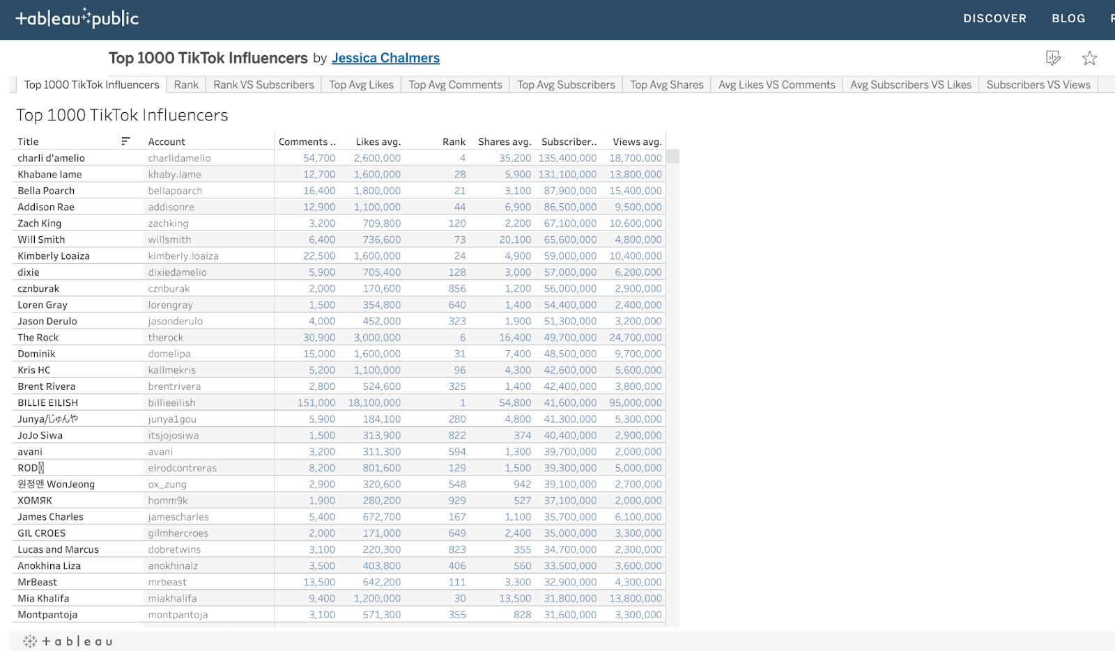
I used this table chart just to get a quick glance at who had the most subscribers. I changed the measure value color to blue. Since there are so many names, I figured it would be easier to look at the number values. Also, I wanted to change the colors to the other columns and headers but I was having some issues figuring out how to change the colors.
In Tableau, I created several charts but I am going to highlight a few that I feel is important and you can look at the whole thing here.
This next chart is a scatter chart graph that shows the relationship between the subscribers and their likes.

In this visualization, I chose the color orange so that it can be bright and easier to see especially since there are so many accounts to look at. I really wanted to limit it to the Top 20 but I couldn’t figure out how to do so. I think if I was able to limit it to 20 accounts, it would be better to review who has the most likes in comparison to their subscribers. Thus far, I was able to see Billie Ellish has the most followers (18M) but fewer likes (40M). And, Charli Damelio has a little over 4M followers and has the most likes of about 140M. This finding supports my question of are followers more important than engagement. We can see that the person who has the most followers doesn’t have the most likes.

For this scatter chart, I wanted to try something different than the one above. I wanted to see what it looks like with triangles and if it helps the user read it better. I kept the same color of orange because I thought it was better to use.
Reflection
After doing this assignment, I realized I could’ve spent a little more time in discovering how I can rearrange the information. Also, how I can highlight the most important parts of the visualization without it coming off overwhelming.