INTRODUCTION
Android Netrunner is a two-player, asymmetrical, deck-building card game that began releasing cards in 2012. The game pits two players, one a runner and one a corporation, against each other using a deck built from whichever cards the players have purchased. This report focuses on visualizations designed from cards strictly from the runner side. First the players choose an Identity. This unique identity card also decides which faction (shaper, anarch, or criminal) the player will play as. Decks can be built with any number of cards matching the player’s faction plus neutral cards. The players may choose to “splash” cards from another faction using a limited number of influence points to do so.
The success of Android Netrunner comes from the adaptability of gameplay, players can adjust which cards they use over time, learning from successes and failures during play. This develops what is called a metagame, the group of preferred cards commonly used within a community of players. As players battle within their communities, a metagame develops that should be different from community to community based on the style of play of the players making up the community. Comparing the cards used in a defined community to the general Android Netrunner population would show if these metagames exists and possibly define trends for each community. For the defined user community, I chose decks submitted to NetrunnerDB used in the 2015 World Tournament. I will compare them to the 20 most liked decks on NetrunnerDB, decks that would represent the general population of players.
- Will there be a distinction between the metagame of professional Android Netrunner players when visualized against the general gaming population?
METHODS
Data
The data used in these visualizations came from the Android Netrunner fansite NetrunnerDB. This site allows users to submit their decks online allowing other users to comment, like, and build off of these decklists. To select the decks to visualize, I obtained the deckID for the 20 decks with the most likes on the site and 20 decks labeled as used in the 2015 World Tournament. These ID numbers were organized in a JSON file and used to query the NetrunnerDB API to retrieve each card used in each deck. Built in Python functions then created each paired combination of cards that appeared together in any deck; this was necessary for creating an edge table for Gephi. I also used the API to obtain details about each card in the edge table including faction, type, image link, and title.
Gephi
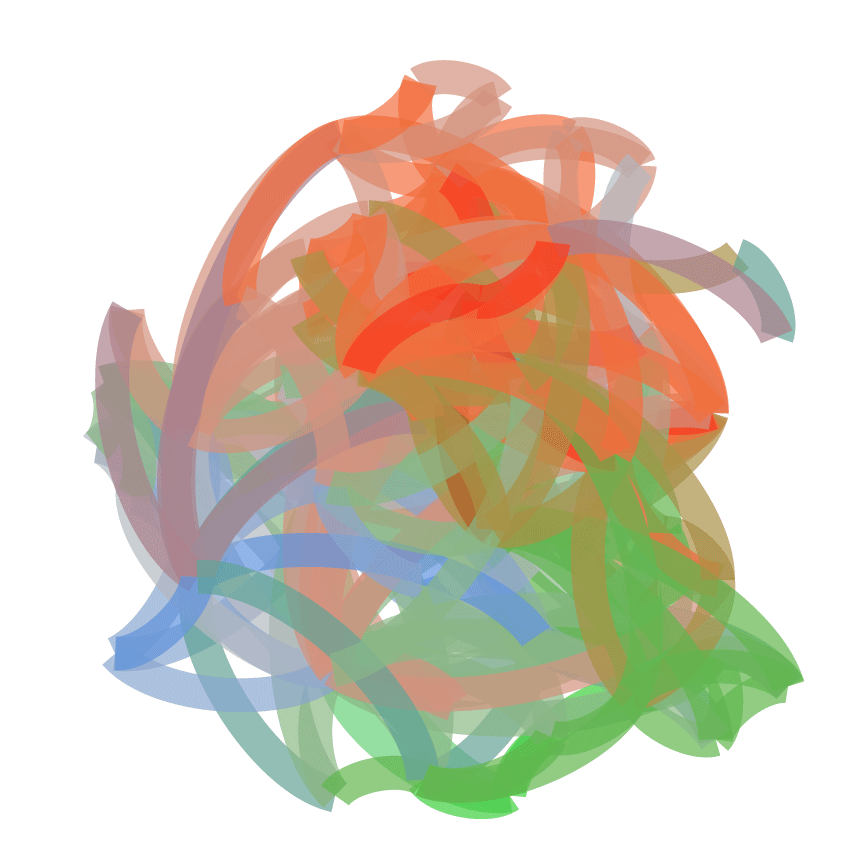
Gephi was the natural choice for showing the complex networks that form when studying Android Netrunner metagame. After importing the edge and node tables into Gephi, I made two static visualizations, one for each community. These visualizations were made using identical processes to insure the most reliable visual comparison. The steps in creating each visualization began with applying an YiFi Multidimensional layout which was expanded by 600%. Nodes were replaced by the card’s title and colored according to the its faction. Label size also corresponds to the frequency of a cards occurrence throughout all decks and edges were colored as a mixture of the two parent nodes.
As the level of detail in static images exported from Gephi was limited, I also exported each visualization as an interactive web model using sigmajs. These were uploaded to the web so they can be accessible online. They were modeled similar to the static visualizations, except using circular nodes instead of labels and included a picture of each card, displayed when clicked.

Runner 20 Most Liked Decks

Runner World Tournament 2015
Tableau
There was also a need to visualize descriptive statistical data in a way that was not possible with Gephi alone. I used Tableau Public to visualize the two communities side by side using the same dataset used to build the networks in Gephi. It was important to show the frequency of occurrence of each individual card as a bar graph, while the occurrence of cards by faction was represented in a bubble chart as it is a higher level grouping of cards. Type of card was also included as it was not represented in the Gephi networks. Cards were colored by the in-game faction colors and card type was colored using a Tableau palette that did not mimic too closely and of the faction colors. Filters were placed on each sheet so that all variables would be available as a filter.
User Research
To improve the design and accessibility of the visualizations, I conducted user research on three subjects at two points in the design process. The first interview used the first test visualization using a known subject who was an experienced player of the game and avid collector of the cards. The second interviews were conducted after creating a new set of visualizations specifically new sigmajs pages. These final two subjects were recruited from a Brooklyn board game store, one a novice player and the other a store employee familiar with the game, but had not played.
I presented the visualization on a laptop screen to each tester; I did not tell them where the designs came from. I asked predetermined interview questions, but allowed the testers to express their opinions freely during the process. My first question was the same: “Which cards are the most popular?” Other questions included: “What do the colored lines represent?” and “What are these outlying clusters?”. The testers were happy to provide their opinions on the design without much prompting by questions.
RESULTS & DISCUSSION
Design
When designing the static visualizations, I used the card title instead of nodes with label size corresponding to frequency of use. This creates a word cloud that was easily identified by players of the game, which was understood by all the test users. The large labels also make the central cards immediately stand out as important and help with readability at most zoom levels as opposed to nodes with small labels. Test users also preferred the visualizations with the white background instead of black, for reason of readability. For the node and label color, I used the colors that corresponded to the card’s faction: green for Shaper, blue for Criminal, red for Anarch, and grey for Neutral. Users picked out this distinction quickly and it appeared to be the best option for coloring.
After some user comments about the clusters of cards, I changed the Gephi network layout from Fruchterman-Reingold to YiFi Multidimensional; this made the popular cards center at the core and created more distinct clusters of each decks’ less popular cards.
Exporting the Gephi visualization through sigmajs limits the control over the design. Nodes remain circular and edges default to grey. I included the option to group by faction on the first test sigmajs page. This grouping function was limited as the group titles did not correspond to faction name, but instead was labeled as “Group 1”, “Group 2”, etc. This was confusing to tester as well as the reasoning behind the grouping, since the identity nodes were colored a brighter shade of their faction color, they each were treated as a separate group by sigmajs. It was found less confusing to leave off the grouping function completely, rather than including it with less than optimal functionality. My first user tester also wanted pictures of the cards when clicked, so these were added to the next set of visualizations. Finally, I created the Tableau visualization to give more specific quantitative details about each metagame community. User tests showed that they desired more specific information about the contents of decks, information provided by the new Tableau visualization.
Metagame
Networks. The 2015 World Tournament’s network had 123 nodes (cards) with 5,763 edges (connections of cards by deck). The nodes clustered in a central core with two rings of lesser common cards surrounding. The central cluster of cards were well connected to the rest of the network, with the card Sure Gamble making up the central point as it is present 100% (20) decks examined. The second most common card was Plascrete Carapace in 85% (17) of decks. The surrounding cards in the central cluster appear in 8 or more decks, 19 cards or 15% of total cards. Out of the 20 deck players used 10 unique identity cards.
The Top 20 decks network had 172 nodes with 4,393 edges. There was a small central cluster of common cards centered around Sure Gamble and Plascrete Carapace that appeared in 70% (14) and 60% (12) of the decks respectively. The cards surrounding the core are clustered far away from each other with outlying clusters flung far away from the center. The players used 13 unique identity cards out of the 20 decks.
Factions. Shaper and Anarch were the most popular factions for World’s and Top 20 decks. However neutral cards were always among the most popular cards, always in the top 2 positions. In the World’s decks, Shaper and Anarch tie for player identity cards, both with 85% (7) of total decks. For Top 20 decks, Shaper was the most popular identity at 50% (10) of decks and Anarch at 40% (8) of decks. Criminal is the less popular faction for cards and identities and in the World’s decks, the first criminal card did not appear until the 14th most popular position.
Comparison. While the World’s network had less nodes, it had a greater number of edges, suggesting that the World Tournament players use a smaller selection of cards in a more concentrated distribution between decks. The top 20 decks were more diverse with cards less likely to be repeated between decks. The metagame of the World’s players revolves around a tight group of popular cards; the Top 20 metagames is scattered and arguably non-existent. Selection of cards changes through interactive gameplay adapting over time to the strategies of opponents. While the World’s decks were chosen to play within a known group of players, the Top 20 decks were developed independently of each other and come from different points in time. The Top 20 decks represent the many viable combinations of cards.
CONCLUSION
For this project I made two visualizations, one static and one interactive, for two user communities of the card game Android Netrunner. Comparing the networks and statistics of two communities, decks from the World tournament 2015 and the top 20 decks by likes on NetrunnerDB, showed that there was a distinct difference between the metagame of each. Where the World’s decks had a distinct and concentrated center, the Top 20 decks were more diverse but less connected.
Future Work
Based on user research there were several design elements that I would change on future visualizations. Adding a legend that explains what faction each color corresponds to on the static visualizations would add clarity for all users regardless of their experience with the game. Further customization of the online sigmajs visualizations would fix some issues raised by user testers. These customizations require more time working within the javascript code exported by Gephi to make improvements. Changing the Shaper color to a darker green would increase those nodes’ visibility, which was difficult for some testers to see. Renaming the group names would also clarify and allow for more user interaction.
There is also room for expanded the scope of the visualizations. It would be informative to do a set of visualizations with decks from another defined user community to compare to the World’s group. Another set of visualizations dealing with the Corporation side of the game could show if these decks network in a similar manner as the Runner decks.