
INTRODUCTION
After playing Android Netrunner a handful of times, I was interested to visualize the network between cards. Netrunner is a two player, asymmetrical, deck-building card game where players first choose a side (Runner or Corporation), then build a deck from available cards. For this visualization I focused solely on the Runner side which has three factions (shaper, criminal, and anarch) as well as neutral cards. There are around 400 unique Runner cards and each deck has approximately 17 unique cards.
More experienced players have described their love of the game due to card interactions being well balanced and the fact that there are “no bad cards.” Looking through online comments for certain cards, there are some that are considered essential for any runner deck. I was interested to see if these claims were actually true and if there are cards that are core to a majority of decks.
- Will you see a central cluster of “essential” cards when networking popular Android Netrunner decks?
INSPIRATION
This first visualization shows statistics on the Magic: the Gathering metagame for European players versus American players during the Modern Masters Weekend in May 2015. Metagame refers to which cards become popular amongst different communities based on the players and style of play in those communities. Android Netrunner and Magic: the Gathering share qualities as deck-building games and in some aspects of gameplay. The visualization shows a lot of facts effectively but does not go into depth about how cards pair together.
The second example is another Android Netrunner visualization, which graphs all decklists available on NetrunnerDB into one Gephi visualization. The author does not distinguish weight or degree of nodes or edges in any way, but relies on node’s positioning to show connectedness. While there are cards which group in the center as the most common cards, the visualization does not highlight these in any obvious way to a viewer, which makes it difficult to immediately find the most frequently used cards.
The third visualization shows the likeliness of one hand in Texas Hold ‘Em to beat any combination of opponents hands. I’ve included this as Richard Garfield considered the bluffing aspect of poker as an inspiration when designing Netrunner. Poker differs from Android Netrunner in its mathematical precision over what is a winning hand, whereas Android Netrunner is much more nuanced in what combinations of cards are winners.
METHODS
Data
I wanted to begin with a small sample size to make a test network. I chose to use the popular Android Netrunner resource netrunnerDB and their public API to gather deck data. I used the Python request module to run queries through netrunnerDB’s API to pull all cards in each of the top 10 runner decks based on likes. Python’s combination function helped create the edge table representing each time any two cards were in the same deck. The netrunnerDB API also allowed me to add extra details to my node table like faction and type for each card. This gave me more options for comparison and visualization in Gephi.
Gephi
I wanted a visualization that would clearly illustrate the network interaction between cards, answering the basic research question using layout, size, and color to compare relationships. I gravitated to two layout styles initially: Force Atlas 2 and Fruchterman-Reingold. While Fruchterman produce a well-rounded shape, I decided that Force Atlas 2 better distinguished the outliers from the more common cards in the core of the visualization. There are a few cards that remain fairly centered as they appeared in the most decks and also had the most connections to other cards. I wanted these nodes to be differentiated visually in an obvious fashion, like using size to correspond to frequency of a card’s appearance in any deck and thickness of edges corresponds the weight of each connection between any two cards.
I experimented with three ways to use color to distinguish nodes: card faction, card type, & modularity. The visualizations colored based on faction seemed to be the most useful so I used the colors that match those in the game; fans would also immediately recognize this meaning. I also highlighted the Identity cards with a brighter shade of its faction color and annotated them on my final image. One, and only one, identity card is required in every deck so it was important to make these unique cards stand out in the visualization.

NetrunnerDB: Top Ten Decks Network
I created two final visualizations, one static and one interactive. For the static visualizations I wanted an image that tells a complete story even when zoomed out. I used label size to show frequency of cards, made nodes transparent, and colored edges a mix between its two node colors. This image is visually resonant and uses color to show how factions interact between decks. The large labels also make the visualization easier to read at any zoom level. The core cards pop out from the visualization, but they still maintain their original faction colors as a colored text outline.
The web interactive visualization, exported through sigma.js, has node size correspond to card frequency, less obvious labels, and grayscale edges. In the web format the labels and colors do not have to be as obvious since the users can click around to manipulate and expand upon the display.
RESULTS & DISCUSSION
After finishing networking in Gephi, I was left with a static image of my network, on both a black and a white background. I also exported an interactive version of my network, colored by faction, using sigma.js. Each of these uses layout to illustrate groupings of cards; you can easily see which cards are commonly used, which lie in the center, and see groupings of decks on the outer edges of the visualization. These decks also cluster around identities and I can start to see which identities cluster centrally, mostly Whizzard. Factions also tend to cluster together, which is appropriate to the rules of the game which limits the number of out of faction cards in each deck. You can see a few cards that lie clearly surrounded by cards from another faction, such as Gorman Drip v1 and Chakana nestled in the top right anarch corner. This is called splashing, when you use influence points to add cards from other factions to your deck.
Having node & label size correspond to frequency of use makes the most common cards, like Sure Gamble and Plascrete Carapace, stand out immediately. Sure Gamble allows a player to gain credits and Plascrete Carapace can prevent the player from taking damage. Each of these neutral cards provides one necessary aspect to a well rounded deck, a good economy and protection from damage. These cards are also two of the oldest cards which speaks to their utility as they are still popular years later with hundreds of new cards published since their release. Comments on NetrunerDB call Sure Gamble “an auto-include in every runner deck” with newer cards beginning to make this card less “glorified”.
FUTURE DIRECTION
The goal of this visualization was to show if any clustering of cards existed between ten popular Android Netrunner decks. After showing that there are central cards common across decks, I want to first expand the sample size to see its effect on the network. Another addition would be to visualize the other side of Netrunner, the Corporation decks, and ask the same question with these decks.
The most interesting area for future comparison would be looking into communities of Netrunner players and visualizing their Metagame. Grouping decks by communities on NetrunnerDB, such as by regional tournaments, would show how differently each community build decks and how they differ from the netrunnerDB popular decks as a whole. Another possibility would be comparing decks over time to see if the Metagame has changed since decklists began being published on NetrunnerDB in 2013.
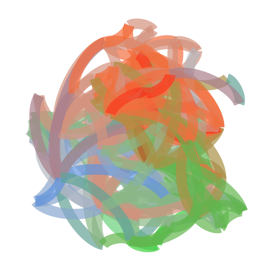
Abstraction of Popular Deck Network